
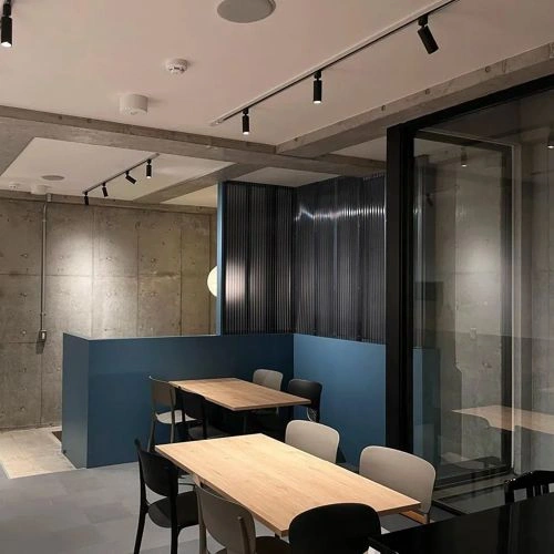
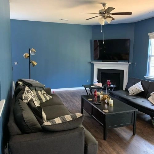
Closest paint matches and alternatives to Valspar Providence 8003-44F
Find similar colors and alternatives to Valspar Providence 8003-44F . Compare L436, Retro-Colonial Blue, Goddess of the Nile and other matches by ΔE and LRV.
Select color
Select palette to match
Valspar 8003-44F Providence
h: 206, s: 34, v: 54
LRV: 17.00%
Tikkurila L436
ΔE*₀₀ = 0.80
Smaller is closer:
~0–1 (imperceptible),
1–2 (just noticeable),
2–5 (small difference),
5–10 (clear),
more than 10 (very different).
h: 204, s: 36, v: 53
LRV: 15.63%

Valspar Retro-Colonial Blue / 4006-4B
ΔE*₀₀ = 0.84
Smaller is closer:
~0–1 (imperceptible),
1–2 (just noticeable),
2–5 (small difference),
5–10 (clear),
more than 10 (very different).
h: 204, s: 35, v: 53
LRV: 16.37%
Valspar Goddess of the Nile / V109-5
ΔE*₀₀ = 2.16
Smaller is closer:
~0–1 (imperceptible),
1–2 (just noticeable),
2–5 (small difference),
5–10 (clear),
more than 10 (very different).
h: 206, s: 41, v: 56
LRV: 16.98%
Behr Arrowhead Lake / PPU14-01
ΔE*₀₀ = 2.25
Smaller is closer:
~0–1 (imperceptible),
1–2 (just noticeable),
2–5 (small difference),
5–10 (clear),
more than 10 (very different).
h: 209, s: 36, v: 54
LRV: 15.44%

Benjamin Moore Mozart Blue / 1665
ΔE*₀₀ = 2.38
Smaller is closer:
~0–1 (imperceptible),
1–2 (just noticeable),
2–5 (small difference),
5–10 (clear),
more than 10 (very different).
h: 202, s: 37, v: 52
LRV: 16.93%
Jotun Moon Reflection / 4072
ΔE*₀₀ = 2.48
Smaller is closer:
~0–1 (imperceptible),
1–2 (just noticeable),
2–5 (small difference),
5–10 (clear),
more than 10 (very different).
h: 205, s: 28, v: 54
LRV: 17.71%
Behr Layers Of Ocean / S520-6
ΔE*₀₀ = 2.61
Smaller is closer:
~0–1 (imperceptible),
1–2 (just noticeable),
2–5 (small difference),
5–10 (clear),
more than 10 (very different).
h: 210, s: 31, v: 53
LRV: 15.48%
Benjamin Moore Bedford Blue / 1679
ΔE*₀₀ = 2.64
Smaller is closer:
~0–1 (imperceptible),
1–2 (just noticeable),
2–5 (small difference),
5–10 (clear),
more than 10 (very different).
h: 204, s: 44, v: 55
LRV: 17.43%

Valspar Veranda Blue / 4004-6B
ΔE*₀₀ = 2.67
Smaller is closer:
~0–1 (imperceptible),
1–2 (just noticeable),
2–5 (small difference),
5–10 (clear),
more than 10 (very different).
h: 205, s: 43, v: 54
LRV: 15.33%
Valspar Thundering Clouds / 4005-4B
ΔE*₀₀ = 2.71
Smaller is closer:
~0–1 (imperceptible),
1–2 (just noticeable),
2–5 (small difference),
5–10 (clear),
more than 10 (very different).
h: 209, s: 35, v: 52
LRV: 15.02%
Behr Shipyard / S500-6
ΔE*₀₀ = 2.83
Smaller is closer:
~0–1 (imperceptible),
1–2 (just noticeable),
2–5 (small difference),
5–10 (clear),
more than 10 (very different).
h: 204, s: 41, v: 52
LRV: 13.98%
Sherwin Williams Inky Blue / SW 9149
ΔE*₀₀ = 2.84
Smaller is closer:
~0–1 (imperceptible),
1–2 (just noticeable),
2–5 (small difference),
5–10 (clear),
more than 10 (very different).
h: 202, s: 42, v: 53
LRV: 15.40%
Dulux Pebble Drift 1 / 90BG 17/120
ΔE*₀₀ = 3.01
Smaller is closer:
~0–1 (imperceptible),
1–2 (just noticeable),
2–5 (small difference),
5–10 (clear),
more than 10 (very different).
h: 200, s: 32, v: 51
Valspar Bountiful Blue / 4007-6B
ΔE*₀₀ = 3.11
Smaller is closer:
~0–1 (imperceptible),
1–2 (just noticeable),
2–5 (small difference),
5–10 (clear),
more than 10 (very different).
h: 200, s: 41, v: 54
LRV: 16.57%
Benjamin Moore Philipsburg Blue / HC-159
ΔE*₀₀ = 3.15
Smaller is closer:
~0–1 (imperceptible),
1–2 (just noticeable),
2–5 (small difference),
5–10 (clear),
more than 10 (very different).
h: 202, s: 26, v: 52
LRV: 19.06%

Please note that the color shown on this page is a representation and might not exactly match the real shade of the cards, fan decks, or color collections. Your monitor, browser, and screen angle can all affect how the paint looks, so it may not be the same as what you see here. All information on this page is based on HSV, LRV, RGB and HEX values provided by manufacturers.
It's important to keep in mind that the same color may appear differently on various surfaces due to the nature of those surfaces. For example, the same shade will look different on a rough wall compared to the smooth surface of cabinets.