

Closest paint matches and alternatives to Valspar US Statue of Liberty T645
Find similar colors and alternatives to Valspar US Statue of Liberty T645 . Compare Crushed Mint, Sylvan Mist, Misty Dreams and other matches by ΔE and LRV.
Select color
Select palette to match
Valspar US T645 Statue of Liberty
h: 154, s: 7, v: 77
LRV: 53.63%
Dulux Crushed Mint
ΔE*₀₀ = 1.00
Smaller is closer:
~0–1 (imperceptible),
1–2 (just noticeable),
2–5 (small difference),
5–10 (clear),
more than 10 (very different).
h: 163, s: 7, v: 78

Benjamin Moore Sylvan Mist / CSP-740
ΔE*₀₀ = 1.04
Smaller is closer:
~0–1 (imperceptible),
1–2 (just noticeable),
2–5 (small difference),
5–10 (clear),
more than 10 (very different).
h: 148, s: 8, v: 78
LRV: 53.89%

Valspar US Misty Dreams / V100-3
ΔE*₀₀ = 1.94
Smaller is closer:
~0–1 (imperceptible),
1–2 (just noticeable),
2–5 (small difference),
5–10 (clear),
more than 10 (very different).
h: 167, s: 10, v: 78
LRV: 54.00%
Valspar US Opalescence / M332
ΔE*₀₀ = 2.05
Smaller is closer:
~0–1 (imperceptible),
1–2 (just noticeable),
2–5 (small difference),
5–10 (clear),
more than 10 (very different).
h: 125, s: 6, v: 77
LRV: 54.06%
Benjamin Moore Beach Glass / 1564
ΔE*₀₀ = 2.10
Smaller is closer:
~0–1 (imperceptible),
1–2 (just noticeable),
2–5 (small difference),
5–10 (clear),
more than 10 (very different).
h: 153, s: 6, v: 75
LRV: 49.70%

Jotun Tender Green / 6351
ΔE*₀₀ = 2.12
Smaller is closer:
~0–1 (imperceptible),
1–2 (just noticeable),
2–5 (small difference),
5–10 (clear),
more than 10 (very different).
h: 156, s: 5, v: 76
LRV: 51.21%

Valspar US Adieu / 8004-34C
ΔE*₀₀ = 2.12
Smaller is closer:
~0–1 (imperceptible),
1–2 (just noticeable),
2–5 (small difference),
5–10 (clear),
more than 10 (very different).
h: 156, s: 5, v: 76
LRV: 52.00%
Farrow and Ball Teresa's Green / 236
ΔE*₀₀ = 2.17
Smaller is closer:
~0–1 (imperceptible),
1–2 (just noticeable),
2–5 (small difference),
5–10 (clear),
more than 10 (very different).
h: 141, s: 7, v: 80
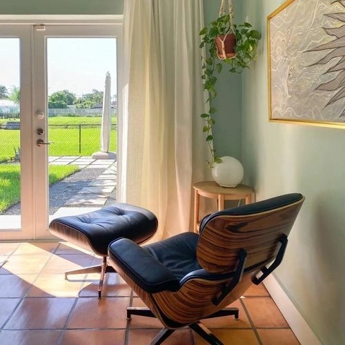
Behr Mountain Falls / N420-2
ΔE*₀₀ = 2.18
Smaller is closer:
~0–1 (imperceptible),
1–2 (just noticeable),
2–5 (small difference),
5–10 (clear),
more than 10 (very different).
h: 134, s: 6, v: 79
LRV: 55.76%
Valspar US Hearth Frost / T635
ΔE*₀₀ = 2.20
Smaller is closer:
~0–1 (imperceptible),
1–2 (just noticeable),
2–5 (small difference),
5–10 (clear),
more than 10 (very different).
h: 145, s: 9, v: 78
LRV: 53.85%
Benjamin Moore Wales Gray / 1585
ΔE*₀₀ = 2.24
Smaller is closer:
~0–1 (imperceptible),
1–2 (just noticeable),
2–5 (small difference),
5–10 (clear),
more than 10 (very different).
h: 170, s: 6, v: 77
LRV: 53.54%
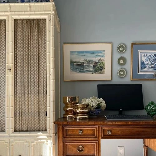
Valspar US Sparkling Lake / 5002-3B
ΔE*₀₀ = 2.27
Smaller is closer:
~0–1 (imperceptible),
1–2 (just noticeable),
2–5 (small difference),
5–10 (clear),
more than 10 (very different).
h: 158, s: 9, v: 80
LRV: 56.74%
Valspar US Patina Gray / T675
ΔE*₀₀ = 2.40
Smaller is closer:
~0–1 (imperceptible),
1–2 (just noticeable),
2–5 (small difference),
5–10 (clear),
more than 10 (very different).
h: 153, s: 5, v: 76
LRV: 52.76%
Valspar US Sweetest Damask / T624
ΔE*₀₀ = 2.44
Smaller is closer:
~0–1 (imperceptible),
1–2 (just noticeable),
2–5 (small difference),
5–10 (clear),
more than 10 (very different).
h: 174, s: 10, v: 78
LRV: 53.94%
Benjamin Moore Tranquility / AF-490
ΔE*₀₀ = 2.50
Smaller is closer:
~0–1 (imperceptible),
1–2 (just noticeable),
2–5 (small difference),
5–10 (clear),
more than 10 (very different).
h: 120, s: 4, v: 76
LRV: 53.31%
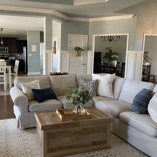
Please note that the color shown on this page is a representation and might not exactly match the real shade of the cards, fan decks, or color collections. Your monitor, browser, and screen angle can all affect how the paint looks, so it may not be the same as what you see here. All information on this page is based on HSV, LRV, RGB and HEX values provided by manufacturers.
It's important to keep in mind that the same color may appear differently on various surfaces due to the nature of those surfaces. For example, the same shade will look different on a rough wall compared to the smooth surface of cabinets.