
Paints matching Sumptuous Purple by Valspar
We found 7 closest paint color matches to Sumptuous Purple 4010-10
Select color
Select palette to match
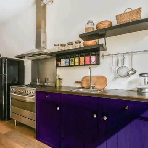
Valspar 4010-10 Sumptuous Purple
h: 259, s: 51, v: 40
LRV: 4.46%
NCS S 5040-R60B
ΔE*₀₀ = 2.00
Smaller is closer:
~0–1 (imperceptible),
1–2 (just noticeable),
2–5 (small difference),
5–10 (clear),
more than 10 (very different).
h: 265, s: 56, v: 40
NCS S 6030-R60B
ΔE*₀₀ = 3.34
Smaller is closer:
~0–1 (imperceptible),
1–2 (just noticeable),
2–5 (small difference),
5–10 (clear),
more than 10 (very different).
h: 255, s: 48, v: 35

Dulux Regal Purple / 15RB 07/237
ΔE*₀₀ = 4.19
Smaller is closer:
~0–1 (imperceptible),
1–2 (just noticeable),
2–5 (small difference),
5–10 (clear),
more than 10 (very different).
h: 250, s: 41, v: 39
Benjamin Moore Grape Gum / 2068-20
ΔE*₀₀ = 4.30
Smaller is closer:
~0–1 (imperceptible),
1–2 (just noticeable),
2–5 (small difference),
5–10 (clear),
more than 10 (very different).
h: 245, s: 44, v: 43
LRV: 7.21%
Dulux Amethyst Falls 2 / 18RB 08/286
ΔE*₀₀ = 4.30
Smaller is closer:
~0–1 (imperceptible),
1–2 (just noticeable),
2–5 (small difference),
5–10 (clear),
more than 10 (very different).
h: 253, s: 42, v: 42
Benjamin Moore Gentle Violet / 2071-20
ΔE*₀₀ = 4.73
Smaller is closer:
~0–1 (imperceptible),
1–2 (just noticeable),
2–5 (small difference),
5–10 (clear),
more than 10 (very different).
h: 270, s: 42, v: 41
LRV: 7.43%
NCS S 4050-R60B
ΔE*₀₀ = 4.73
Smaller is closer:
~0–1 (imperceptible),
1–2 (just noticeable),
2–5 (small difference),
5–10 (clear),
more than 10 (very different).
h: 258, s: 57, v: 49

Please note that the color shown on this page is a representation and might not exactly match the real shade of the cards, fan decks, or color collections. Your monitor, browser, and screen angle can all affect how the paint looks, so it may not be the same as what you see here. All information on this page is based on HSV, LRV, RGB and HEX values provided by manufacturers.
It's important to keep in mind that the same color may appear differently on various surfaces due to the nature of those surfaces. For example, the same shade will look different on a rough wall compared to the smooth surface of cabinets.