
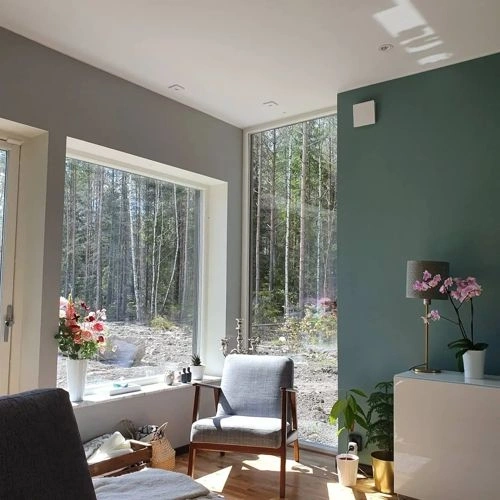
Paints matching Tidepool Wonder by Valspar
We found 15 closest paint color matches to Tidepool Wonder M333
Select color
Select palette to match
Valspar M333 Tidepool Wonder
h: 180, s: 18, v: 57
LRV: 26.54%
Sherwin Williams Moody Blue / SW 6221
ΔE*₀₀ = 1.22
Smaller is closer:
~0–1 (imperceptible),
1–2 (just noticeable),
2–5 (small difference),
5–10 (clear),
more than 10 (very different).
h: 183, s: 16, v: 57
LRV: 26.52%

Dulux Sea Urchin 2 / 90GG 28/133
ΔE*₀₀ = 1.96
Smaller is closer:
~0–1 (imperceptible),
1–2 (just noticeable),
2–5 (small difference),
5–10 (clear),
more than 10 (very different).
h: 178, s: 22, v: 58
LRV: 25.73%

NCS S 4010-B70G
ΔE*₀₀ = 2.25
Smaller is closer:
~0–1 (imperceptible),
1–2 (just noticeable),
2–5 (small difference),
5–10 (clear),
more than 10 (very different).
h: 174, s: 14, v: 58
Valspar Laid-Back Blue / 8003-39E
ΔE*₀₀ = 2.34
Smaller is closer:
~0–1 (imperceptible),
1–2 (just noticeable),
2–5 (small difference),
5–10 (clear),
more than 10 (very different).
h: 187, s: 22, v: 60
LRV: 28.00%
Behr Dragonfly / PPU12-3
ΔE*₀₀ = 2.35
Smaller is closer:
~0–1 (imperceptible),
1–2 (just noticeable),
2–5 (small difference),
5–10 (clear),
more than 10 (very different).
h: 174, s: 21, v: 56
LRV: 26.00%

Valspar Grand Boulevard / V103-4
ΔE*₀₀ = 2.37
Smaller is closer:
~0–1 (imperceptible),
1–2 (just noticeable),
2–5 (small difference),
5–10 (clear),
more than 10 (very different).
h: 186, s: 25, v: 59
LRV: 26.64%
Benjamin Moore Fort Pierce Green / 712
ΔE*₀₀ = 2.44
Smaller is closer:
~0–1 (imperceptible),
1–2 (just noticeable),
2–5 (small difference),
5–10 (clear),
more than 10 (very different).
h: 178, s: 22, v: 56
LRV: 26.39%
Tikkurila Silk Road / S440
ΔE*₀₀ = 2.53
Smaller is closer:
~0–1 (imperceptible),
1–2 (just noticeable),
2–5 (small difference),
5–10 (clear),
more than 10 (very different).
h: 174, s: 21, v: 56
LRV: 23.90%
Benjamin Moore Hemlock / 719
ΔE*₀₀ = 2.68
Smaller is closer:
~0–1 (imperceptible),
1–2 (just noticeable),
2–5 (small difference),
5–10 (clear),
more than 10 (very different).
h: 188, s: 24, v: 60
LRV: 28.89%
Valspar Secluded Garden / 5002-4A
ΔE*₀₀ = 2.69
Smaller is closer:
~0–1 (imperceptible),
1–2 (just noticeable),
2–5 (small difference),
5–10 (clear),
more than 10 (very different).
h: 172, s: 20, v: 59
LRV: 27.79%
Valspar Villa Blue / 5002-4B
ΔE*₀₀ = 2.99
Smaller is closer:
~0–1 (imperceptible),
1–2 (just noticeable),
2–5 (small difference),
5–10 (clear),
more than 10 (very different).
h: 178, s: 22, v: 55
LRV: 23.88%
Behr Polaris Blue / PPU13-06
ΔE*₀₀ = 3.00
Smaller is closer:
~0–1 (imperceptible),
1–2 (just noticeable),
2–5 (small difference),
5–10 (clear),
more than 10 (very different).
h: 184, s: 21, v: 55
LRV: 22.56%

Jotun Sea Emerald / 6084
ΔE*₀₀ = 3.02
Smaller is closer:
~0–1 (imperceptible),
1–2 (just noticeable),
2–5 (small difference),
5–10 (clear),
more than 10 (very different).
h: 175, s: 23, v: 58
LRV: 25.80%
Sherwin Williams Peacock Plume / SW 0020
ΔE*₀₀ = 3.04
Smaller is closer:
~0–1 (imperceptible),
1–2 (just noticeable),
2–5 (small difference),
5–10 (clear),
more than 10 (very different).
h: 177, s: 23, v: 59
LRV: 27.47%

Benjamin Moore Aegean Teal / 2136-40
ΔE*₀₀ = 3.30
Smaller is closer:
~0–1 (imperceptible),
1–2 (just noticeable),
2–5 (small difference),
5–10 (clear),
more than 10 (very different).
h: 184, s: 20, v: 55
LRV: 25.13%

Please note that the color shown on this page is a representation and might not exactly match the real shade of the cards, fan decks, or color collections. Your monitor, browser, and screen angle can all affect how the paint looks, so it may not be the same as what you see here. All information on this page is based on HSV, LRV, RGB and HEX values provided by manufacturers.
It's important to keep in mind that the same color may appear differently on various surfaces due to the nature of those surfaces. For example, the same shade will look different on a rough wall compared to the smooth surface of cabinets.