
Paints matching Winter Moss by Valspar
We found 15 closest paint color matches to Winter Moss V105-3
Select color
Select palette to match
Valspar V105-3 Winter Moss
h: 191, s: 17, v: 75
LRV: 45.80%
Benjamin Moore Cape Blue / 1642
ΔE*₀₀ = 0.46
Smaller is closer:
~0–1 (imperceptible),
1–2 (just noticeable),
2–5 (small difference),
5–10 (clear),
more than 10 (very different).
h: 192, s: 16, v: 75
LRV: 46.87%
Sherwin Williams French Moire / SW 9056
ΔE*₀₀ = 1.02
Smaller is closer:
~0–1 (imperceptible),
1–2 (just noticeable),
2–5 (small difference),
5–10 (clear),
more than 10 (very different).
h: 193, s: 18, v: 76
LRV: 46.95%
Benjamin Moore Buxton Blue / HC-149
ΔE*₀₀ = 1.22
Smaller is closer:
~0–1 (imperceptible),
1–2 (just noticeable),
2–5 (small difference),
5–10 (clear),
more than 10 (very different).
h: 188, s: 16, v: 73
LRV: 44.97%
Behr Clear Vista / PPU13-11
ΔE*₀₀ = 1.33
Smaller is closer:
~0–1 (imperceptible),
1–2 (just noticeable),
2–5 (small difference),
5–10 (clear),
more than 10 (very different).
h: 191, s: 17, v: 77
LRV: 47.17%
Dulux River Valley / 50BG 44/094
ΔE*₀₀ = 1.38
Smaller is closer:
~0–1 (imperceptible),
1–2 (just noticeable),
2–5 (small difference),
5–10 (clear),
more than 10 (very different).
h: 191, s: 17, v: 73
Jotun Teal Zen / 4423
ΔE*₀₀ = 1.61
Smaller is closer:
~0–1 (imperceptible),
1–2 (just noticeable),
2–5 (small difference),
5–10 (clear),
more than 10 (very different).
h: 194, s: 15, v: 76
LRV: 46.77%

Benjamin Moore Exhale / AF-515
ΔE*₀₀ = 1.61
Smaller is closer:
~0–1 (imperceptible),
1–2 (just noticeable),
2–5 (small difference),
5–10 (clear),
more than 10 (very different).
h: 196, s: 18, v: 76
LRV: 46.30%

Valspar Soft Shore / 8004-39C
ΔE*₀₀ = 1.65
Smaller is closer:
~0–1 (imperceptible),
1–2 (just noticeable),
2–5 (small difference),
5–10 (clear),
more than 10 (very different).
h: 195, s: 16, v: 76
LRV: 46.00%
Benjamin Moore Colorado Gray / 2136-50
ΔE*₀₀ = 1.76
Smaller is closer:
~0–1 (imperceptible),
1–2 (just noticeable),
2–5 (small difference),
5–10 (clear),
more than 10 (very different).
h: 187, s: 14, v: 72
LRV: 44.16%
Valspar Warm Breezes / V103-3
ΔE*₀₀ = 1.83
Smaller is closer:
~0–1 (imperceptible),
1–2 (just noticeable),
2–5 (small difference),
5–10 (clear),
more than 10 (very different).
h: 187, s: 18, v: 74
LRV: 45.43%
Tikkurila J438
ΔE*₀₀ = 1.94
Smaller is closer:
~0–1 (imperceptible),
1–2 (just noticeable),
2–5 (small difference),
5–10 (clear),
more than 10 (very different).
h: 195, s: 15, v: 75
LRV: 45.43%

Behr Peaceful Blue / S470-3
ΔE*₀₀ = 1.94
Smaller is closer:
~0–1 (imperceptible),
1–2 (just noticeable),
2–5 (small difference),
5–10 (clear),
more than 10 (very different).
h: 196, s: 20, v: 75
LRV: 44.00%
Valspar Sea Star / 8003-39C
ΔE*₀₀ = 2.13
Smaller is closer:
~0–1 (imperceptible),
1–2 (just noticeable),
2–5 (small difference),
5–10 (clear),
more than 10 (very different).
h: 186, s: 15, v: 76
LRV: 49.00%
Benjamin Moore Ocean City Blue / 718
ΔE*₀₀ = 2.14
Smaller is closer:
~0–1 (imperceptible),
1–2 (just noticeable),
2–5 (small difference),
5–10 (clear),
more than 10 (very different).
h: 189, s: 17, v: 72
LRV: 42.36%
Valspar Artisan Blue / M228
ΔE*₀₀ = 2.27
Smaller is closer:
~0–1 (imperceptible),
1–2 (just noticeable),
2–5 (small difference),
5–10 (clear),
more than 10 (very different).
h: 192, s: 13, v: 73
LRV: 44.97%
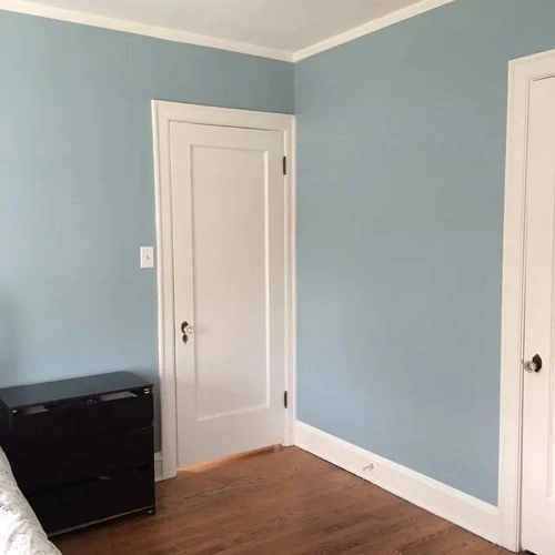
Please note that the color shown on this page is a representation and might not exactly match the real shade of the cards, fan decks, or color collections. Your monitor, browser, and screen angle can all affect how the paint looks, so it may not be the same as what you see here. All information on this page is based on HSV, LRV, RGB and HEX values provided by manufacturers.
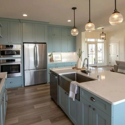
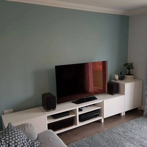
It's important to keep in mind that the same color may appear differently on various surfaces due to the nature of those surfaces. For example, the same shade will look different on a rough wall compared to the smooth surface of cabinets.