Tikkurila Abyss N439
Contentsshow +hide -
| Code: | N439 |
| Name: | Abyss |
| Brand: | Tikkurila |
What color is Tikkurila Abyss?
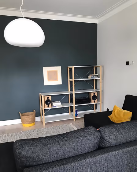
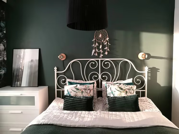
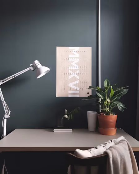
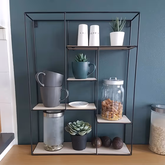
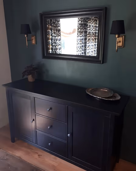
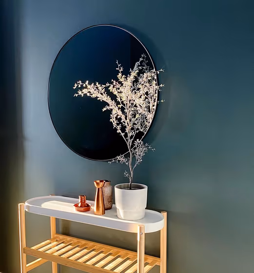
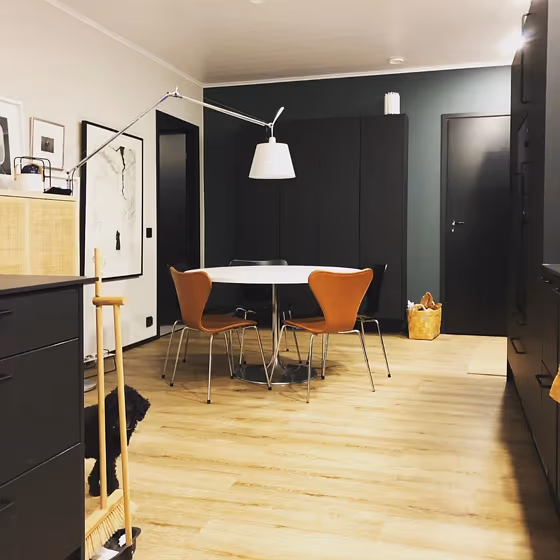
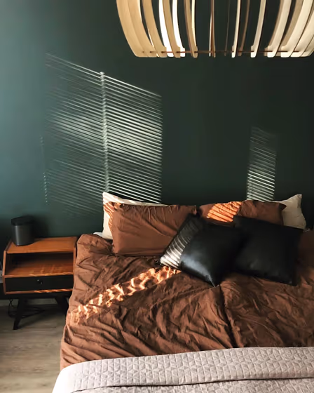
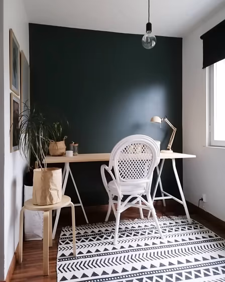
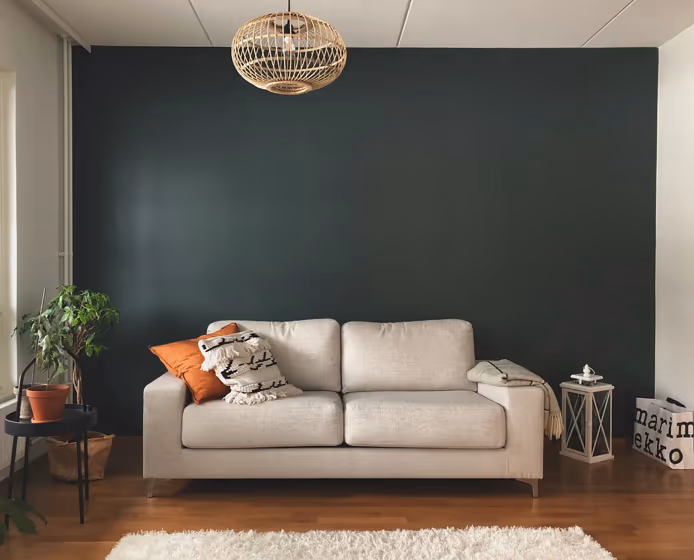
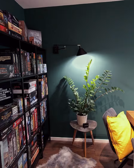
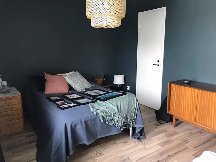
Tikkurila N439 Abyss is a deep and mysterious shade that adds a touch of sophistication to any space. This rich color pairs beautifully with neutrals like Pearl White and Warm Tones like Y52 Walnut. For a bold contrast, consider combining Abyss with L270 Midnight Blue or C3 Cognac for a striking look. Whether used as an accent wall or for a full room transformation, N439 Abyss brings depth and drama to your interior decor. Elevate your space with this versatile and elegant color choice from Tikkurila's collection.
Loading...
LRV of Abyss
Abyss has an LRV of 11.07% and refers to Medium Dark which means that this color reflects very little light. Why LRV is important?

Light Reflectance Value measures the amount of visible and usable light that reflects from a painted surface.
Simply put, the higher the LRV of a paint color, the brighter the room you will get.
The scale goes from 0% (absolute black, absorbing all light) to 100% (pure white, reflecting all light).
Act like a pro: When choosing paint with an LRV of 11.07%, pay attention to your bulbs' brightness. Light brightness is measured in lumens. The lower the paint's LRV, the higher lumen level you need. Every square foot of room needs at least 40 lumens. That means for a 200 ft2 living room you'll need about 8000 lumens of light – e.g., eight 1000 lm bulbs.
Color codes
We have collected almost every possible color code you could ever need.
Not sure what the difference between HEX and RGB is? We break down color models in plain language. Understanding color models
| Format | Code |
|---|---|
| HEX | #56605e |
| RGB Decimal | 86, 96, 94 |
| RGB Percent | 33.73%, 37.65%, 36.86% |
| HSV | Hue: 168° Saturation: 10.42% Value: 37.65% |
| HSL | hsl(168, 5, 36) |
| CMYK | Cyan: 10.42 Magenta: 0.0 Yellow: 2.08 Key: 62.35 |
| YIQ | Y: 92.782 I: -5.316 Q: -2.738 |
| XYZ | X: 10.04 Y: 11.152 Z: 12.21 |
| CIE Lab | L:39.836 a:-4.311 b:-0.178 |
| CIE Luv | L:39.836 u:-5.245 v:0.405 |
| Decimal | 5660766 |
| Hunter Lab | 33.395, -4.774, 1.698 |