Sherwin Williams Adrift SW 7608
Contentsshow +hide -
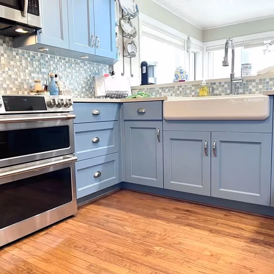
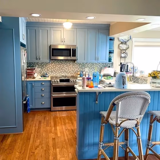
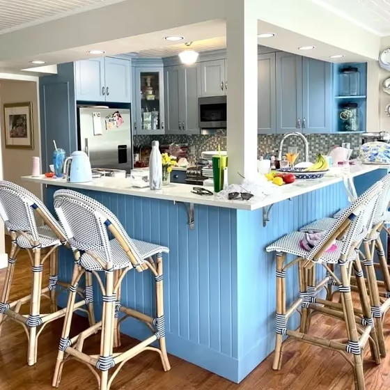
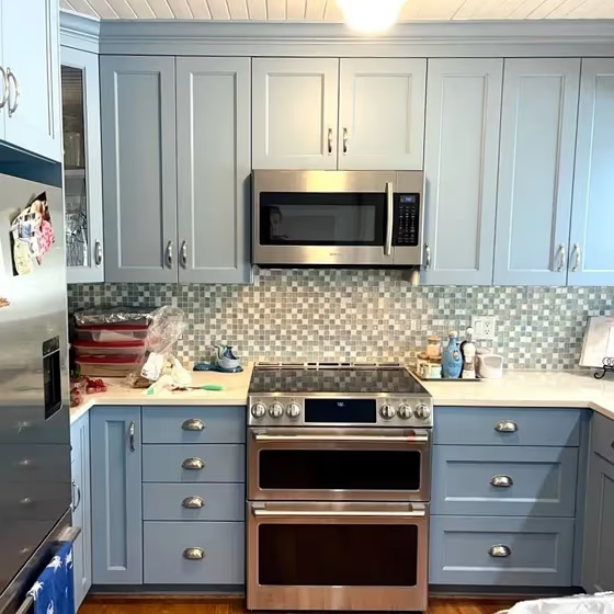
- Sherwin Williams SW 7608 on kitchen cabinets (4 photos)
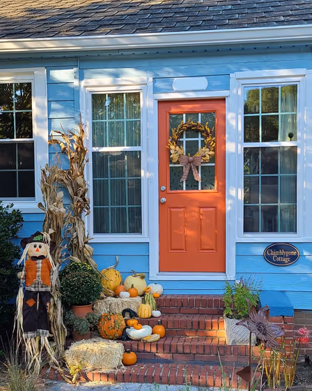
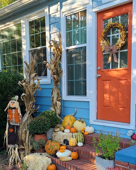
- Adrift for exterior (2 photos)
- Sherwin Williams Adrift reviews (3 photos)
- What are Sherwin Williams Adrift undertones?
- Is Adrift SW 7608 cool or warm?
- How light temperature affects on Adrift
- Monochromatic color scheme
- Complementary color scheme
- Color comparison and matching
- LRV of Adrift SW 7608
- Color codes
- Color equivalents
| Code: | SW 7608 |
| Name: | Adrift |
| Brand: | Sherwin Williams |
| Collections: | 2018 Unity, Timeless Color Wall |
What color is Sherwin Williams Adrift?
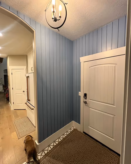
Sherwin Williams SW 7608 Adrift is a serene and calming shade that evokes the feeling of a peaceful ocean breeze in your space. This soft blue hue pairs beautifully with warm neutrals like SW 7006 Extra White and SW 7036 Accessible Beige for a harmonious and inviting look. For a more modern and bold contrast, Adrift can be styled with deep navy tones such as SW 6244 Naval or SW 7067 Cityscape. Whether you're looking to create a coastal retreat or a sophisticated atmosphere, SW 7608 Adrift is a versatile color choice that will elevate any room in your home.
Loading...
LRV of Adrift
Adrift has an LRV of 37.27% and refers to Medium colors that reflect a lot of light. Why LRV is important?

Light Reflectance Value measures the amount of visible and usable light that reflects from a painted surface.
Simply put, the higher the LRV of a paint color, the brighter the room you will get.
The scale goes from 0% (absolute black, absorbing all light) to 100% (pure white, reflecting all light).
Act like a pro: When choosing paint with an LRV of 37.27%, pay attention to your bulbs' brightness. Light brightness is measured in lumens. The lower the paint's LRV, the higher lumen level you need. Every square foot of room needs at least 40 lumens. That means for a 200 ft2 living room you'll need about 8000 lumens of light – e.g., eight 1000 lm bulbs.
Color codes
We have collected almost every possible color code you could ever need.
Not sure what the difference between HEX and RGB is? We break down color models in plain language. Understanding color models
| Format | Code |
|---|---|
| HEX | #87aab9 |
| RGB Decimal | 135, 170, 185 |
| RGB Percent | 52.94%, 66.67%, 72.55% |
| HSV | Hue: 198° Saturation: 27.03% Value: 72.55% |
| HSL | hsl(198, 26, 63) |
| CMYK | Cyan: 27.03 Magenta: 8.11 Yellow: 0.0 Key: 27.45 |
| YIQ | Y: 161.245 I: -25.677 Q: -2.736 |
| XYZ | X: 33.12 Y: 37.402 Z: 51.36 |
| CIE Lab | L:67.577 a:-8.4 b:-11.588 |
| CIE Luv | L:67.577 u:-18.256 v:-16.21 |
| Decimal | 8891065 |
| Hunter Lab | 61.157, -10.356, -6.982 |