Sherwin Williams Baroness SW 6837
Contentsshow +hide -
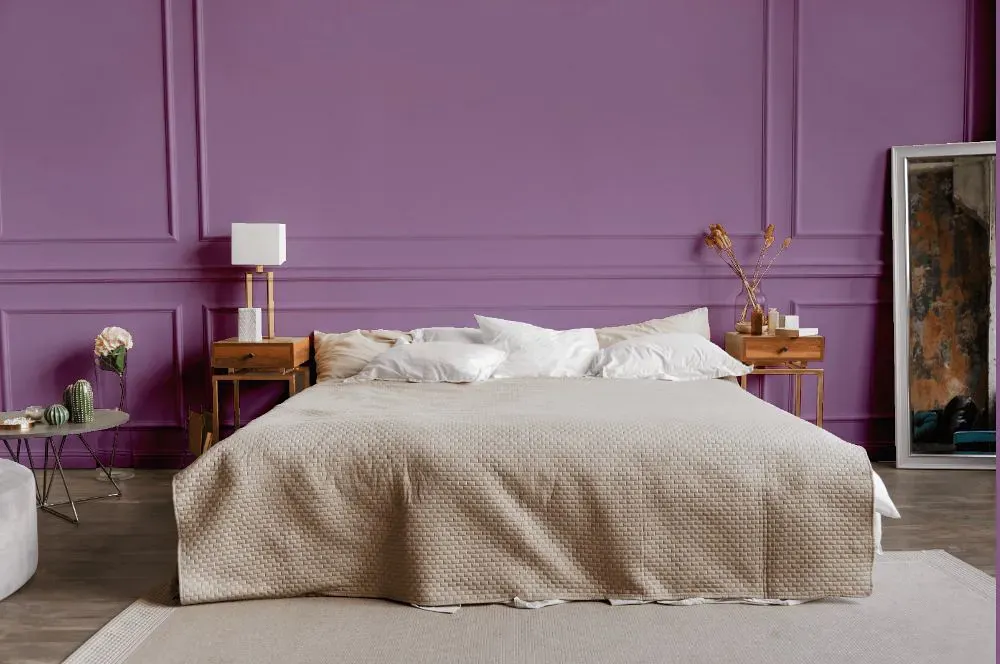
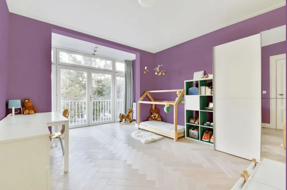
- Baroness for bedroom (1 photo)
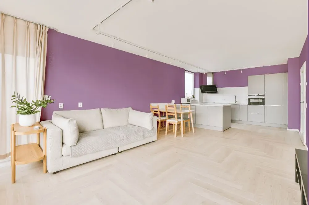
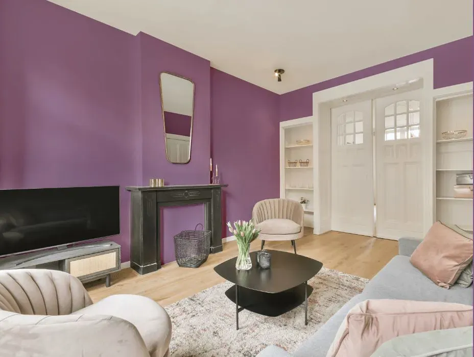
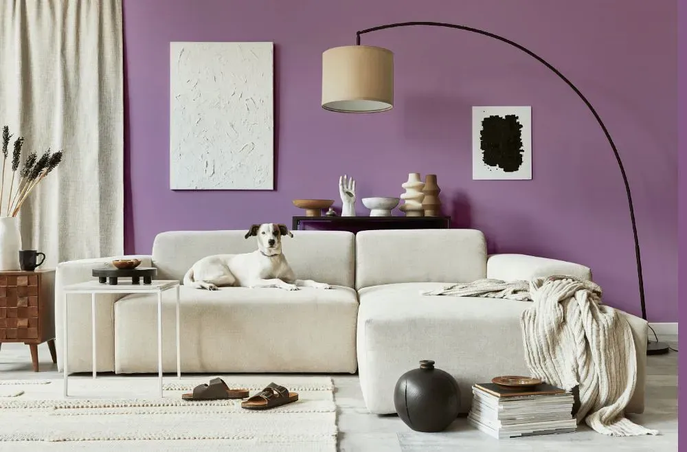
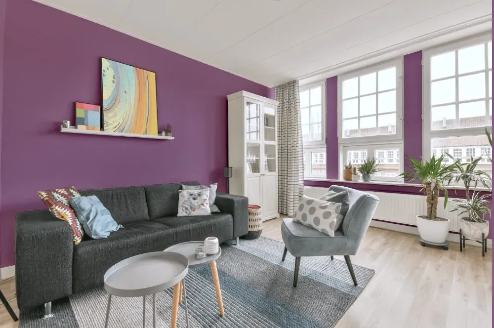
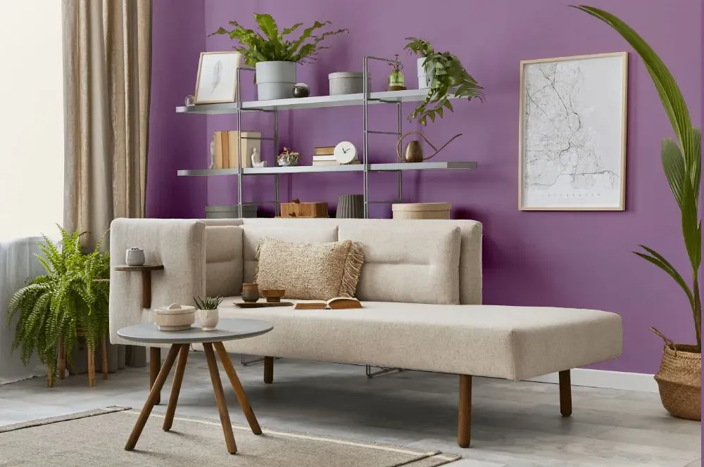
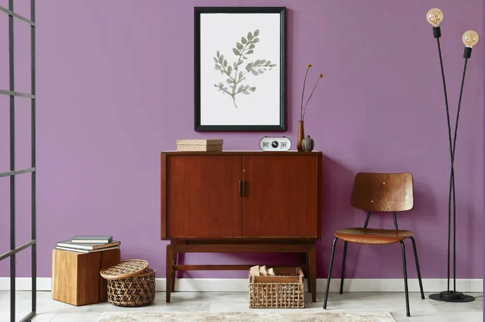
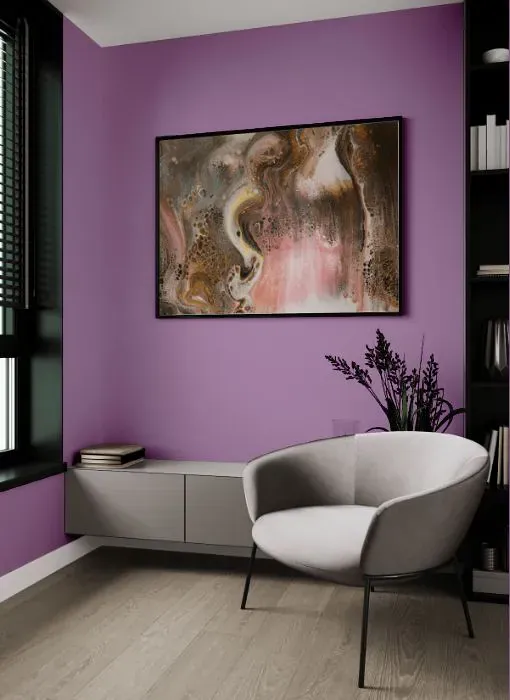
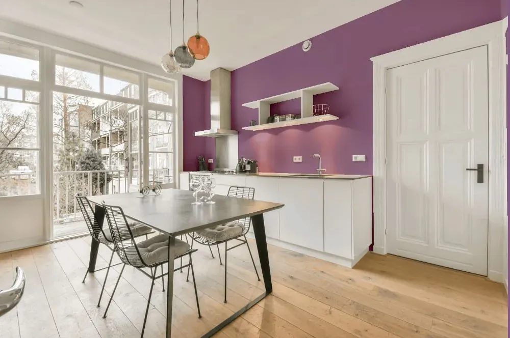
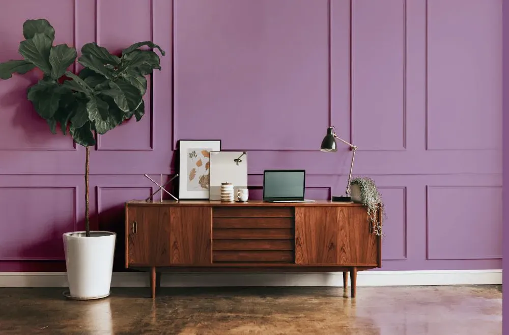
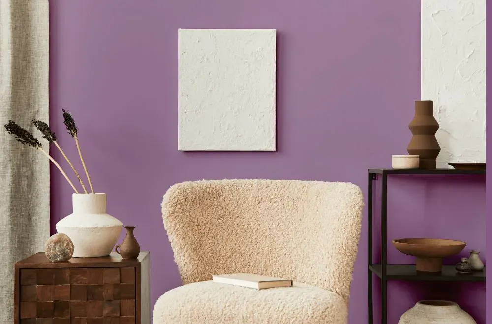
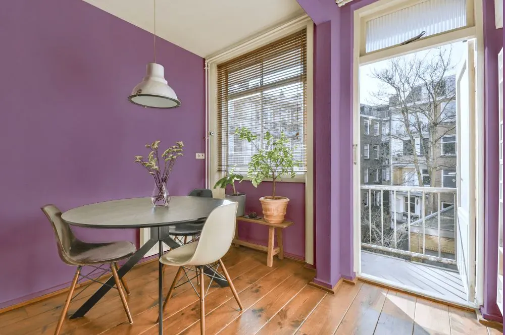
- Baroness for living room (7 photos)
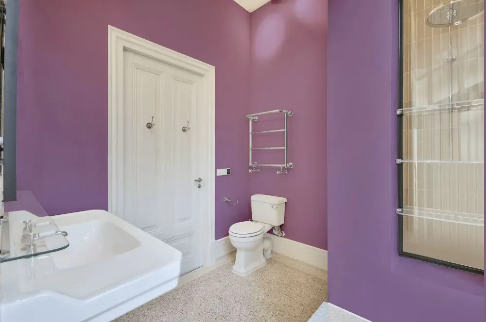
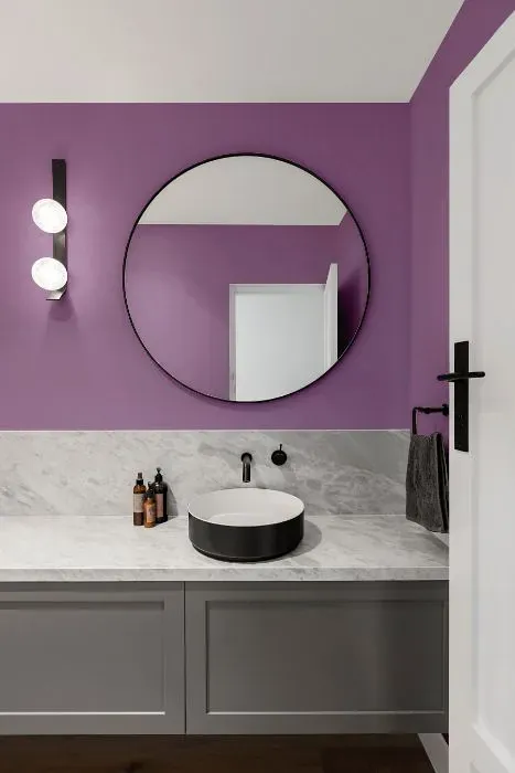
- Sherwin Williams Baroness for bathroom (2 photos)
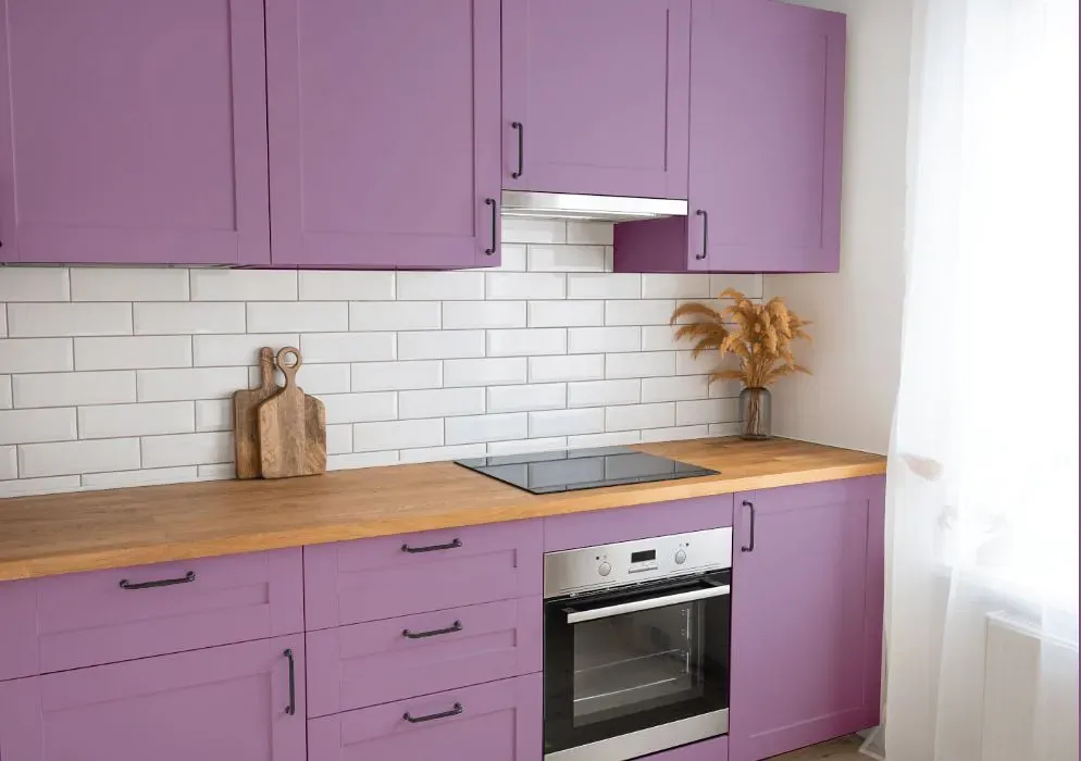
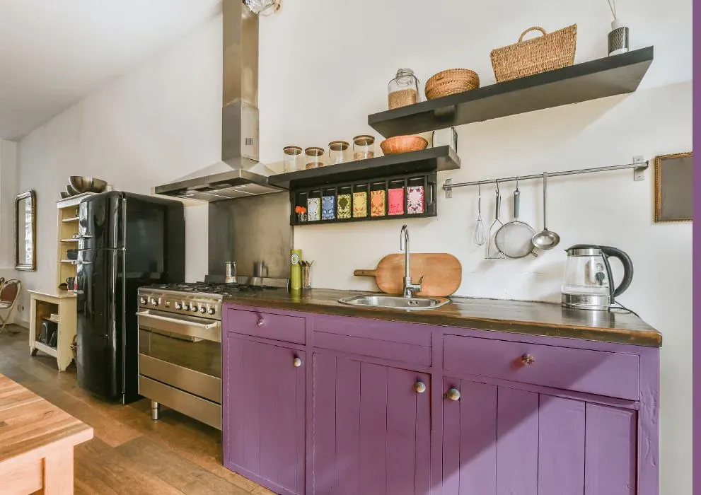
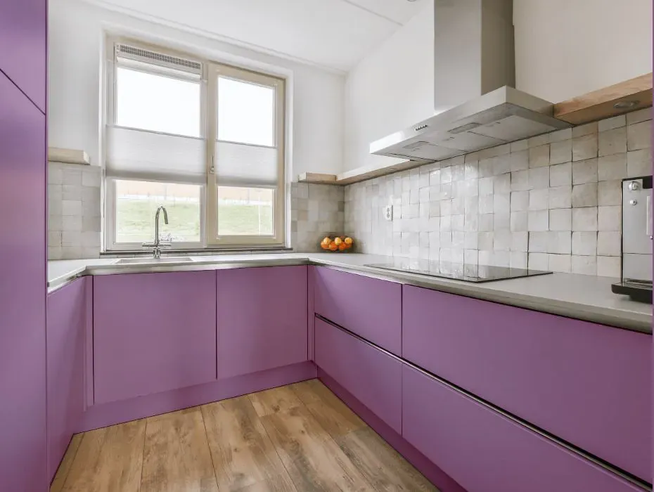
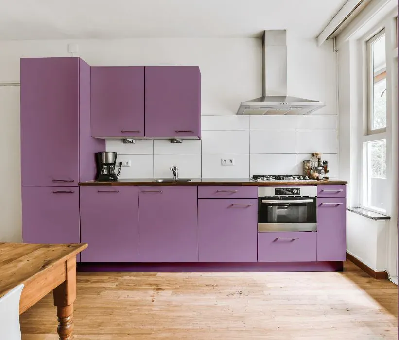
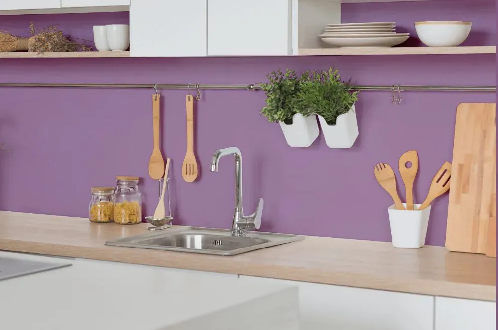
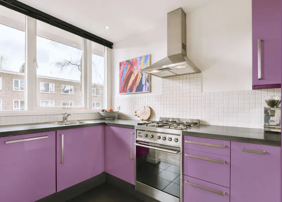
- Sherwin Williams SW 6837 on kitchen cabinets (4 photos)
- Sherwin Williams Baroness reviews (9 photos)
- What are Sherwin Williams Baroness undertones?
- Is Baroness SW 6837 cool or warm?
- How light temperature affects on Baroness
- Monochromatic color scheme
- Complementary color scheme
- Color comparison and matching
- LRV of Baroness SW 6837
- Color codes
- Color equivalents
| Official page: | Baroness SW 6837 |
| Code: | SW 6837 |
| Name: | Baroness |
| Brand: | Sherwin Williams |
| Collections: | 2015 Buoyant |
What color is Sherwin Williams Baroness?
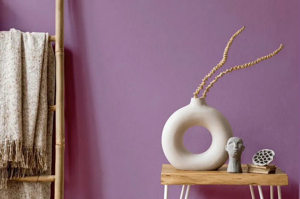
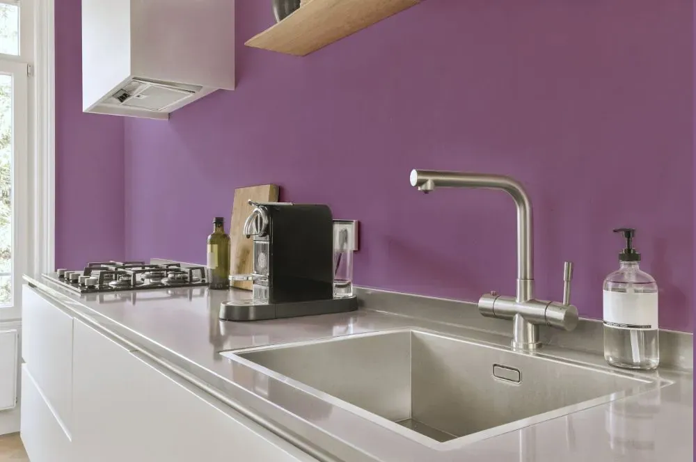
Elevate your space with the regal charm of Sherwin Williams Baroness (SW 6837). This rich and sophisticated shade of plum adds a luxurious touch to any room, creating a sense of opulence and warmth. Baroness is perfect for bedrooms, creating a cozy and intimate atmosphere for restful nights. For a bold and dramatic statement, consider using Baroness in a home office or library, exuding elegance and creativity. Embrace the allure of Sherwin Williams SW 6837 Baroness for a space that radiates glamour and style.
Loading...
LRV of Baroness
Baroness has an LRV of 27.74% and refers to Medium colors that reflect a lot of light. Why LRV is important?

Light Reflectance Value measures the amount of visible and usable light that reflects from a painted surface.
Simply put, the higher the LRV of a paint color, the brighter the room you will get.
The scale goes from 0% (absolute black, absorbing all light) to 100% (pure white, reflecting all light).
Act like a pro: When choosing paint with an LRV of 27.74%, pay attention to your bulbs' brightness. Light brightness is measured in lumens. The lower the paint's LRV, the higher lumen level you need. Every square foot of room needs at least 40 lumens. That means for a 200 ft2 living room you'll need about 8000 lumens of light – e.g., eight 1000 lm bulbs.
Color codes
We have collected almost every possible color code you could ever need.
Not sure what the difference between HEX and RGB is? We break down color models in plain language. Understanding color models
| Format | Code |
|---|---|
| HEX | #a785a7 |
| RGB Decimal | 167, 133, 167 |
| RGB Percent | 65.49%, 52.16%, 65.49% |
| HSV | Hue: 300° Saturation: 20.36% Value: 65.49% |
| HSL | hsl(300, 16, 59) |
| CMYK | Cyan: 0.0 Magenta: 20.36 Yellow: 0.0 Key: 34.51 |
| YIQ | Y: 147.042 I: 9.335 Q: 17.773 |
| XYZ | X: 31.298 Y: 27.781 Z: 40.262 |
| CIE Lab | L:59.691 a:19.019 b:-13.051 |
| CIE Luv | L:59.691 u:17.269 v:-22.319 |
| Decimal | 10978727 |
| Hunter Lab | 52.708, 13.753, -8.395 |