Tikkurila Beetroot M425
Contentsshow +hide -
| Code: | M425 |
| Name: | Beetroot |
| Brand: | Tikkurila |
What color is Tikkurila Beetroot?
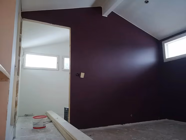
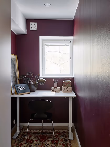
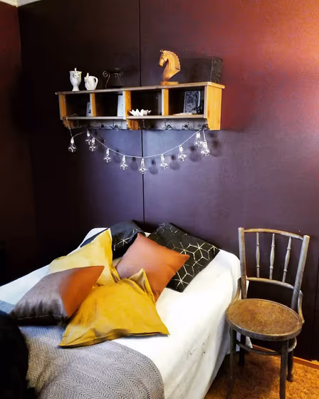
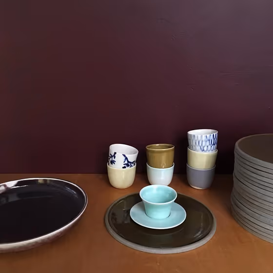
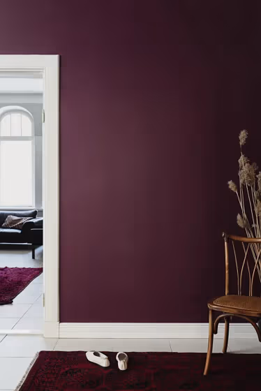
Introducing Tikkurila M425 Beetroot, a rich and luscious color that adds depth to any space. This warm hue pairs elegantly with M371 Wheat, creating a harmonious and inviting atmosphere. For a modern touch, consider combining Beetroot with M524 Moonlight to achieve a chic and sophisticated look. The versatility of Beetroot allows it to be paired with neutral tones like M499 Linen for a balanced and timeless aesthetic in your interiors. Whether used as a statement accent or as a main color, Beetroot brings a sense of warmth and style to your living spaces.
Loading...
LRV of Beetroot
Beetroot has an LRV of 8% and refers to Dark colors which means that this color almost does not reflect light. Why LRV is important?

Light Reflectance Value measures the amount of visible and usable light that reflects from a painted surface.
Simply put, the higher the LRV of a paint color, the brighter the room you will get.
The scale goes from 0% (absolute black, absorbing all light) to 100% (pure white, reflecting all light).
Act like a pro: When choosing paint with an LRV of 8%, pay attention to your bulbs' brightness. Light brightness is measured in lumens. The lower the paint's LRV, the higher lumen level you need. Every square foot of room needs at least 40 lumens. That means for a 200 ft2 living room you'll need about 8000 lumens of light – e.g., eight 1000 lm bulbs.
Color codes
We have collected almost every possible color code you could ever need.
Not sure what the difference between HEX and RGB is? We break down color models in plain language. Understanding color models
| Format | Code |
|---|---|
| HEX | #5F464E |
| RGB Decimal | 95, 70, 78 |
| RGB Percent | 37.25%, 27.45%, 30.59% |
| HSV | Hue: 341° Saturation: 26.32% Value: 37.25% |
| HSL | hsl(341, 15, 32) |
| CMYK | Cyan: 0.0 Magenta: 26.32 Yellow: 17.89 Key: 62.75 |
| YIQ | Y: 78.387 I: 12.327 Q: 7.778 |
| XYZ | X: 8.285 Y: 7.364 Z: 8.191 |
| CIE Lab | L:32.621 a:12.118 b:-0.598 |
| CIE Luv | L:32.621 u:14.161 v:-2.5 |
| Decimal | 6243918 |
| Hunter Lab | 27.136, 7.008, 1.099 |