Tikkurila Fjord M442
Contentsshow +hide -
| Code: | M442 |
| Name: | Fjord |
| Brand: | Tikkurila |
What color is Tikkurila Fjord?
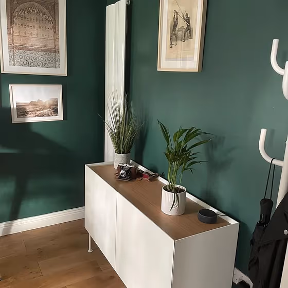
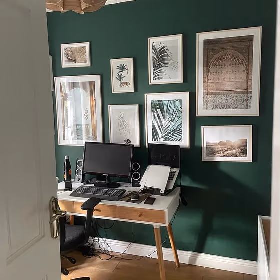
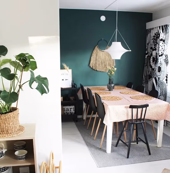
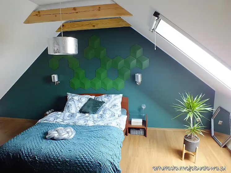
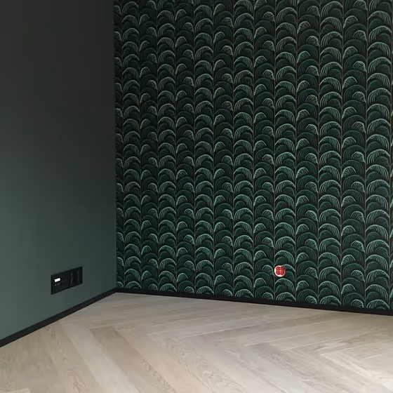
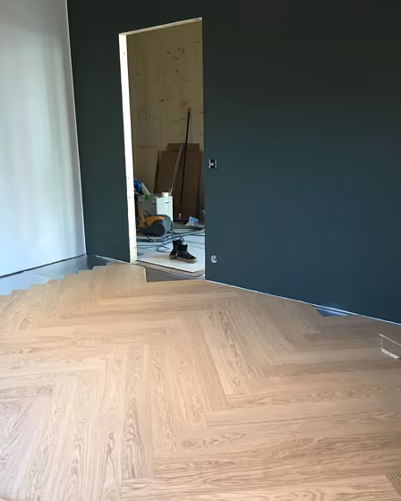
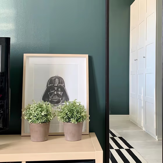
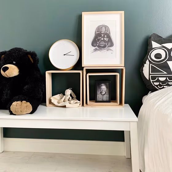
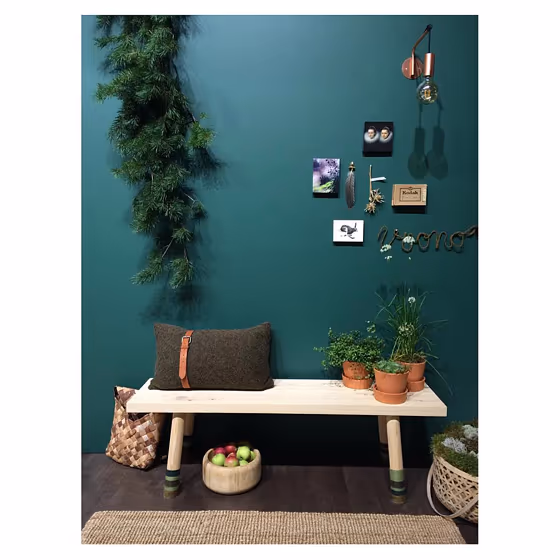
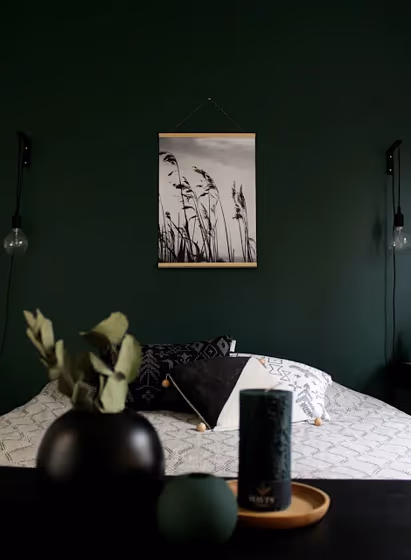
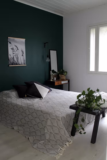
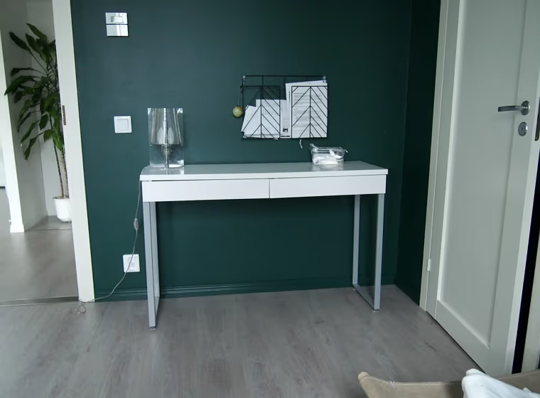
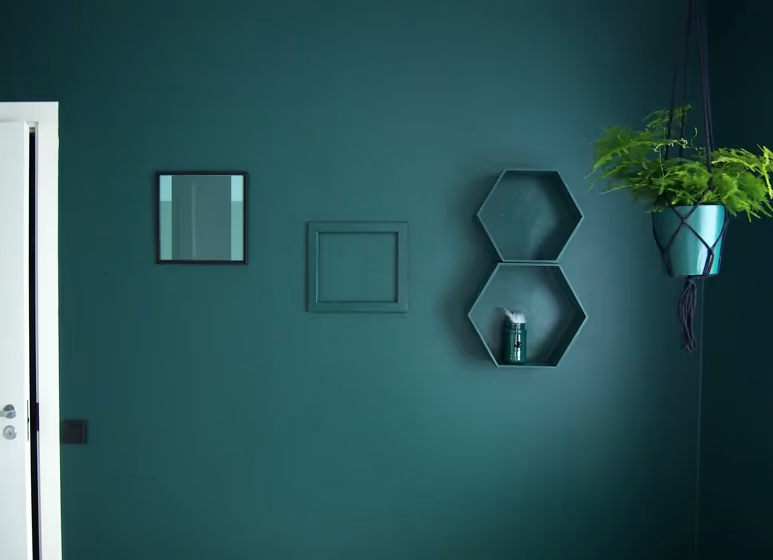
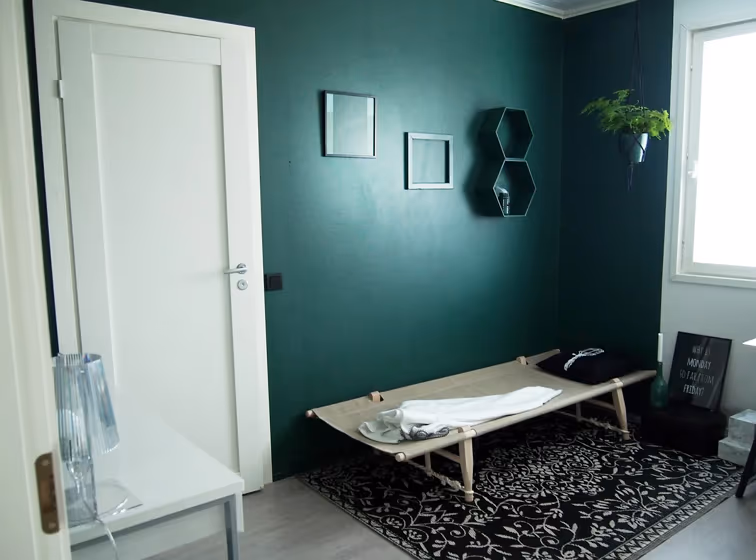
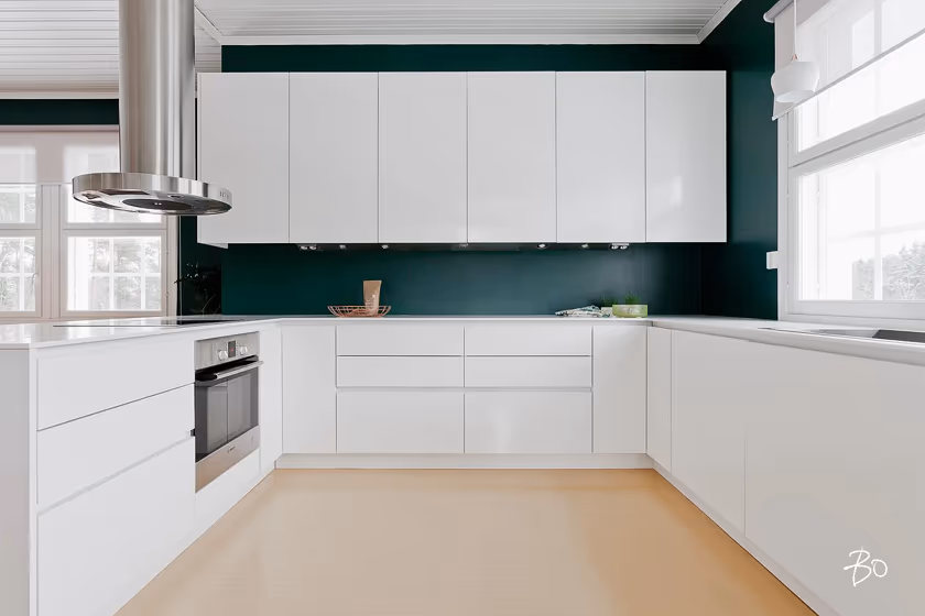
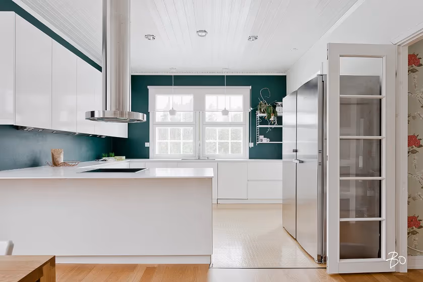
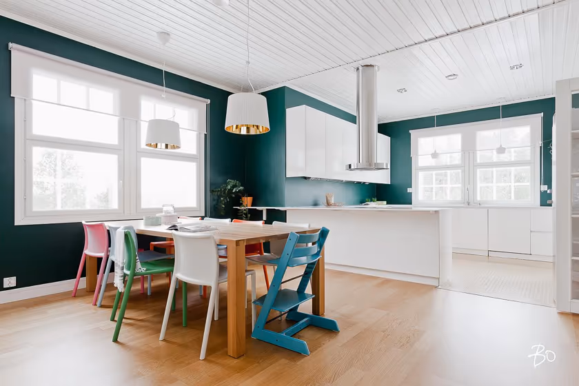
Immerse yourself in the serene beauty of Tikkurila M442 Fjord - a graceful blend of blue and gray that effortlessly evokes a sense of calm and tranquility. This sophisticated hue would be a perfect choice for creating a peaceful oasis in your living room, where you can unwind and relax after a long day. In the bedroom, M442 Fjord lends a soothing ambiance, promoting restful sleep and peaceful dreams. Whether used in a home office or a cozy reading nook, this color creates a sophisticated and timeless backdrop for productivity and introspection alike. Let the timeless elegance of M442 Fjord infuse your space with a sense of peace and harmony, making every moment a soothing retreat.
Loading...
LRV of Fjord
Fjord has an LRV of 9.79% and refers to Dark colors which means that this color almost does not reflect light. Why LRV is important?

Light Reflectance Value measures the amount of visible and usable light that reflects from a painted surface.
Simply put, the higher the LRV of a paint color, the brighter the room you will get.
The scale goes from 0% (absolute black, absorbing all light) to 100% (pure white, reflecting all light).
Act like a pro: When choosing paint with an LRV of 9.79%, pay attention to your bulbs' brightness. Light brightness is measured in lumens. The lower the paint's LRV, the higher lumen level you need. Every square foot of room needs at least 40 lumens. That means for a 200 ft2 living room you'll need about 8000 lumens of light – e.g., eight 1000 lm bulbs.
Color codes
We have collected almost every possible color code you could ever need.
Not sure what the difference between HEX and RGB is? We break down color models in plain language. Understanding color models
| Format | Code |
|---|---|
| HEX | #485F57 |
| RGB Decimal | 72, 95, 87 |
| RGB Percent | 28.24%, 37.25%, 34.12% |
| HSV | Hue: 159° Saturation: 24.21% Value: 37.25% |
| HSL | hsl(159, 14, 33) |
| CMYK | Cyan: 24.21 Magenta: 0.0 Yellow: 8.42 Key: 62.75 |
| YIQ | Y: 87.211 I: -11.135 Q: -7.355 |
| XYZ | X: 8.484 Y: 10.25 Z: 10.546 |
| CIE Lab | L:38.287 a:-10.539 b:1.751 |
| CIE Luv | L:38.287 u:-11.342 v:3.73 |
| Decimal | 4742999 |
| Hunter Lab | 32.016, -8.723, 2.881 |