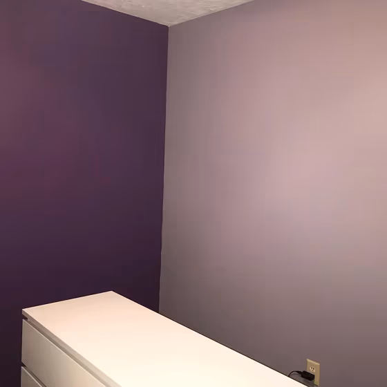
Behr Ashberry N550-4
Contentsshow +hide -
| Code: | N550-4 |
| Name: | Ashberry |
| Brand: | Behr |
What color is Behr Ashberry?
Elevate your living space with the sophisticated allure of Behr Ashberry (N550-4). This rich and warm tone exudes elegance and charm, making it the perfect choice for a cozy bedroom or a stylish home office. Ashberry's (N550-4) versatile nature pairs beautifully with both modern and traditional decor styles, adding depth and character to any room it graces. Enhance your kitchen or dining area with a pop of Ashberry (N550-4) on an accent wall for a touch of refinement and warmth. Embrace the timeless beauty of Ashberry (N550-4) in your home and create a space that exudes both comfort and style.
Loading...
LRV of Ashberry
Ashberry has an LRV of 35.75% and refers to Medium colors that reflect a lot of light. Why LRV is important?

Light Reflectance Value measures the amount of visible and usable light that reflects from a painted surface.
Simply put, the higher the LRV of a paint color, the brighter the room you will get.
The scale goes from 0% (absolute black, absorbing all light) to 100% (pure white, reflecting all light).
Act like a pro: When choosing paint with an LRV of 35.75%, pay attention to your bulbs' brightness. Light brightness is measured in lumens. The lower the paint's LRV, the higher lumen level you need. Every square foot of room needs at least 40 lumens. That means for a 200 ft2 living room you'll need about 8000 lumens of light – e.g., eight 1000 lm bulbs.
Color codes
We have collected almost every possible color code you could ever need.
Not sure what the difference between HEX and RGB is? We break down color models in plain language. Understanding color models
| Format | Code |
|---|---|
| HEX | #a29fa8 |
| RGB Decimal | 162, 159, 168 |
| RGB Percent | 63.53%, 62.35%, 65.88% |
| HSV | Hue: 260° Saturation: 5.36% Value: 65.88% |
| HSL | hsl(260, 5, 64) |
| CMYK | Cyan: 3.57 Magenta: 5.36 Yellow: 0.0 Key: 34.12 |
| YIQ | Y: 160.923 I: -1.104 Q: 3.435 |
| XYZ | X: 34.365 Y: 35.305 Z: 42.039 |
| CIE Lab | L:65.985 a:2.815 b:-4.28 |
| CIE Luv | L:65.985 u:1.166 v:-6.755 |
| Decimal | 10657704 |
| Hunter Lab | 59.418, -0.745, -0.356 |