Behr At Ease S400-1
Contentsshow +hide -
| Code: | S400-1 |
| Name: | At Ease |
| Brand: | Behr |
What color is Behr At Ease?
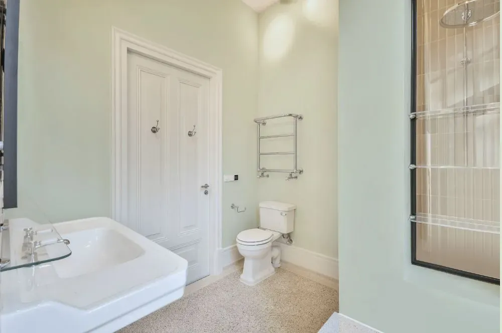
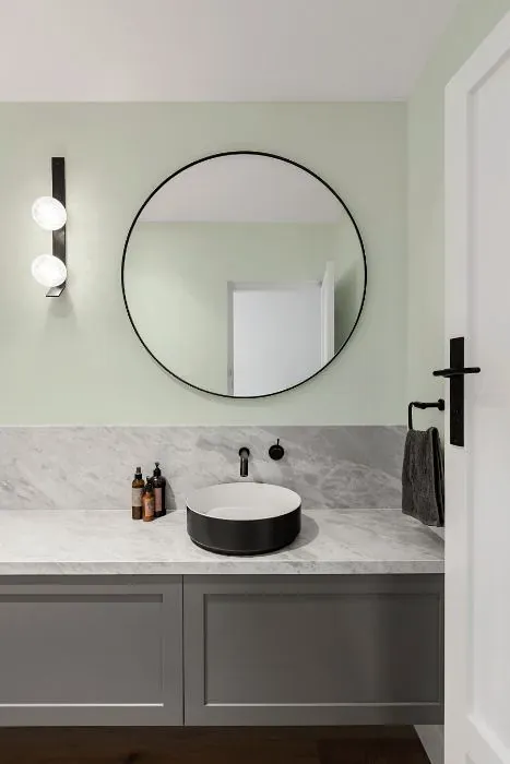
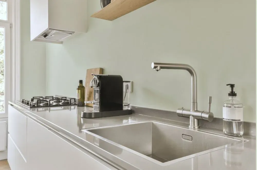
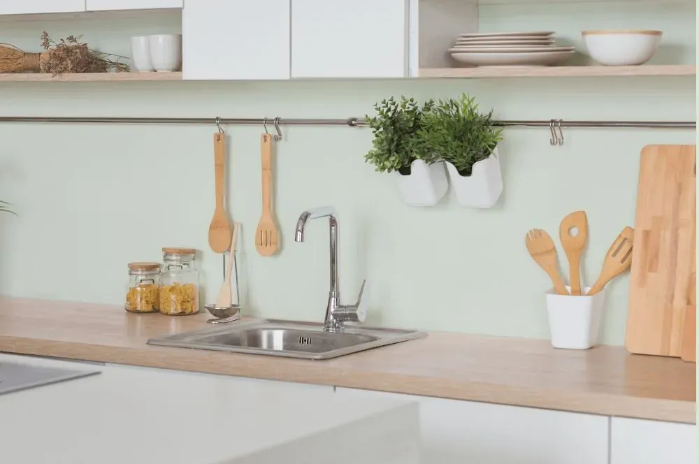
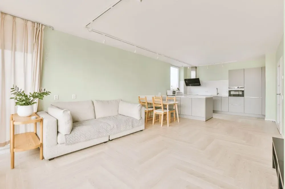
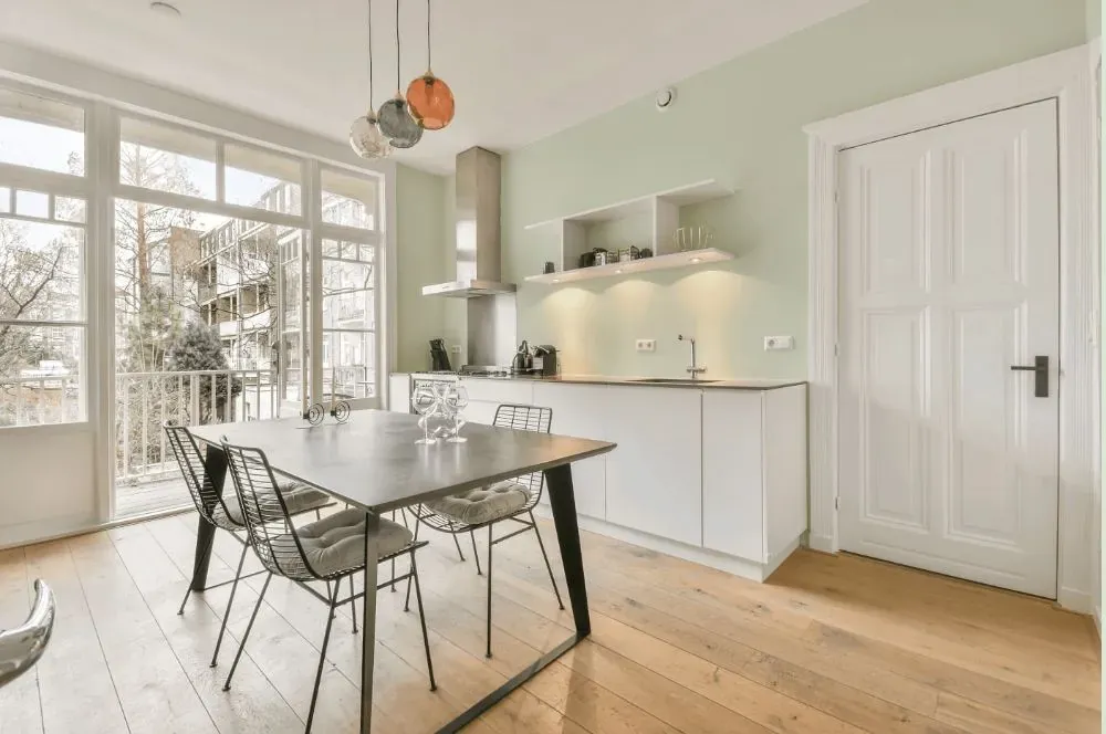
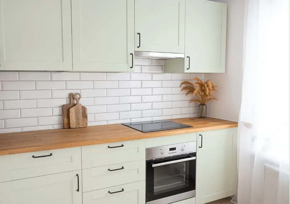
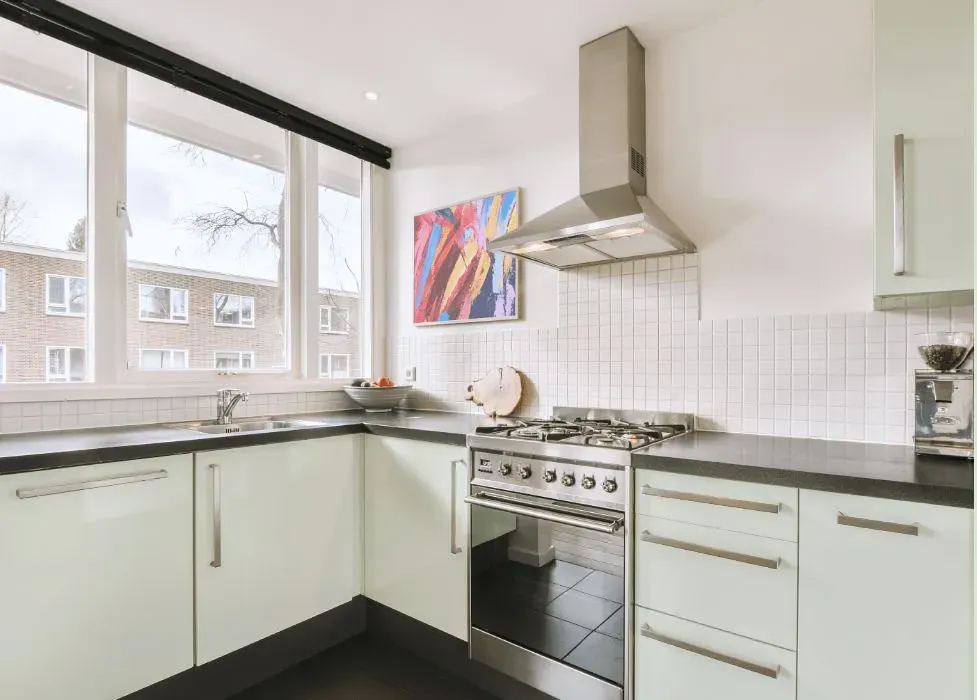
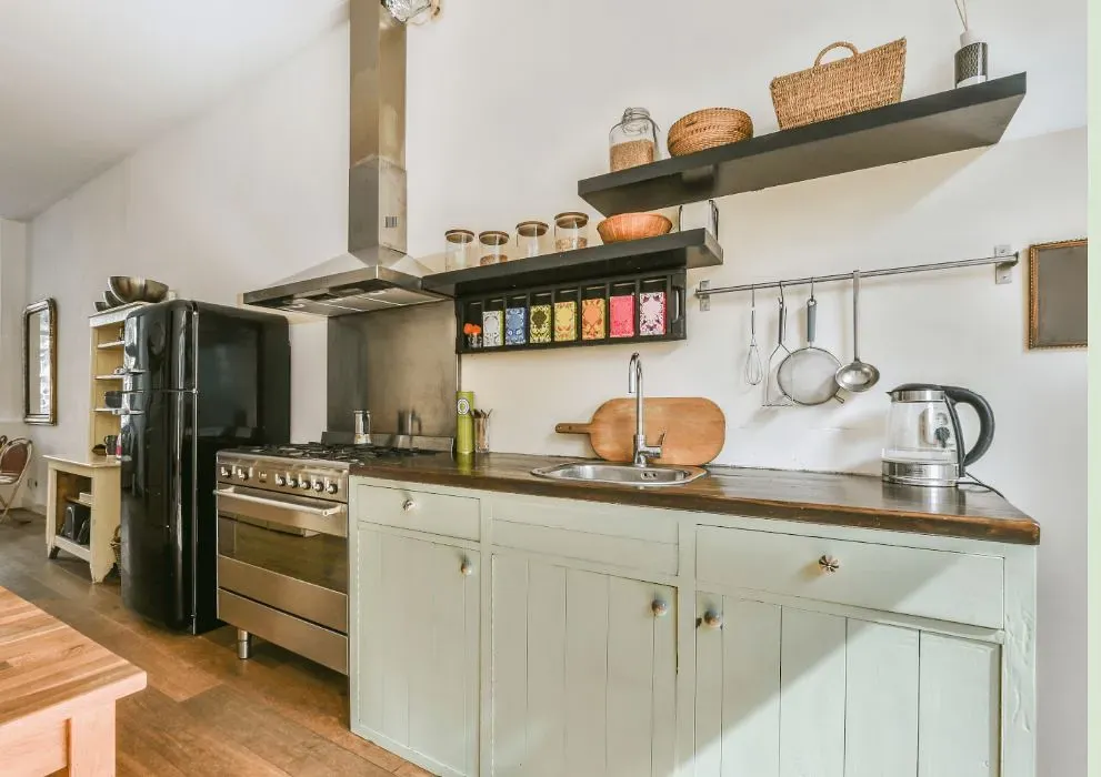
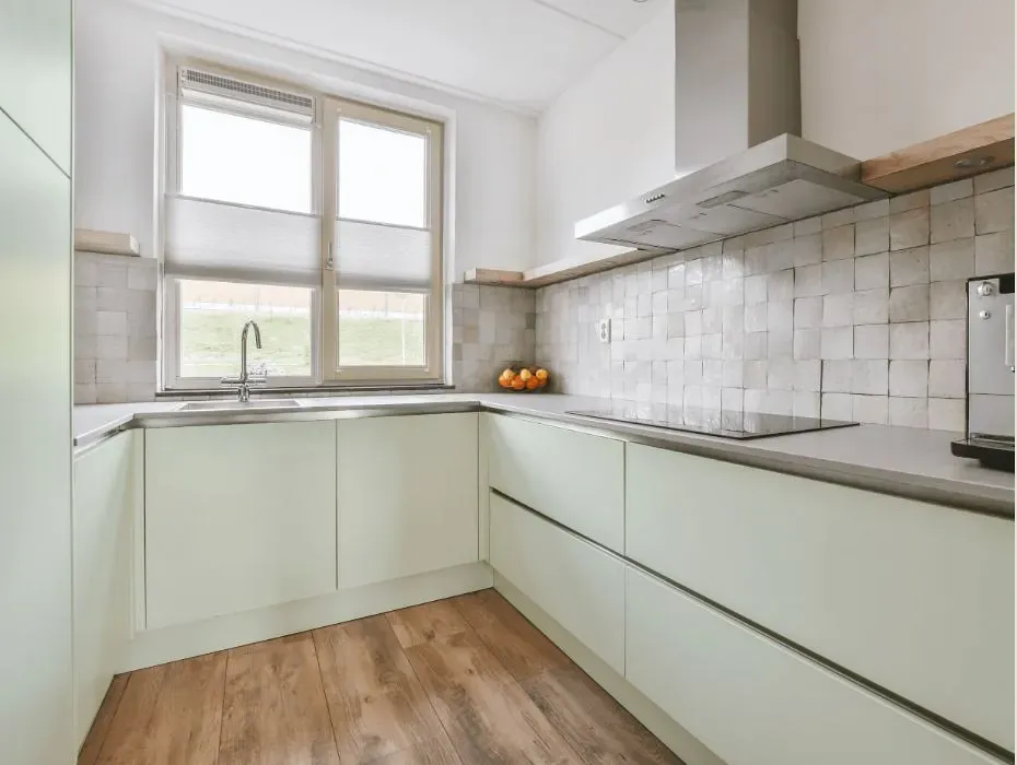
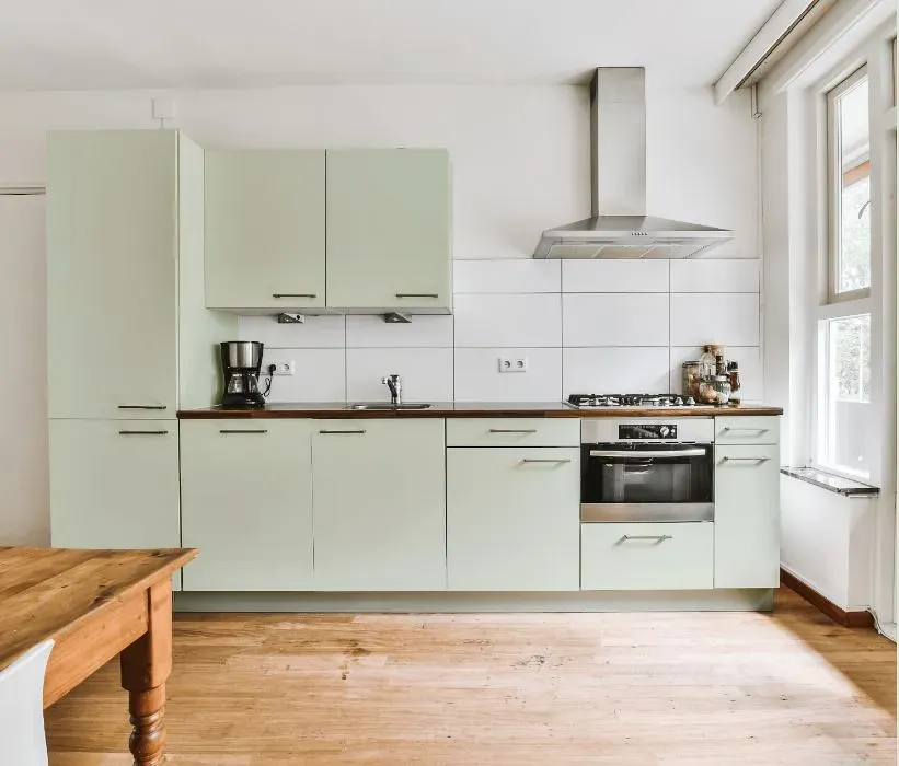
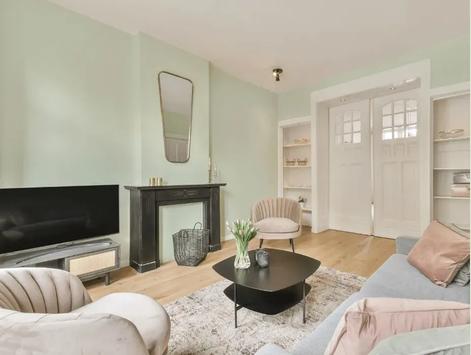
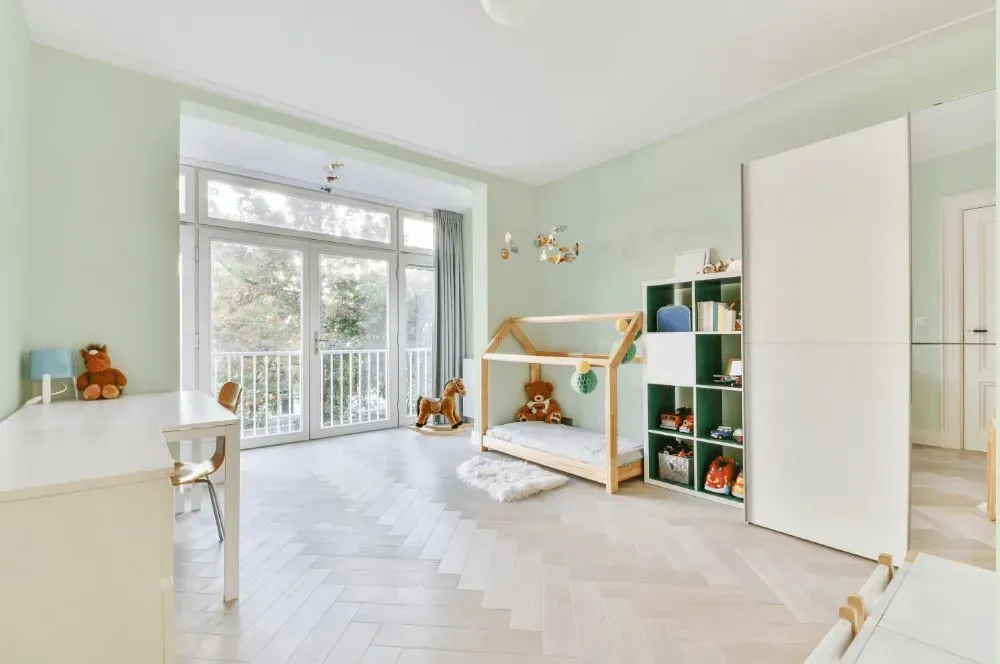
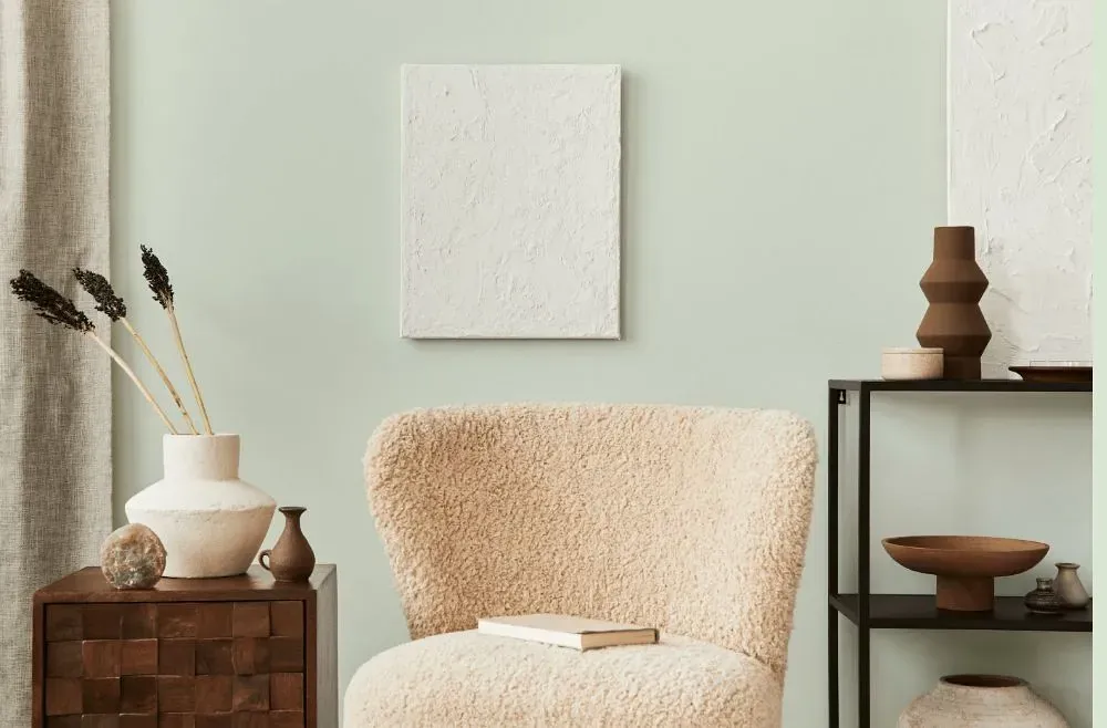
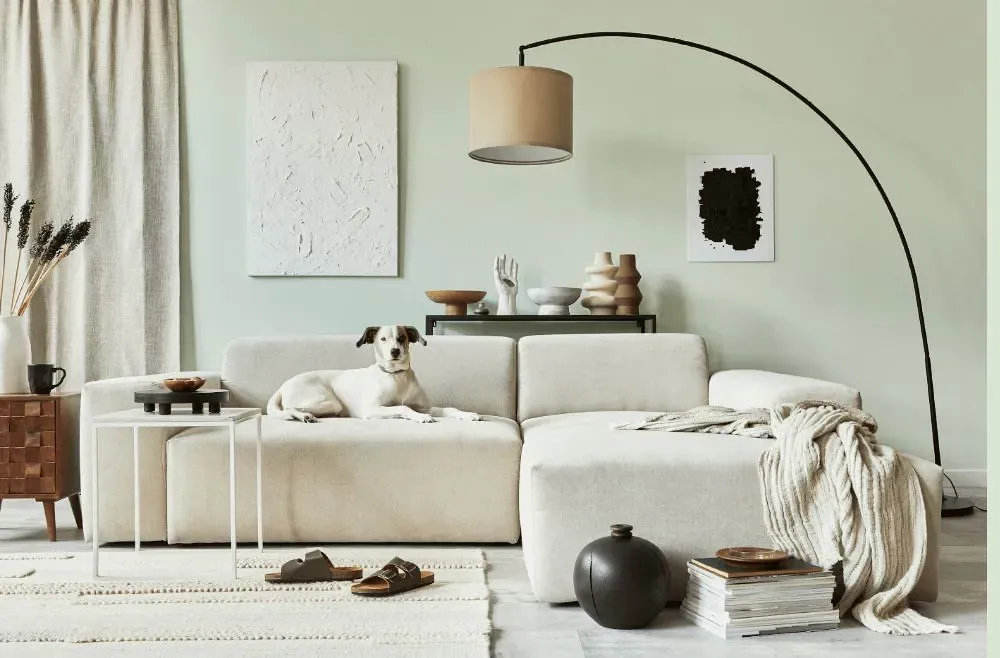
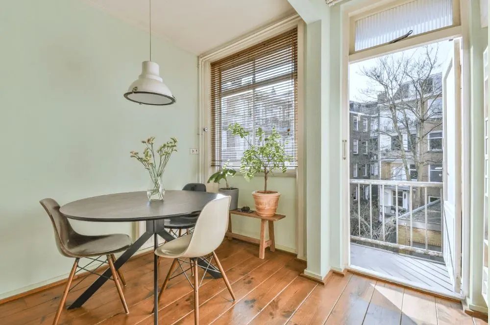
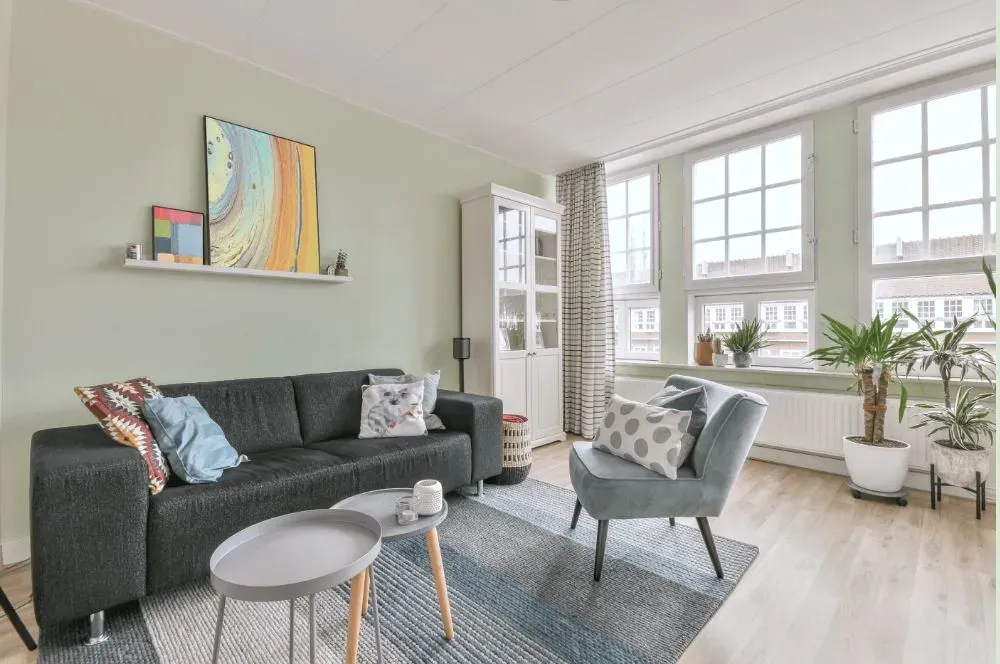
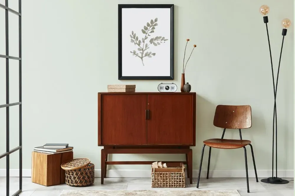
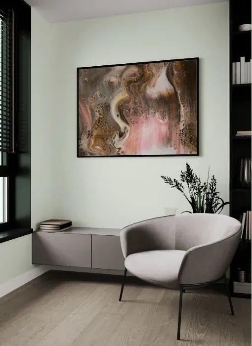
Welcome to a space enveloped in the calming embrace of Behr At Ease. This soft and sophisticated gray hue with a slight blue undertone creates a tranquil ambiance ideal for bedrooms, home offices, and cozy reading nooks. At Ease's versatility allows it to seamlessly blend into both modern and traditional interior designs, adding a touch of serenity and elegance to any room it graces. Pair it with warm wood tones and plush textiles for a harmonious retreat that soothes the senses and uplifts the spirit. Let Behr S400-1 At Ease be the soothing backdrop that elevates your home into a sanctuary of relaxation and style.
Loading...
LRV of At Ease
At Ease has an LRV of 82.58% and refers to White colors that reflect almost all light. Why LRV is important?

Light Reflectance Value measures the amount of visible and usable light that reflects from a painted surface.
Simply put, the higher the LRV of a paint color, the brighter the room you will get.
The scale goes from 0% (absolute black, absorbing all light) to 100% (pure white, reflecting all light).
Act like a pro: When choosing paint with an LRV of 82.58%, pay attention to your bulbs' brightness. Light brightness is measured in lumens. The lower the paint's LRV, the higher lumen level you need. Every square foot of room needs at least 40 lumens. That means for a 200 ft2 living room you'll need about 8000 lumens of light – e.g., eight 1000 lm bulbs.
Color codes
We have collected almost every possible color code you could ever need.
Not sure what the difference between HEX and RGB is? We break down color models in plain language. Understanding color models
| Format | Code |
|---|---|
| HEX | #e7eee1 |
| RGB Decimal | 231, 238, 225 |
| RGB Percent | 90.59%, 93.33%, 88.24% |
| HSV | Hue: 92° Saturation: 5.46% Value: 93.33% |
| HSL | hsl(92, 28, 91) |
| CMYK | Cyan: 2.94 Magenta: 0.0 Yellow: 5.46 Key: 6.67 |
| YIQ | Y: 234.425 I: 0.006 Q: -5.526 |
| XYZ | X: 77.117 Y: 83.574 Z: 83.283 |
| CIE Lab | L:93.265 a:-4.626 b:5.482 |
| CIE Luv | L:93.265 u:-3.248 v:9.148 |
| Decimal | 15199969 |
| Hunter Lab | 91.419, -9.409, 9.98 |