Behr Blissful P560-1
Contentsshow +hide -
| Code: | P560-1 |
| Name: | Blissful |
| Brand: | Behr |
What color is Behr Blissful?
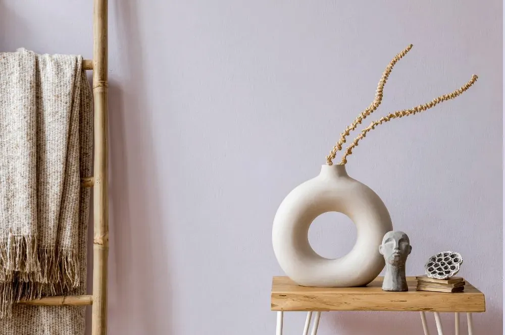
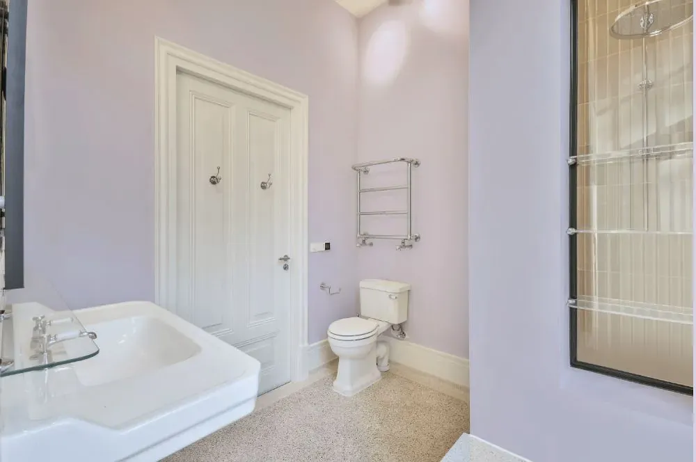
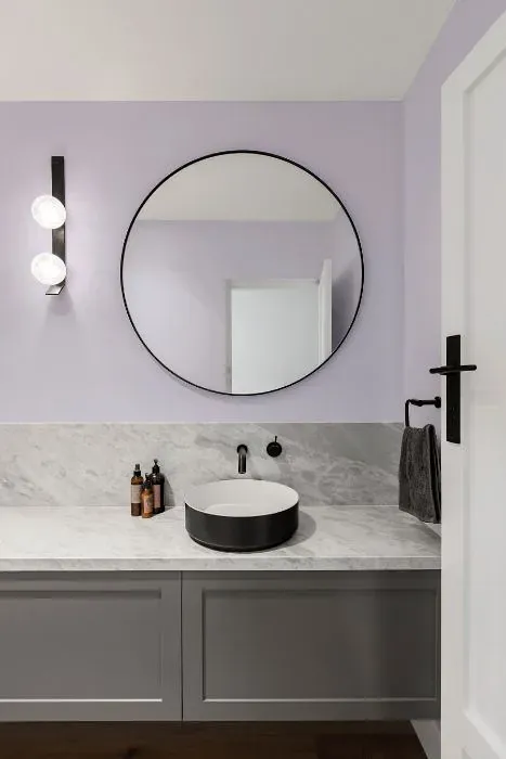
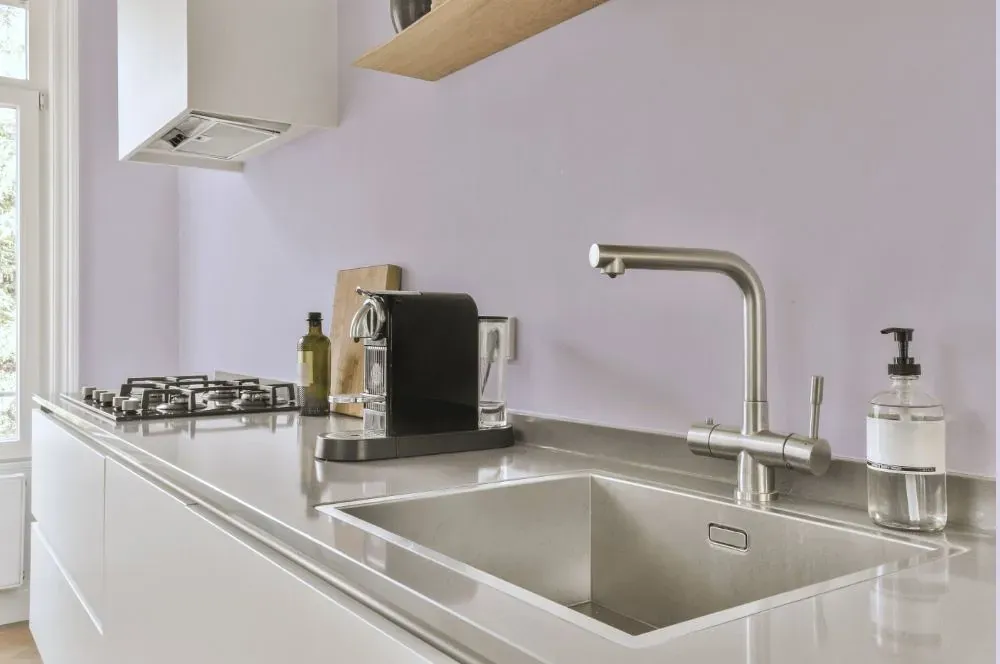
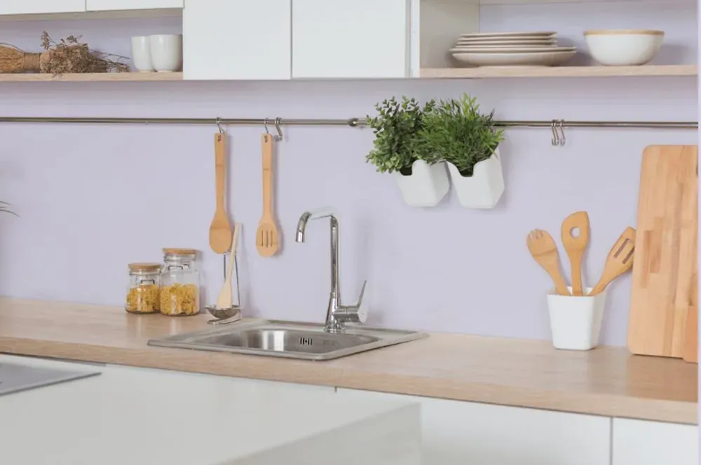
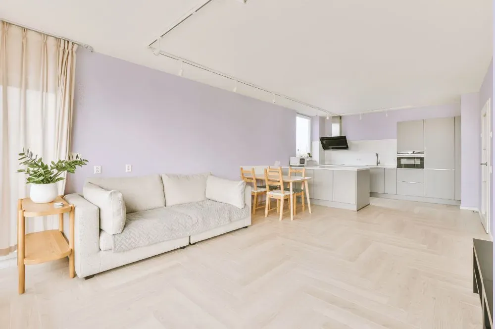
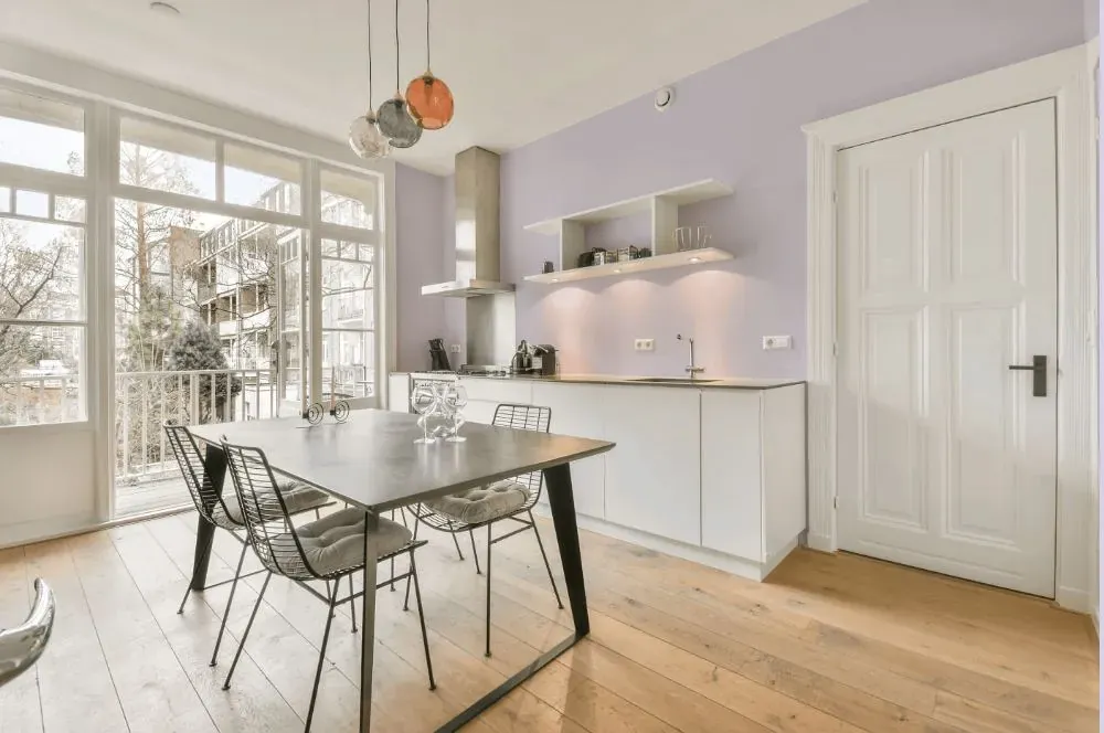
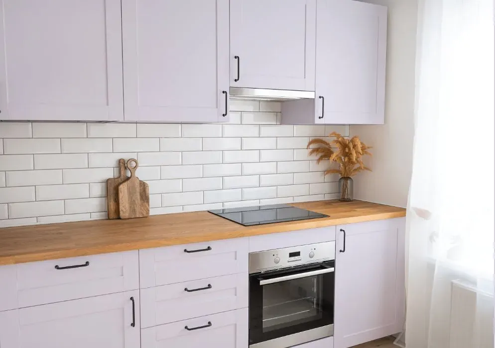
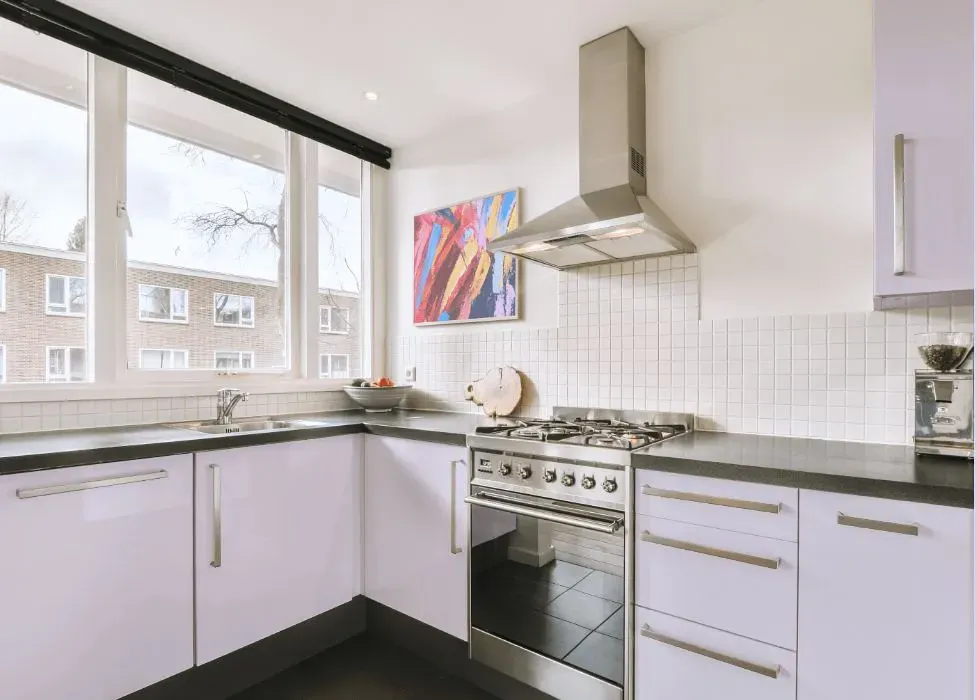
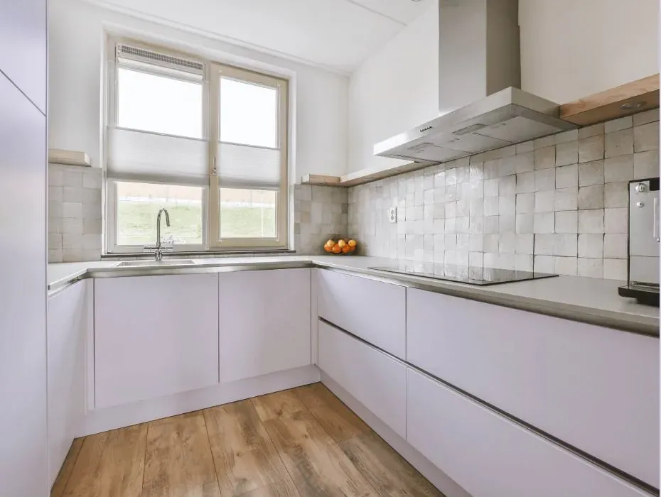
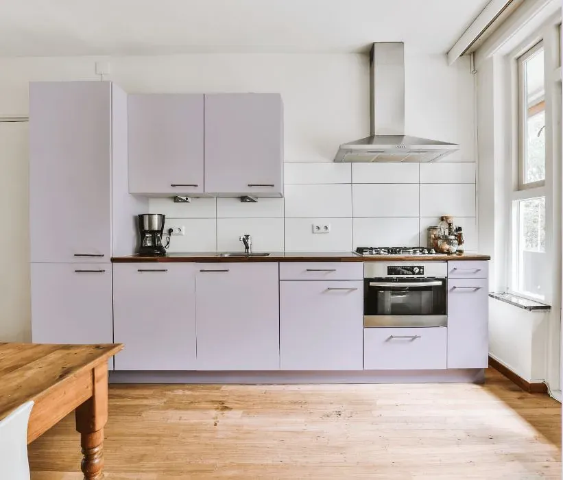
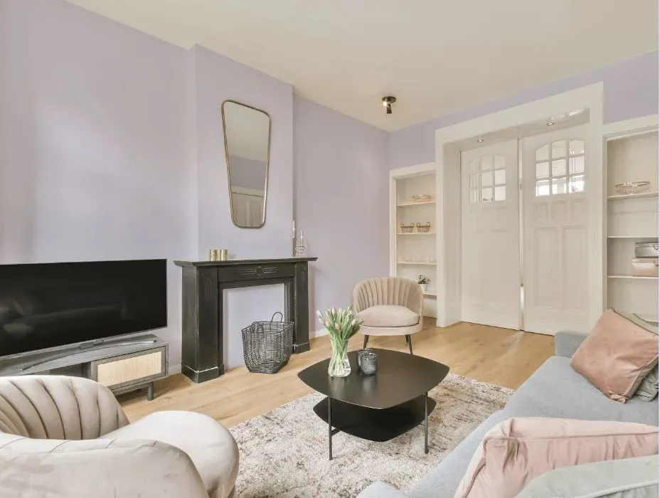
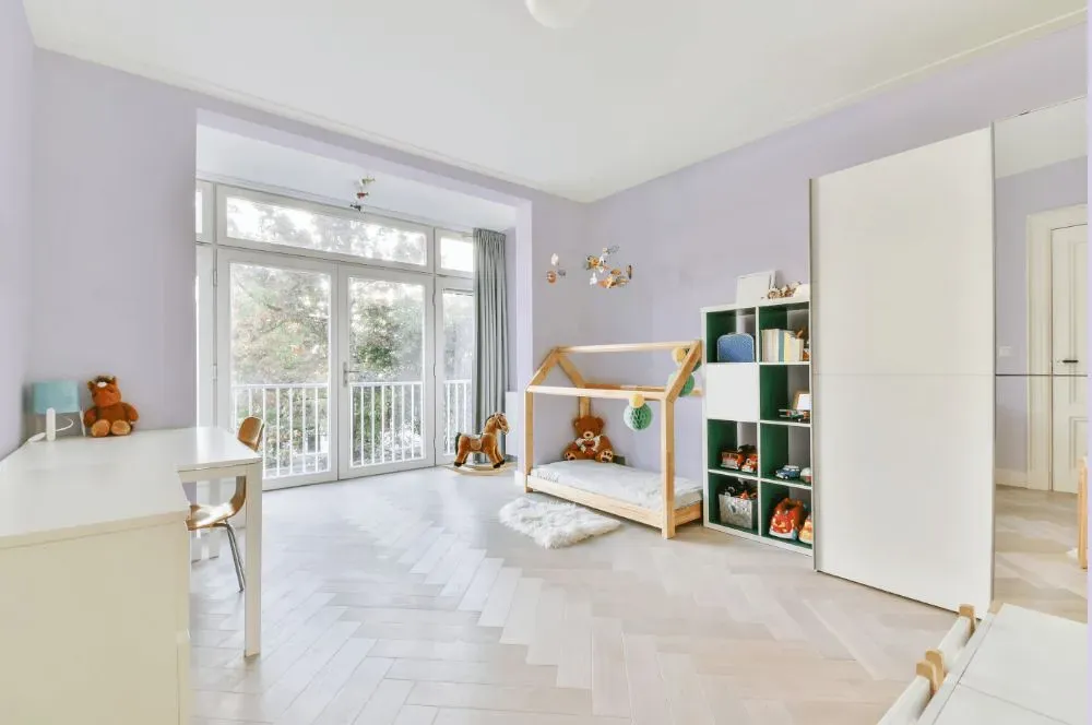
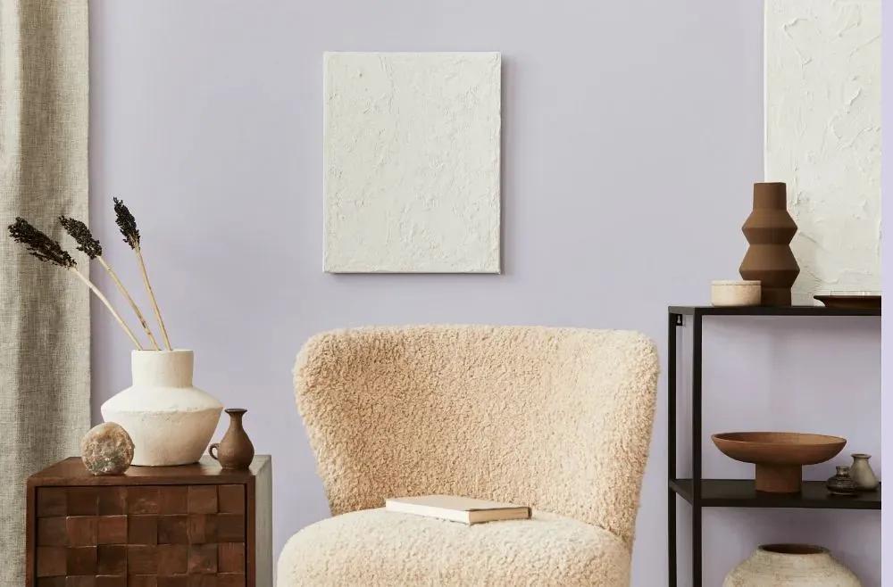
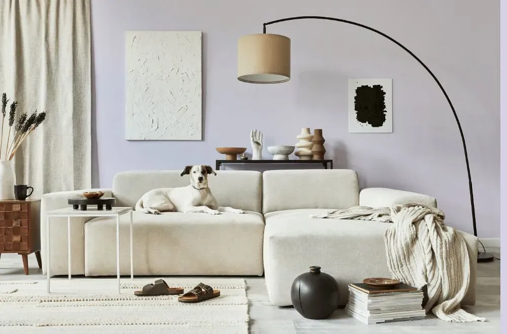
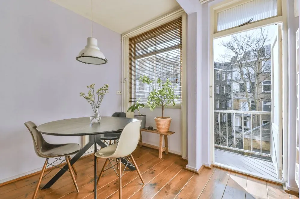
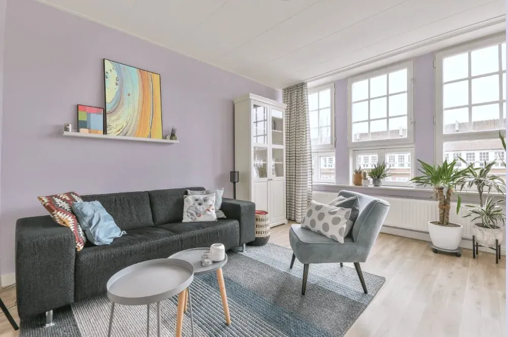
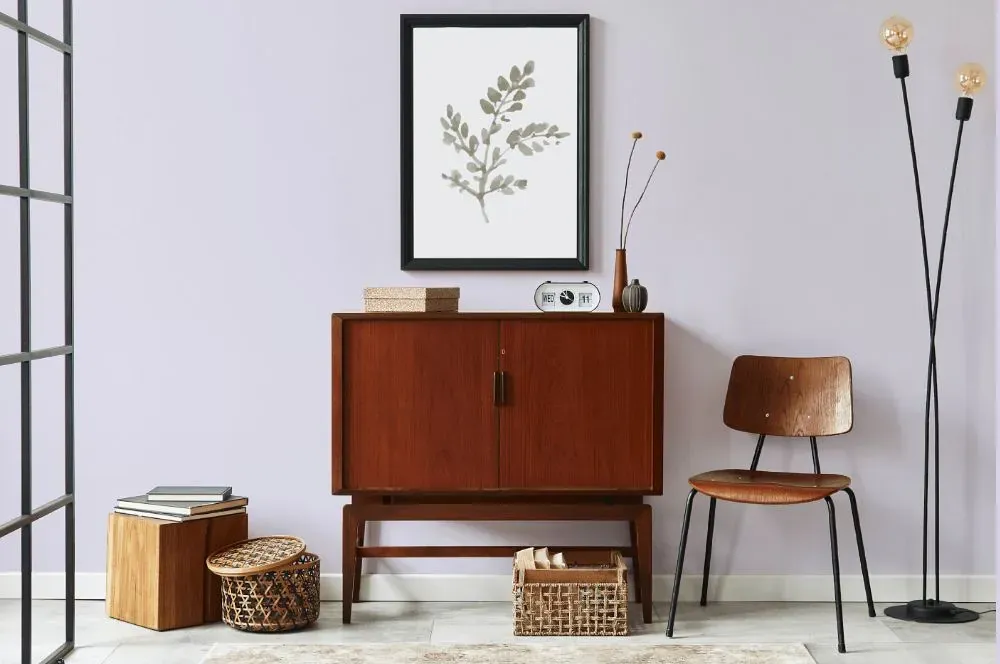
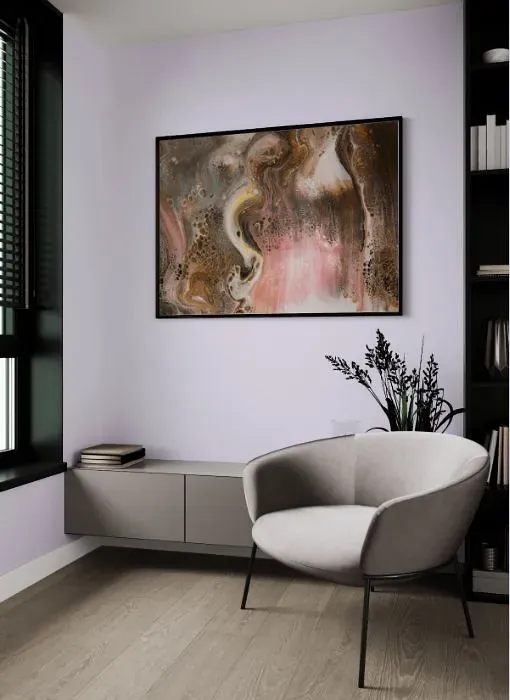
Experience a serene retreat with Behr P560-1 Blissful. This soft and soothing hue brings a sense of tranquility to any space, making it perfect for bedrooms, living rooms, or home offices. Pair Blissful with crisp whites for a clean and fresh look, or complement it with warm neutrals like PPU7-08 Ecru for a cozy atmosphere. For a touch of contrast, consider adding accents in PPU12-16 Beckoning Chestnut to create a sophisticated and welcoming vibe. Embrace the calming essence of Blissful in your home decor for a space that radiates peace and relaxation.
Loading...
LRV of Blissful
Blissful has an LRV of 76.56% and refers to Off‑White colors that reflect a lot of light. Why LRV is important?

Light Reflectance Value measures the amount of visible and usable light that reflects from a painted surface.
Simply put, the higher the LRV of a paint color, the brighter the room you will get.
The scale goes from 0% (absolute black, absorbing all light) to 100% (pure white, reflecting all light).
Act like a pro: When choosing paint with an LRV of 76.56%, pay attention to your bulbs' brightness. Light brightness is measured in lumens. The lower the paint's LRV, the higher lumen level you need. Every square foot of room needs at least 40 lumens. That means for a 200 ft2 living room you'll need about 8000 lumens of light – e.g., eight 1000 lm bulbs.
Color codes
We have collected almost every possible color code you could ever need.
Not sure what the difference between HEX and RGB is? We break down color models in plain language. Understanding color models
| Format | Code |
|---|---|
| HEX | #e4e0ee |
| RGB Decimal | 228, 224, 238 |
| RGB Percent | 89.41%, 87.84%, 93.33% |
| HSV | Hue: 257° Saturation: 5.88% Value: 93.33% |
| HSL | hsl(257, 29, 91) |
| CMYK | Cyan: 4.2 Magenta: 5.88 Yellow: 0.0 Key: 6.67 |
| YIQ | Y: 226.792 I: -2.115 Q: 5.203 |
| XYZ | X: 74.079 Y: 75.978 Z: 91.628 |
| CIE Lab | L:89.849 a:3.893 b:-6.324 |
| CIE Luv | L:89.849 u:1.416 v:-10.498 |
| Decimal | 14999790 |
| Hunter Lab | 87.165, -0.838, -1.31 |