Behr Clear Pond PPU13-15
Contentsshow +hide -
| Code: | PPU13-15 |
| Name: | Clear Pond |
| Brand: | Behr |
What color is Behr Clear Pond?
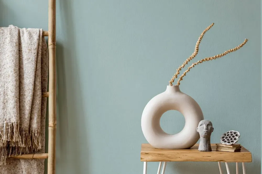
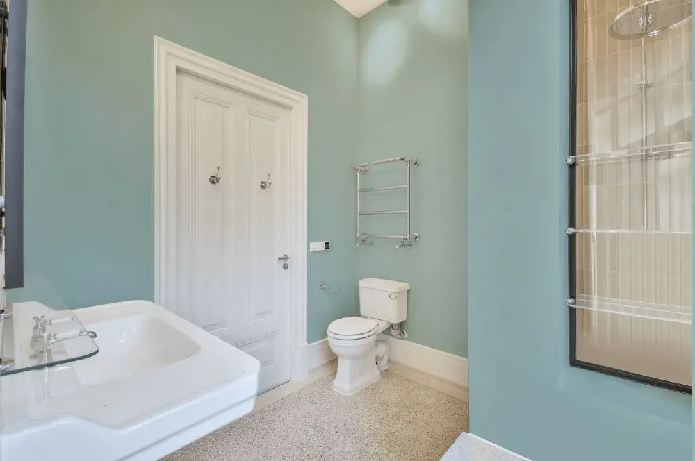
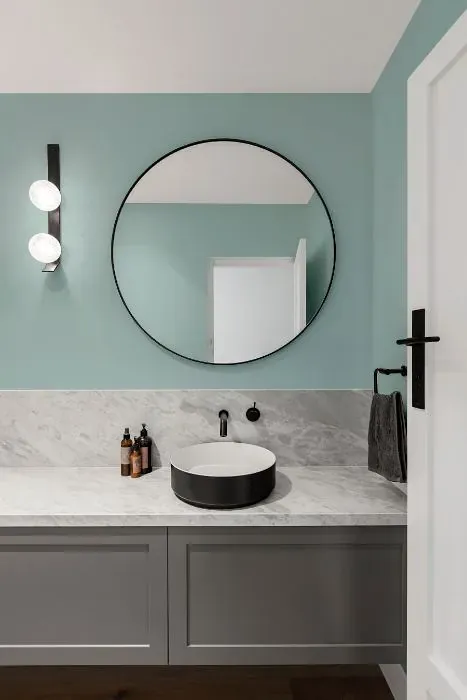
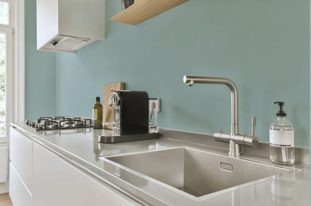
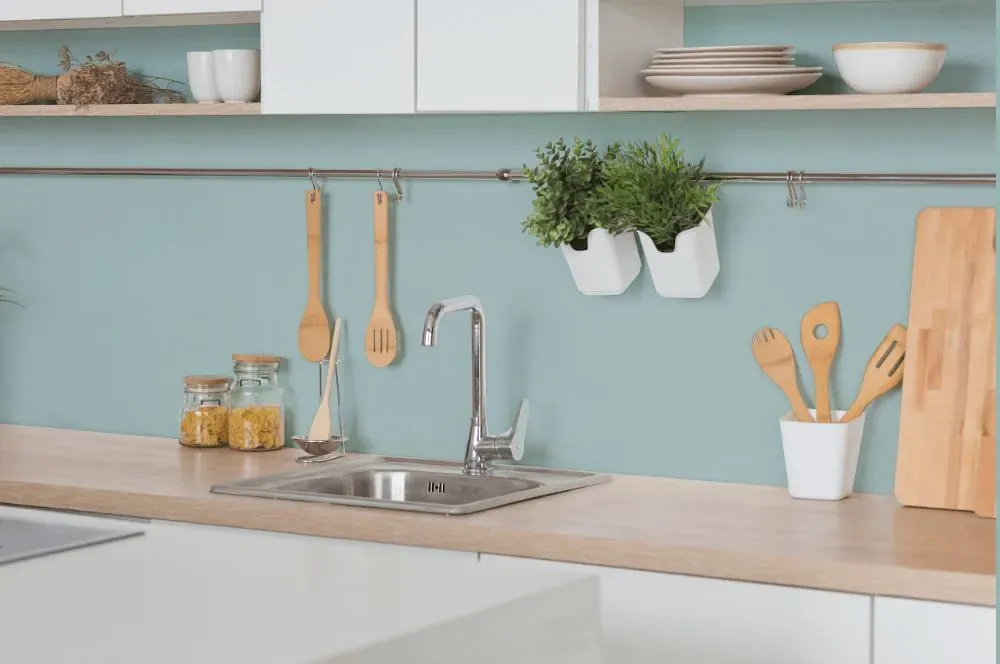
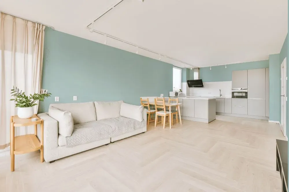
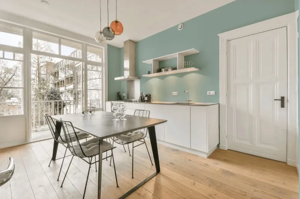
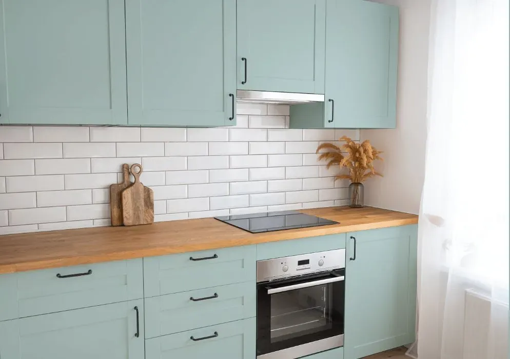
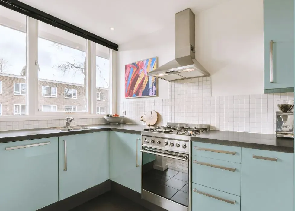
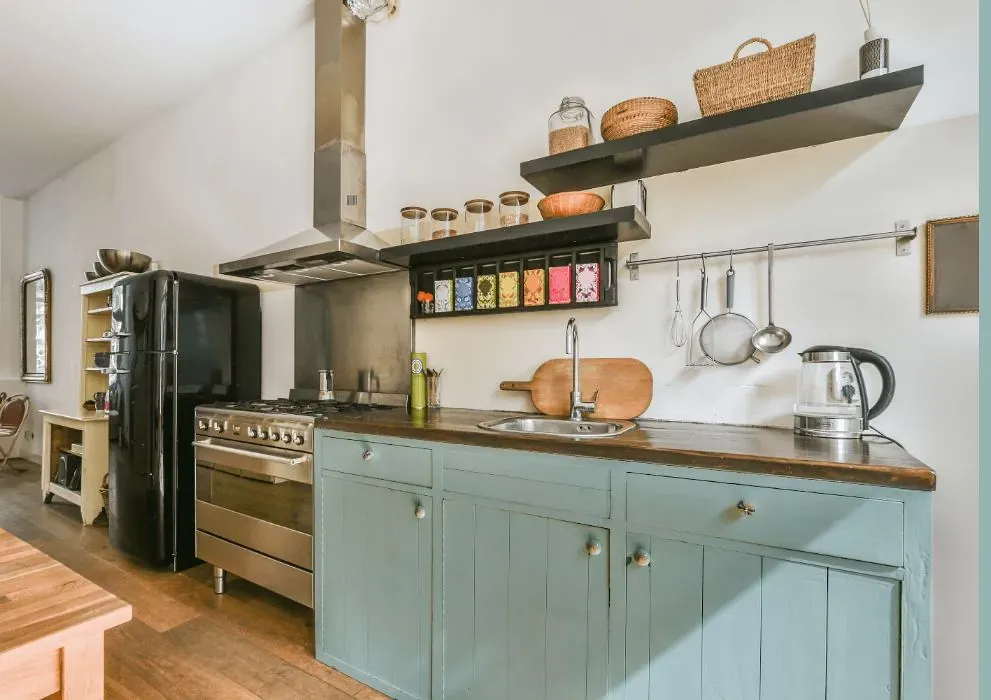
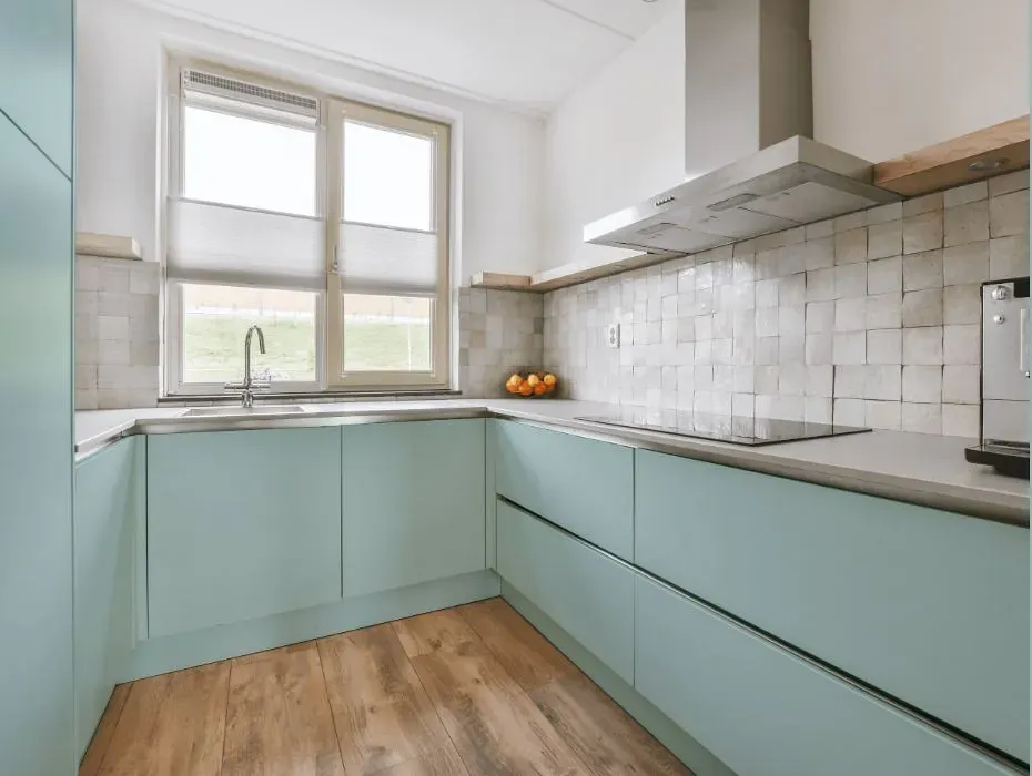
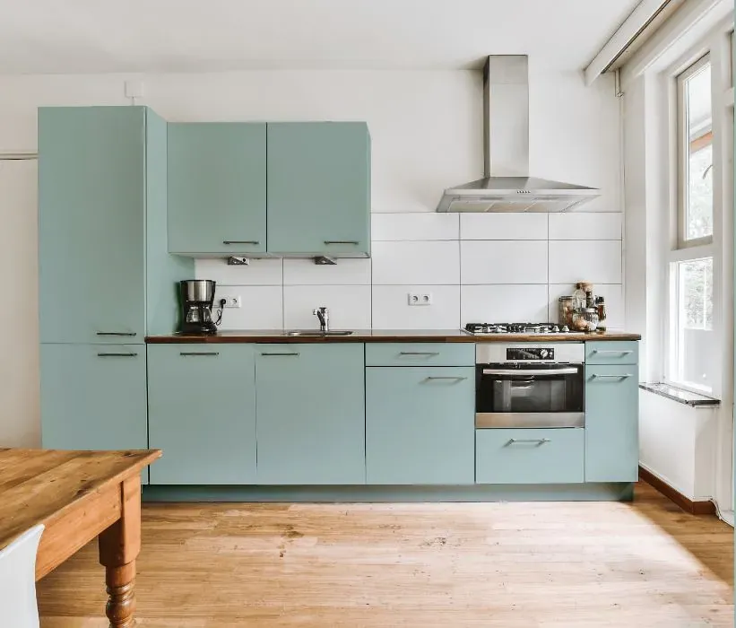
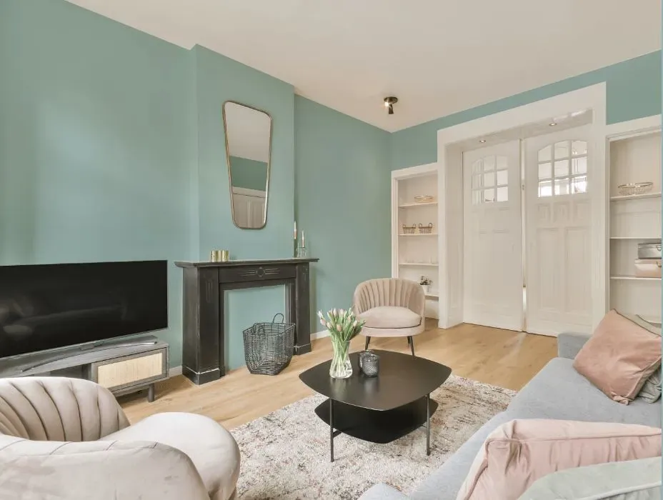
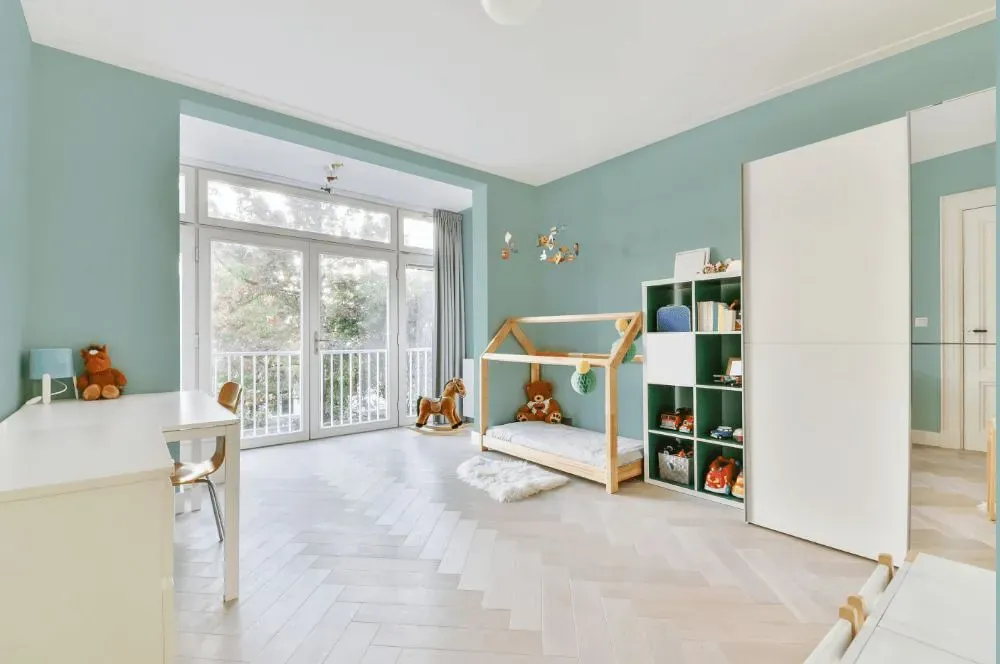
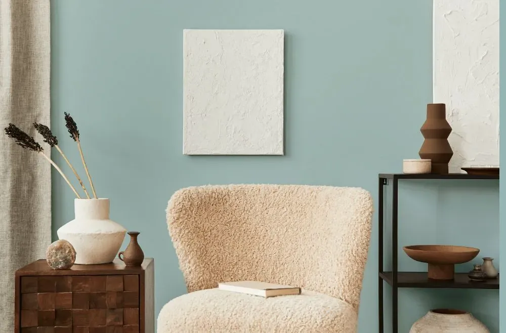
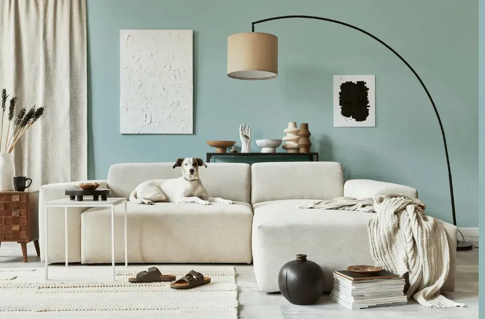
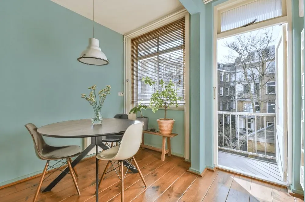
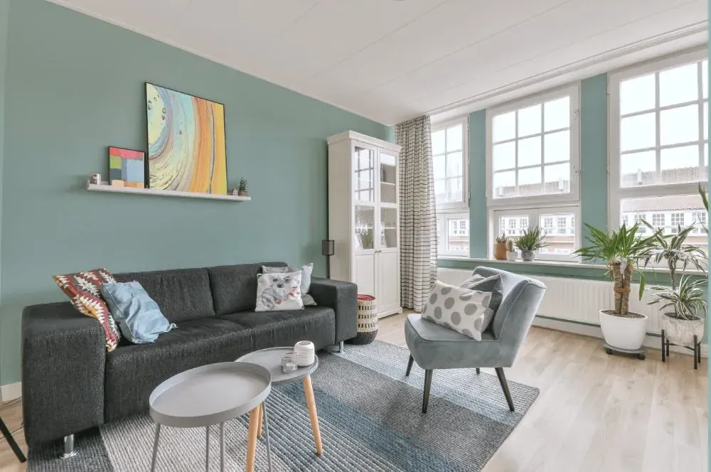
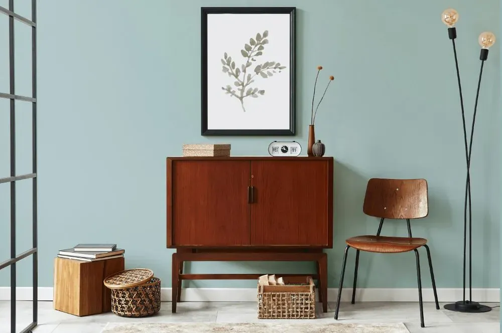
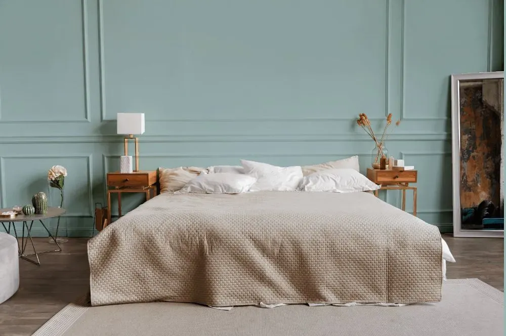
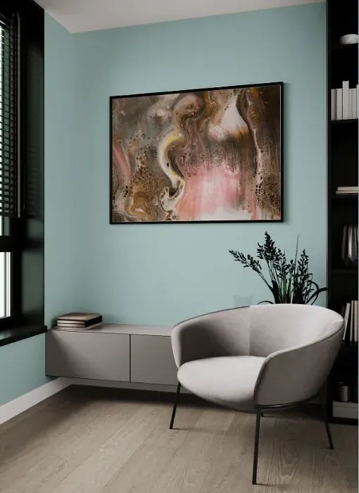
Transform your space with the serene beauty of Behr Clear Pond (PPU13-15). This soft and soothing shade of blue-green instantly creates a calming atmosphere in any room. Clear Pond pairs beautifully with crisp white trim and accents, adding a touch of freshness to your decor. For a more dramatic look, combine Clear Pond with rich navy blues or warm sandy beiges. Whether used as a wall color or in furniture and decor accents, Clear Pond brings a sense of tranquility and sophistication to your home. Elevate your space with this versatile and timeless hue.
Loading...
LRV of Clear Pond
Clear Pond has an LRV of 55.6% and refers to Light colors that reflect most of the incident light. Why LRV is important?

Light Reflectance Value measures the amount of visible and usable light that reflects from a painted surface.
Simply put, the higher the LRV of a paint color, the brighter the room you will get.
The scale goes from 0% (absolute black, absorbing all light) to 100% (pure white, reflecting all light).
Act like a pro: When choosing paint with an LRV of 55.6%, pay attention to your bulbs' brightness. Light brightness is measured in lumens. The lower the paint's LRV, the higher lumen level you need. Every square foot of room needs at least 40 lumens. That means for a 200 ft2 living room you'll need about 8000 lumens of light – e.g., eight 1000 lm bulbs.
Color codes
We have collected almost every possible color code you could ever need.
Not sure what the difference between HEX and RGB is? We break down color models in plain language. Understanding color models
| Format | Code |
|---|---|
| HEX | #b4cccb |
| RGB Decimal | 180, 204, 203 |
| RGB Percent | 70.59%, 80.00%, 79.61% |
| HSV | Hue: 177° Saturation: 11.76% Value: 80.0% |
| HSL | hsl(177, 19, 75) |
| CMYK | Cyan: 11.76 Magenta: 0.0 Yellow: 0.49 Key: 20.0 |
| YIQ | Y: 196.71 I: -13.98 Q: -5.388 |
| XYZ | X: 51.191 Y: 57.2 Z: 64.827 |
| CIE Lab | L:80.292 a:-8.243 b:-2.233 |
| CIE Luv | L:80.292 u:-12.848 v:-1.977 |
| Decimal | 11848907 |
| Hunter Lab | 75.631, -11.534, 2.12 |