Behr Confetti P570-2
| Code: | P570-2 |
| Name: | Confetti |
| Brand: | Behr |
What color is Behr Confetti?
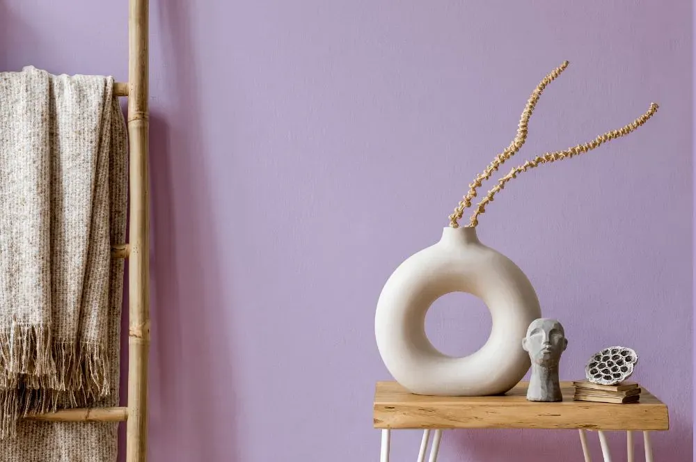
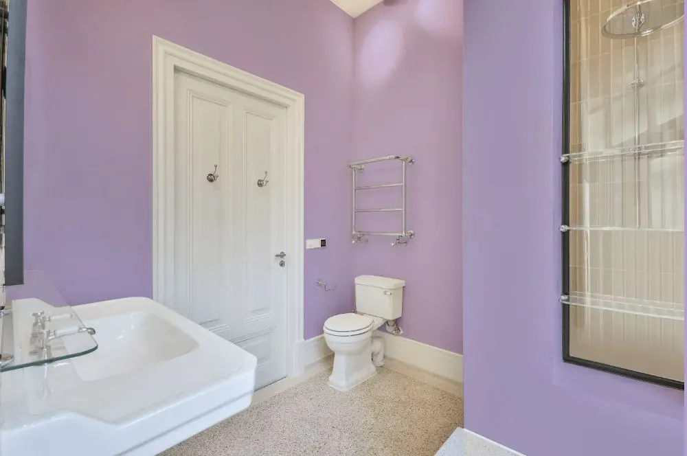
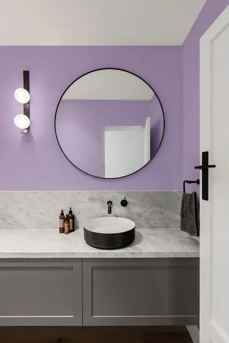
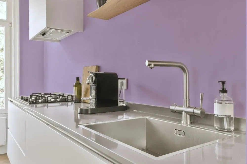
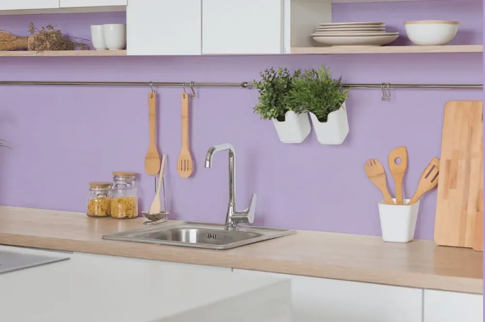
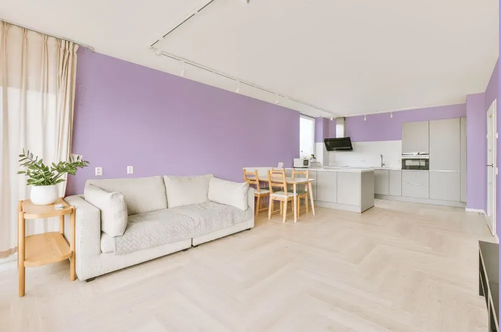
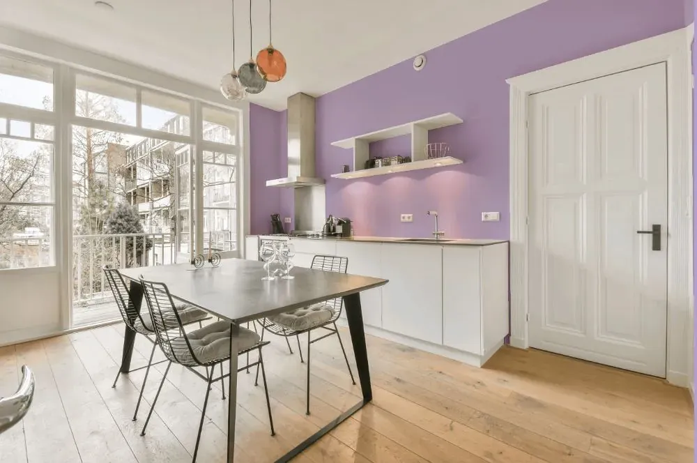
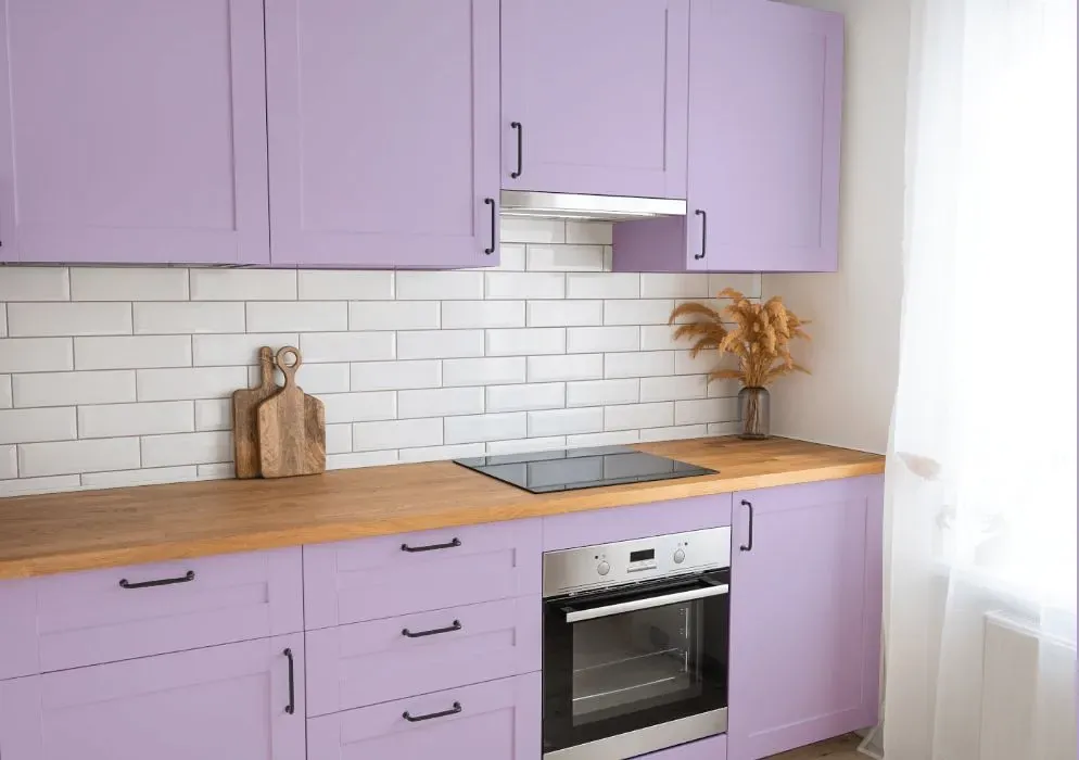
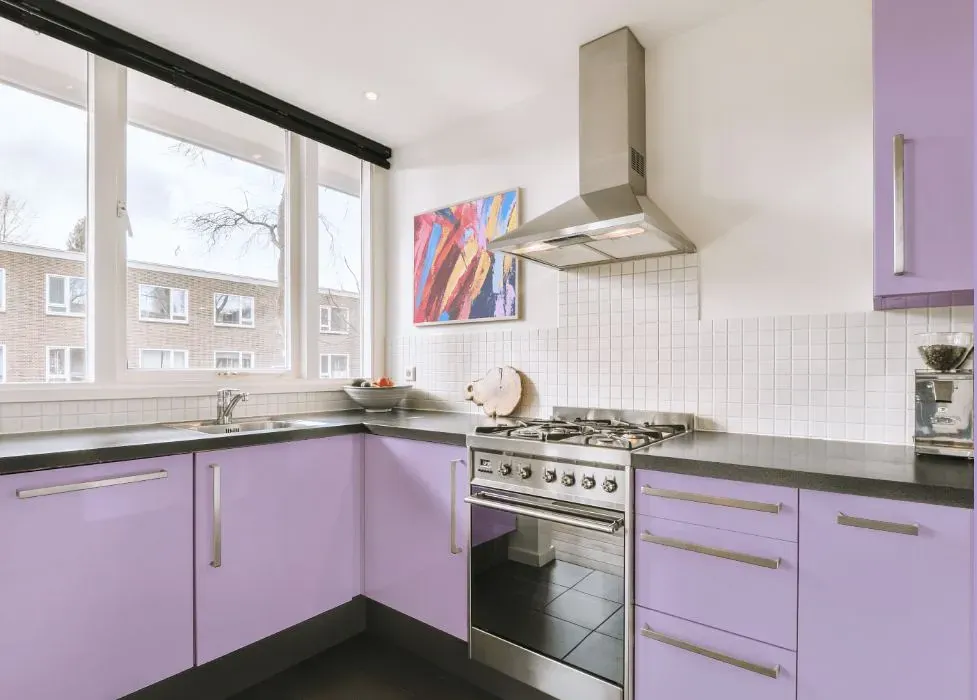
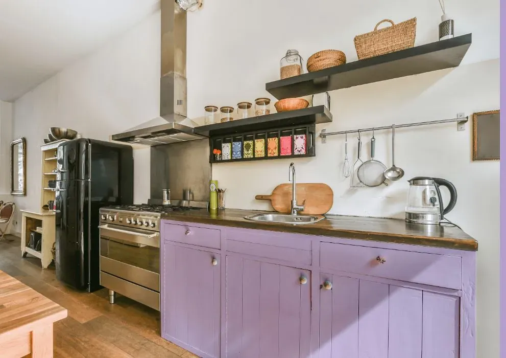
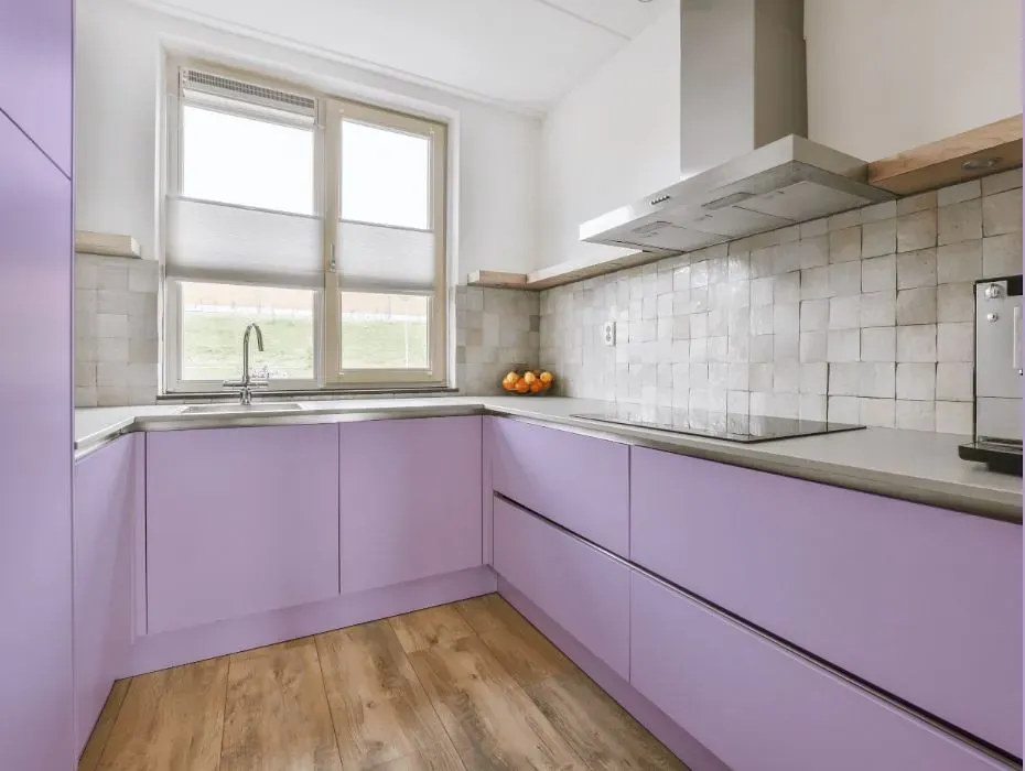
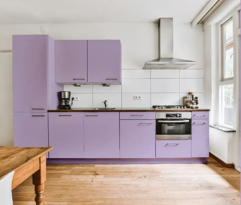
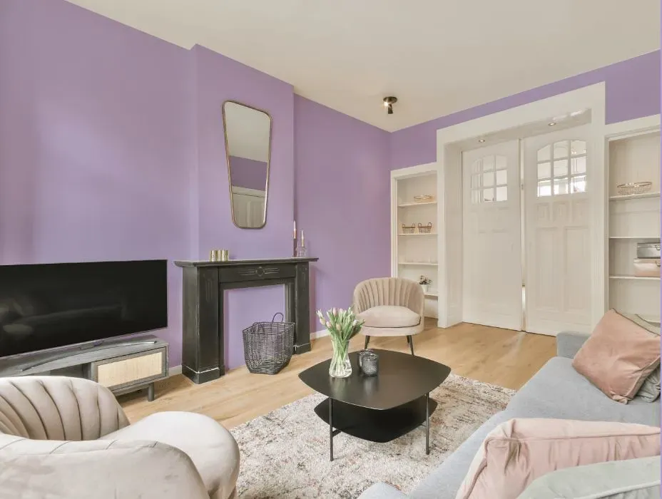
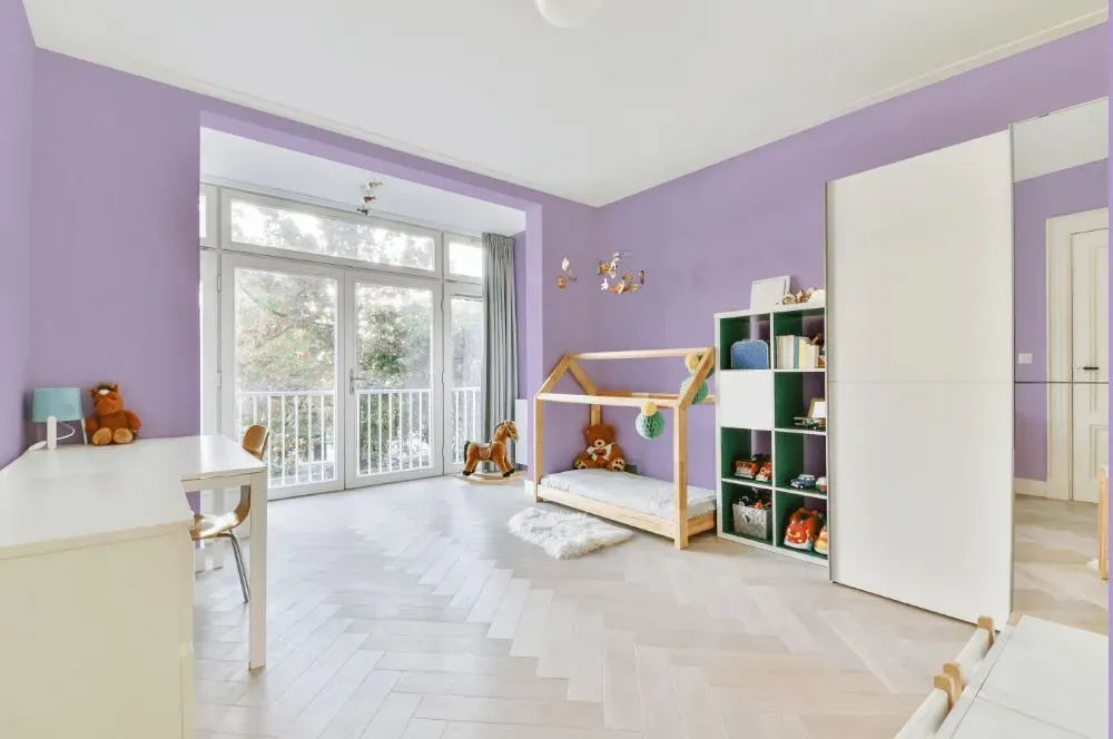
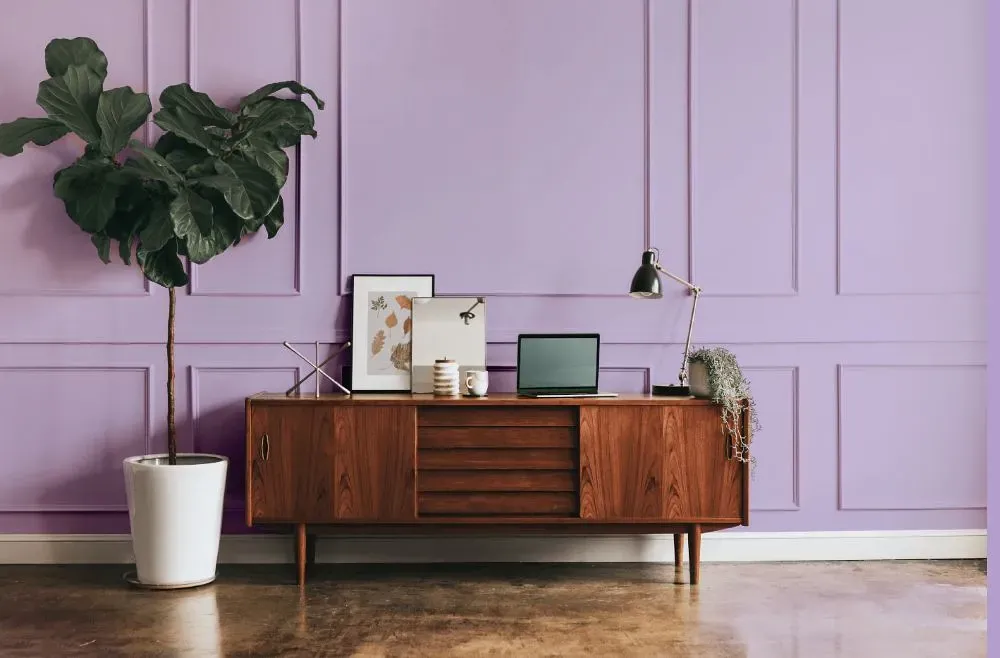
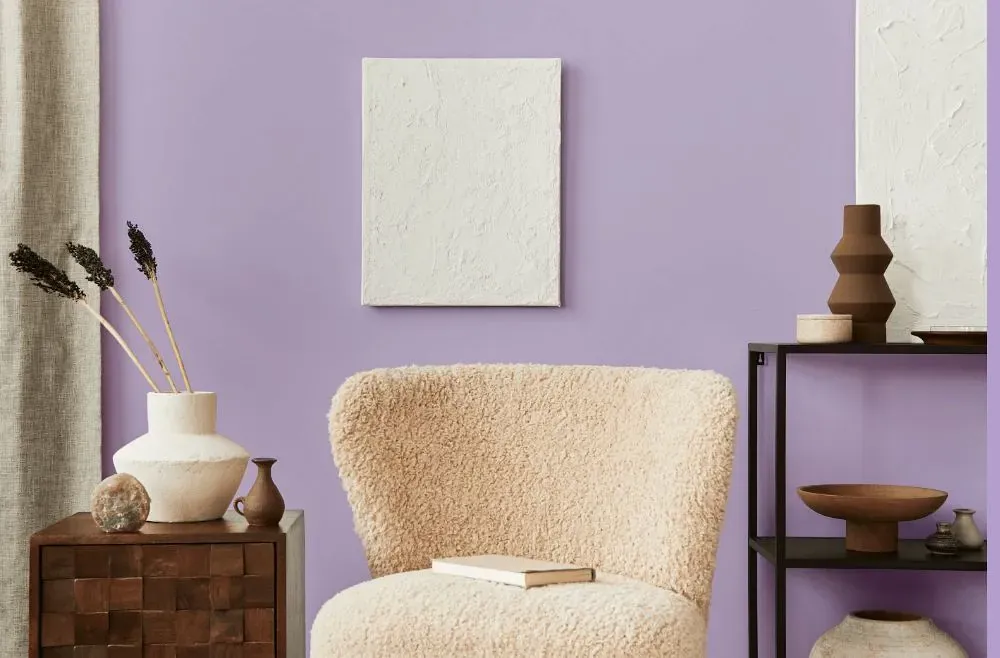
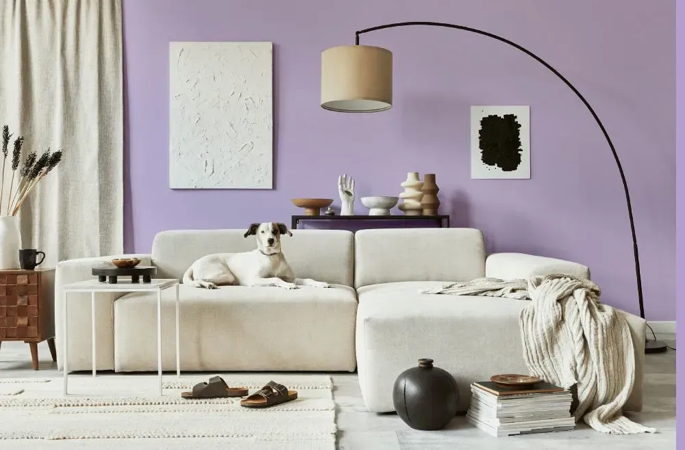
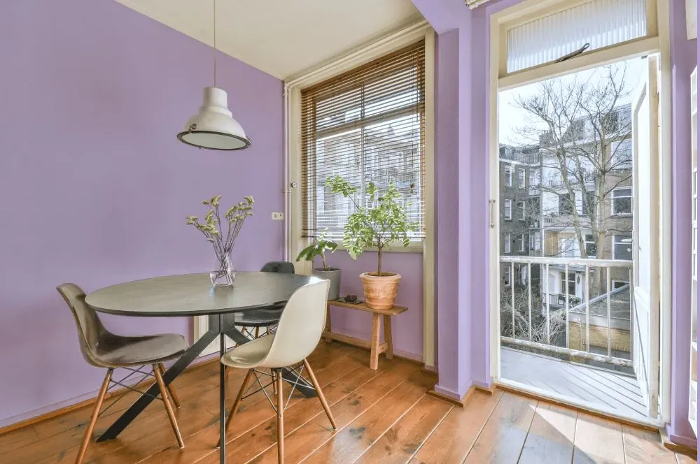
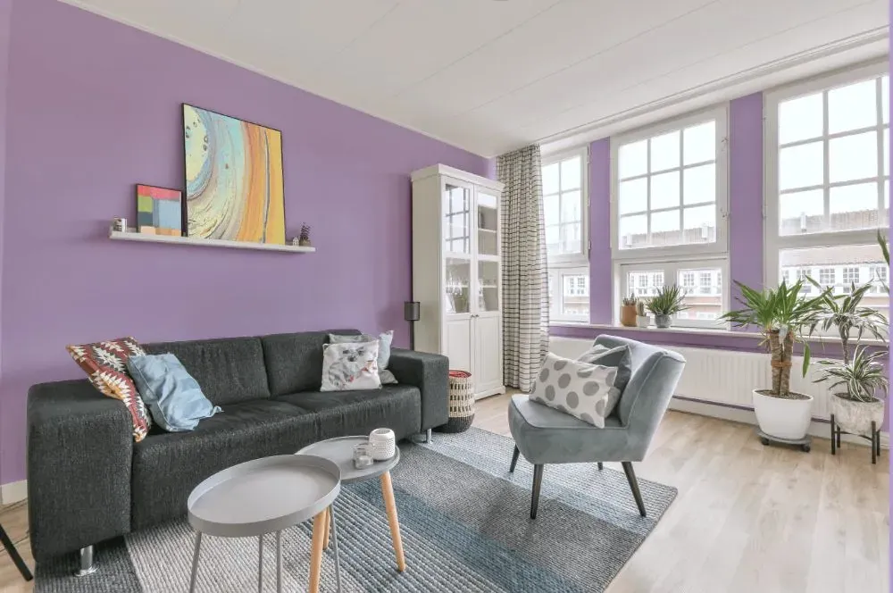
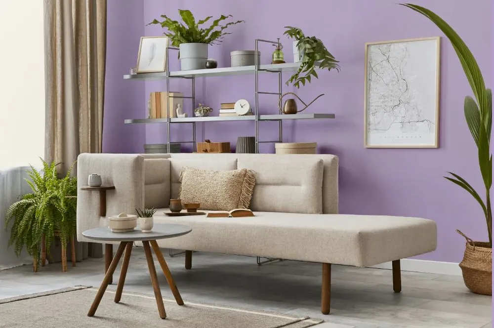
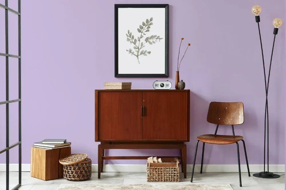
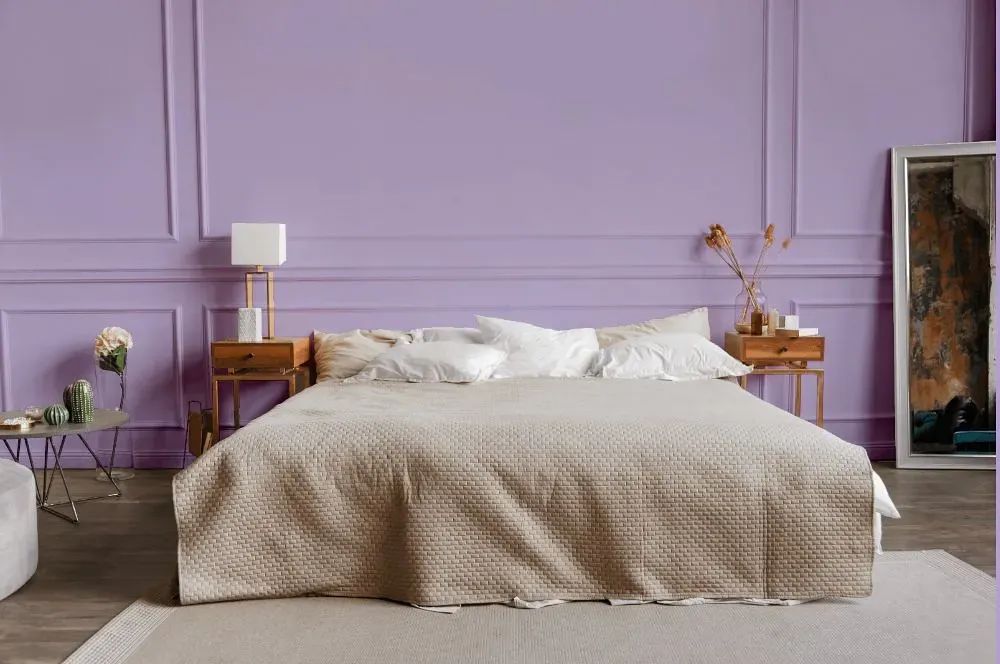
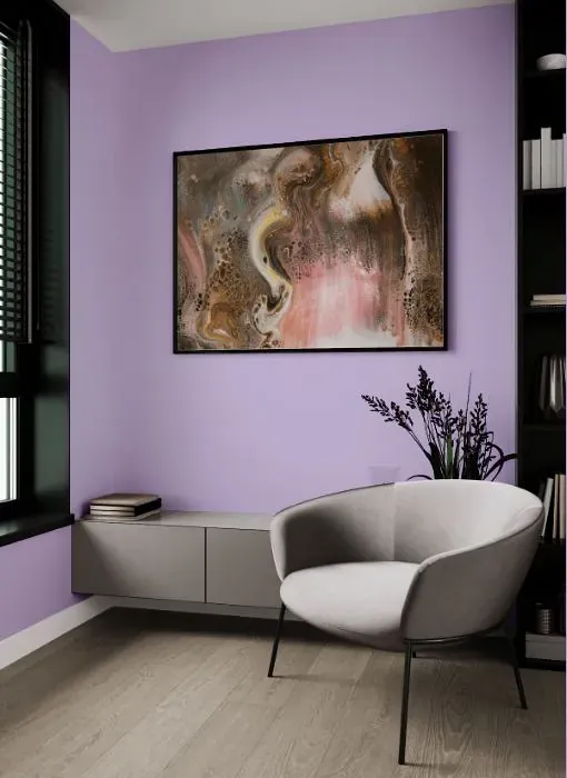
Experience a touch of elegance with Behr Confetti (P570-2), a delicate and charming shade that brings a soft warmth to any space. This subtle blush tone adds a sophisticated and cozy feel to a room, making it ideal for bedrooms, nurseries, or living areas. Pair Confetti with crisp whites and soft greys for a modern and fresh look, or combine it with deep navy blues or moody charcoal (PPU24-22) for a bold and dramatic contrast. Embrace the versatility of Behr Confetti (P570-2) to create a timeless and inviting atmosphere in your home.
Behr Confetti reviews
View the photos of real spaces painted with this that were not included in specific categories.Close-ups, painted furniture, storages and dressers, hallways, stairs and ceilings.
Try before you buy

100% accurate
reusable paint samples
Peel, stick,
and repeat
Twice painted
with real paint
Next day
delivery
What are Behr Confetti undertones?
The undertone of Confetti can be accurately described as a Purple hue, as is apparent from the color space provided. By isolating the pure hue and eliminating any tints, tones, and shades, we were able to precisely determine its undertone. This approach has proven to be more accurate than traditional methods of defining undertones on a white background, which are now considered outdated.
HEX value
HEX value:
#CCBBDD
RGB code:
204, 187, 221
Is Behr Confetti P570-2 cool or warm?
With a hue of 270° thisPurplerefers cool paint shade according to HSL (Hue, Saturation, Lightness) on the color wheel.
P570-2 Confetti HSL code: 270, 33%, 80%
Hue - degree on a color wheel from 0 to 360. 0 is red, 120 is green, and 240 is blue.
Saturation is expressed as a percentage. At 0%, it appears as a shade of grey, and at 100%, it is in full color..
Lightness is also a percentage value. 0% is black, and 100% is white.
- Cooler hues have a calm and relaxation effect
- Cool purple shades add a touch of elegance and creativity to a room, making it feel luxurious and imaginative, ideal for bedrooms, creative spaces, and living areas.
- Light, soft colors like pastel blues and greens make a room feel fresh and open. They're great for bathrooms, nurseries, and kitchens, creating a calm and inviting atmosphere. Just avoid using these colors in north-facing rooms, as they might feel too cold.
Act like a pro: Mixing warm and cool shades is a must have to get harmonius interior. Add accents that contrast with the primary color to create visual balance. If your walls are a warm color, don’t forget to add accent in cold colors (furniture, art, décor). A good practice is too use a complementary color scheme.
How light temperature affects Confetti
Natural Lighting. During the day, natural light shifts from about 2000 K at sunrise/sunset to 5500–6500 K at noon.
In addition, natural‑light temperature depends on its direction:
| Direction of sunlight | Visible temp. | Hue | Duration |
|---|---|---|---|
| North | Cool | Bluish | All day |
| East | Warm | Yellow | Before noon |
| West | Warm | Orange‑red | After noon |
| South | Warm | Orange‑yellow | All day |
Artificial Lighting. When choosing bulbs, pay attention to their color‑temperature (Kelvins).
Use the slider to see how this Purple shade looks under different lighting:


4000K
Coordinating colors.
Colors that go with Behr Confetti:
Monochromatic color scheme
This scheme consists of various shades, tints, and tones of a single color. While it offers a perfect combination of hues, without accent décor it may become monotonous.
Lighter shades
P570-2
Confetti
Darker shades
Complementary color scheme
This color scheme is a combination of two shades that are opposite each other on the color wheel. The high contrast between these colors creates a vibrant and dynamic visual effect. For the color Confetti with a purple hue, complementary colors are those with a yellow hue close to 90, such as Behr Summer Green and Shy Green.
LRV of Confetti
Confetti has an LRV of 55.13% and refers to Light colors that reflect most of the incident light. Why LRV is important?
Light Reflectance Value measures the amount of visible and usable light that reflects from a painted surface.
Simply put, the higher the LRV of a paint color, the brighter the room you will get.
The scale goes from 0% (absolute black, absorbing all light) to 100% (pure white, reflecting all light).
Act like a pro: When choosing paint with an LRV of 55.13%, pay attention to your bulbs' brightness. Light brightness is measured in lumens. The lower the paint's LRV, the higher lumen level you need. Every square foot of room needs at least 40 lumens. That means for a 200 ft2 living room you’ll need about 8000 lumens of light – e.g., eight 1000 lm bulbs.
Color codes
We have collected almost every possible color code you could ever need. To copy the code, just click the icon to the right of it.
| Format | Code | |
|---|---|---|
| HEX | #ccbbdd | |
| RGB Decimal | 204, 187, 221 | |
| RGB Percent | 80.00%, 73.33%, 86.67% | |
| HSV | Hue: 270° Saturation: 15.38% Value: 86.67% | |
| HSL | hsl(270, 33, 80) | |
| CMYK | Cyan: 7.69 Magenta: 15.38 Yellow: 0.0 Key: 13.33 | |
| YIQ | Y: 195.959 I: -0.795 Q: 14.177 | |
| XYZ | X: 55.72 Y: 53.599 Z: 75.797 | |
| CIE Lab | L:78.227 a:12.315 b:-14.793 | |
| CIE Luv | L:78.227 u:7.306 v:-25.012 | |
| Decimal | 13417437 | |
| Hunter Lab | 73.211, 7.735, -10.137 |
Color equivalents
P560-3
Party Hat
Behr
SW 6973
Free Spirit
Sherwin Williams
SW 6829
Magical
Sherwin Williams

1389
Wishing Well
Benjamin Moore
SW 6822
Wisteria
Sherwin Williams
1395
Grape Ice
Benjamin Moore
P100-3
Epiphany
Behr
1396
Heather Plum
Benjamin Moore
M560-3
Grape Hyacinth
Behr
2071-50
Amethyst Cream
Benjamin Moore

MQ4-59
Purple Gladiola
Behr
M570-3
On Location
Behr
2071-60
Lily Lavender
Benjamin Moore

M570-4
Cyber Grape
Behr
1382
Violet Petal
Benjamin Moore
SW 6828
Rhapsody Lilac
Sherwin Williams

2072-50
Lavender Lipstick
Benjamin Moore
2073-50
Purple Easter Egg
Benjamin Moore
SW 6835
Euphoric Lilac
Sherwin Williams


