Behr Courteous S560-1
| Code: | S560-1 |
| Name: | Courteous |
| Brand: | Behr |
What color is Behr Courteous?
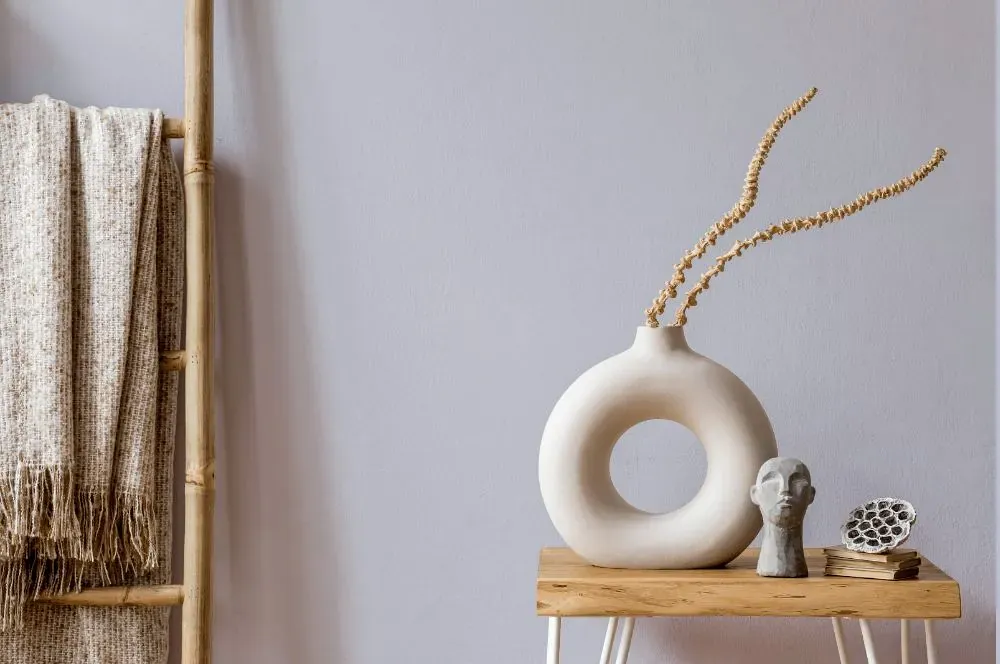
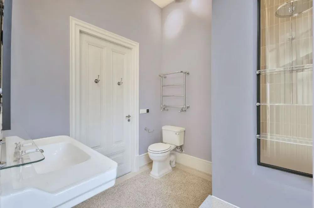
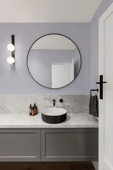
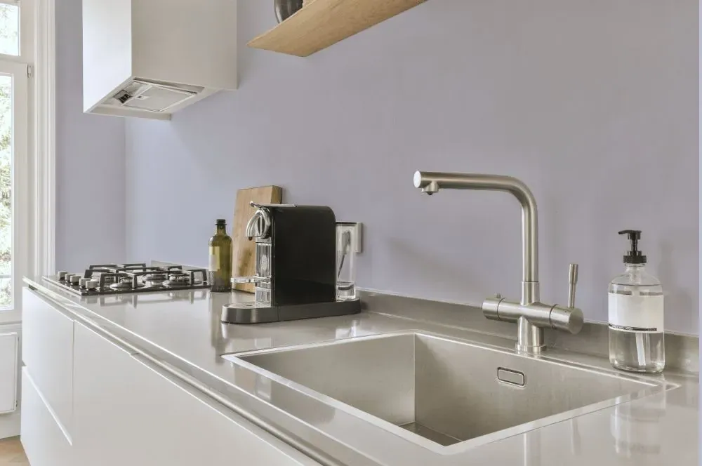
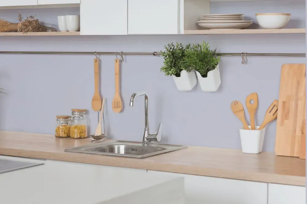
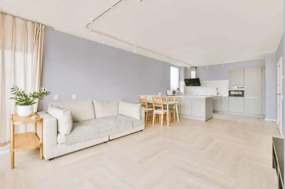
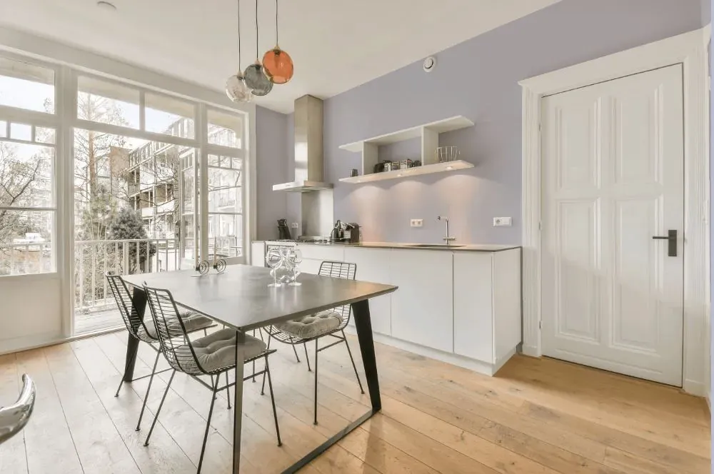
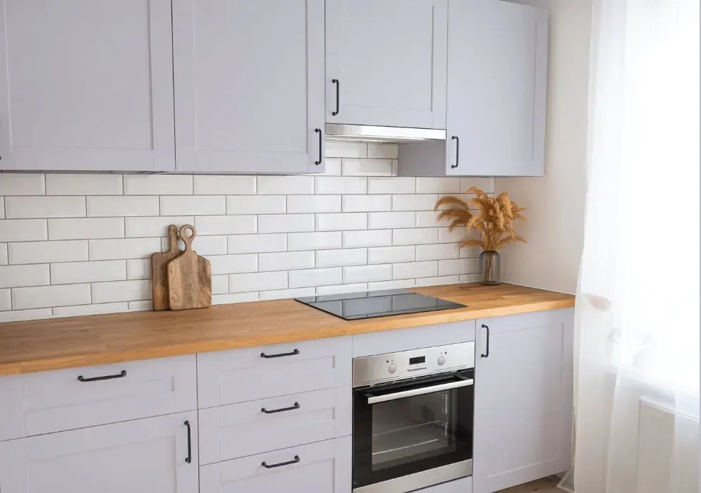
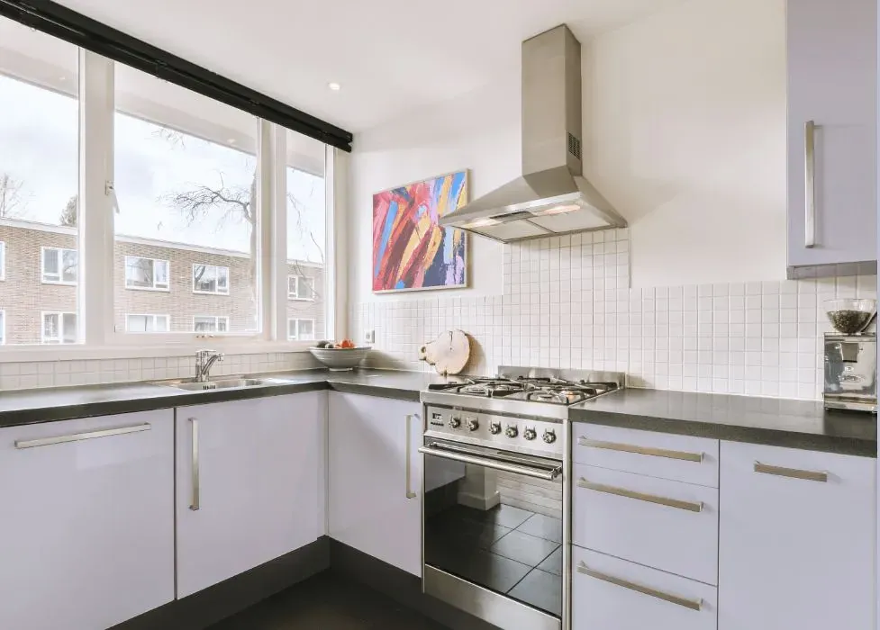
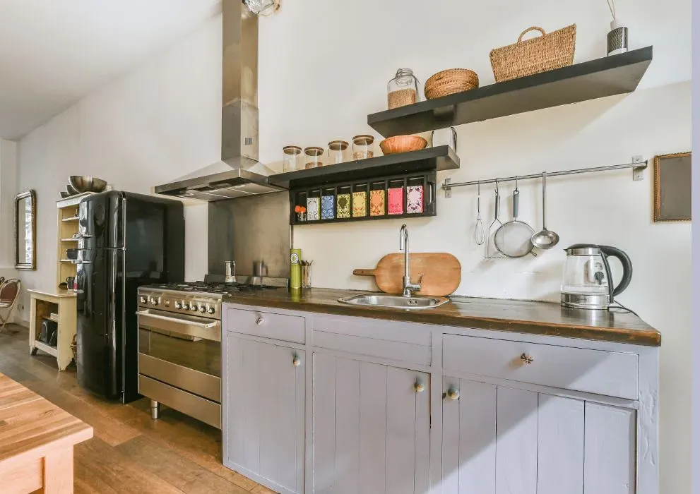
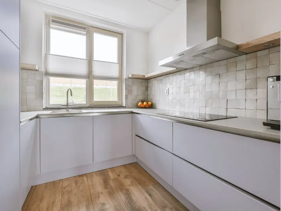
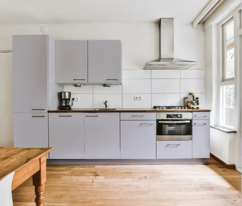
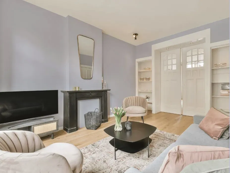
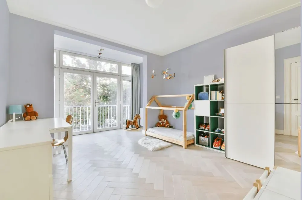
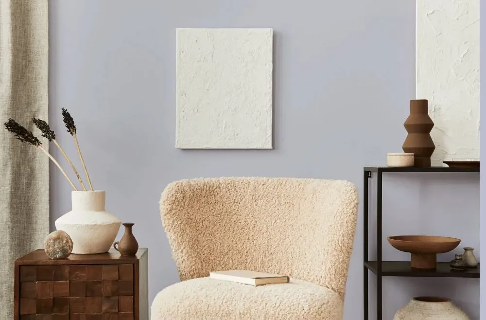
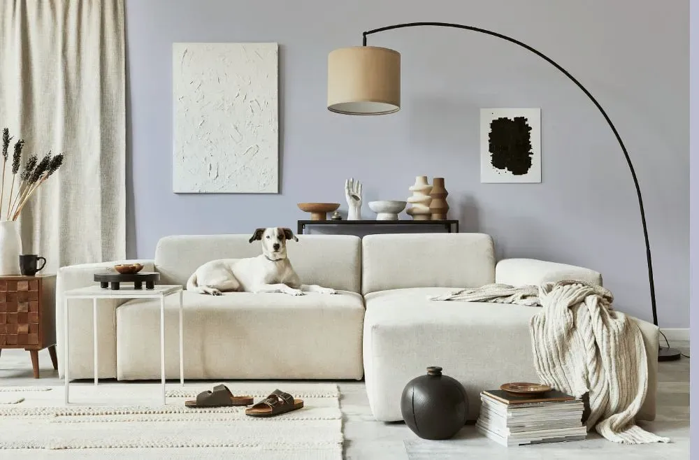
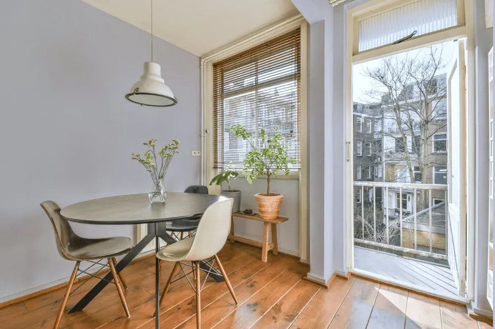
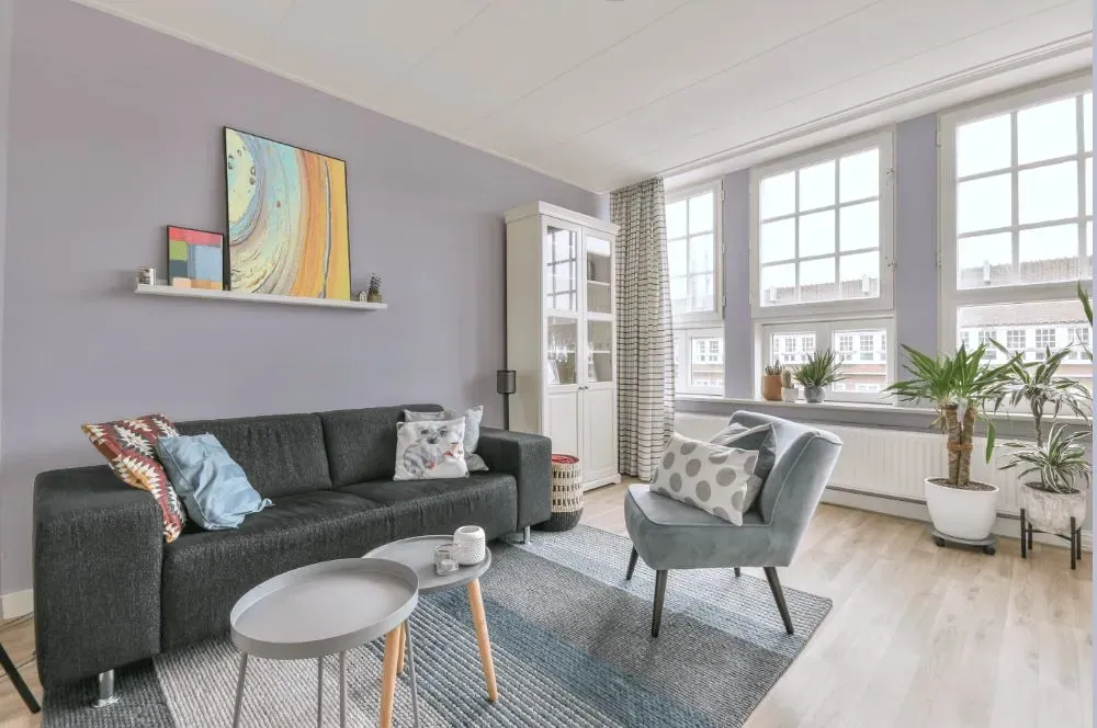
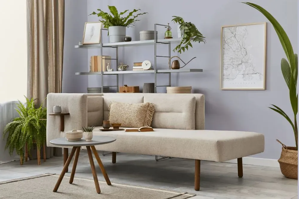
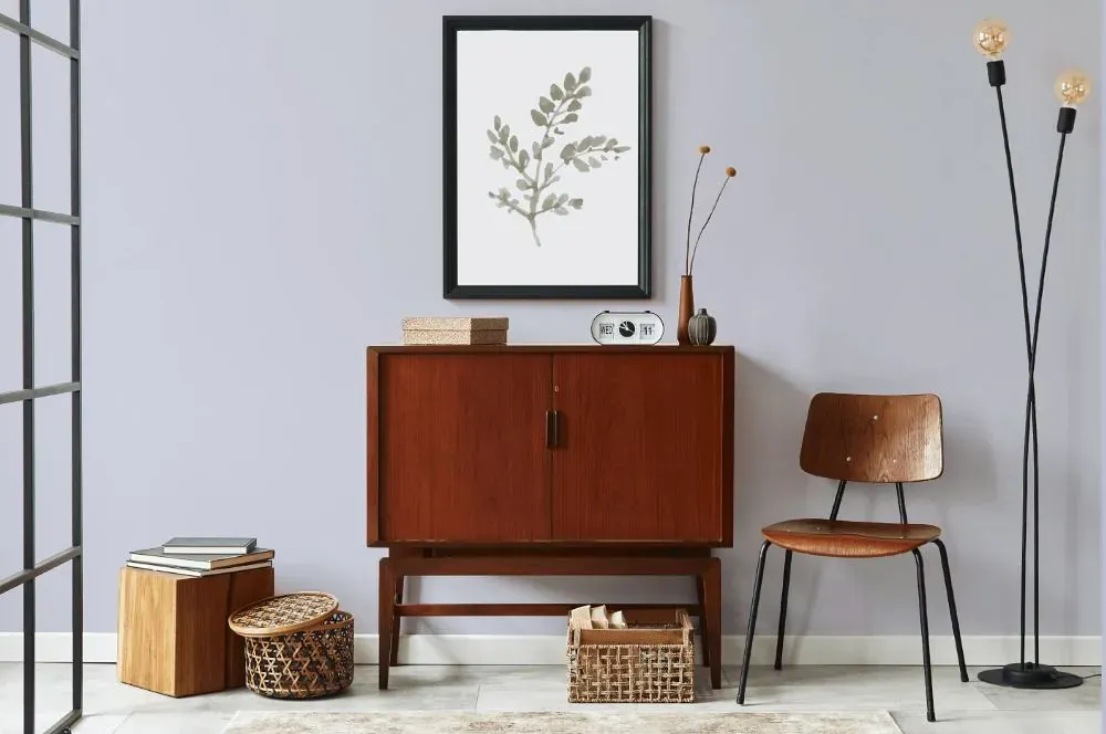
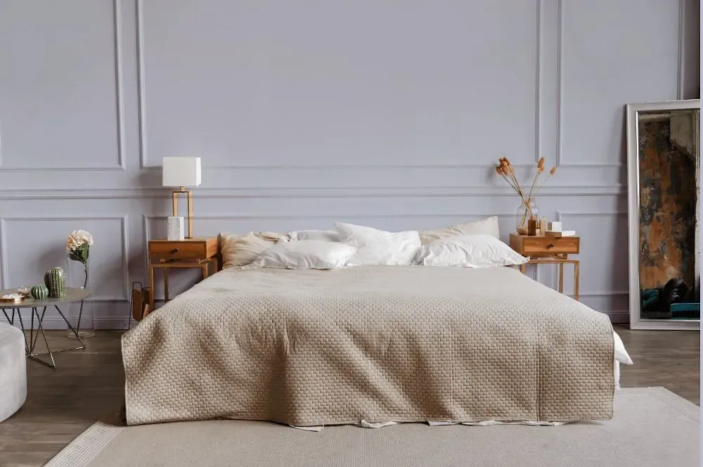
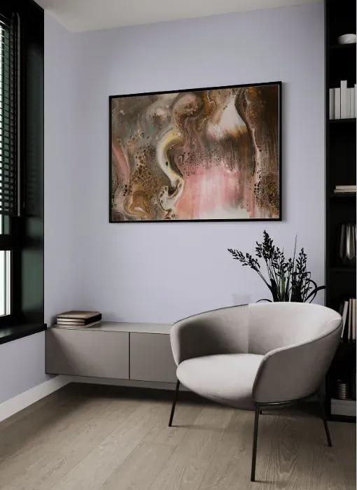
This delicate shade of Behr Courteous (S560-1) creates a tranquil and inviting atmosphere in any space. Pair it with soft neutrals like cream and taupe for a sophisticated look, or combine it with dusty blues and blush pinks for a dreamy and romantic feel. Behr Courteous harmonizes beautifully with natural materials like light wood and bamboo, bringing a sense of warmth and serenity to the room. Whether used as a wall color or in decor accents, Behr S560-1 Courteous adds a touch of elegance and refinement to any interior.
Behr Courteous reviews
View the photos of real spaces painted with this that were not included in specific categories.Close-ups, painted furniture, storages and dressers, hallways, stairs and ceilings.
Try before you buy

100% accurate
reusable paint samples
Peel, stick,
and repeat
Twice painted
with real paint
Next day
delivery
What are Behr Courteous undertones?
The undertone of Courteous can be accurately described as a Blue hue, as is apparent from the color space provided. By isolating the pure hue and eliminating any tints, tones, and shades, we were able to precisely determine its undertone. This approach has proven to be more accurate than traditional methods of defining undertones on a white background, which are now considered outdated.
HEX value
HEX value:
#D2D3DE
RGB code:
210, 211, 222
Is Behr Courteous S560-1 cool or warm?
With a hue of 235° thisPurplerefers cool paint shade according to HSL (Hue, Saturation, Lightness) on the color wheel.
S560-1 Courteous HSL code: 235, 15%, 85%
Hue - degree on a color wheel from 0 to 360. 0 is red, 120 is green, and 240 is blue.
Saturation is expressed as a percentage. At 0%, it appears as a shade of grey, and at 100%, it is in full color..
Lightness is also a percentage value. 0% is black, and 100% is white.
- Cooler hues have a calm and relaxation effect
- Cool purple shades add a touch of elegance and creativity to a room, making it feel luxurious and imaginative, ideal for bedrooms, creative spaces, and living areas.
- Light, soft colors like pastel blues and greens make a room feel fresh and open. They're great for bathrooms, nurseries, and kitchens, creating a calm and inviting atmosphere. Just avoid using these colors in north-facing rooms, as they might feel too cold.
Act like a pro: Mixing warm and cool shades is a must have to get harmonius interior. Add accents that contrast with the primary color to create visual balance. If your walls are a warm color, don’t forget to add accent in cold colors (furniture, art, décor). A good practice is too use a complementary color scheme.
How light temperature affects Courteous
Natural Lighting. During the day, natural light shifts from about 2000 K at sunrise/sunset to 5500–6500 K at noon.
In addition, natural‑light temperature depends on its direction:
| Direction of sunlight | Visible temp. | Hue | Duration |
|---|---|---|---|
| North | Cool | Bluish | All day |
| East | Warm | Yellow | Before noon |
| West | Warm | Orange‑red | After noon |
| South | Warm | Orange‑yellow | All day |
Artificial Lighting. When choosing bulbs, pay attention to their color‑temperature (Kelvins).
Use the slider to see how this Purple shade looks under different lighting:


4000K
Coordinating colors.
Colors that go with Behr Courteous:
Monochromatic color scheme
This scheme consists of various shades, tints, and tones of a single color. While it offers a perfect combination of hues, without accent décor it may become monotonous.
Lighter shades
Darker shades
Complementary color scheme
This color scheme is a combination of two shades that are opposite each other on the color wheel. The high contrast between these colors creates a vibrant and dynamic visual effect. For the color Courteous with a blue hue, complementary colors are those with a orange hue close to 55, such as Behr Greywood and Aged Olive.
LRV of Courteous
Courteous has an LRV of 65.69% and refers to Light colors that reflect most of the incident light. Why LRV is important?
Light Reflectance Value measures the amount of visible and usable light that reflects from a painted surface.
Simply put, the higher the LRV of a paint color, the brighter the room you will get.
The scale goes from 0% (absolute black, absorbing all light) to 100% (pure white, reflecting all light).
Act like a pro: When choosing paint with an LRV of 65.69%, pay attention to your bulbs' brightness. Light brightness is measured in lumens. The lower the paint's LRV, the higher lumen level you need. Every square foot of room needs at least 40 lumens. That means for a 200 ft2 living room you’ll need about 8000 lumens of light – e.g., eight 1000 lm bulbs.
Color codes
We have collected almost every possible color code you could ever need. To copy the code, just click the icon to the right of it.
| Format | Code | |
|---|---|---|
| HEX | #d2d3de | |
| RGB Decimal | 210, 211, 222 | |
| RGB Percent | 82.35%, 82.75%, 87.06% | |
| HSV | Hue: 235° Saturation: 5.41% Value: 87.06% | |
| HSL | hsl(235, 15, 85) | |
| CMYK | Cyan: 5.41 Magenta: 4.95 Yellow: 0.0 Key: 12.94 | |
| YIQ | Y: 211.955 I: -4.131 Q: 3.212 | |
| XYZ | X: 63.054 Y: 65.564 Z: 78.421 | |
| CIE Lab | L:84.773 a:1.707 b:-5.528 | |
| CIE Luv | L:84.773 u:-1.178 v:-8.793 | |
| Decimal | 13816798 | |
| Hunter Lab | 80.971, -2.699, -0.742 |
Color equivalents
1410
Iced Lavender
Benjamin Moore
PPU16-08
Hint Of Violet
Behr
S540-1
So Blue-Berry
Behr
M550-2
Lavender Memory
Behr
1429
Celestia Blue
Benjamin Moore
S570-1
Misty Lavender
Behr
2117-60
Winter Gray
Benjamin Moore
1422
Violet Sparkle
Benjamin Moore
1416
Whispering Wind
Benjamin Moore
S550-1
Blueberry Whip
Behr

1402
Spring Iris
Benjamin Moore
1415
Lavender Secret
Benjamin Moore
2069-60
Lavender Ice
Benjamin Moore
MQ3-30
Petal Tip
Behr
1409
Violet Dusk
Benjamin Moore
2118-60
Misty Memories
Benjamin Moore

2070-60
Lavender Mist
Benjamin Moore
1423
Angel's Wings
Benjamin Moore
SW 6827
Elation
Sherwin Williams


