Behr Harmonious PPU13-12

Color code:PPU13-12
Color name:Harmonious
Brand:Behr

What color is Behr Harmonious?

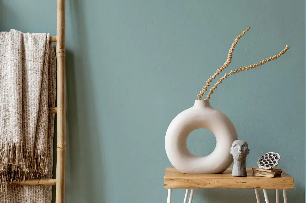
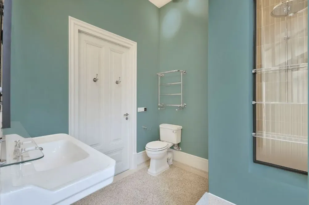
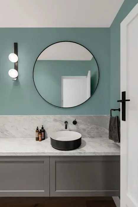
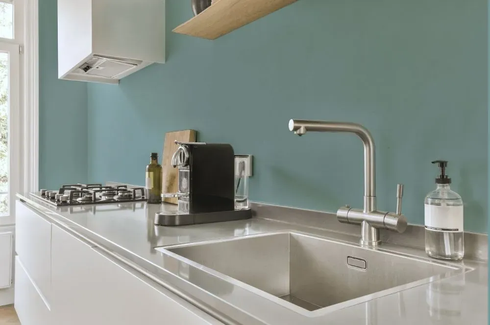
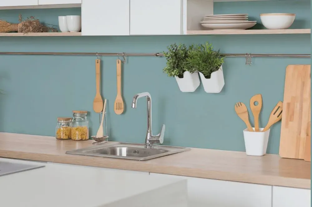
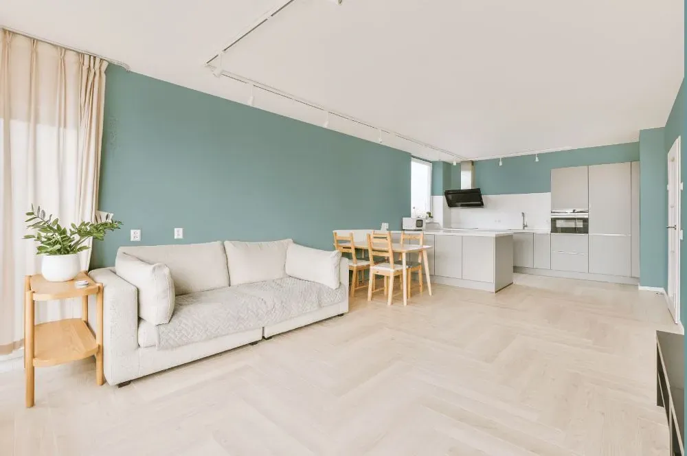
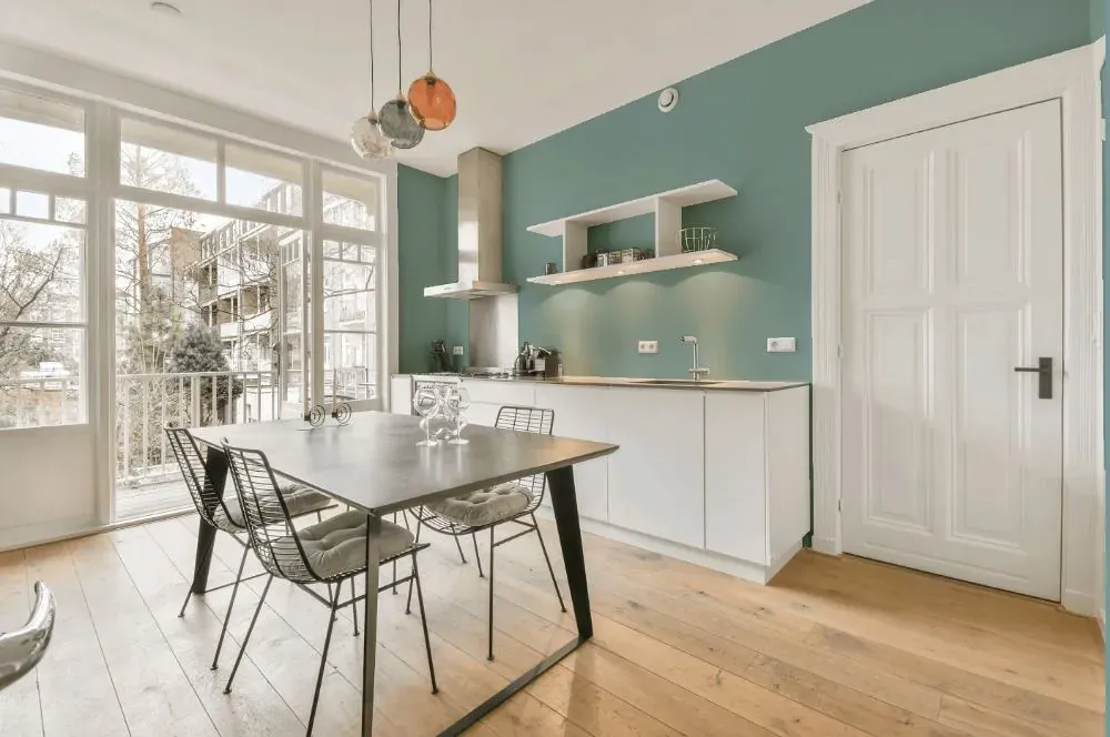
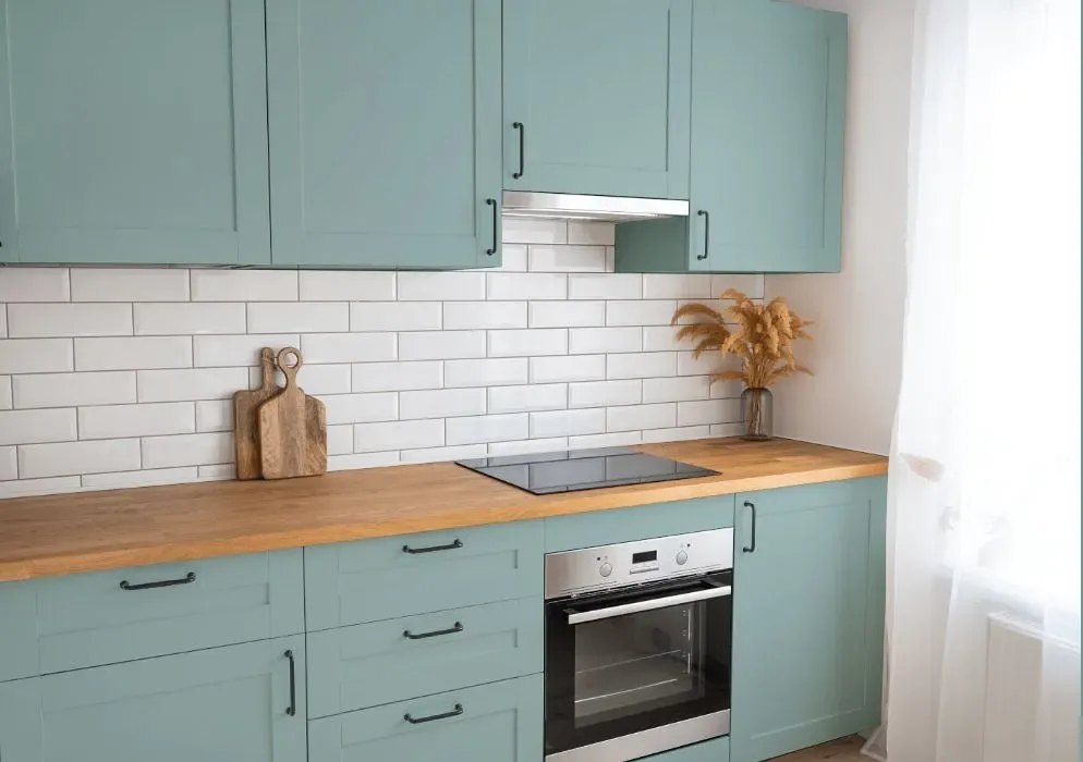
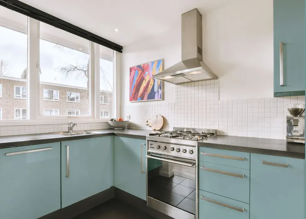
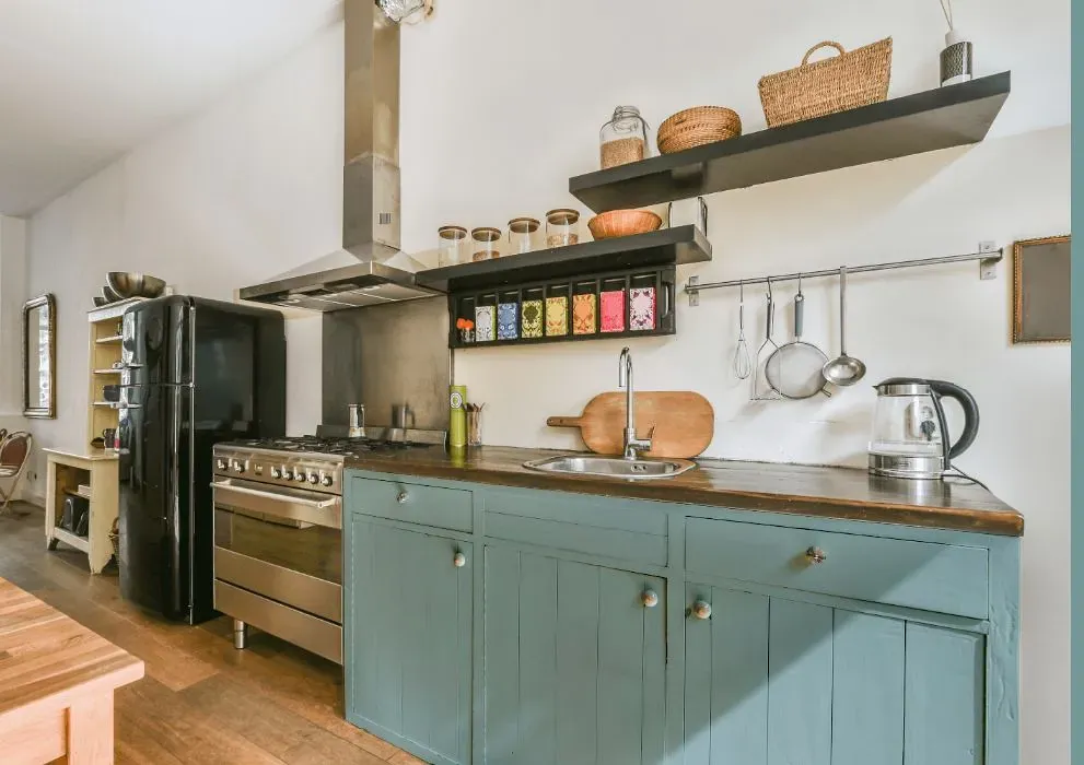
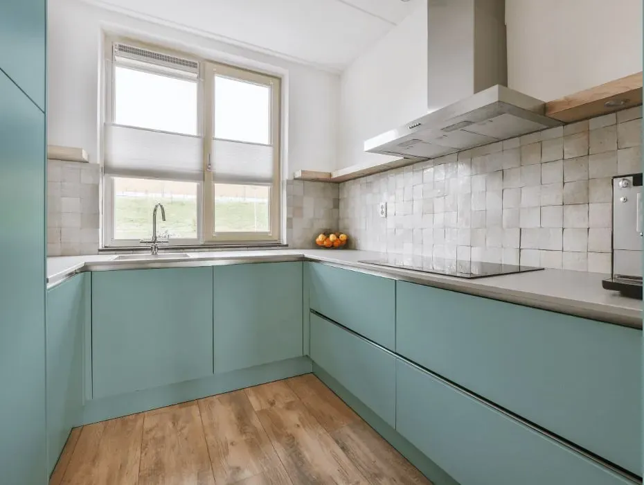
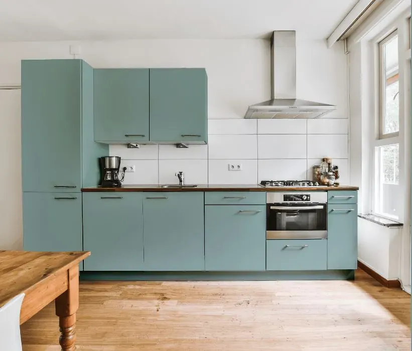
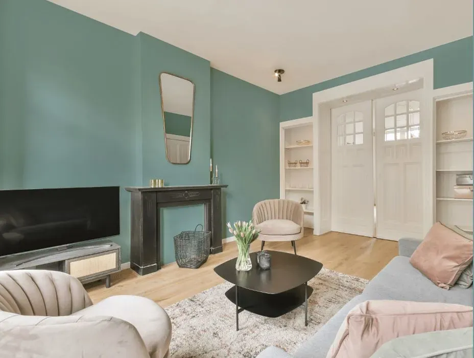
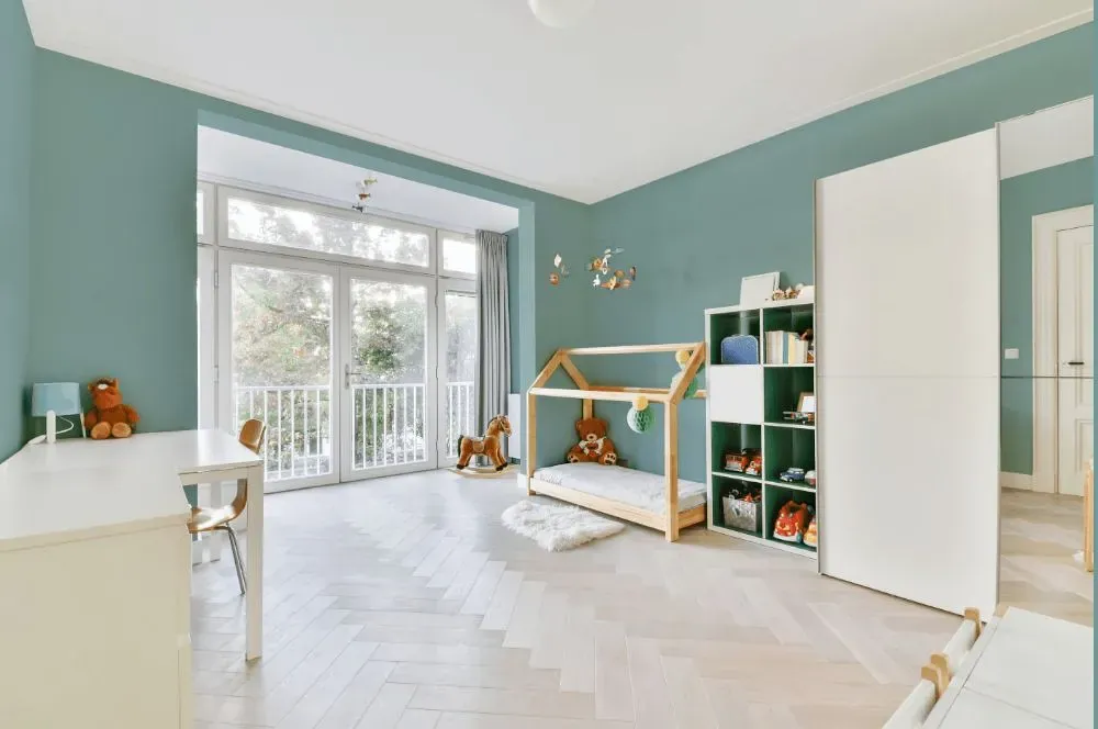
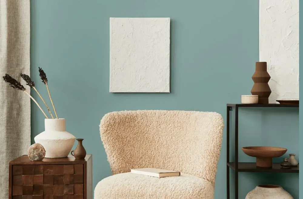
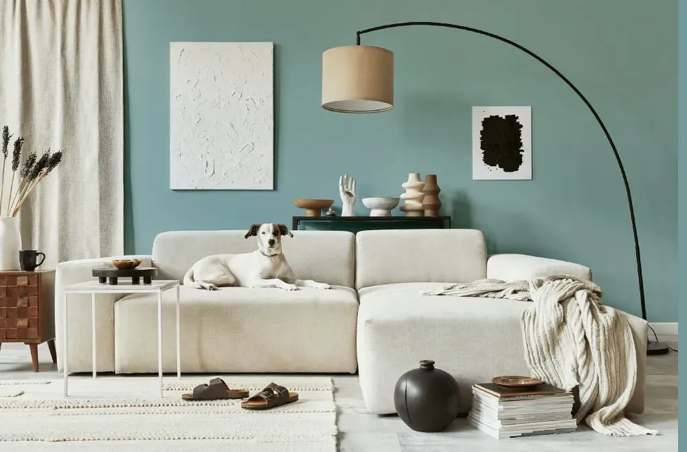
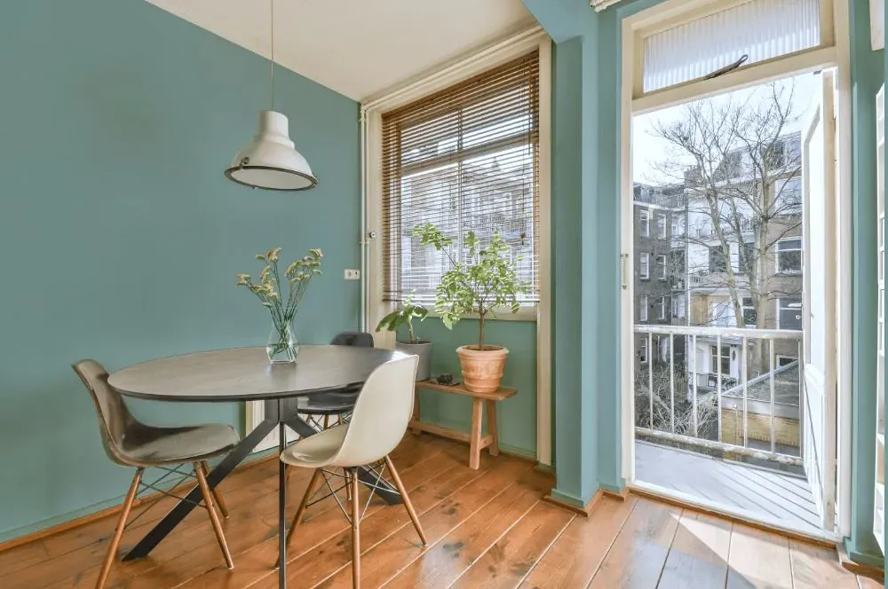
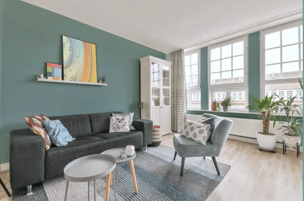
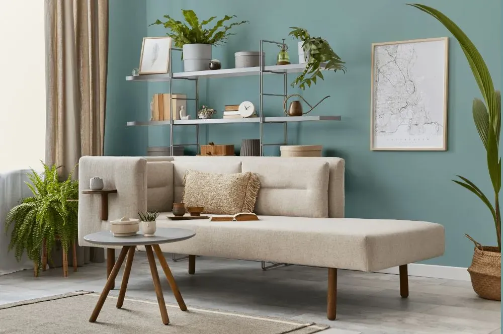
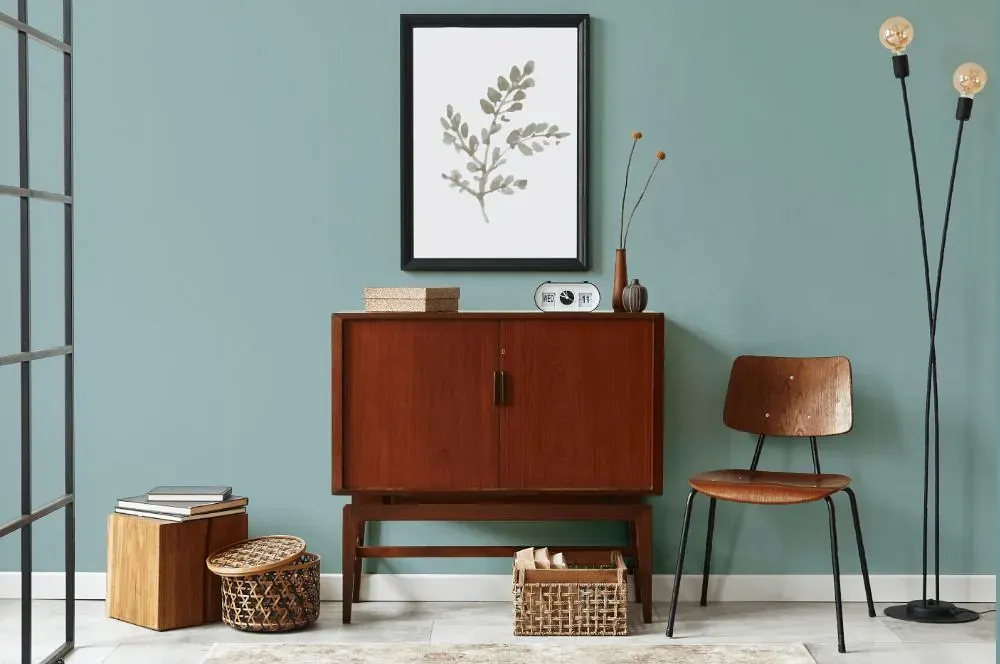
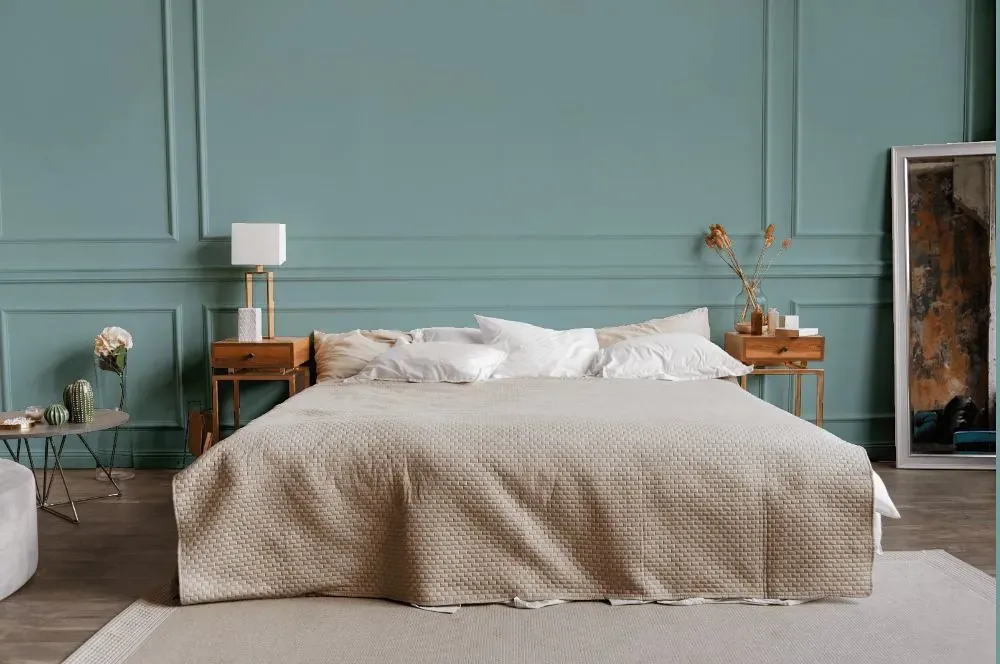
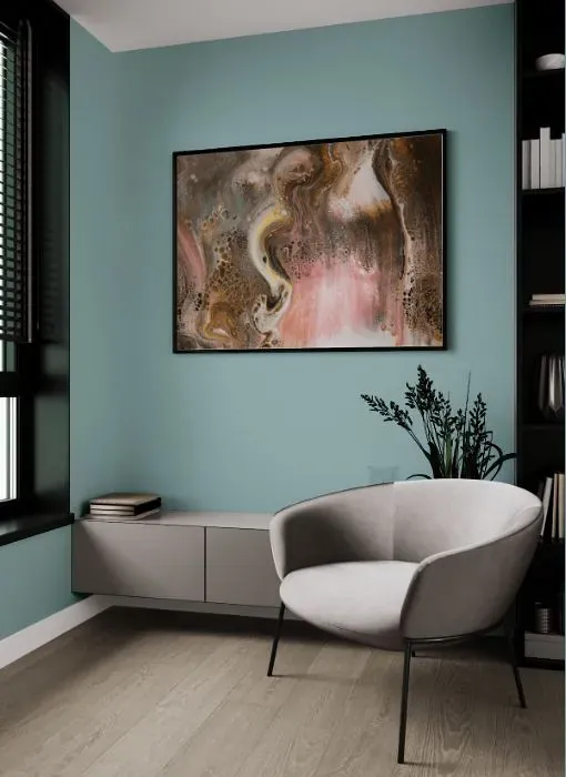
Behr's Harmonious (PPU13-12) is a soft and soothing shade that brings a sense of tranquility to any space. This versatile color effortlessly pairs with both contemporary and traditional decor, adding a touch of elegance and serenity. Ideal for bedrooms, living rooms, and home offices, Harmonious creates a peaceful atmosphere that promotes relaxation and mindfulness. Incorporating this gentle hue into your interior design scheme will evoke a sense of balance and harmony, making it the perfect choice for those seeking a peaceful retreat within their home.

Behr Harmonious reviews

Behr Harmonious wall
Plan Home visualization
Behr Harmonious bathroom
Plan Home visualization
Behr Harmonious minimalist bathroom
Plan Home visualization
Behr Harmonious kitchen painted backsplash
Plan Home visualization
Behr Harmonious kitchen backsplash
Plan Home visualization
Behr Harmonious living room interior
Plan Home visualization
Behr Harmonious kitchen review
Plan Home visualization
Behr Harmonious kitchen cabinets
Plan Home visualization
Behr Harmonious kitchen cabinets
Plan Home visualization
Behr Harmonious kitchen cabinets
Plan Home visualization
Behr Harmonious small kitchen cabinets
Plan Home visualization
Behr Harmonious kitchen cabinets
Plan Home visualization
Behr Harmonious victorian house interior
Plan Home visualization
Behr Harmonious kidsroom interior, children's room
Plan Home visualization
Behr Harmonious modern interior
Plan Home visualization
Behr Harmonious living room interior
Plan Home visualization
Behr Harmonious cozy living room
Plan Home visualization
Behr Harmonious living room
Plan Home visualization
Behr Harmonious living room walls
Plan Home visualization
Behr Harmonious living room
Plan Home visualization
Behr Harmonious japandi interior
Plan Home visualization
Behr Harmonious bedroom
Plan Home visualization
Behr Harmonious living room
Plan Home visualization

View the photos of real spaces painted with this that were not included in specific categories.Close-ups, painted furniture, storages and dressers, hallways, stairs and ceilings.

What are Behr Harmonious undertones?

Blue is Behr Harmonious undertone color, as you can clearly see on the color field below. To determine this undertone we’ve removed all the tints, tones, shades and get HUE (pure color). Seems that undertone definition on a white sheet is already outdated and rather inaccurate

R
G
B

HEX value

HEX value:

#9BB6B6

RGB code:

155, 182, 182

Is Behr Harmonious PPU13-12 cool or warm?

warm colors
Color wheel
cool colors

With a hue of 180° this Blue refers cool paint shade according to HSL (Hue, Saturation, Lightness) on the color wheel.

PPU13-12 Harmonious HSL code: 180, 16%, 66%

Hue - degree on a color wheel from 0 to 360. 0 is red, 120 is green, and 240 is blue.
Saturation is a percentage value. 0% is a shade of grey, and 100% is the full color.
Lightness is also a percentage value. 0% is black, and 100% is white.

  • Cool Blue shades make a room feel sleek, fresh and modern
  • Cooler hues have a calm and relaxation effect
  • Cool Blue undertones make small spaces feel more open and expansive
  • Cool paint hue are ideal for bedroom or bathroom. Be careful with deep blues and greens in bathroom, which will reflect on your skin.

Act like a pro: Mixing warm and cool shades is a must have to get harmonius interior. Add accents that contrast with the primary color to create visual balance. If your walls are a warm color, don’t forget to add accent in cold colors (furniture, art, décor). A good practice is too use a complementary color scheme.

Coordinating colors.
Colors that go with Behr Harmonious:

Monochromatic color scheme

Monochromatic color scheme

This scheme consists of different shades, tints, and tones of a single color. It's the perfect hue combination, but with no accent decor it's pretty boring.

Lighter shades

Darker shades

Complementary color scheme

Complementary color scheme

This color scheme is a combination of two colors that are opposite each other on the color wheel. The high contrast between these colors creates a vibrant and dynamic visual effect.

Color comparison

Harmonious PPU13-12 vs Dockside Blue SW 7601

Behr Harmonious PPU13-12 vs Sherwin Williams Dockside Blue SW 7601Open Harmonious PPU13-12
LRV: 42.38%
Light Medium color
Temperature: cold
LRV: 43.13%
Light Medium color
Temperature: cold

Harmonious PPU13-12 vs Aqua-Sphere SW 7613

Behr Harmonious PPU13-12 vs Sherwin Williams Aqua-Sphere SW 7613Open Harmonious PPU13-12
LRV: 42.38%
Light Medium color
Temperature: cold
LRV: 41.23%
Light Medium color
Temperature: cold