Behr Misted Fern P380-2
Contentsshow +hide -
| Code: | P380-2 |
| Name: | Misted Fern |
| Brand: | Behr |
What color is Behr Misted Fern?
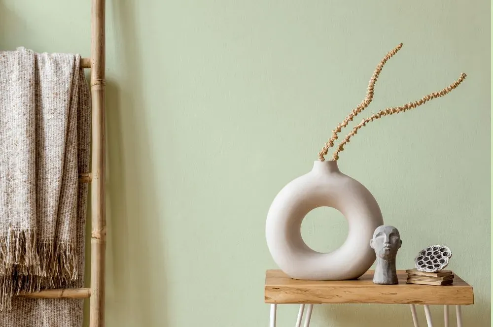
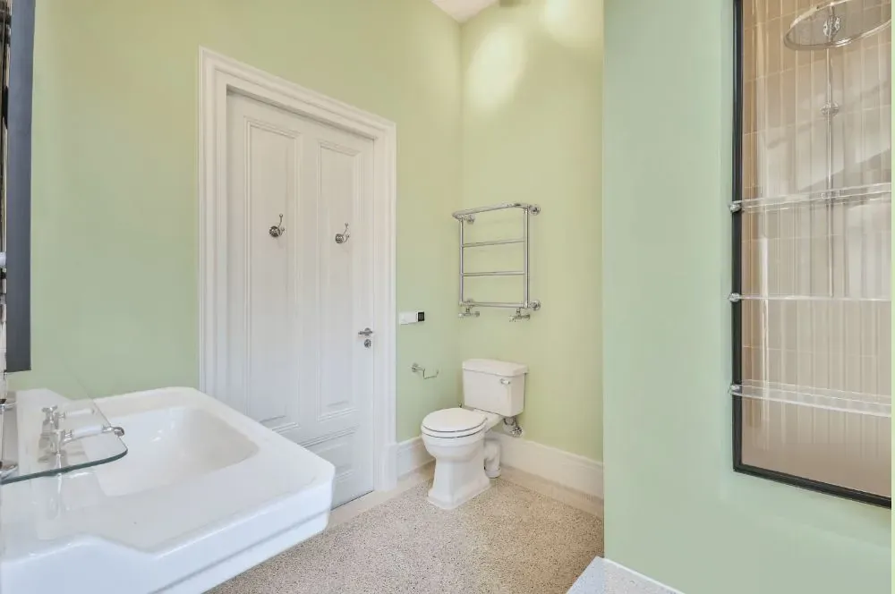
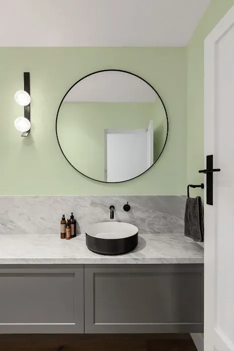
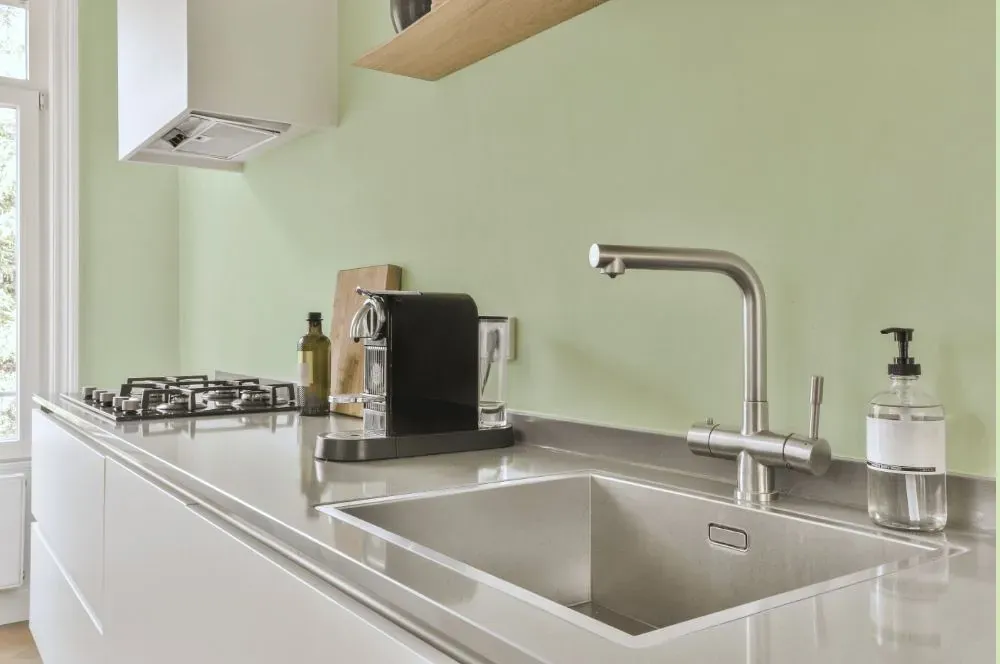
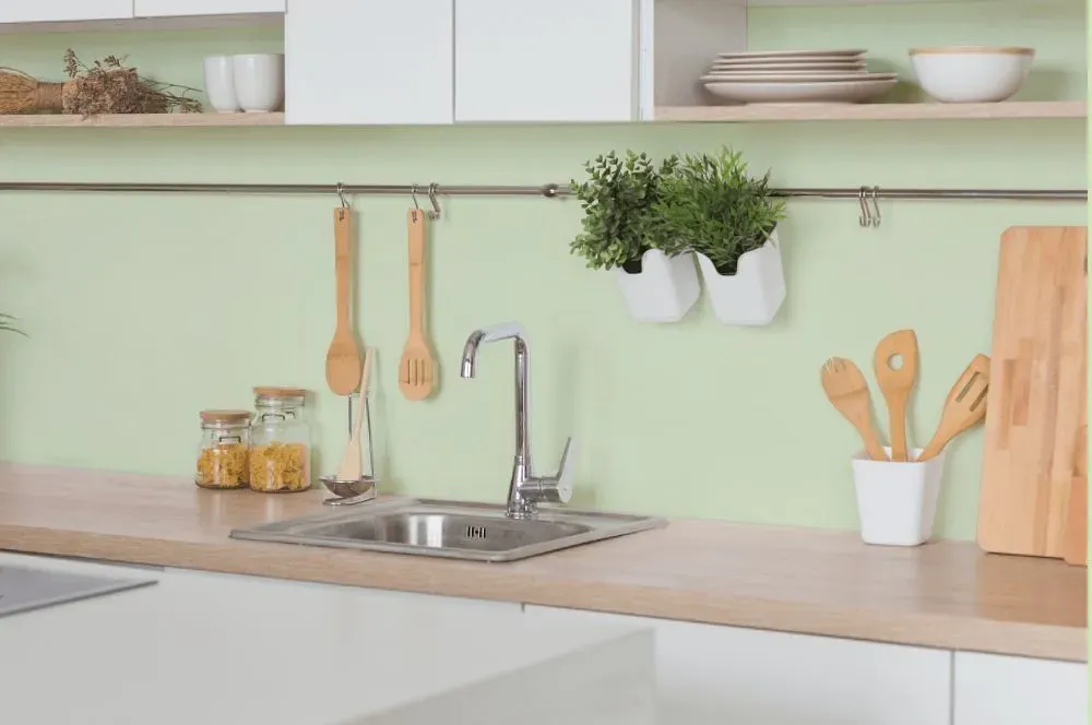
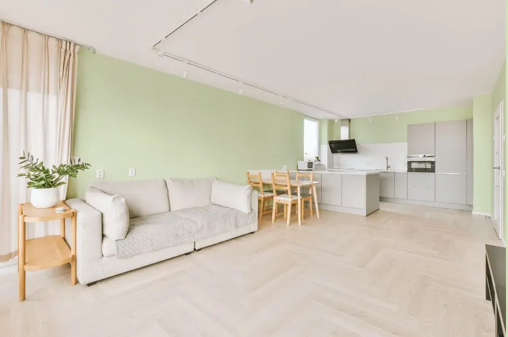
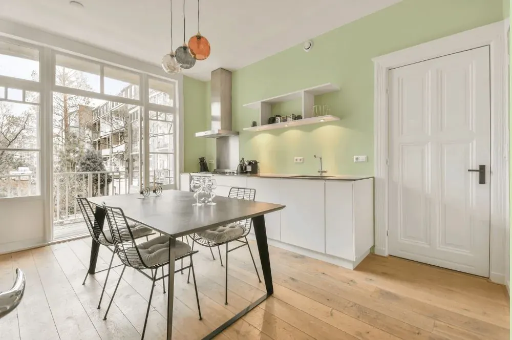
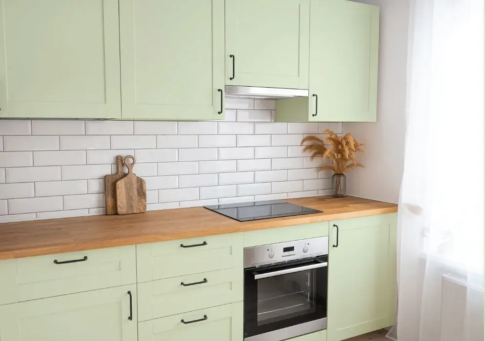
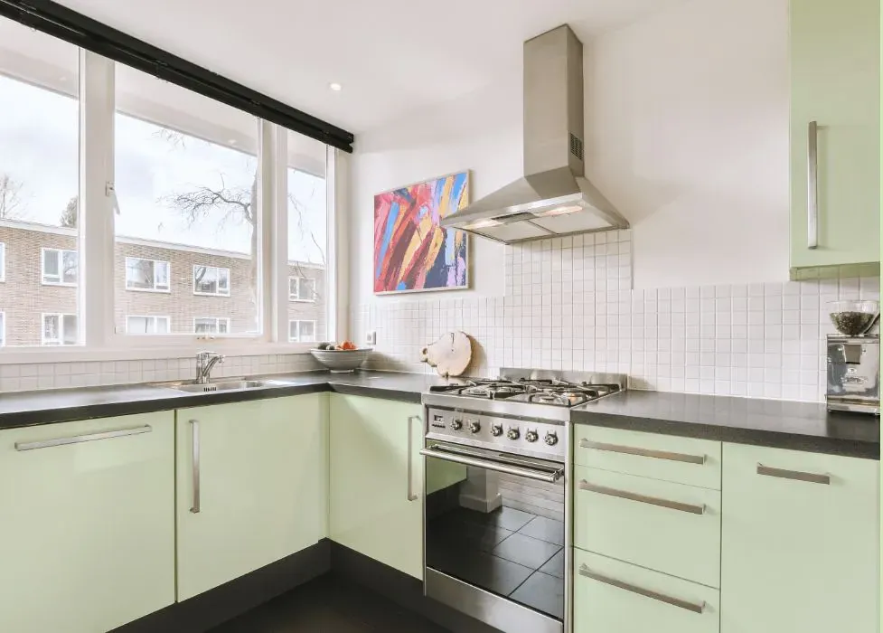
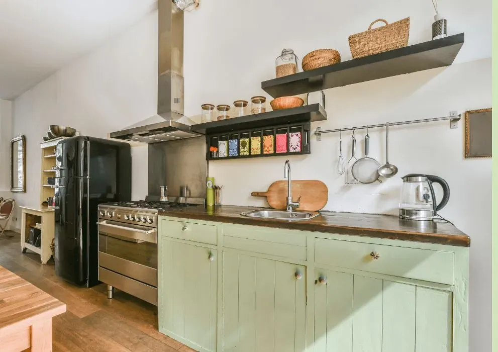
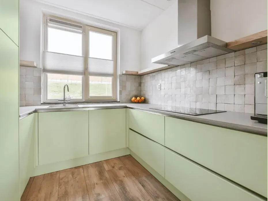
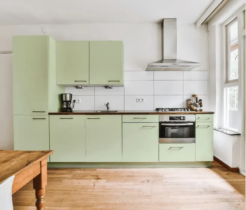
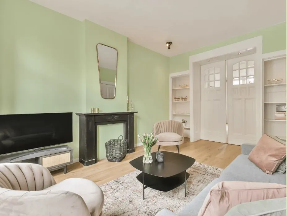
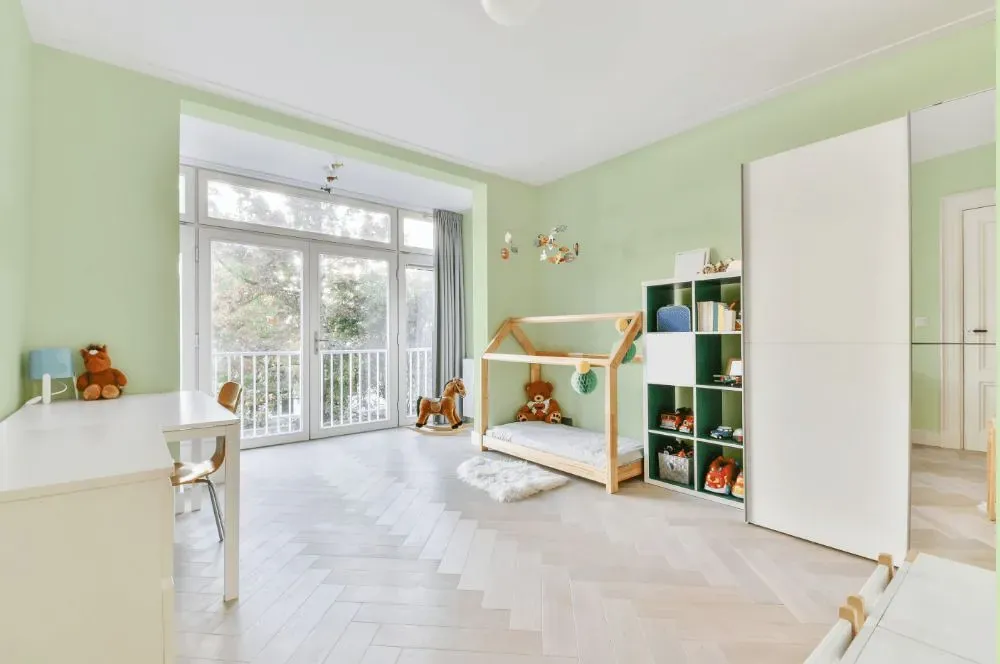
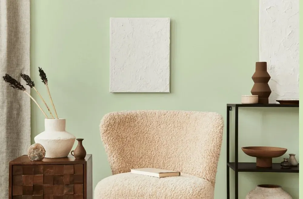
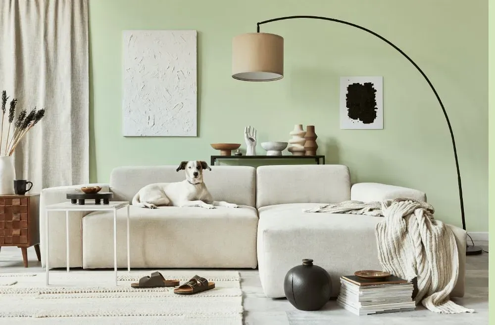
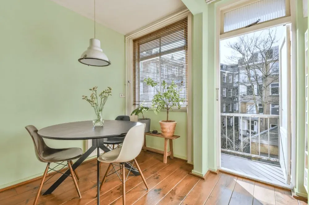
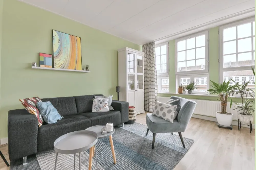
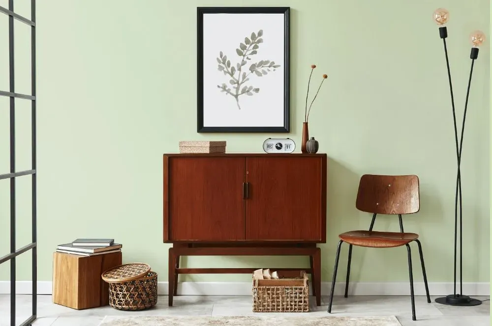
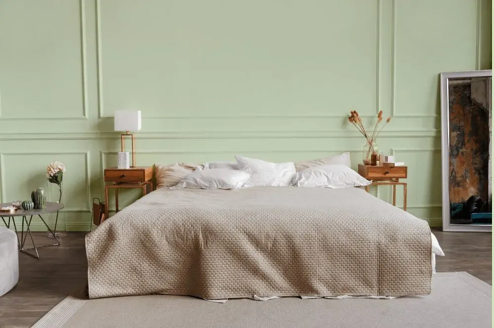
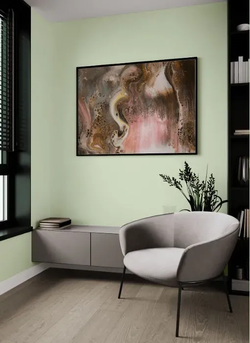
Explore the soothing charm of Behr P380-2, also known as Misted Fern, a soft and subtle green hue that brings a refreshing touch to any space. This delicate color pairs beautifully with earthy tones like warm browns and soft neutrals, creating a harmonious and inviting atmosphere. When combined with accents in shades of ivory and hints of rustic wood, Misted Fern adds a tranquil and organic feel to the room. Whether used as a wall color or through furnishings and decor, this understated green shade effortlessly complements a variety of styles and aesthetics, bringing a sense of calm and renewal to your living space.
Loading...
LRV of Misted Fern
Misted Fern has an LRV of 78.76% and refers to Off‑White colors that reflect a lot of light. Why LRV is important?

Light Reflectance Value measures the amount of visible and usable light that reflects from a painted surface.
Simply put, the higher the LRV of a paint color, the brighter the room you will get.
The scale goes from 0% (absolute black, absorbing all light) to 100% (pure white, reflecting all light).
Act like a pro: When choosing paint with an LRV of 78.76%, pay attention to your bulbs' brightness. Light brightness is measured in lumens. The lower the paint's LRV, the higher lumen level you need. Every square foot of room needs at least 40 lumens. That means for a 200 ft2 living room you'll need about 8000 lumens of light – e.g., eight 1000 lm bulbs.
Color codes
We have collected almost every possible color code you could ever need.
Not sure what the difference between HEX and RGB is? We break down color models in plain language. Understanding color models
| Format | Code |
|---|---|
| HEX | #e1ecd1 |
| RGB Decimal | 225, 236, 209 |
| RGB Percent | 88.24%, 92.55%, 81.96% |
| HSV | Hue: 84° Saturation: 11.44% Value: 92.55% |
| HSL | hsl(84, 42, 87) |
| CMYK | Cyan: 4.66 Magenta: 0.0 Yellow: 11.44 Key: 7.45 |
| YIQ | Y: 229.633 I: 2.121 Q: -10.729 |
| XYZ | X: 72.553 Y: 80.602 Z: 72.04 |
| CIE Lab | L:91.954 a:-8.363 b:11.853 |
| CIE Luv | L:91.954 u:-4.864 v:19.147 |
| Decimal | 14806225 |
| Hunter Lab | 89.779, -12.861, 15.27 |