Behr Polished Pearl PPU6-09
Contentsshow +hide -
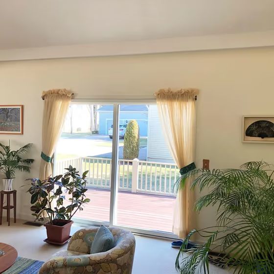
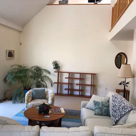
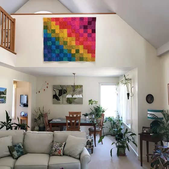
- Polished Pearl for living room (3 photos)
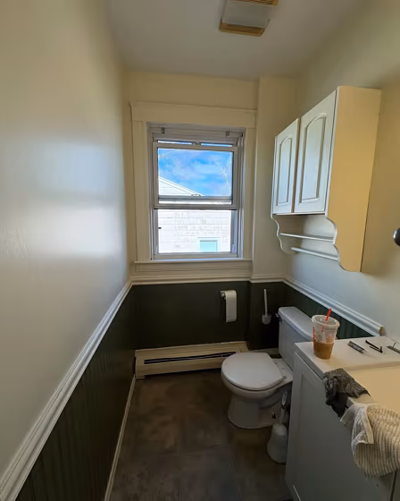
- Behr Polished Pearl for bathroom (2 photos)
- What are Behr Polished Pearl undertones?
- Is Polished Pearl PPU6-09 cool or warm?
- How light temperature affects on Polished Pearl
- Monochromatic color scheme
- Complementary color scheme
- Color comparison and matching
- LRV of Polished Pearl PPU6-09
- Color codes
- Color equivalents
| Code: | PPU6-09 |
| Name: | Polished Pearl |
| Brand: | Behr |
What color is Behr Polished Pearl?
Behr's PPU6-09 Polished Pearl is a soft, elegant shade that exudes sophistication. This versatile color pairs beautifully with rich jewel tones such as sapphire blue and emerald green for a luxurious feel. For a more modern look, combine Polished Pearl with crisp white and accents of charcoal gray. The subtle iridescence of Polished Pearl adds a touch of glamour to any space, making it the perfect choice for those looking to create a chic and timeless interior.
Loading...
LRV of Polished Pearl
Polished Pearl has an LRV of 85.33% and refers to White colors that reflect almost all light. Why LRV is important?

Light Reflectance Value measures the amount of visible and usable light that reflects from a painted surface.
Simply put, the higher the LRV of a paint color, the brighter the room you will get.
The scale goes from 0% (absolute black, absorbing all light) to 100% (pure white, reflecting all light).
Act like a pro: When choosing paint with an LRV of 85.33%, pay attention to your bulbs' brightness. Light brightness is measured in lumens. The lower the paint's LRV, the higher lumen level you need. Every square foot of room needs at least 40 lumens. That means for a 200 ft2 living room you'll need about 8000 lumens of light – e.g., eight 1000 lm bulbs.
Color codes
We have collected almost every possible color code you could ever need.
Not sure what the difference between HEX and RGB is? We break down color models in plain language. Understanding color models
| Format | Code |
|---|---|
| HEX | #f8edd7 |
| RGB Decimal | 248, 237, 215 |
| RGB Percent | 97.25%, 92.94%, 84.31% |
| HSV | Hue: 40° Saturation: 13.31% Value: 97.25% |
| HSL | hsl(40, 70, 91) |
| CMYK | Cyan: 0.0 Magenta: 4.44 Yellow: 13.31 Key: 2.75 |
| YIQ | Y: 237.781 I: 13.624 Q: -4.519 |
| XYZ | X: 81.259 Y: 85.432 Z: 76.481 |
| CIE Lab | L:94.069 a:0.114 b:11.99 |
| CIE Luv | L:94.069 u:7.711 v:17.828 |
| Decimal | 16313815 |
| Hunter Lab | 92.43, -4.824, 15.641 |