Behr Prairie Rose M170-2
Contentsshow +hide -
| Code: | M170-2 |
| Name: | Prairie Rose |
| Brand: | Behr |
What color is Behr Prairie Rose?
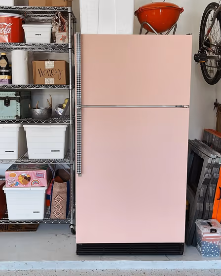
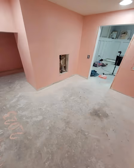
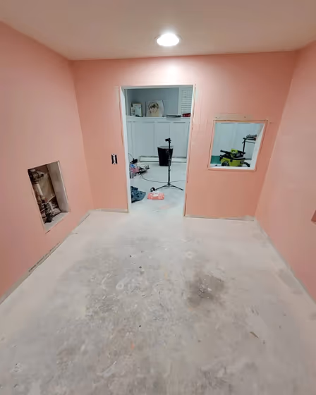
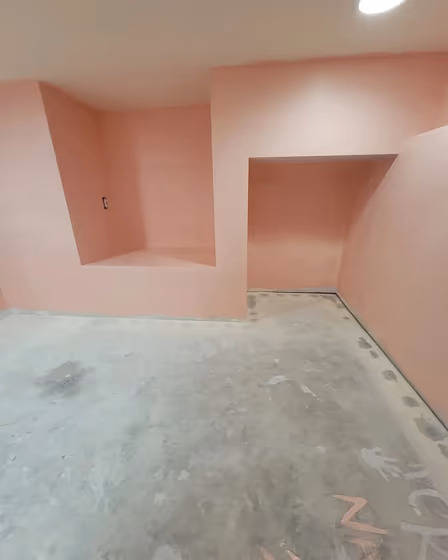
Welcome to a space adorned with the warm and inviting tones of Behr M170-2 Prairie Rose. This charming hue effortlessly infuses a room with a soft, rosy glow that exudes tranquility and sophistication. Pairing beautifully with neutrals such as Behr HDC-NT-20 Cotton Grey and Behr N200-2 Authentic Tan, Prairie Rose creates a harmonious and balanced ambiance. For a more dynamic look, consider accenting with deep shades like Behr T16-08 Black Ruby or Behr S180-7 Licorice Stick to add depth and contrast to your decor. Elevate your space with the timeless elegance of Prairie Rose and transform your room into a sanctuary of style and comfort.
Loading...
LRV of Prairie Rose
Prairie Rose has an LRV of 65.31% and refers to Light colors that reflect most of the incident light. Why LRV is important?

Light Reflectance Value measures the amount of visible and usable light that reflects from a painted surface.
Simply put, the higher the LRV of a paint color, the brighter the room you will get.
The scale goes from 0% (absolute black, absorbing all light) to 100% (pure white, reflecting all light).
Act like a pro: When choosing paint with an LRV of 65.31%, pay attention to your bulbs' brightness. Light brightness is measured in lumens. The lower the paint's LRV, the higher lumen level you need. Every square foot of room needs at least 40 lumens. That means for a 200 ft2 living room you'll need about 8000 lumens of light – e.g., eight 1000 lm bulbs.
Color codes
We have collected almost every possible color code you could ever need.
Not sure what the difference between HEX and RGB is? We break down color models in plain language. Understanding color models
| Format | Code |
|---|---|
| HEX | #f2c8be |
| RGB Decimal | 242, 200, 190 |
| RGB Percent | 94.90%, 78.43%, 74.51% |
| HSV | Hue: 12° Saturation: 21.49% Value: 94.9% |
| HSL | hsl(12, 67, 85) |
| CMYK | Cyan: 0.0 Magenta: 17.36 Yellow: 21.49 Key: 5.1 |
| YIQ | Y: 211.418 I: 28.241 Q: 5.773 |
| XYZ | X: 66.566 Y: 63.906 Z: 57.53 |
| CIE Lab | L:83.917 a:13.35 b:10.583 |
| CIE Luv | L:83.917 u:26.689 v:12.939 |
| Decimal | 15911102 |
| Hunter Lab | 79.941, 8.738, 13.291 |