Behr Provence Blue HDC-AC-23
Contentsshow +hide -
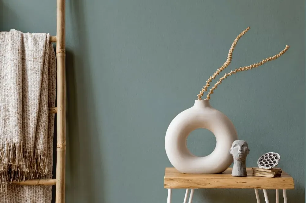
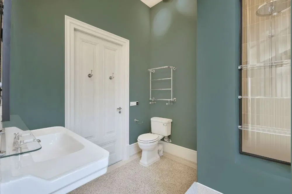
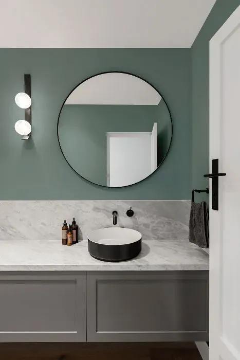
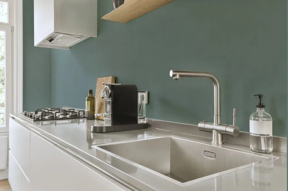
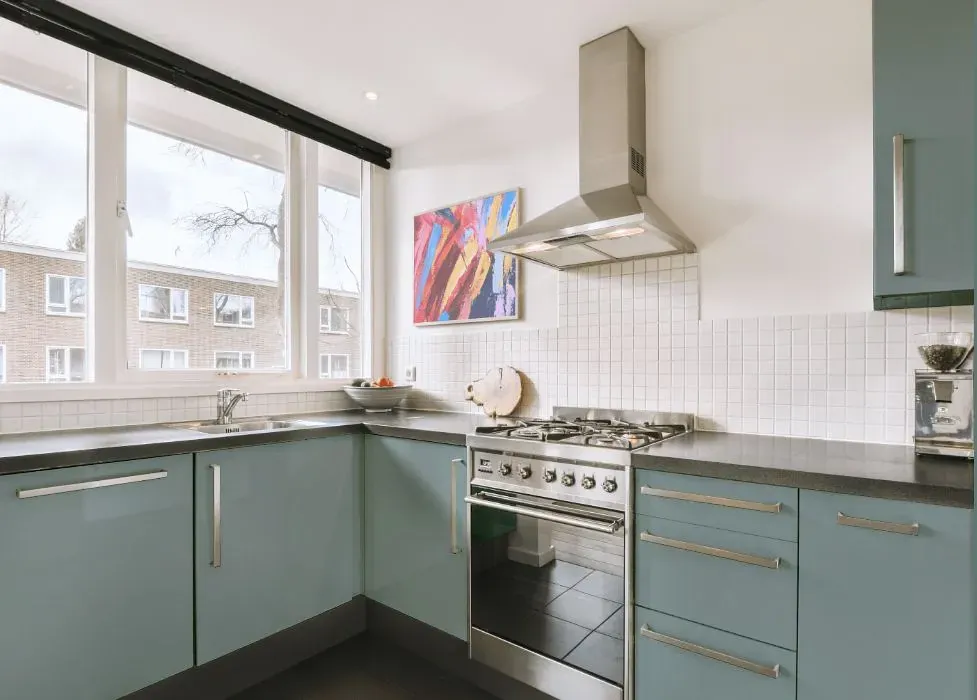
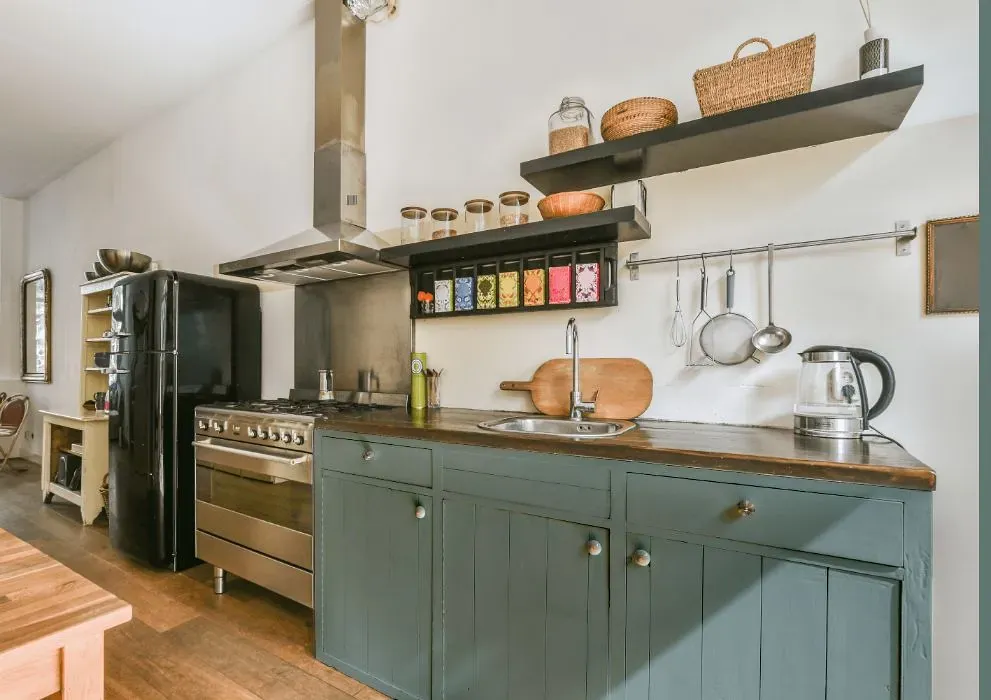
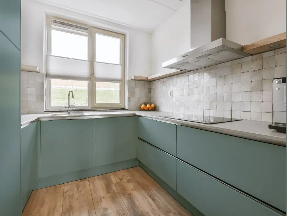
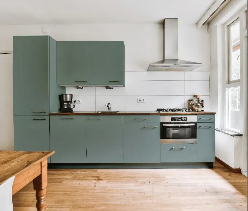
- Behr Provence Blue reviews (23 photos)
- What are Behr Provence Blue undertones?
- Is Provence Blue HDC-AC-23 cool or warm?
- How light temperature affects on Provence Blue
- Monochromatic color scheme
- Complementary color scheme
- Color comparison and matching
- LRV of Provence Blue HDC-AC-23
- Color codes
- Color equivalents
| Code: | HDC-AC-23 |
| Name: | Provence Blue |
| Brand: | Behr |
What color is Behr Provence Blue?
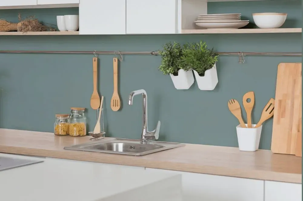
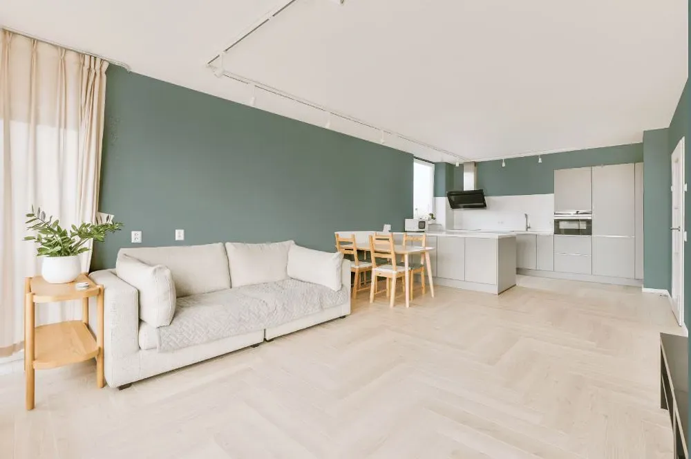
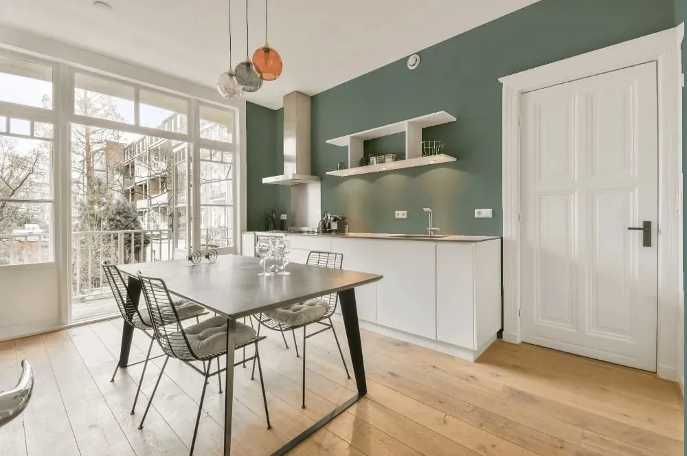
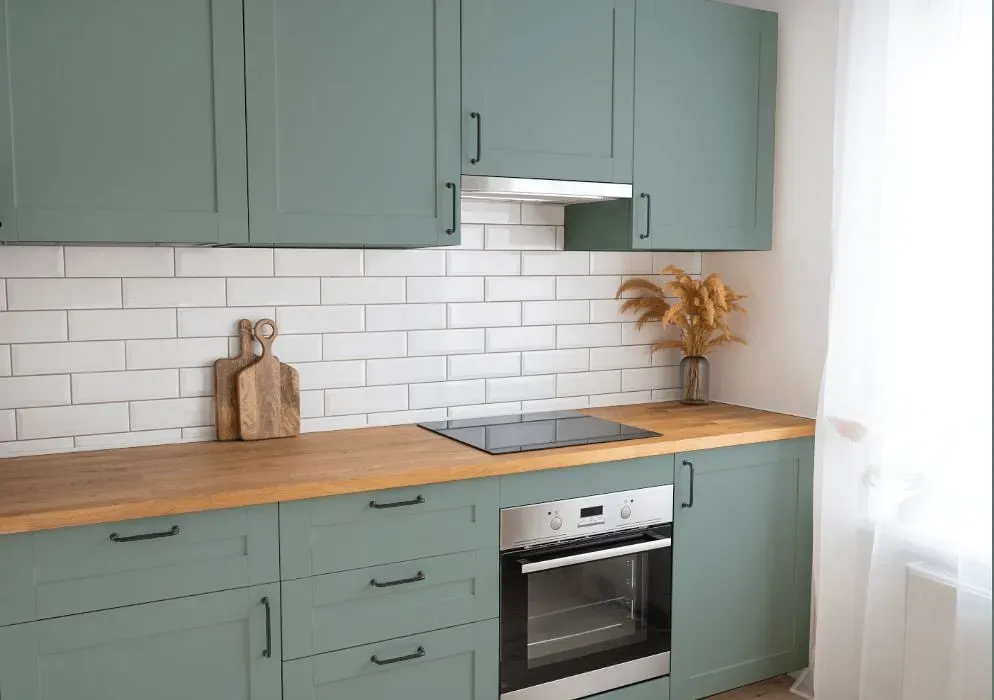
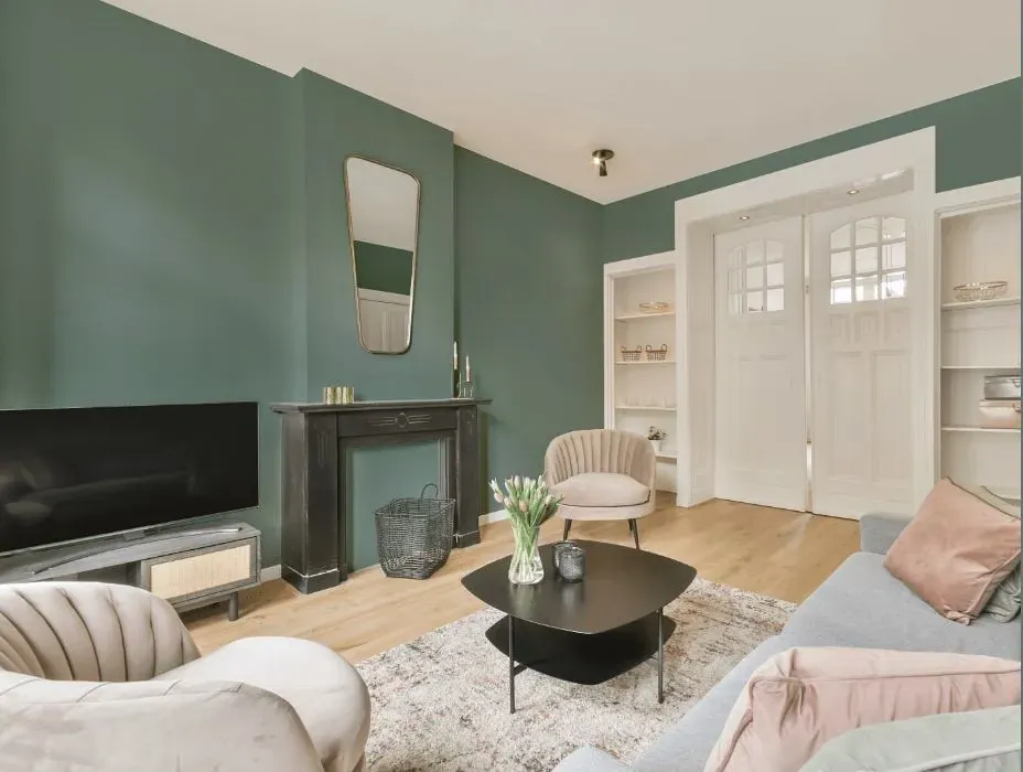
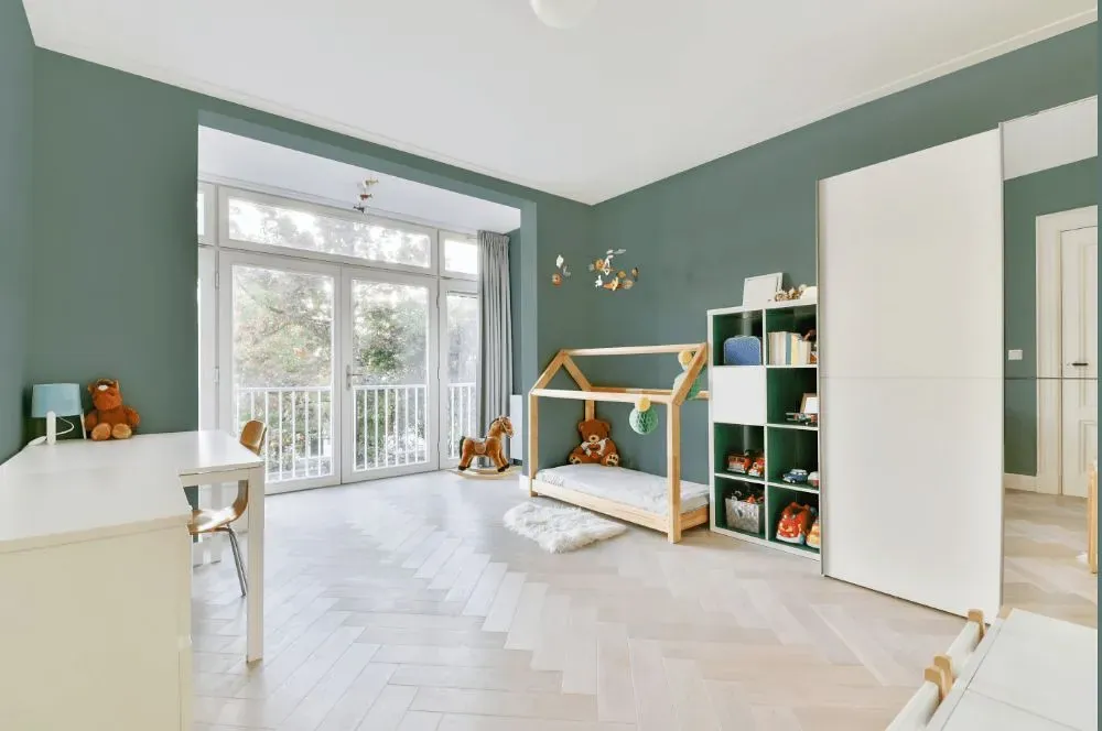
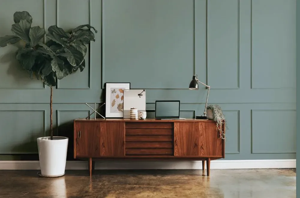
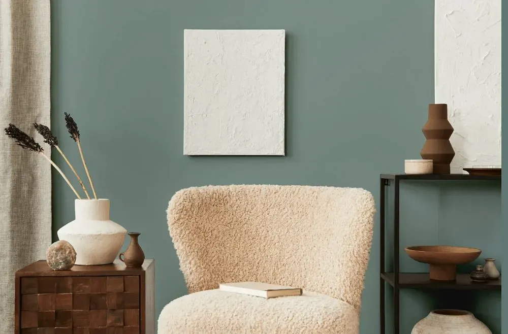
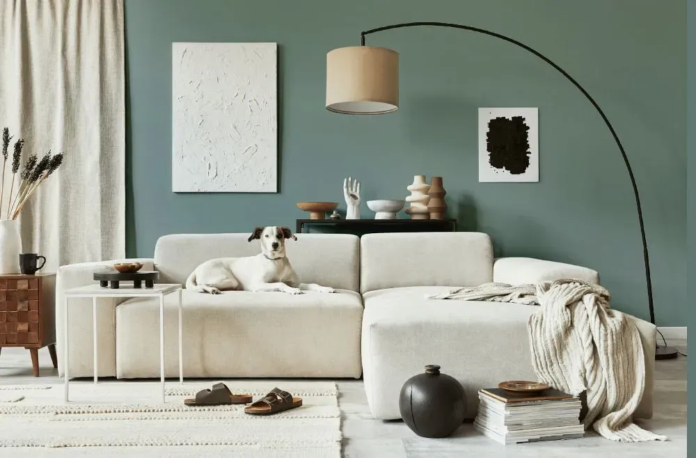
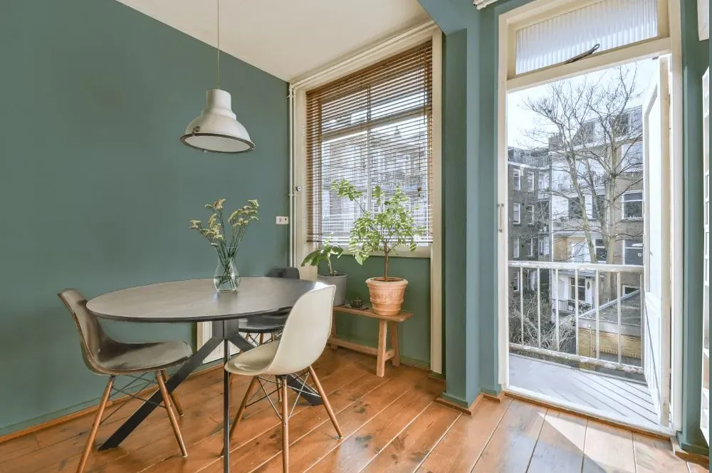
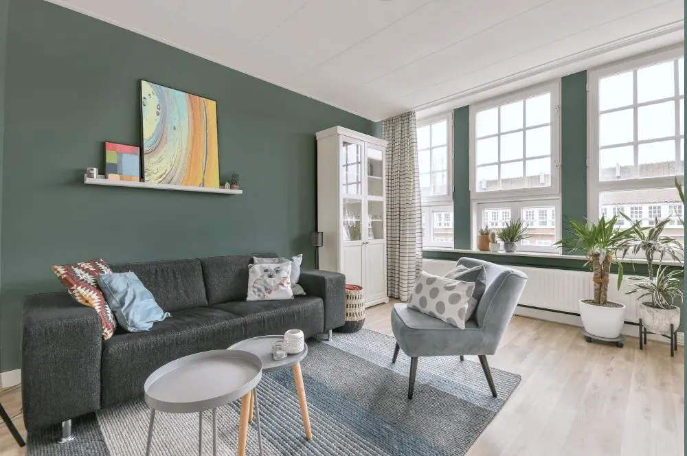
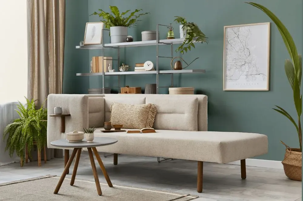
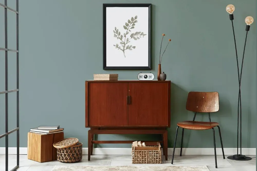
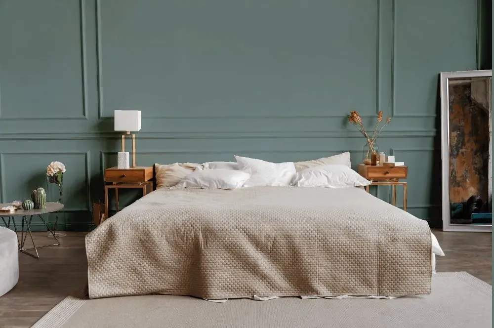
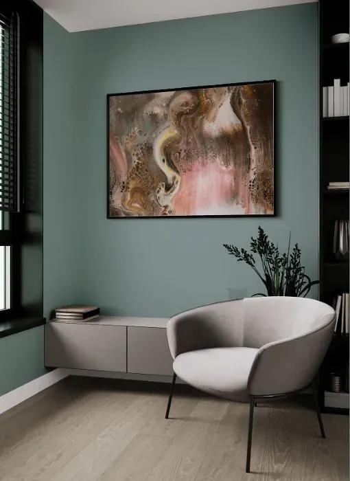
The delicate hue of Behr HDC-AC-23 Provence Blue adds a touch of serene elegance to any space. This subtle blue shade complements well with neutral tones like off-white, warm grays, and natural wood finishes. Pairing Provence Blue with accents in rich greens or soft pinks can create a harmonious color palette that feels both inviting and sophisticated. Whether used on walls or furniture, this soothing color effortlessly brings a sense of tranquility and sophistication to any room. Embrace the timeless charm of Provence Blue and elevate your interiors with its calming presence.
Loading...
LRV of Provence Blue
Provence Blue has an LRV of 30.8% and refers to Medium colors that reflect a lot of light. Why LRV is important?

Light Reflectance Value measures the amount of visible and usable light that reflects from a painted surface.
Simply put, the higher the LRV of a paint color, the brighter the room you will get.
The scale goes from 0% (absolute black, absorbing all light) to 100% (pure white, reflecting all light).
Act like a pro: When choosing paint with an LRV of 30.8%, pay attention to your bulbs' brightness. Light brightness is measured in lumens. The lower the paint's LRV, the higher lumen level you need. Every square foot of room needs at least 40 lumens. That means for a 200 ft2 living room you'll need about 8000 lumens of light – e.g., eight 1000 lm bulbs.
Color codes
We have collected almost every possible color code you could ever need.
Not sure what the difference between HEX and RGB is? We break down color models in plain language. Understanding color models
| Format | Code |
|---|---|
| HEX | #8a9c99 |
| RGB Decimal | 138, 156, 153 |
| RGB Percent | 54.12%, 61.18%, 60.00% |
| HSV | Hue: 170° Saturation: 11.54% Value: 61.18% |
| HSL | hsl(170, 8, 58) |
| CMYK | Cyan: 11.54 Magenta: 0.0 Yellow: 1.92 Key: 38.82 |
| YIQ | Y: 150.276 I: -9.762 Q: -4.741 |
| XYZ | X: 28.118 Y: 31.48 Z: 34.723 |
| CIE Lab | L:62.91 a:-6.973 b:-0.589 |
| CIE Luv | L:62.91 u:-9.633 v:0.292 |
| Decimal | 9084057 |
| Hunter Lab | 56.107, -8.732, 2.581 |