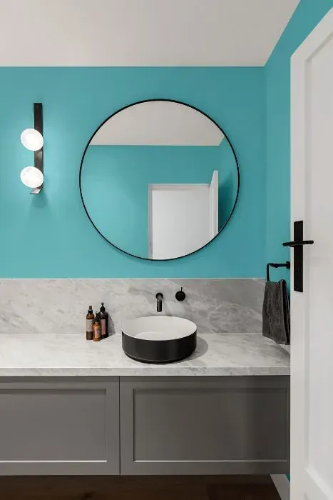
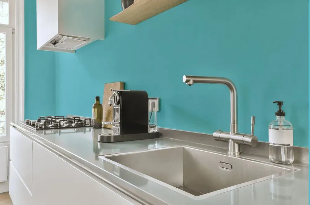
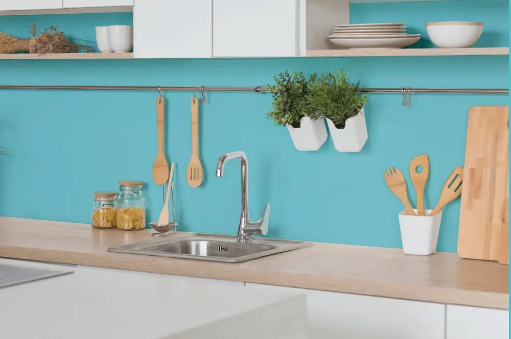
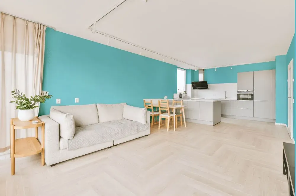
Behr Sea Of Tranquility P470-3
Contentsshow +hide -
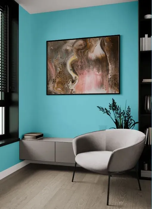
- Behr Sea Of Tranquility reviews (21 photos)
- What are Behr Sea Of Tranquility undertones?
- Is Sea Of Tranquility P470-3 cool or warm?
- How light temperature affects on Sea Of Tranquility
- Monochromatic color scheme
- Complementary color scheme
- Color comparison and matching
- LRV of Sea Of Tranquility P470-3
- Color codes
- Color equivalents
| Code: | P470-3 |
| Name: | Sea Of Tranquility |
| Brand: | Behr |
What color is Behr Sea Of Tranquility?
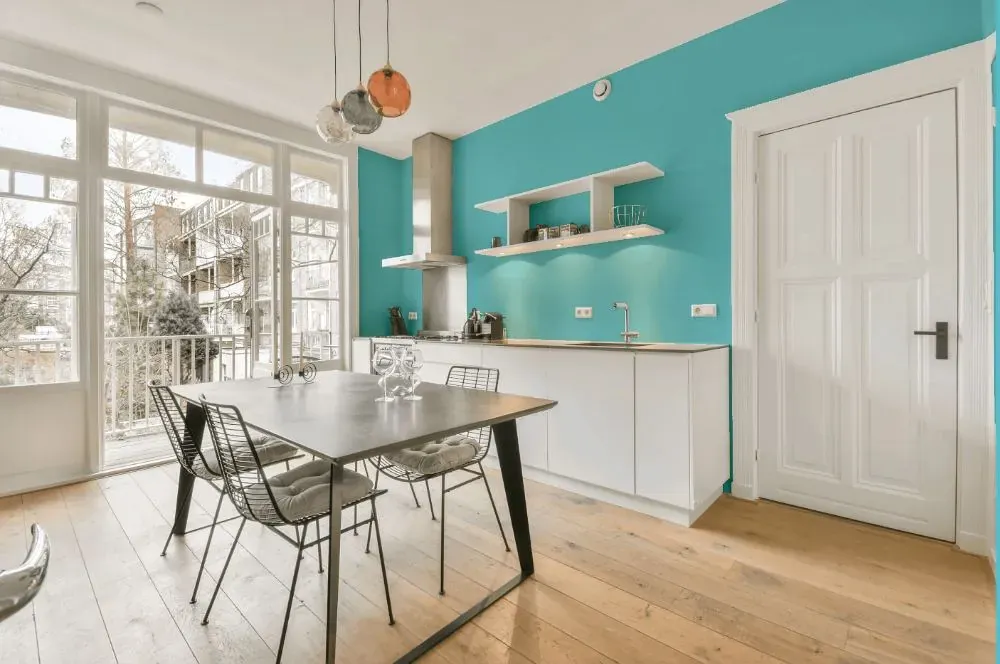
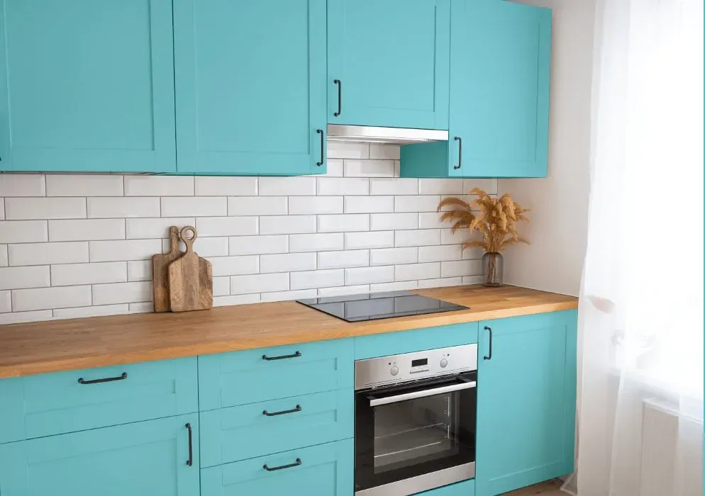
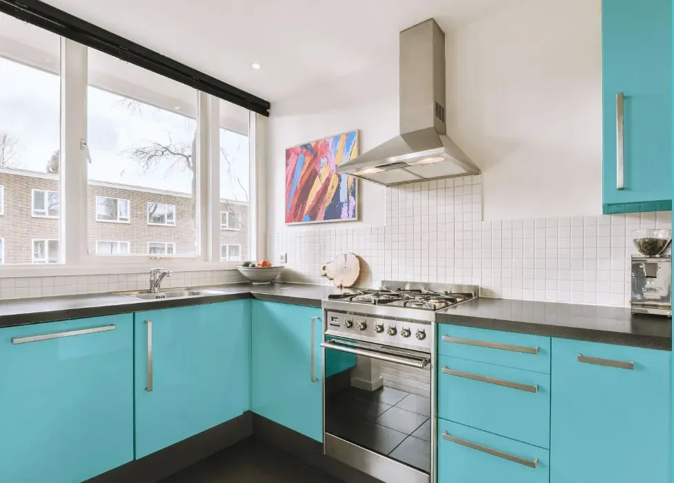
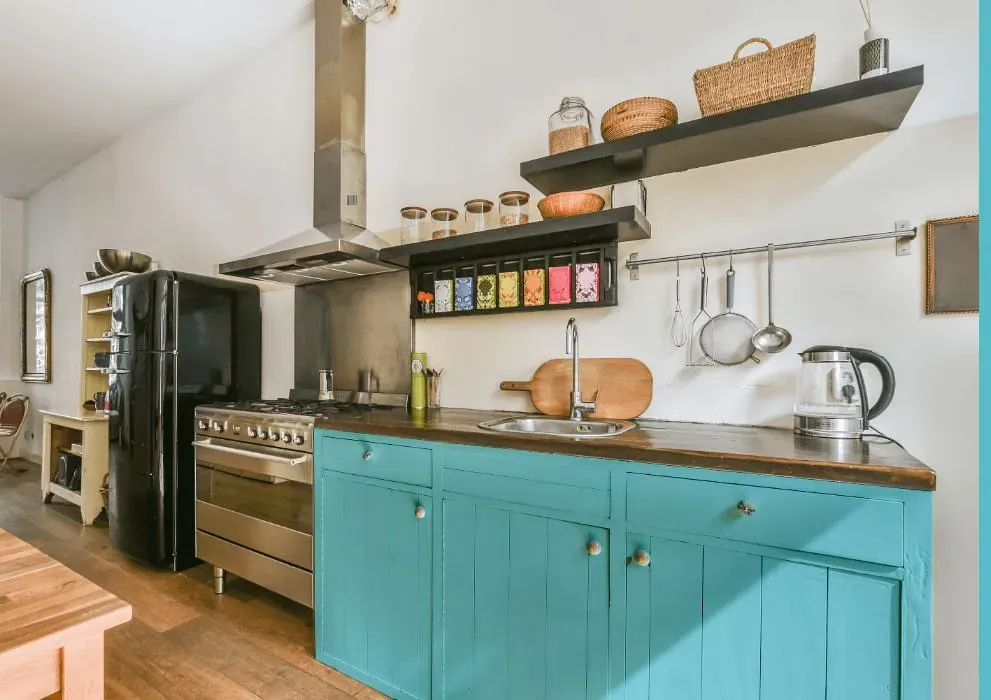
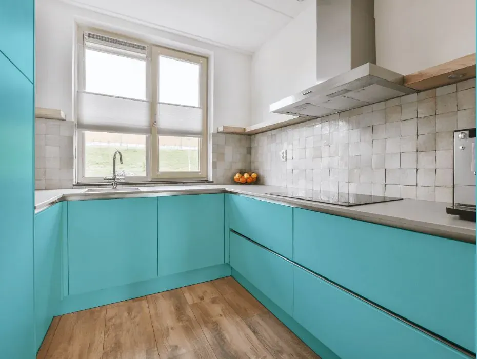
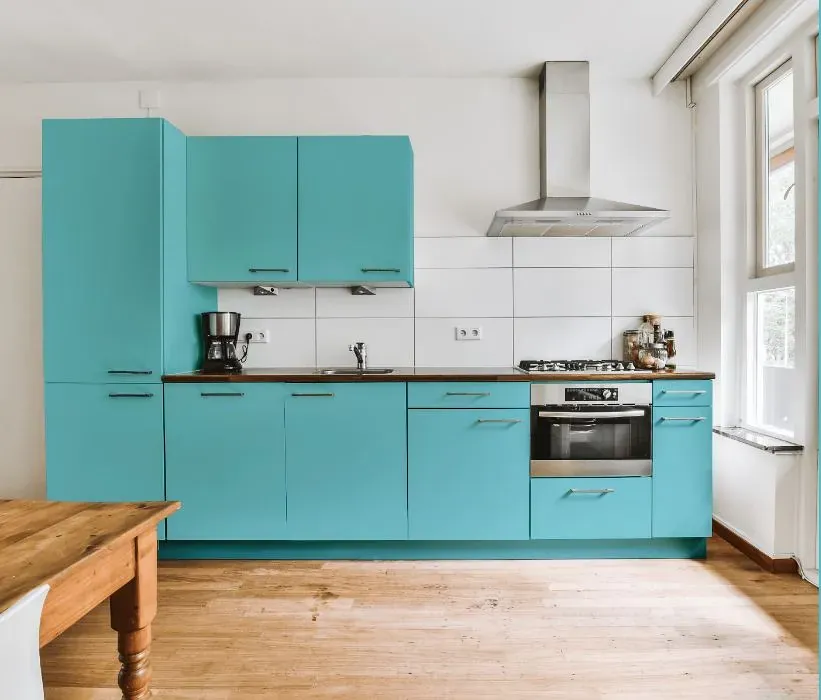
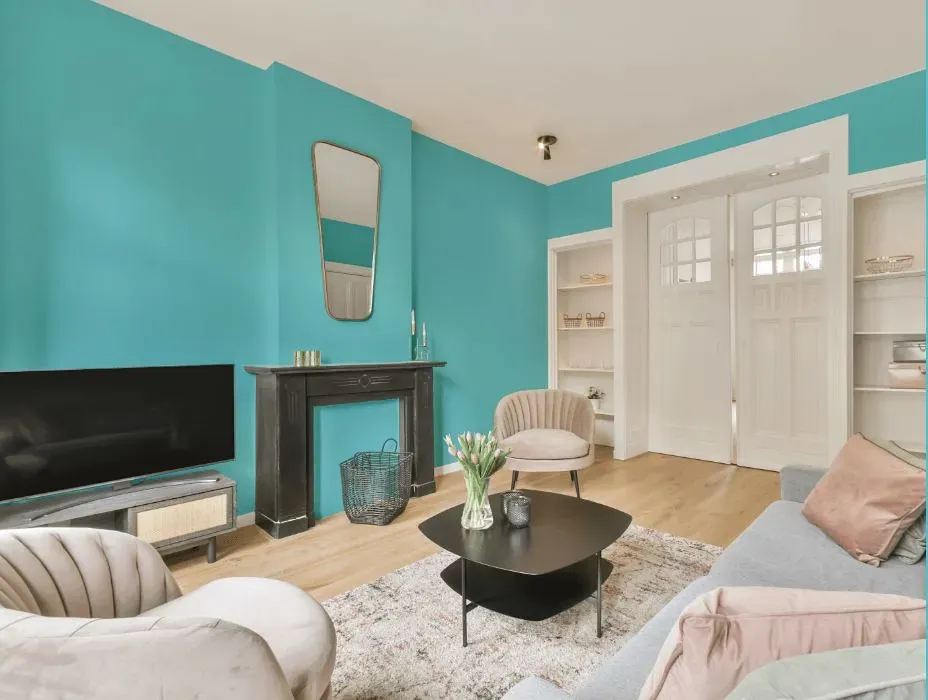
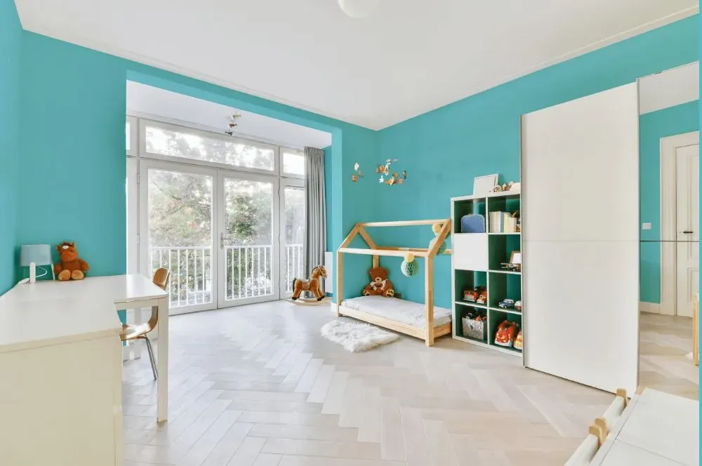
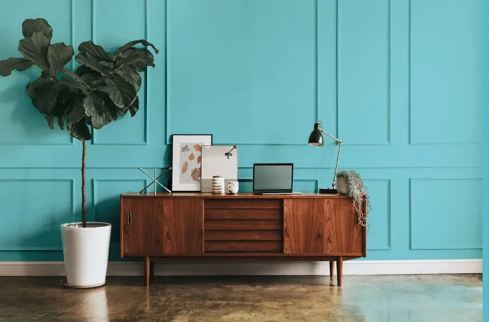
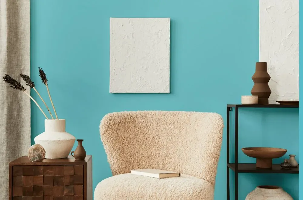
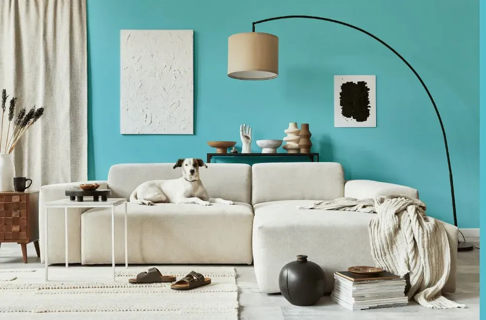
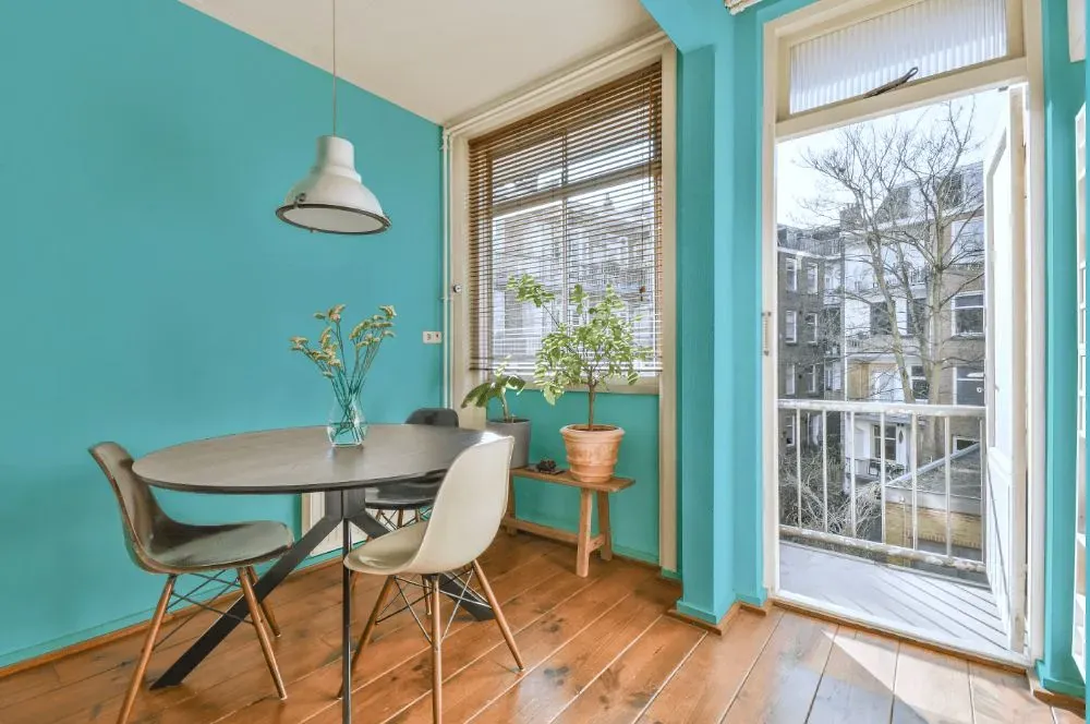
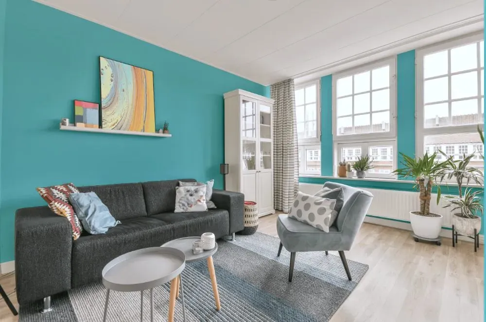
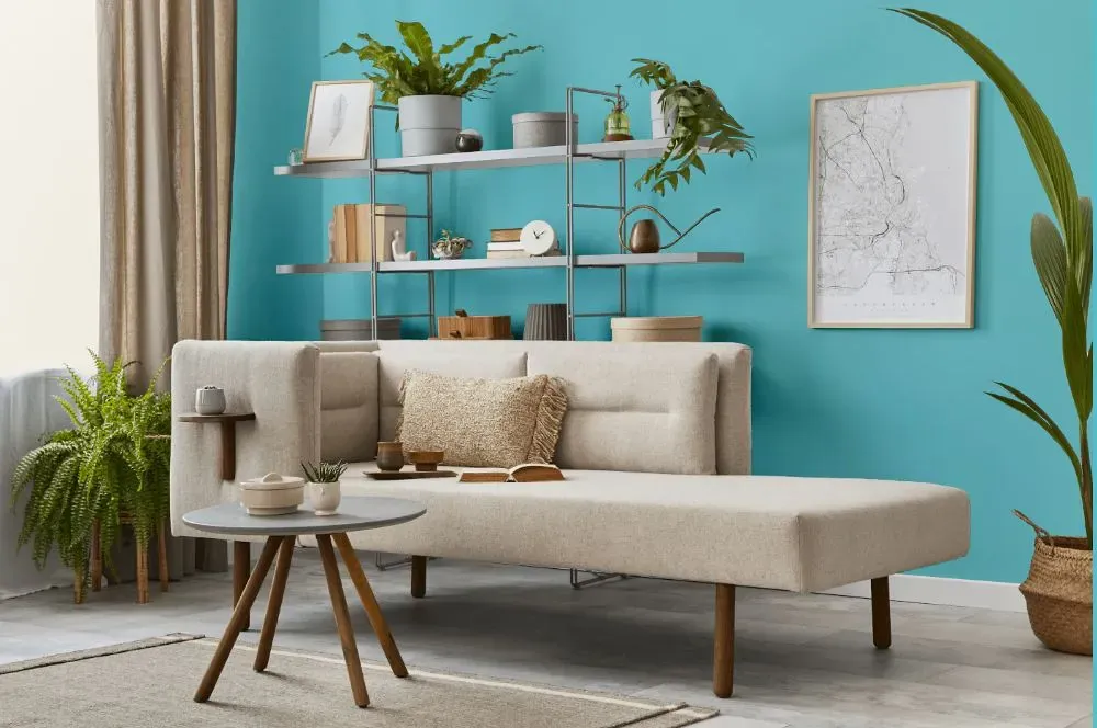
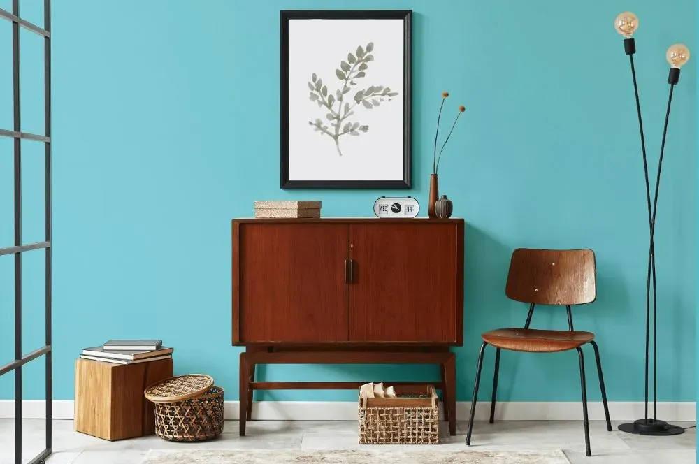
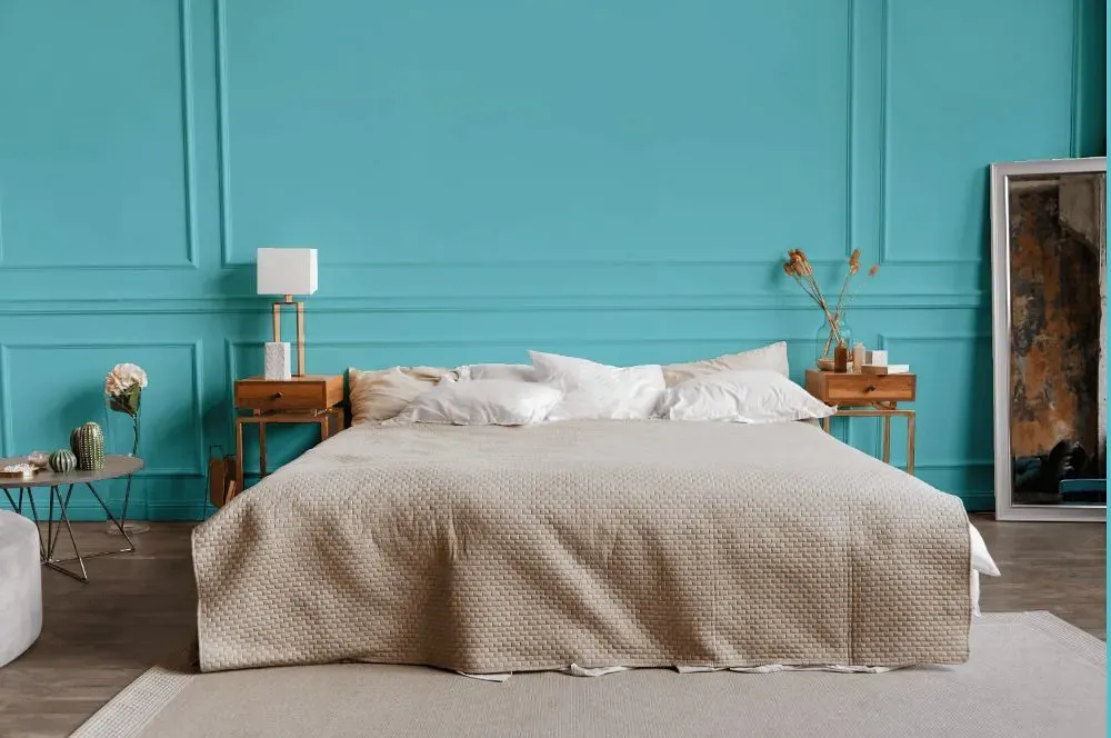
Step into a peaceful sanctuary with Behr Sea Of Tranquility P470-3. This serene hue brings a sense of calm to any space, making it ideal for bedrooms, living rooms, and home offices. The soft, gentle tones of Sea Of Tranquility create a soothing atmosphere, perfect for unwinding after a long day. Whether used as an accent wall or as the main color in a room, this versatile shade pairs beautifully with both light and dark furnishings, adding a touch of elegance to your decor. Embrace the tranquility of Behr P470-3 Sea Of Tranquility and transform your space into a relaxing retreat.
Loading...
LRV of Sea Of Tranquility
Sea Of Tranquility has an LRV of 49.18% and refers to Light Medium colors that reflect half of the incident light. Why LRV is important?

Light Reflectance Value measures the amount of visible and usable light that reflects from a painted surface.
Simply put, the higher the LRV of a paint color, the brighter the room you will get.
The scale goes from 0% (absolute black, absorbing all light) to 100% (pure white, reflecting all light).
Act like a pro: When choosing paint with an LRV of 49.18%, pay attention to your bulbs' brightness. Light brightness is measured in lumens. The lower the paint's LRV, the higher lumen level you need. Every square foot of room needs at least 40 lumens. That means for a 200 ft2 living room you'll need about 8000 lumens of light – e.g., eight 1000 lm bulbs.
Color codes
We have collected almost every possible color code you could ever need.
Not sure what the difference between HEX and RGB is? We break down color models in plain language. Understanding color models
| Format | Code |
|---|---|
| HEX | #81d1da |
| RGB Decimal | 129, 209, 218 |
| RGB Percent | 50.59%, 81.96%, 85.49% |
| HSV | Hue: 186° Saturation: 40.83% Value: 85.49% |
| HSL | hsl(186, 55, 68) |
| CMYK | Cyan: 40.83 Magenta: 4.13 Yellow: 0.0 Key: 14.51 |
| YIQ | Y: 186.106 I: -50.564 Q: -14.122 |
| XYZ | X: 44.503 Y: 55.327 Z: 74.645 |
| CIE Lab | L:79.229 a:-22.212 b:-12.162 |
| CIE Luv | L:79.229 u:-36.838 v:-15.427 |
| Decimal | 8507866 |
| Hunter Lab | 74.382, -23.371, -7.432 |