Behr Tuscany Hillside PPU10-02
Contentsshow +hide -
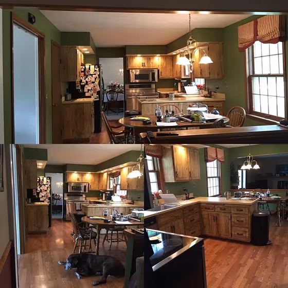
- Behr Tuscany Hillside reviews (1 photo)
- What are Behr Tuscany Hillside undertones?
- Is Tuscany Hillside PPU10-02 cool or warm?
- How light temperature affects on Tuscany Hillside
- Monochromatic color scheme
- Complementary color scheme
- Color comparison and matching
- LRV of Tuscany Hillside PPU10-02
- Color codes
- Color equivalents
| Code: | PPU10-02 |
| Name: | Tuscany Hillside |
| Brand: | Behr |
What color is Behr Tuscany Hillside?
Evoke the warmth and charm of the rolling Italian countryside with Behr Tuscany Hillside (PPU10-02). This rich and earthy hue blends notes of terracotta and olive green, infusing a space with a sense of rustic elegance. Ideal for cozying up a living room or bringing a touch of Mediterranean flair to a kitchen, Tuscany Hillside is the perfect choice for creating a welcoming and inviting atmosphere. Incorporate this versatile color into accent walls or furniture pieces to add depth and character to any space. Let Behr PPU10-02 Tuscany Hillside transport you to the sun-drenched hills of Tuscany right in the comfort of your own home.
Loading...
LRV of Tuscany Hillside
Tuscany Hillside has an LRV of 21.67% and refers to Medium colors that reflect a lot of light. Why LRV is important?

Light Reflectance Value measures the amount of visible and usable light that reflects from a painted surface.
Simply put, the higher the LRV of a paint color, the brighter the room you will get.
The scale goes from 0% (absolute black, absorbing all light) to 100% (pure white, reflecting all light).
Act like a pro: When choosing paint with an LRV of 21.67%, pay attention to your bulbs' brightness. Light brightness is measured in lumens. The lower the paint's LRV, the higher lumen level you need. Every square foot of room needs at least 40 lumens. That means for a 200 ft2 living room you'll need about 8000 lumens of light – e.g., eight 1000 lm bulbs.
Color codes
We have collected almost every possible color code you could ever need.
Not sure what the difference between HEX and RGB is? We break down color models in plain language. Understanding color models
| Format | Code |
|---|---|
| HEX | #7e875f |
| RGB Decimal | 126, 135, 95 |
| RGB Percent | 49.41%, 52.94%, 37.25% |
| HSV | Hue: 73° Saturation: 29.63% Value: 52.94% |
| HSL | hsl(74, 17, 45) |
| CMYK | Cyan: 6.67 Magenta: 0.0 Yellow: 29.63 Key: 47.06 |
| YIQ | Y: 127.749 I: 7.491 Q: -14.352 |
| XYZ | X: 19.333 Y: 22.59 Z: 14.165 |
| CIE Lab | L:54.647 a:-10.461 b:20.465 |
| CIE Luv | L:54.647 u:-3.433 v:27.761 |
| Decimal | 8292191 |
| Hunter Lab | 47.529, -10.567, 15.6 |