Behr Unimaginable P560-5
Contentsshow +hide -
| Code: | P560-5 |
| Name: | Unimaginable |
| Brand: | Behr |
What color is Behr Unimaginable?
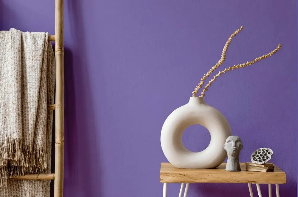
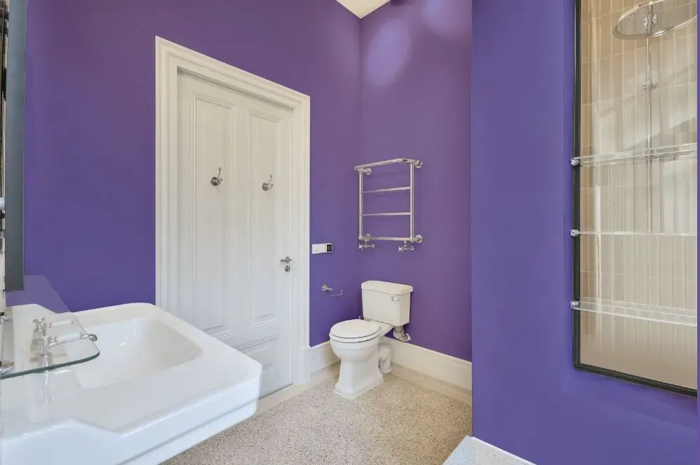
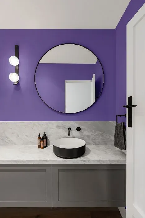
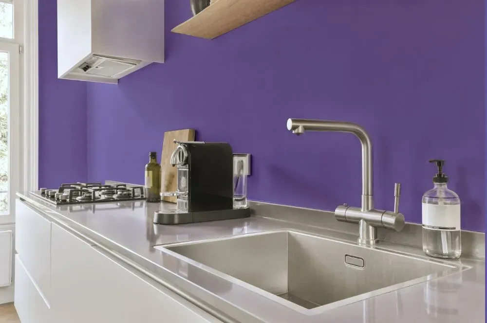
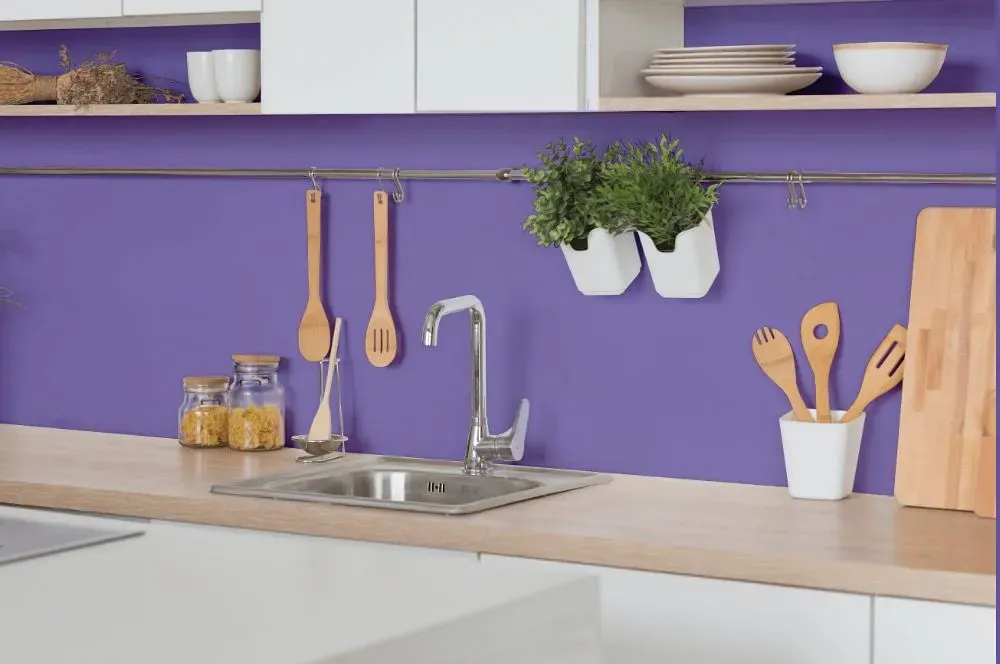
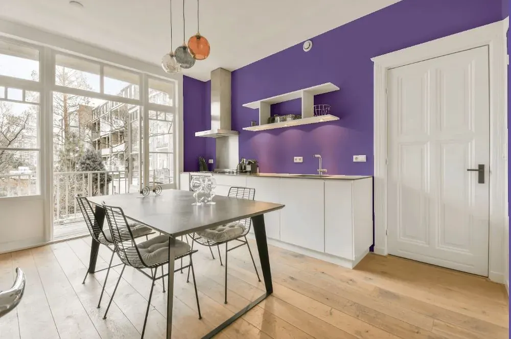
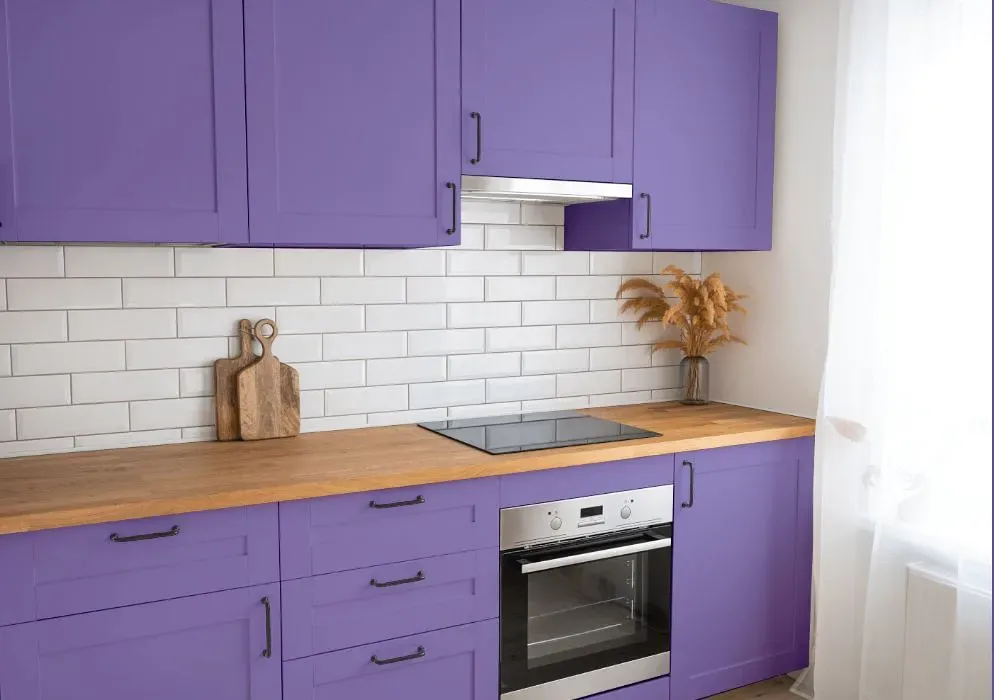
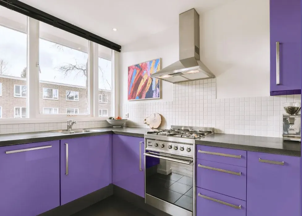
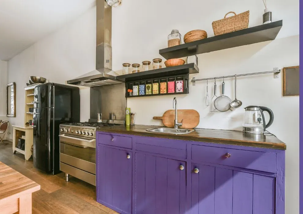
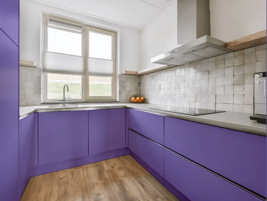
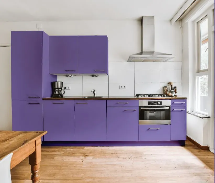
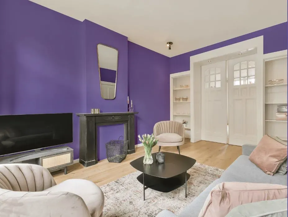
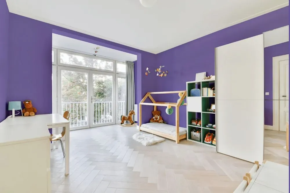
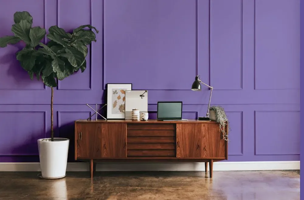
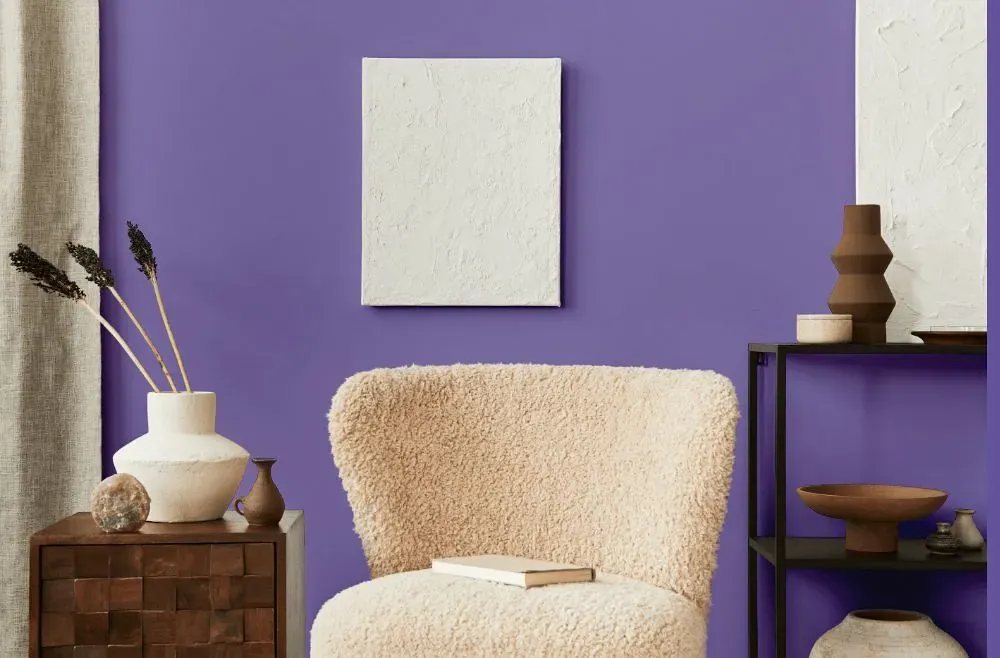
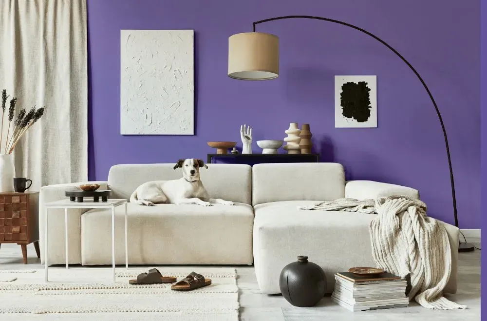
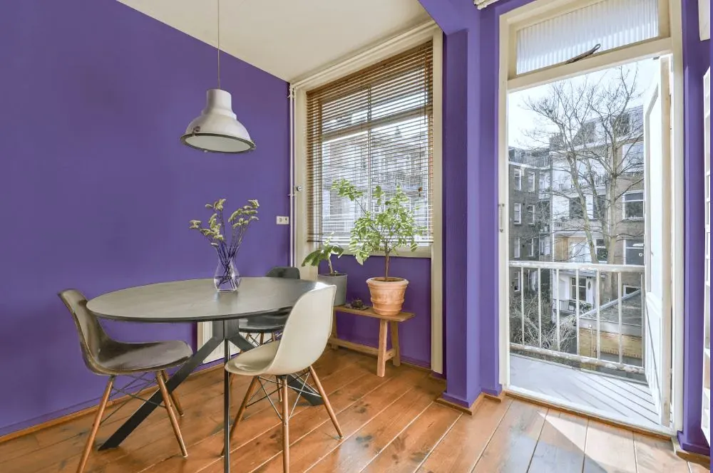
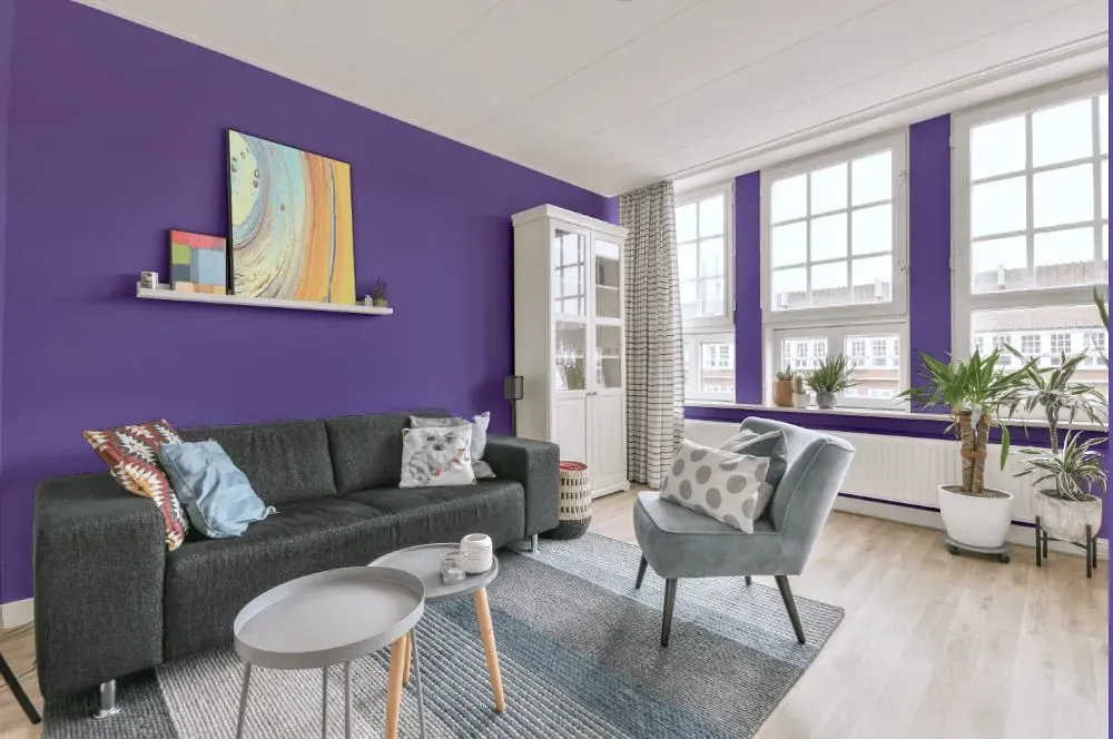
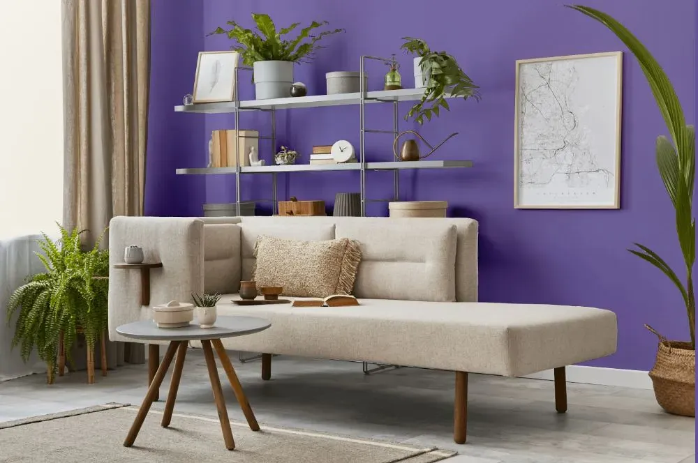
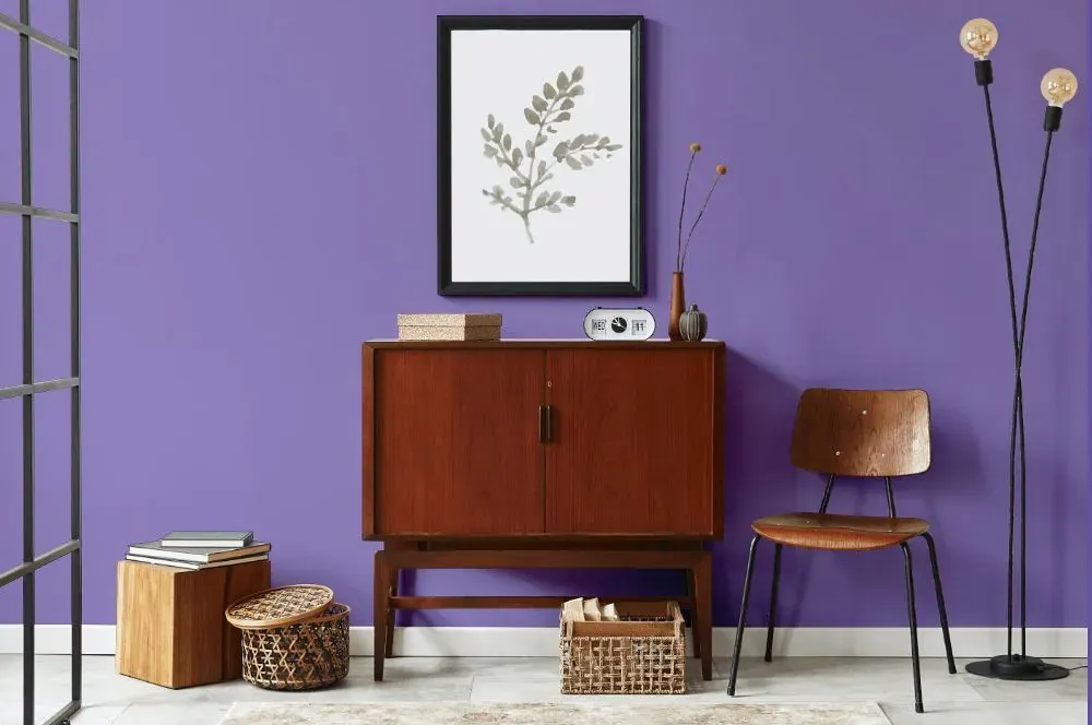
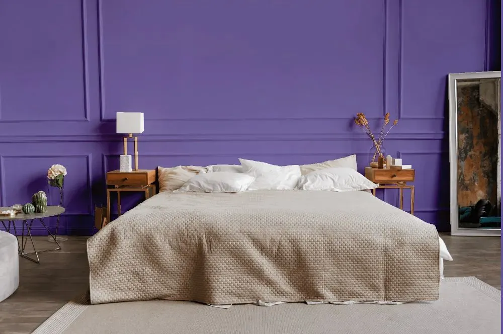
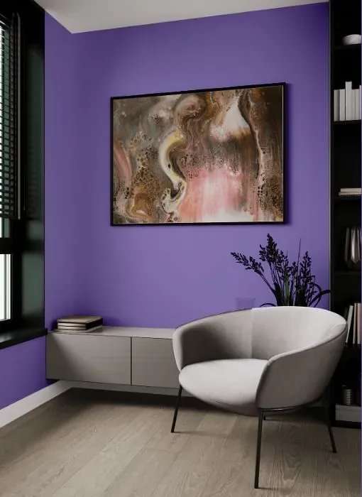
Step into rooms adorned with Behr Unimaginable (P560-5) and feel a wave of creativity wash over you. This captivating hue effortlessly transforms a living room into a sanctuary of inspiration, while casting a warm and inviting glow in a study or home office. Embrace the limitless possibilities of Unimaginable (P560-5) in a bedroom, where its soothing charm promotes relaxation and introspection. Whether used as an accent or a bold statement, this color adds a touch of sophistication and refinement to any space it graces. Behr's Unimaginable (P560-5) is the perfect choice for those seeking to infuse their home with a sense of wonder and elegance.
Loading...
LRV of Unimaginable
Unimaginable has an LRV of 25.17% and refers to Medium colors that reflect a lot of light. Why LRV is important?

Light Reflectance Value measures the amount of visible and usable light that reflects from a painted surface.
Simply put, the higher the LRV of a paint color, the brighter the room you will get.
The scale goes from 0% (absolute black, absorbing all light) to 100% (pure white, reflecting all light).
Act like a pro: When choosing paint with an LRV of 25.17%, pay attention to your bulbs' brightness. Light brightness is measured in lumens. The lower the paint's LRV, the higher lumen level you need. Every square foot of room needs at least 40 lumens. That means for a 200 ft2 living room you'll need about 8000 lumens of light – e.g., eight 1000 lm bulbs.
Color codes
We have collected almost every possible color code you could ever need.
Not sure what the difference between HEX and RGB is? We break down color models in plain language. Understanding color models
| Format | Code |
|---|---|
| HEX | #8c7eb9 |
| RGB Decimal | 140, 126, 185 |
| RGB Percent | 54.90%, 49.41%, 72.55% |
| HSV | Hue: 254° Saturation: 31.89% Value: 72.55% |
| HSL | hsl(254, 30, 61) |
| CMYK | Cyan: 24.32 Magenta: 31.89 Yellow: 0.0 Key: 27.45 |
| YIQ | Y: 136.912 I: -10.617 Q: 21.322 |
| XYZ | X: 27.03 Y: 23.999 Z: 49.094 |
| CIE Lab | L:56.087 a:18.086 b:-29.074 |
| CIE Luv | L:56.087 u:3.295 v:-46.724 |
| Decimal | 9207481 |
| Hunter Lab | 48.989, 12.758, -25.124 |