Benjamin Moore Baby Pink 2085-70
Contentsshow +hide -
| Official page: | Baby Pink 2085-70 |
| Code: | 2085-70 |
| Name: | Baby Pink |
| Brand: | Benjamin Moore |
What color is Benjamin Moore Baby Pink?
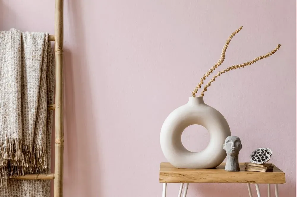
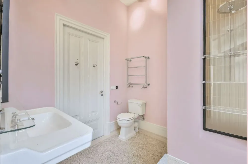
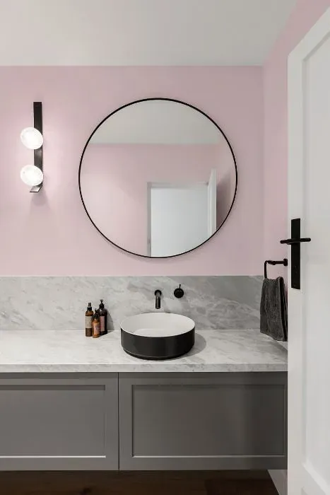
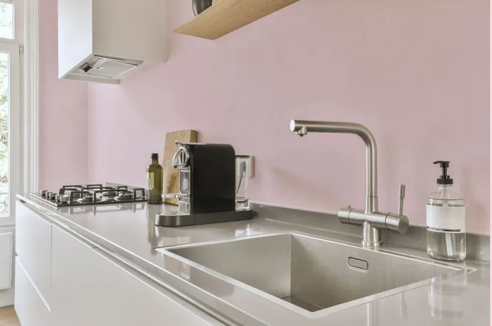
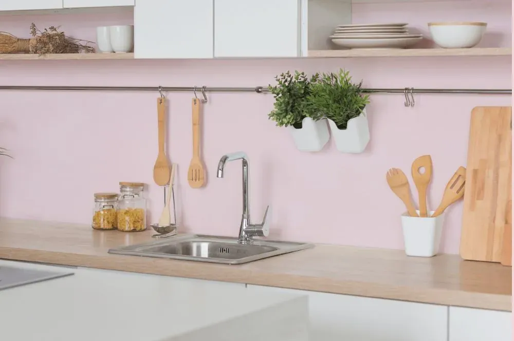
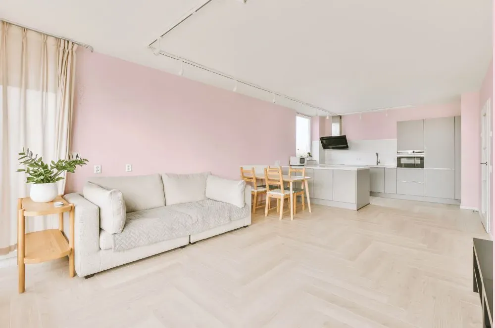
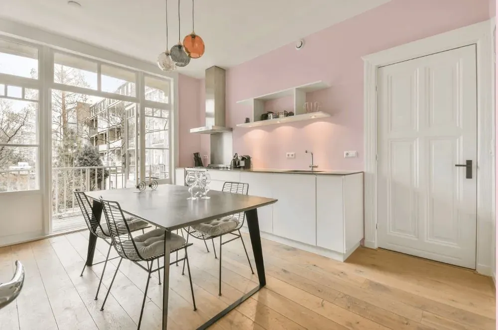
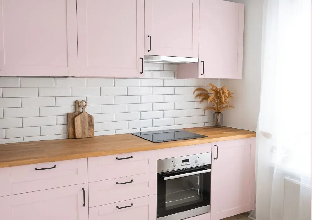
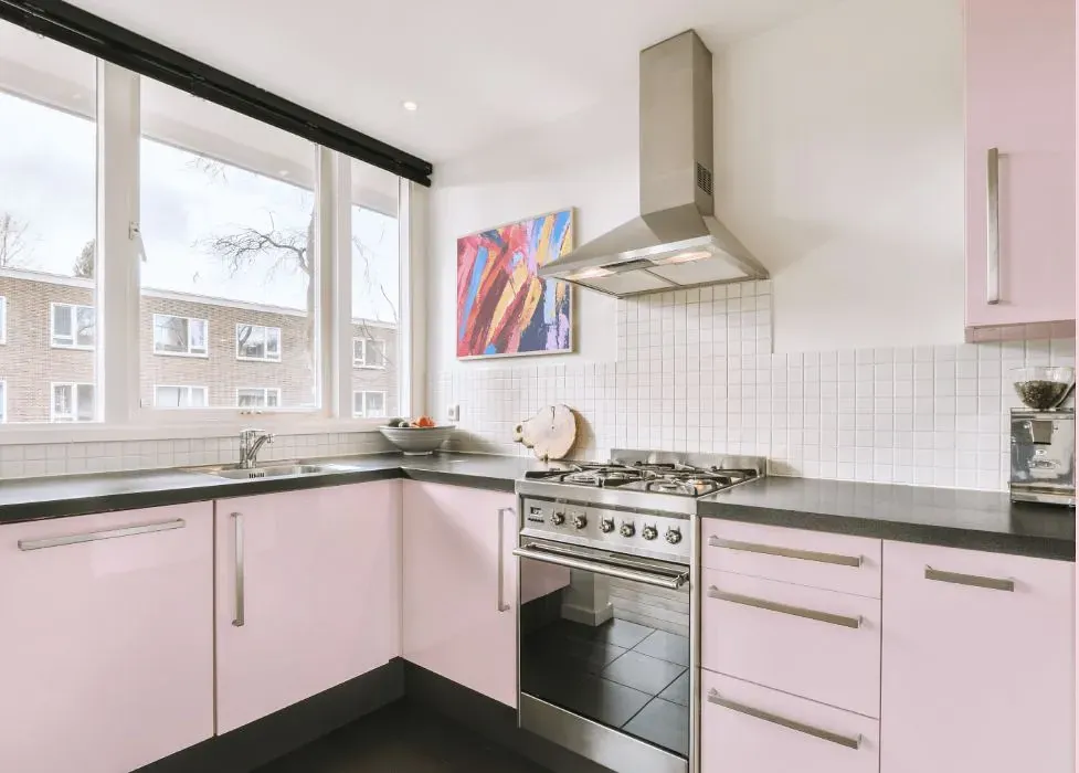
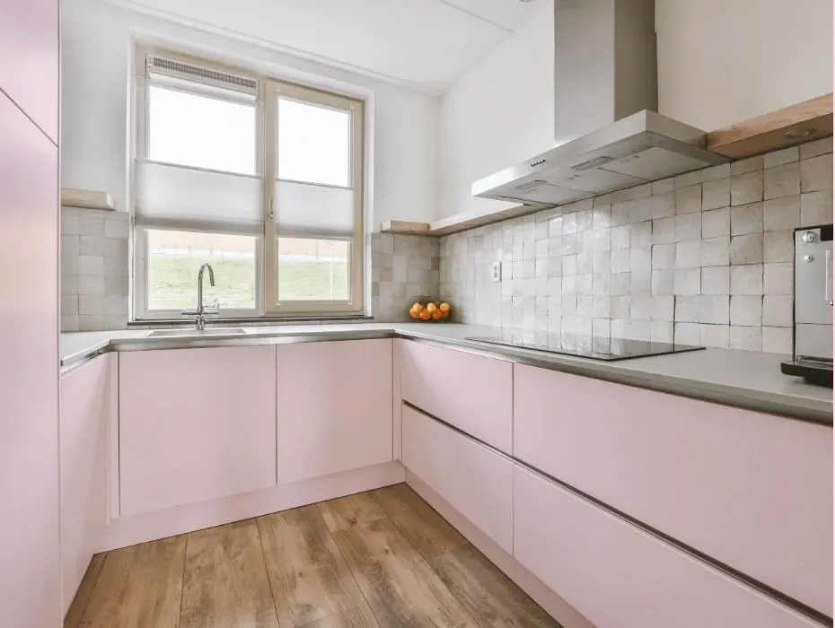
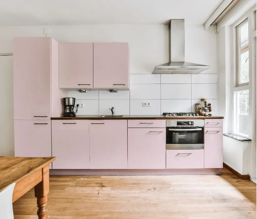
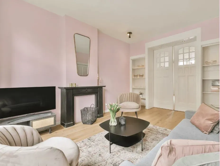
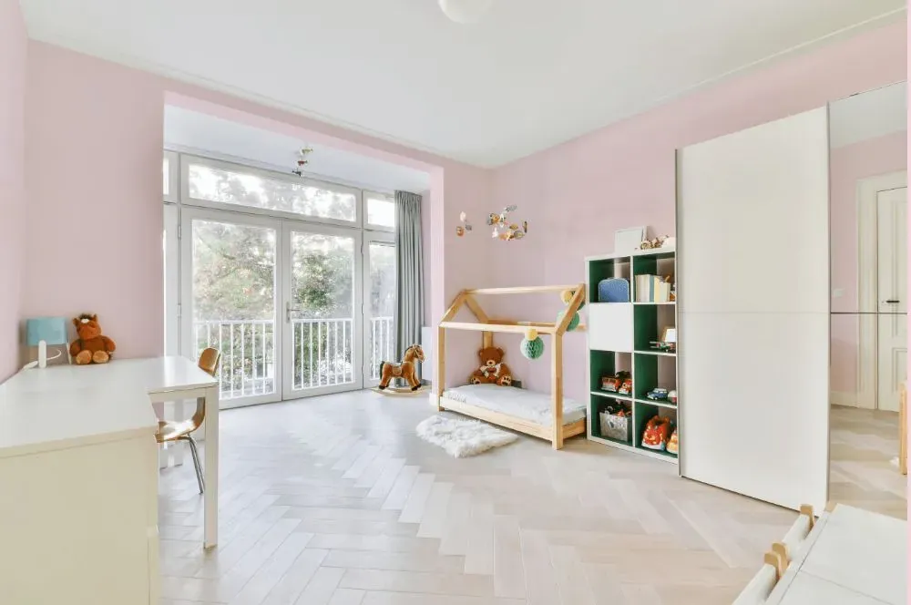
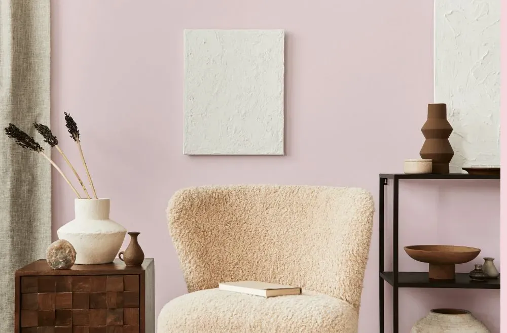
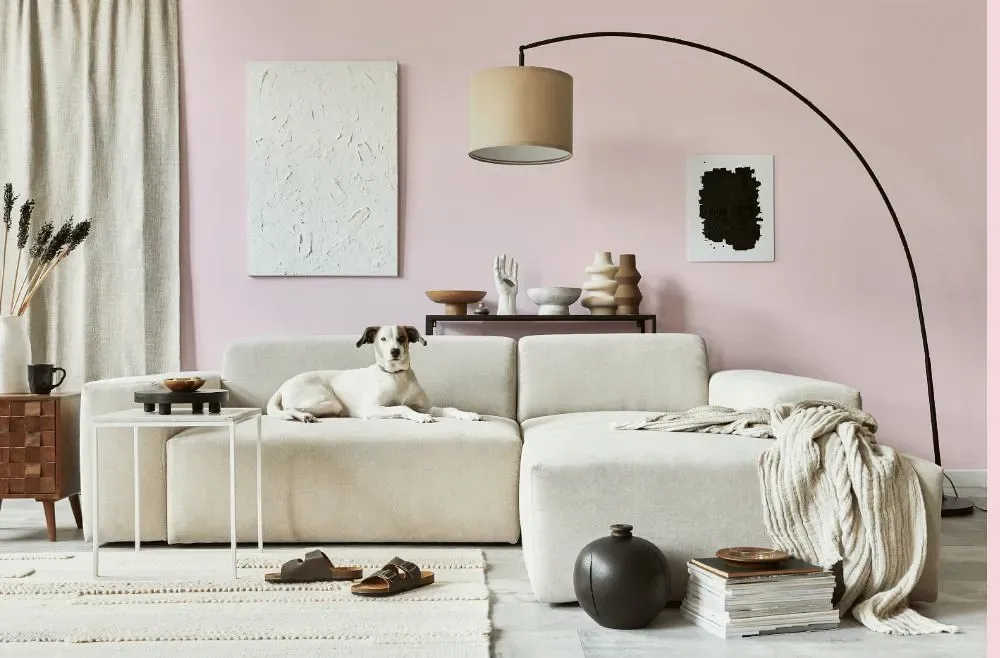
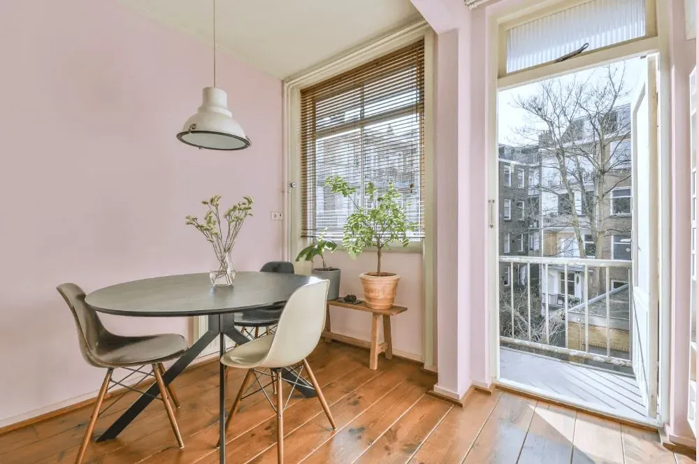
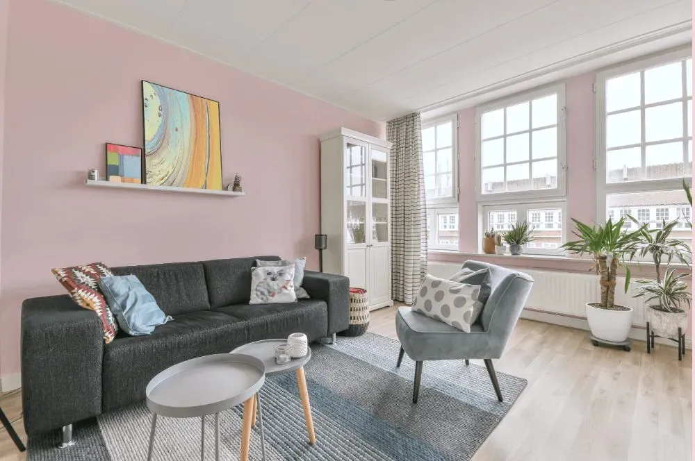
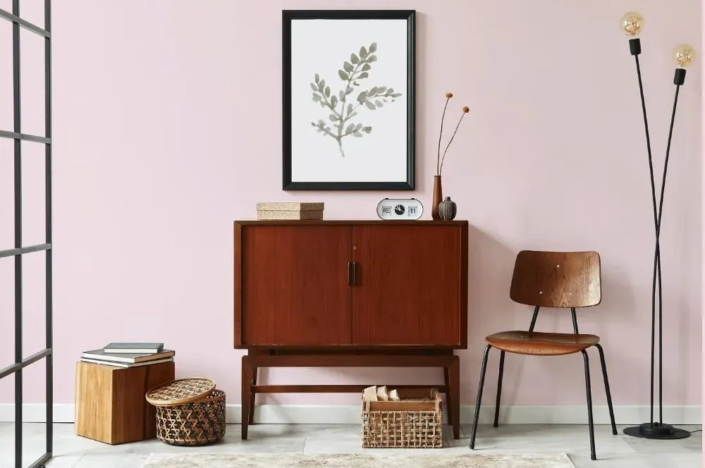
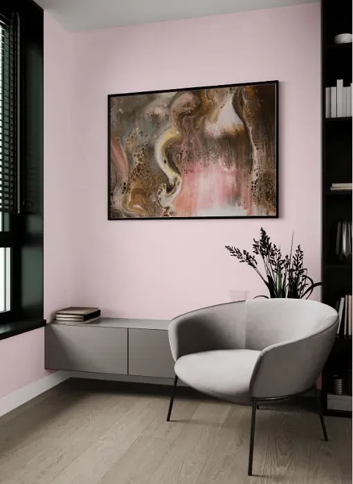
Step into a world of soft sophistication with Benjamin Moore 2085-70 Baby Pink. This delicate hue exudes charm and elegance, adding a touch of whimsy to any space. Baby Pink pairs beautifully with crisp whites, muted grays, and soft blues, creating a palette that is both soothing and stylish. Whether used as an accent wall or throughout a room, this versatile color brings a sense of tranquility and warmth. Elevate your interior design with Baby Pink and create a space that is both timeless and trendy.
Loading...
LRV of Baby Pink
Baby Pink has an LRV of 79.1% and refers to Off‑White colors that reflect a lot of light. Why LRV is important?

Light Reflectance Value measures the amount of visible and usable light that reflects from a painted surface.
Simply put, the higher the LRV of a paint color, the brighter the room you will get.
The scale goes from 0% (absolute black, absorbing all light) to 100% (pure white, reflecting all light).
Act like a pro: When choosing paint with an LRV of 79.1%, pay attention to your bulbs' brightness. Light brightness is measured in lumens. The lower the paint's LRV, the higher lumen level you need. Every square foot of room needs at least 40 lumens. That means for a 200 ft2 living room you'll need about 8000 lumens of light – e.g., eight 1000 lm bulbs.
Color codes
We have collected almost every possible color code you could ever need.
Not sure what the difference between HEX and RGB is? We break down color models in plain language. Understanding color models
| Format | Code |
|---|---|
| HEX | #F8E3E8 |
| RGB Decimal | 248, 227, 232 |
| RGB Percent | 97.25%, 89.02%, 90.98% |
| HSV | Hue: 346° Saturation: 8.47% Value: 97.25% |
| HSL | hsl(346, 60, 93) |
| CMYK | Cyan: 0.0 Magenta: 8.47 Yellow: 6.45 Key: 2.75 |
| YIQ | Y: 233.849 I: 10.907 Q: 5.998 |
| XYZ | X: 80.743 Y: 80.722 Z: 87.649 |
| CIE Lab | L:92.008 a:7.992 b:0.172 |
| CIE Luv | L:92.008 u:11.87 v:-1.186 |
| Decimal | 16311272 |
| Hunter Lab | 89.845, 3.187, 5.051 |