Benjamin Moore Cat's Meow 1332
Contentsshow +hide -
| Official page: | Cat's Meow 1332 |
| Code: | 1332 |
| Name: | Cat's Meow |
| Brand: | Benjamin Moore |
What color is Benjamin Moore Cat's Meow?
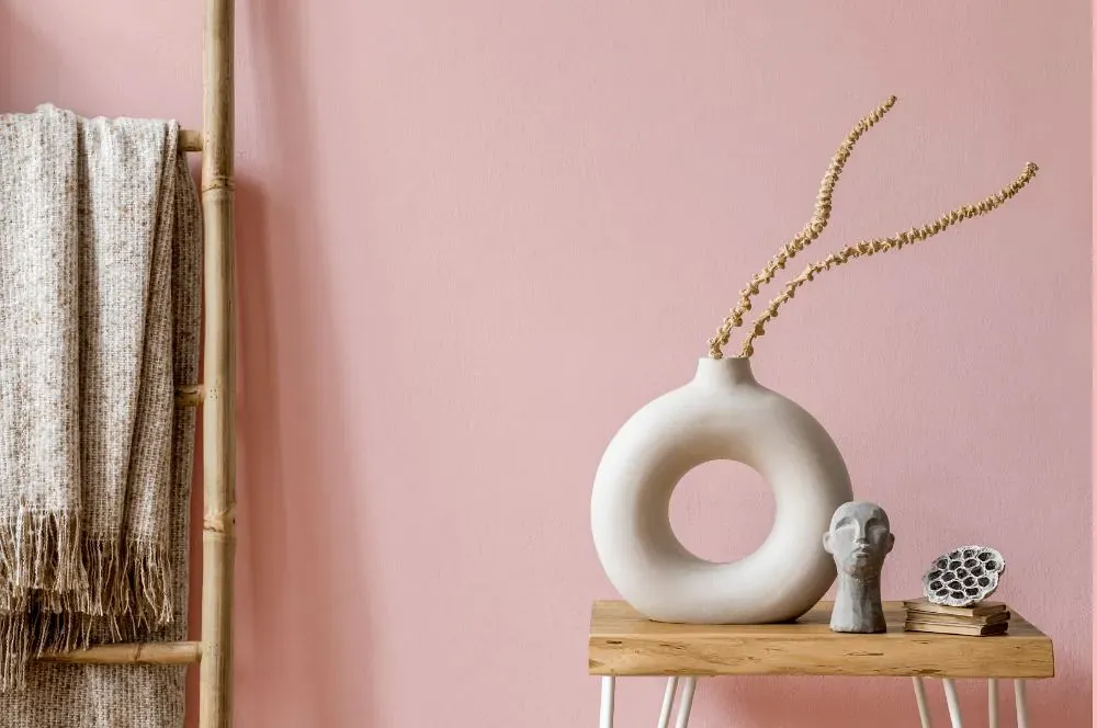
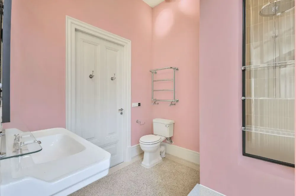
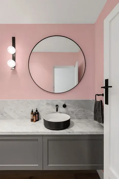
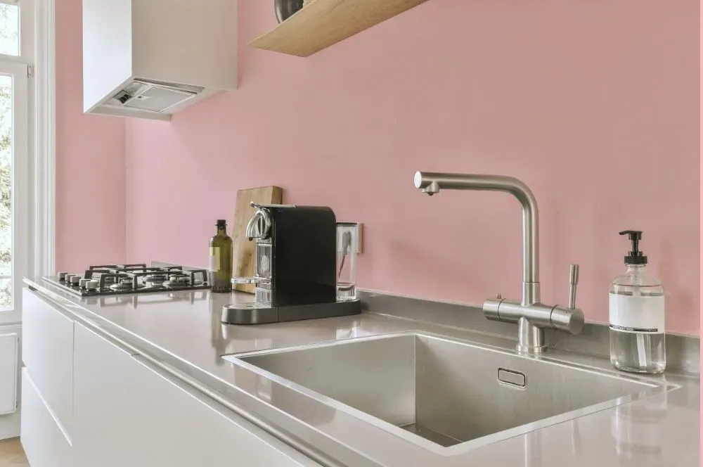
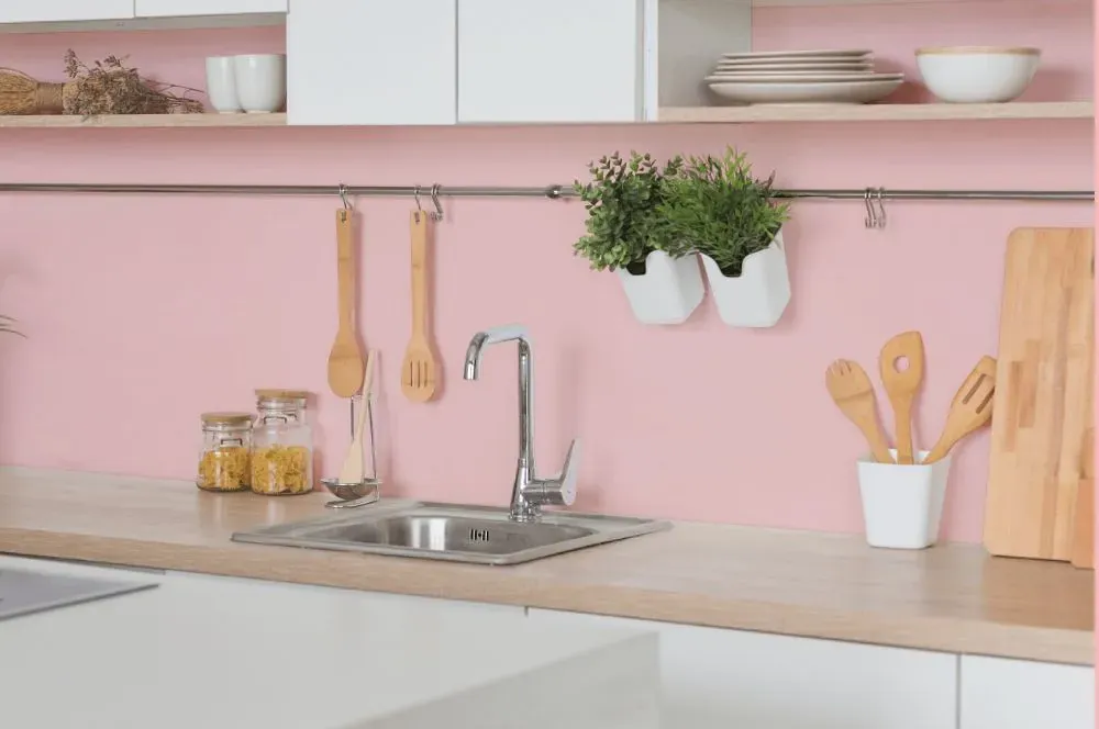
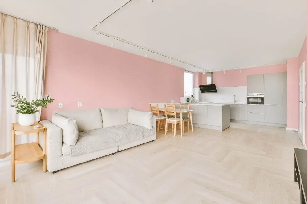
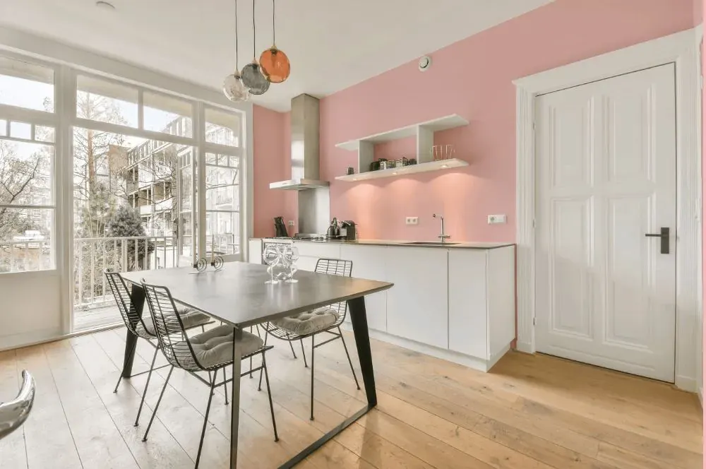
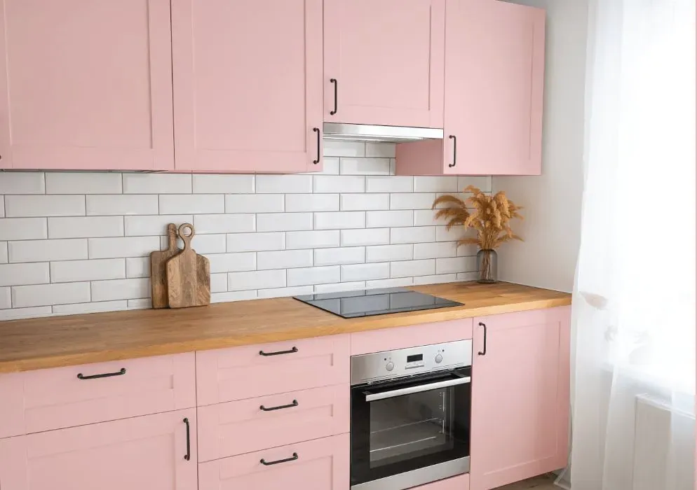
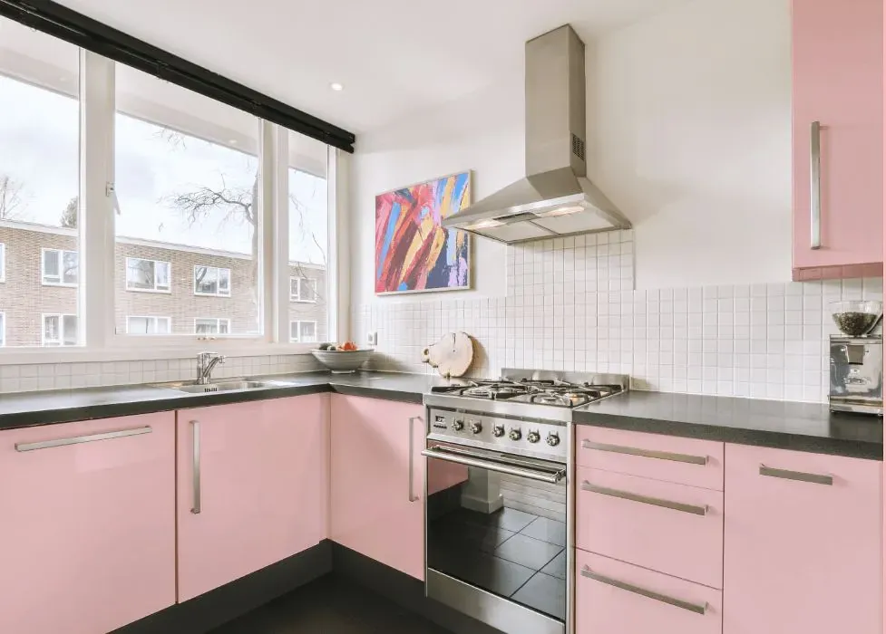
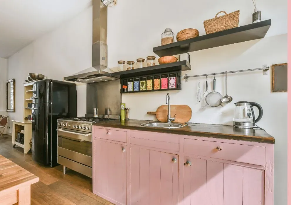
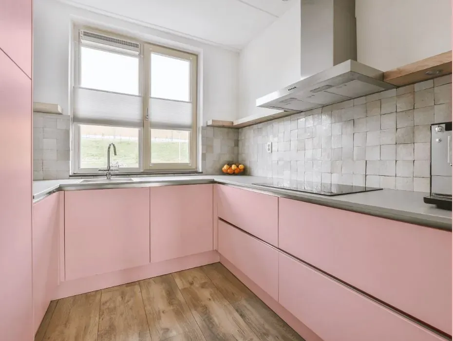
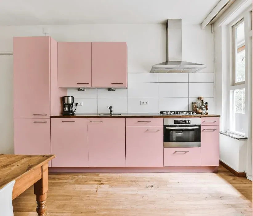
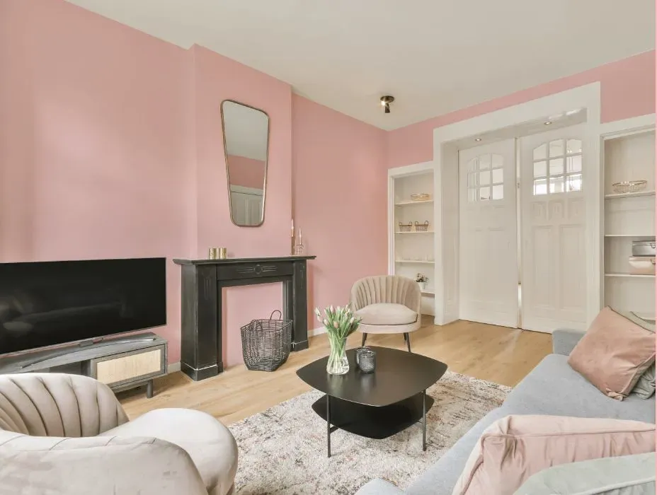
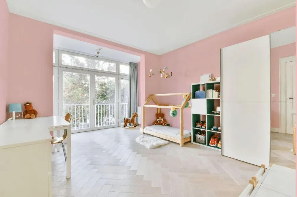
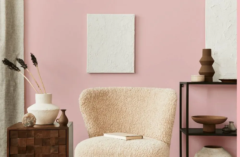
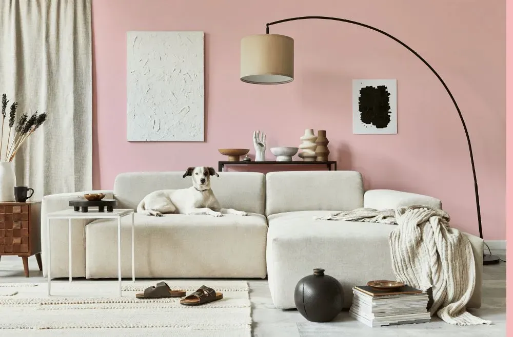
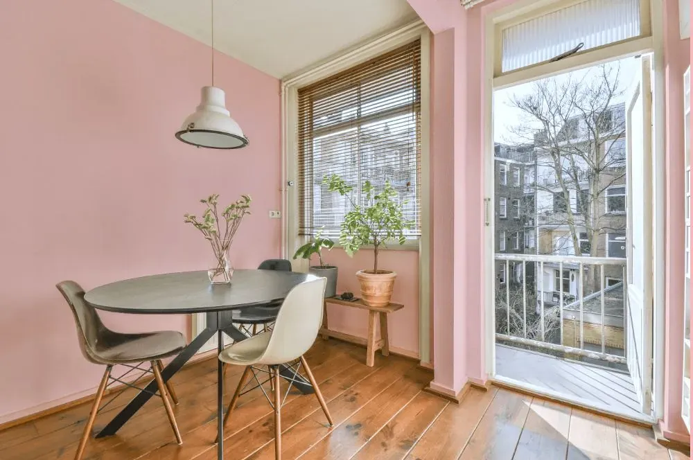
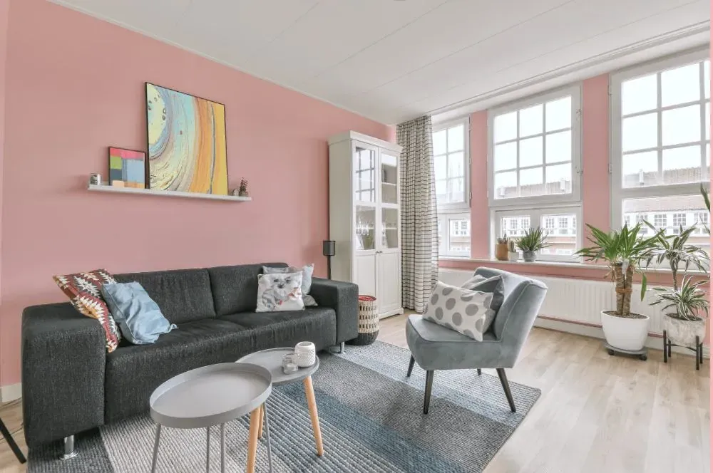
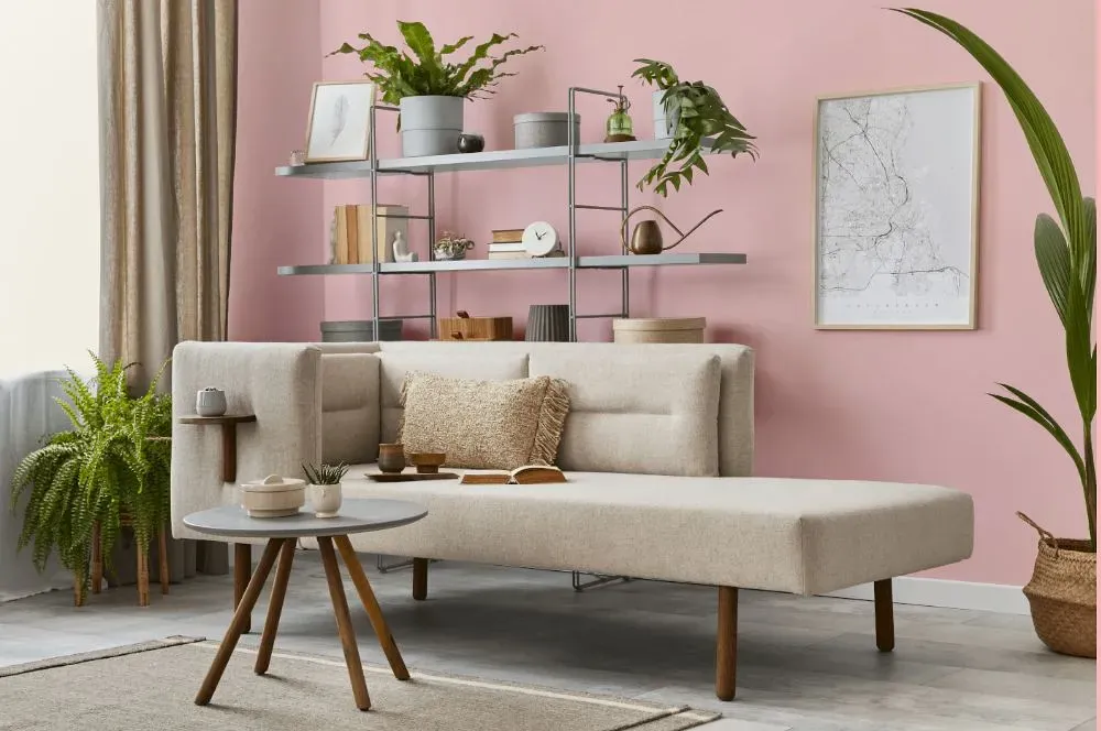
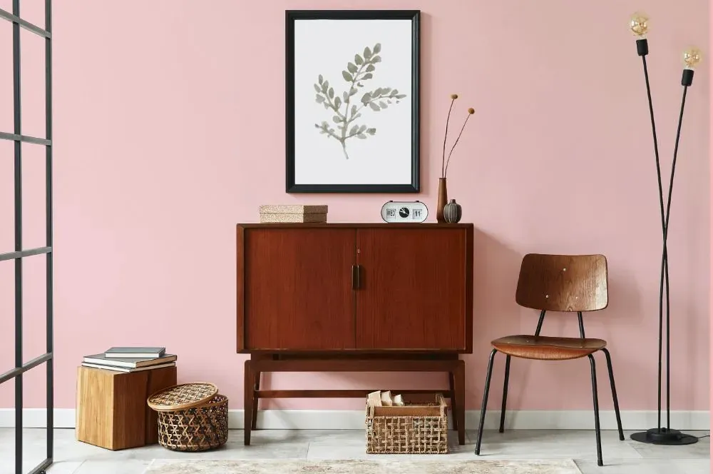
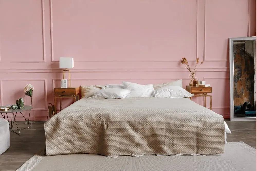
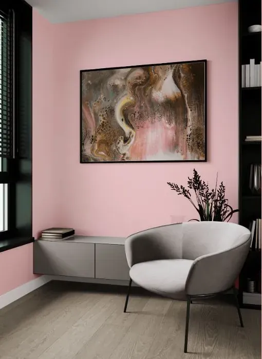
Benjamin Moore 1332 Cat's Meow is a rich and vibrant hue that adds depth to any space it graces. This warm and cozy color pairs beautifully with soft neutrals like cream and taupe, creating a harmonious and inviting atmosphere. For a bit of contrast, consider combining Cat's Meow with accents in shades of sage green or dusky blue. This versatile color can easily adapt to a variety of styles, from traditional to modern, making it a versatile choice for any room in your home.
Loading...
LRV of Cat's Meow
Cat's Meow has an LRV of 68.34% and refers to Light colors that reflect most of the incident light. Why LRV is important?

Light Reflectance Value measures the amount of visible and usable light that reflects from a painted surface.
Simply put, the higher the LRV of a paint color, the brighter the room you will get.
The scale goes from 0% (absolute black, absorbing all light) to 100% (pure white, reflecting all light).
Act like a pro: When choosing paint with an LRV of 68.34%, pay attention to your bulbs' brightness. Light brightness is measured in lumens. The lower the paint's LRV, the higher lumen level you need. Every square foot of room needs at least 40 lumens. That means for a 200 ft2 living room you'll need about 8000 lumens of light – e.g., eight 1000 lm bulbs.
Color codes
We have collected almost every possible color code you could ever need.
Not sure what the difference between HEX and RGB is? We break down color models in plain language. Understanding color models
| Format | Code |
|---|---|
| HEX | #F9D0D1 |
| RGB Decimal | 249, 208, 209 |
| RGB Percent | 97.65%, 81.57%, 81.96% |
| HSV | Hue: 359° Saturation: 16.47% Value: 97.65% |
| HSL | hsl(359, 77, 90) |
| CMYK | Cyan: 0.0 Magenta: 16.47 Yellow: 16.06 Key: 2.35 |
| YIQ | Y: 220.373 I: 24.111 Q: 8.984 |
| XYZ | X: 73.13 Y: 69.857 Z: 69.936 |
| CIE Lab | L:86.927 a:14.516 b:4.899 |
| CIE Luv | L:86.927 u:24.826 v:4.632 |
| Decimal | 16371921 |
| Hunter Lab | 83.581, 9.916, 8.896 |