Benjamin Moore Chartreuse 2024-10
Contentsshow +hide -
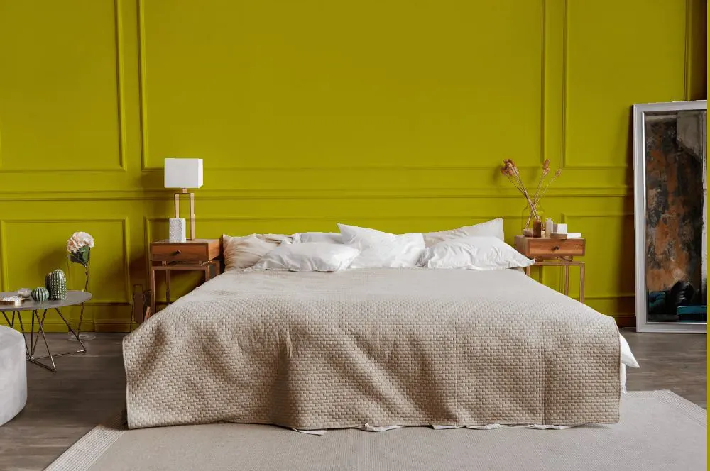
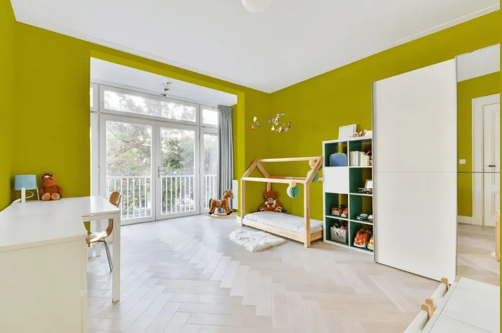
- Chartreuse for bedroom (1 photo)
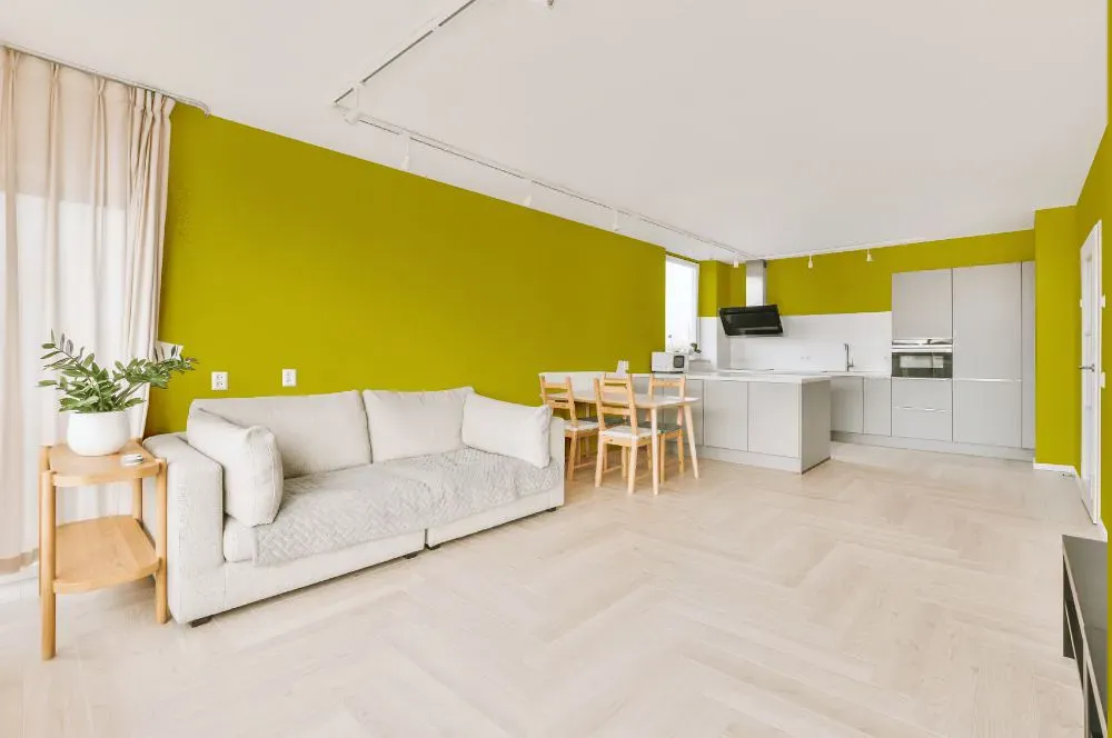
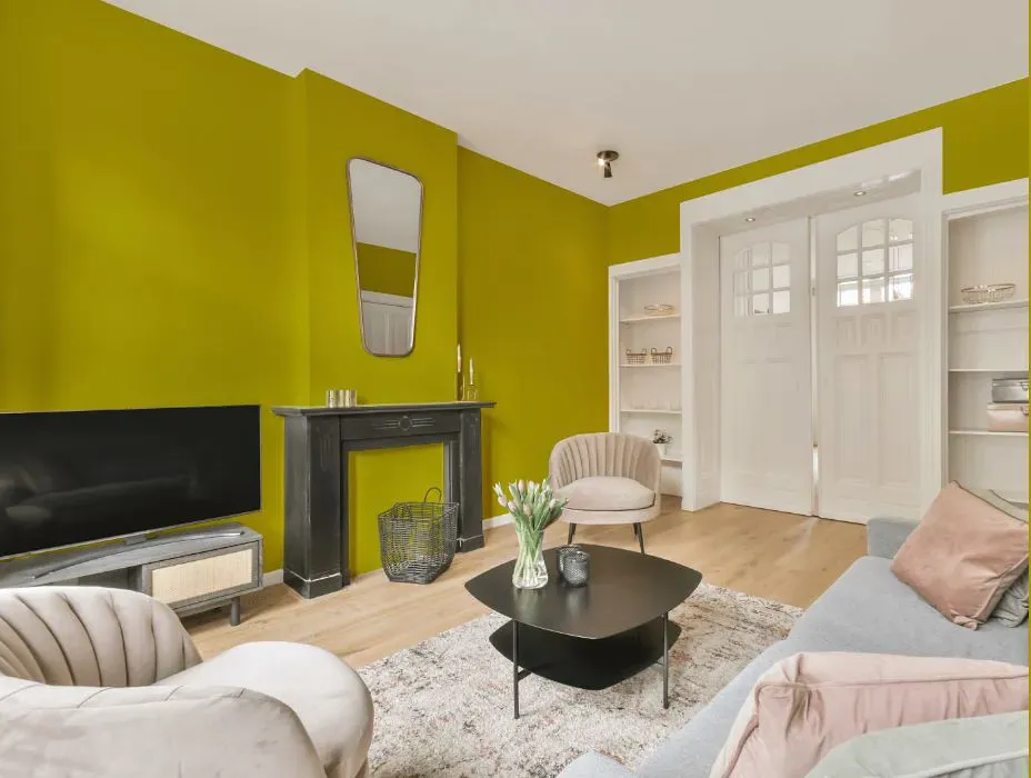
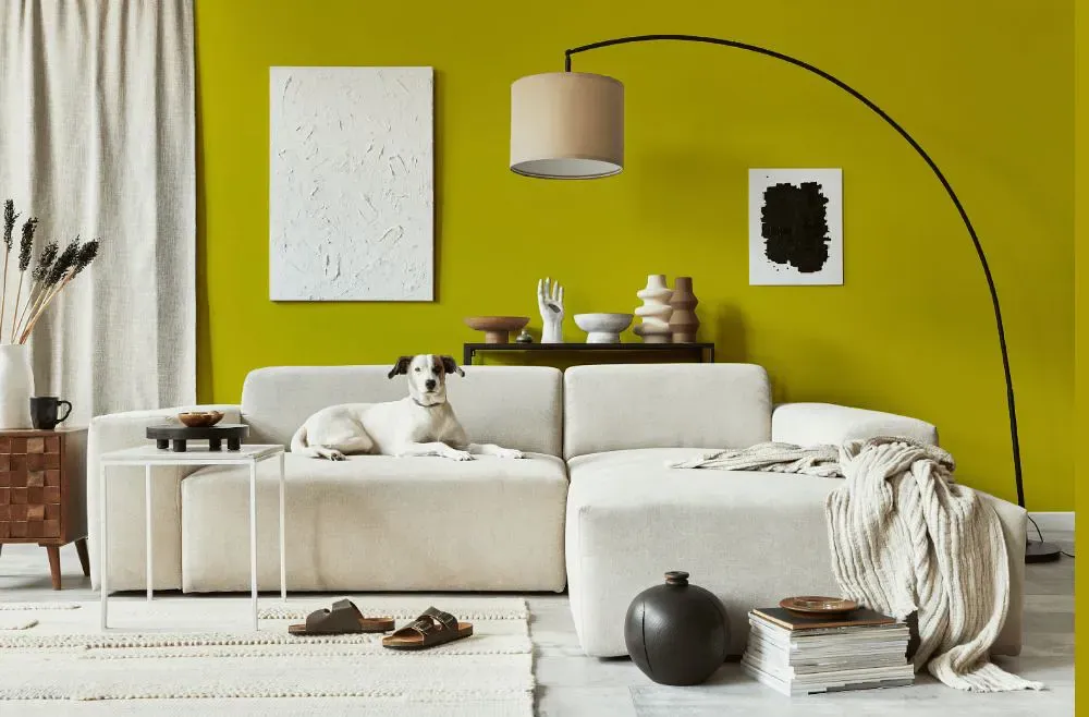
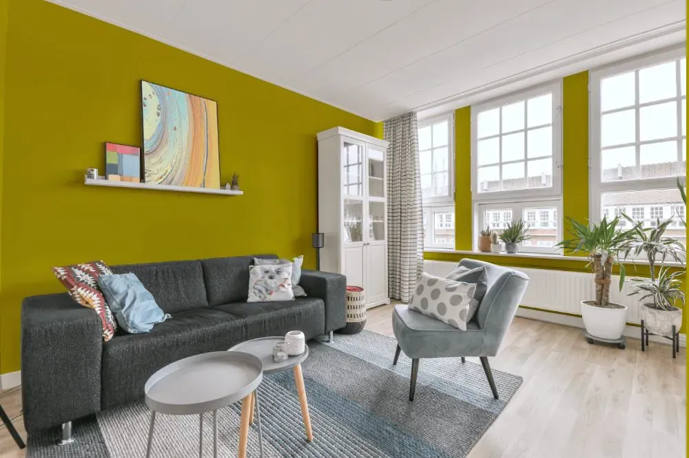
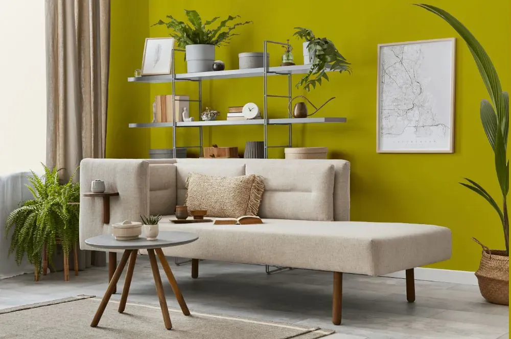
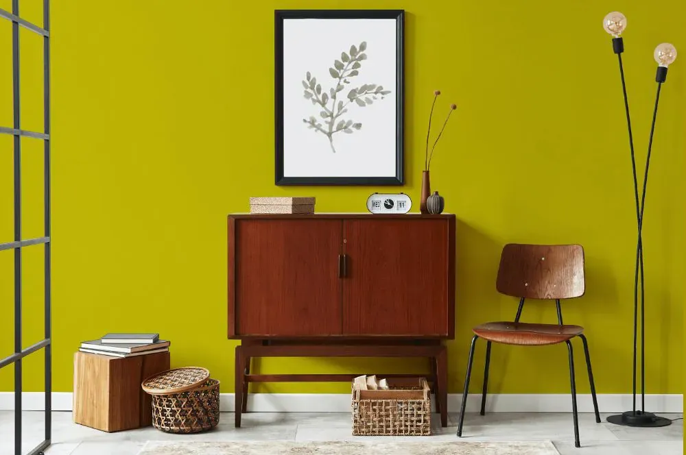
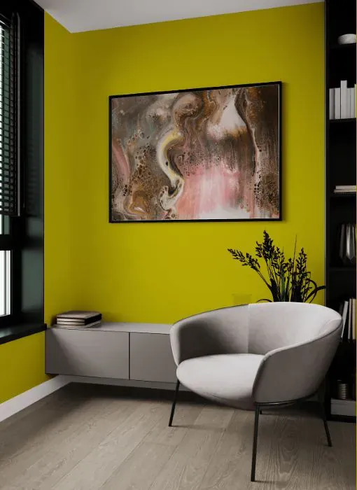
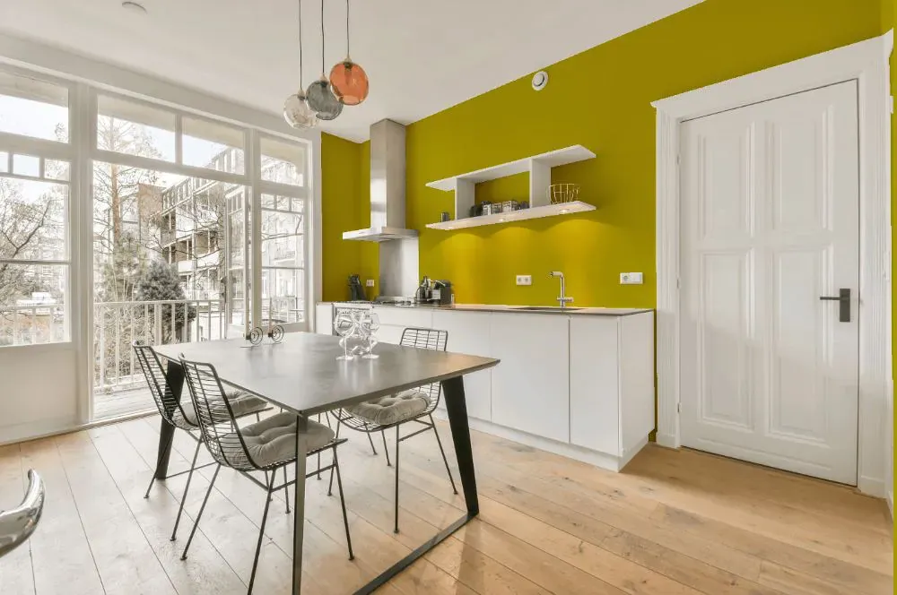
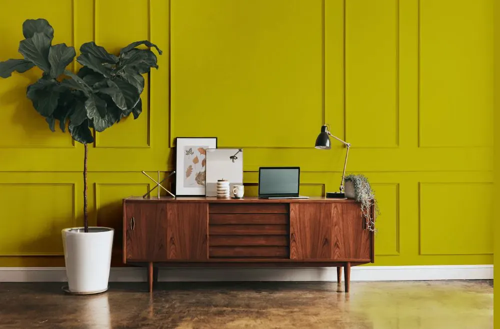
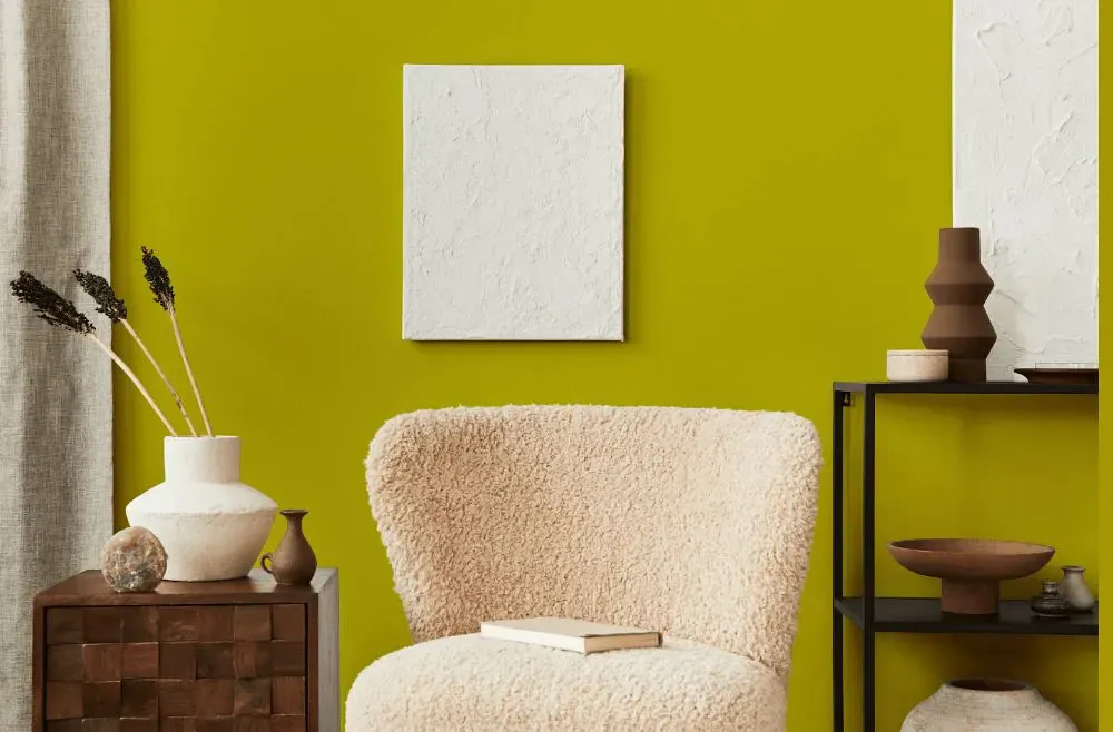
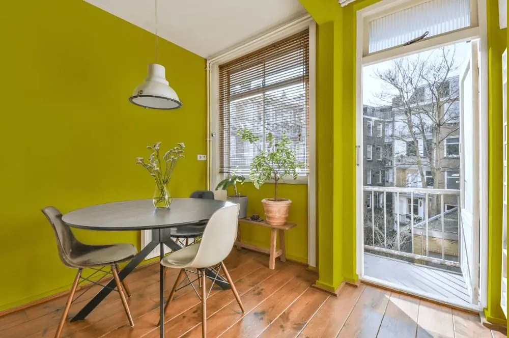
- Chartreuse for living room (7 photos)
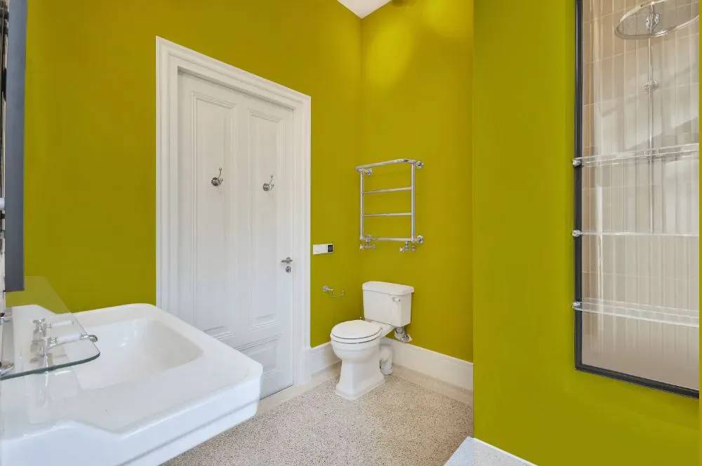
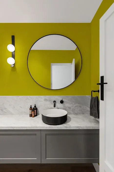
- Benjamin Moore Chartreuse for bathroom (2 photos)
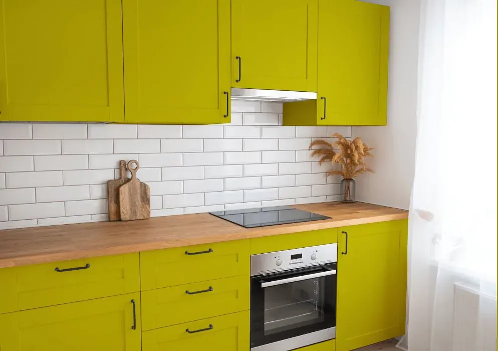
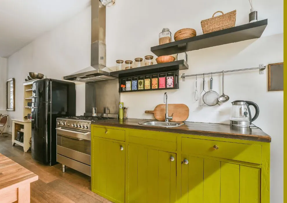
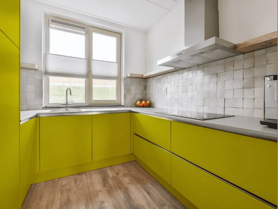
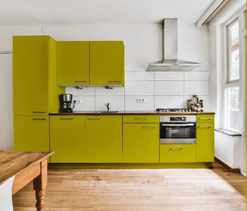
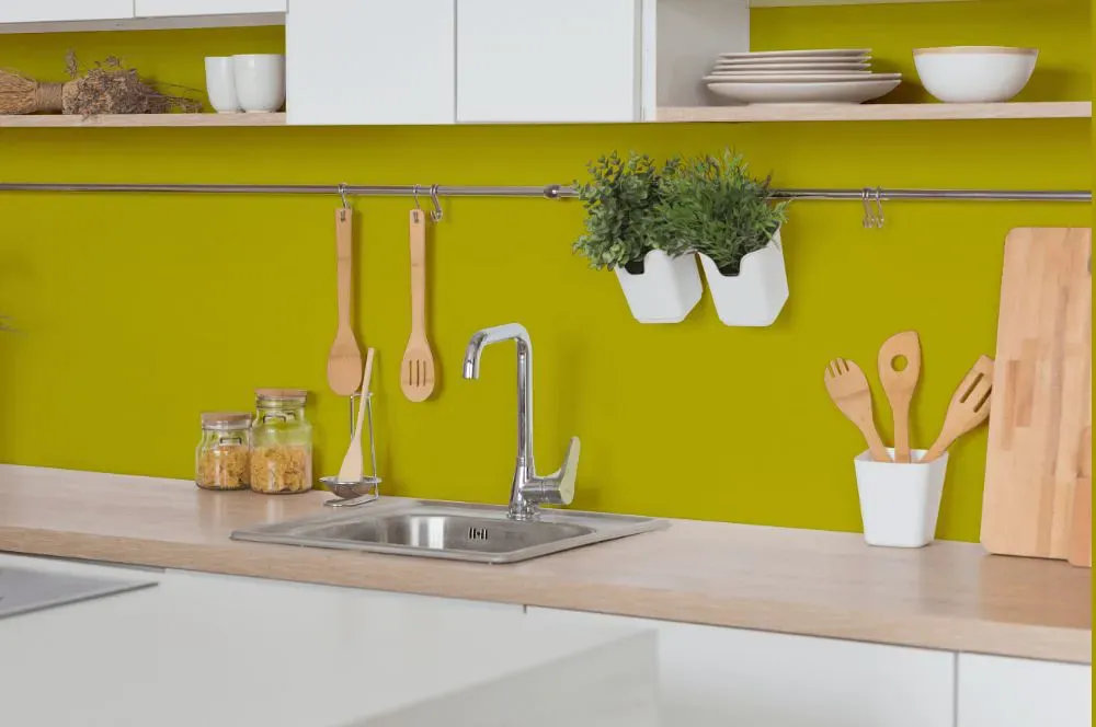
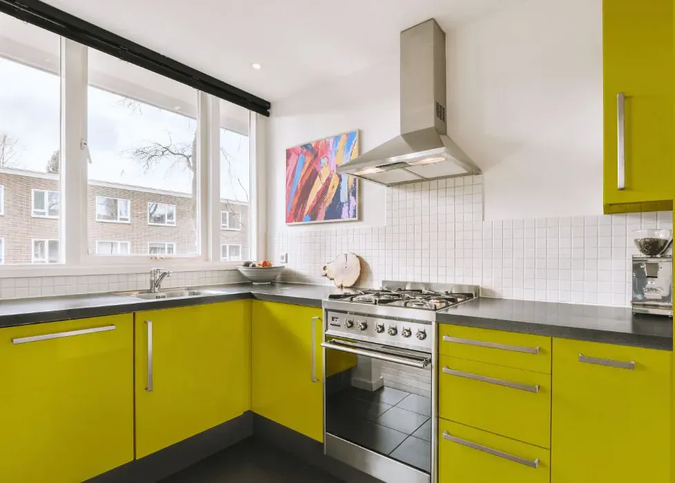
- Benjamin Moore 2024-10 on kitchen cabinets (4 photos)
- Benjamin Moore Chartreuse reviews (9 photos)
- What are Benjamin Moore Chartreuse undertones?
- Is Chartreuse 2024-10 cool or warm?
- How light temperature affects on Chartreuse
- Monochromatic color scheme
- Color comparison and matching
- LRV of Chartreuse 2024-10
- Color codes
- Color equivalents
| Official page: | Chartreuse 2024-10 |
| Code: | 2024-10 |
| Name: | Chartreuse |
| Brand: | Benjamin Moore |
What color is Benjamin Moore Chartreuse?
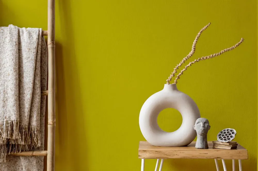
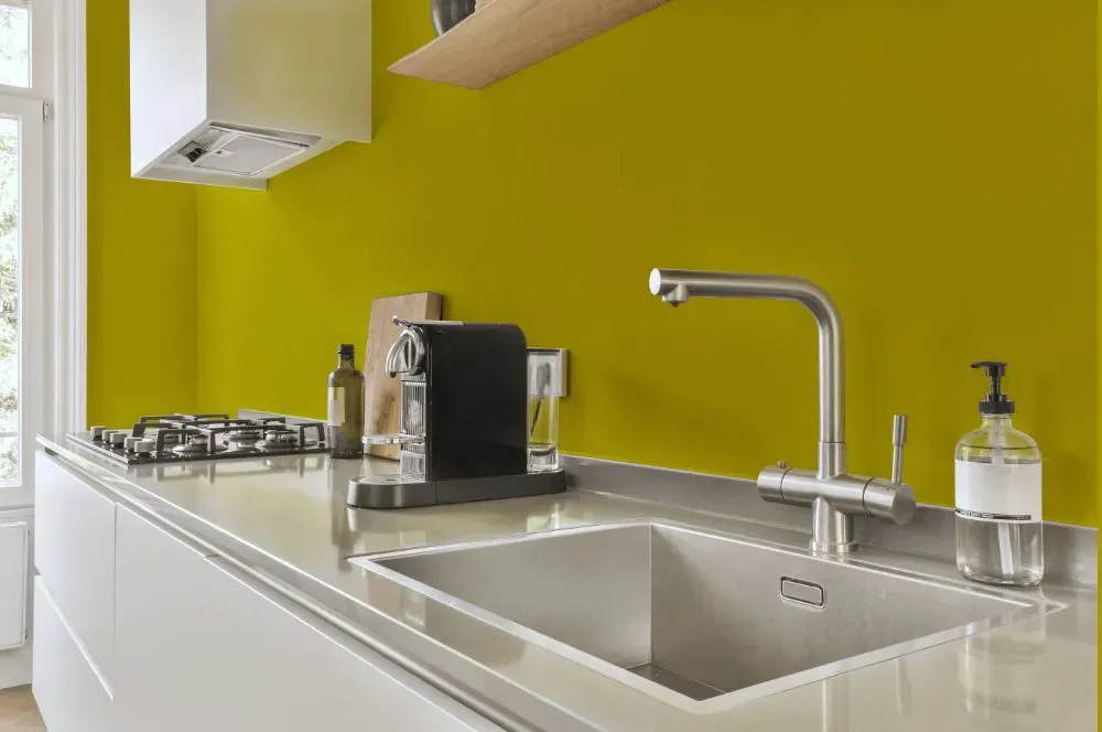
The vibrant Color Benjamin Moore 2024-10 Chartreuse adds a bold punch to any space, injecting a lively energy into the room. This electrifying hue pairs seamlessly with soft neutrals like warm grays and crisp whites, creating a striking contrast that is both modern and sophisticated. Incorporating touches of deep navy or rich plum can further enhance the dynamic nature of Color Chartreuse, adding depth and drama to the overall color palette. Whether used as an accent wall or in furnishings and decor, this color choice will undoubtedly make a lasting impression in a contemporary interior.
Loading...
LRV of Chartreuse
Chartreuse has an LRV of 41.51% and refers to Light Medium colors that reflect half of the incident light. Why LRV is important?

Light Reflectance Value measures the amount of visible and usable light that reflects from a painted surface.
Simply put, the higher the LRV of a paint color, the brighter the room you will get.
The scale goes from 0% (absolute black, absorbing all light) to 100% (pure white, reflecting all light).
Act like a pro: When choosing paint with an LRV of 41.51%, pay attention to your bulbs' brightness. Light brightness is measured in lumens. The lower the paint's LRV, the higher lumen level you need. Every square foot of room needs at least 40 lumens. That means for a 200 ft2 living room you'll need about 8000 lumens of light – e.g., eight 1000 lm bulbs.
Color codes
We have collected almost every possible color code you could ever need.
Not sure what the difference between HEX and RGB is? We break down color models in plain language. Understanding color models
| Format | Code |
|---|---|
| HEX | #C1B400 |
| RGB Decimal | 193, 180, 0 |
| RGB Percent | 75.69%, 70.59%, 0.00% |
| HSV | Hue: 56° Saturation: 100.0% Value: 75.69% |
| HSL | hsl(56, 100, 38) |
| CMYK | Cyan: 0.0 Magenta: 6.74 Yellow: 100.0 Key: 24.31 |
| YIQ | Y: 163.367 I: 65.589 Q: -53.266 |
| XYZ | X: 38.315 Y: 43.982 Z: 6.471 |
| CIE Lab | L:72.216 a:-10.884 b:74.048 |
| CIE Luv | L:72.216 u:14.813 v:78.284 |
| Decimal | 12694528 |
| Hunter Lab | 66.319, -12.93, 40.638 |