Benjamin Moore Creamy Peach 2012-60
Contentsshow +hide -
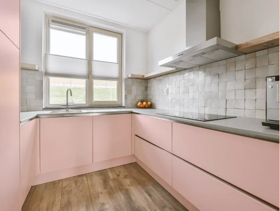
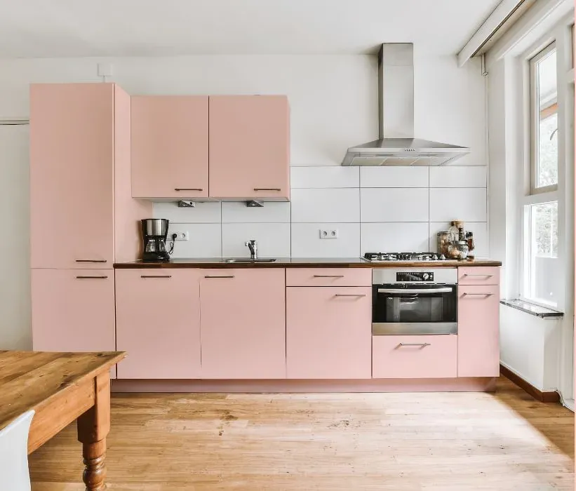
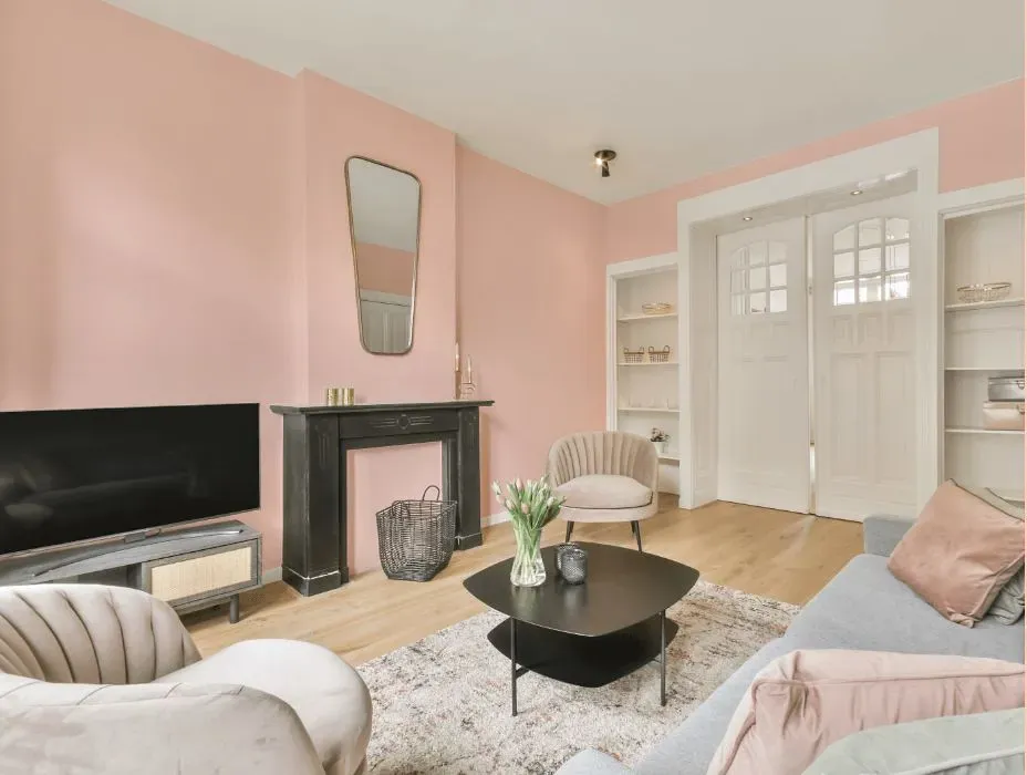
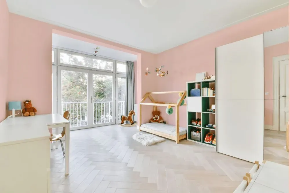
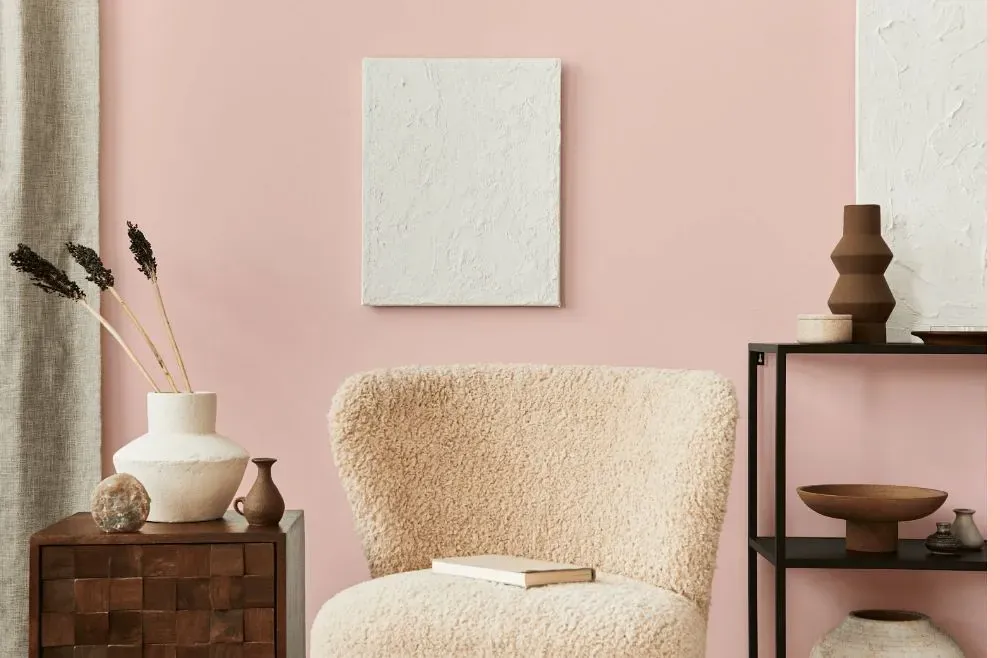
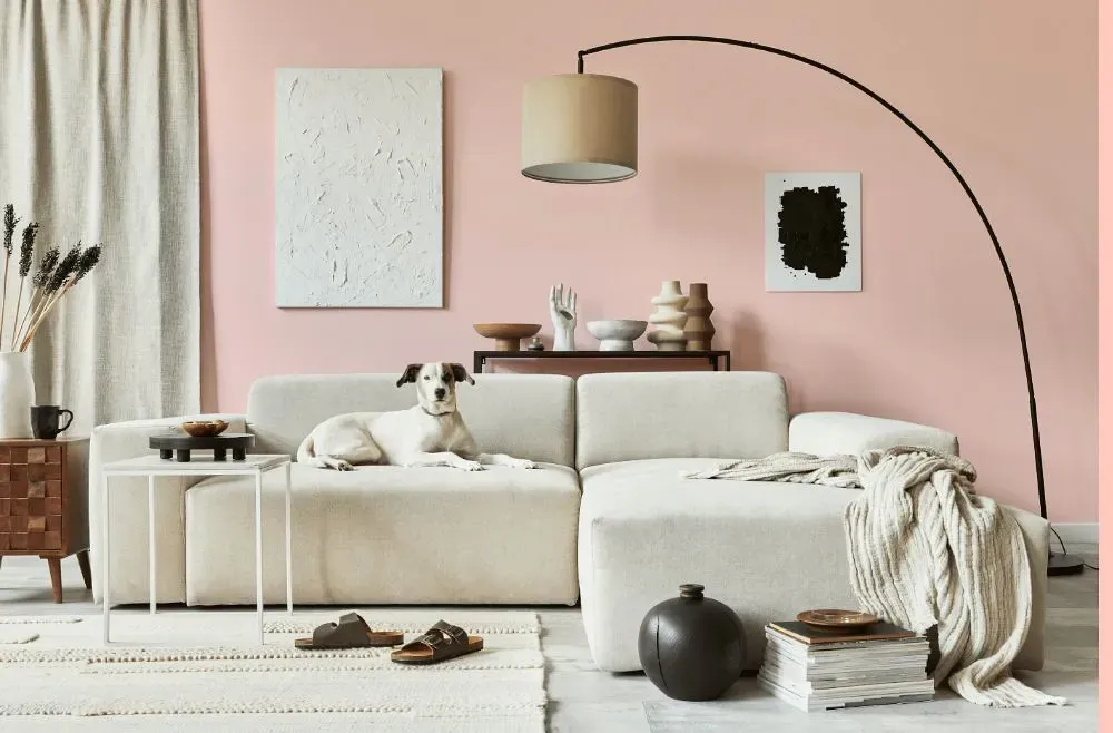
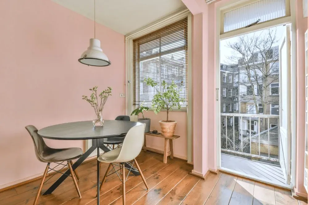
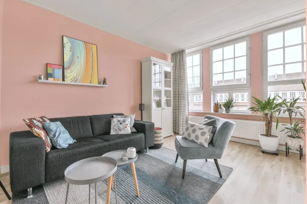
- Benjamin Moore Creamy Peach reviews (23 photos)
- What are Benjamin Moore Creamy Peach undertones?
- Is Creamy Peach 2012-60 cool or warm?
- How light temperature affects on Creamy Peach
- Monochromatic color scheme
- Complementary color scheme
- Color comparison and matching
- LRV of Creamy Peach 2012-60
- Color codes
- Color equivalents
| Official page: | Creamy Peach 2012-60 |
| Code: | 2012-60 |
| Name: | Creamy Peach |
| Brand: | Benjamin Moore |
What color is Benjamin Moore Creamy Peach?
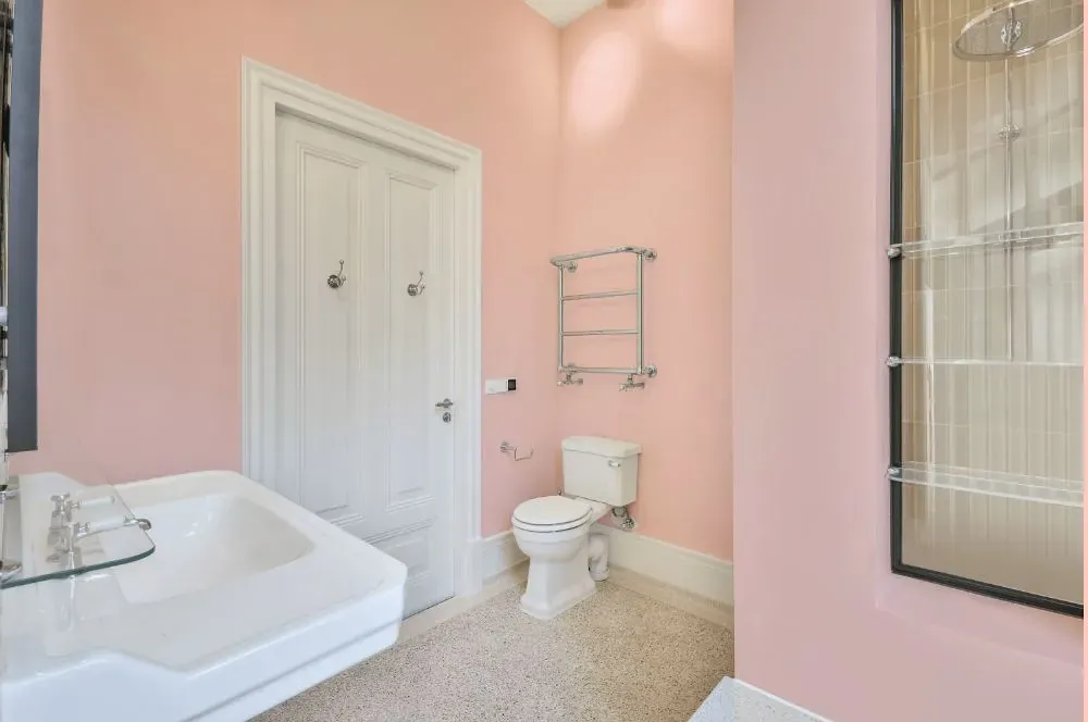
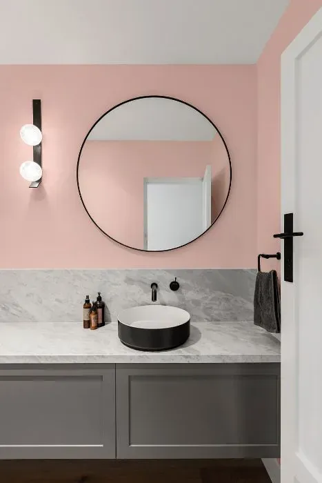
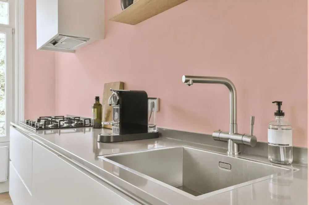
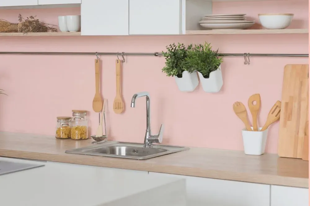
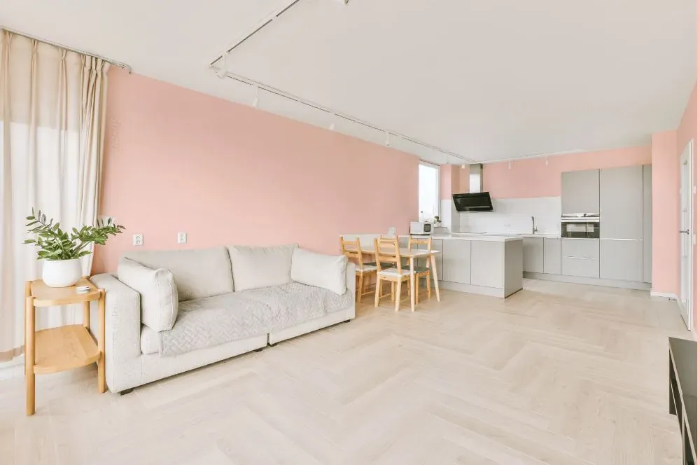
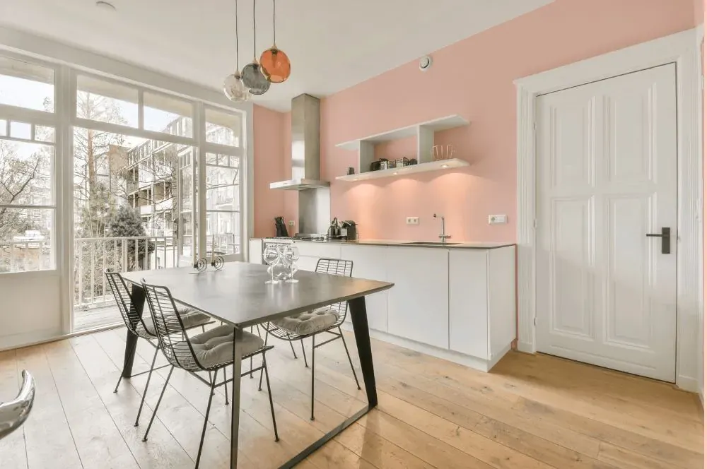
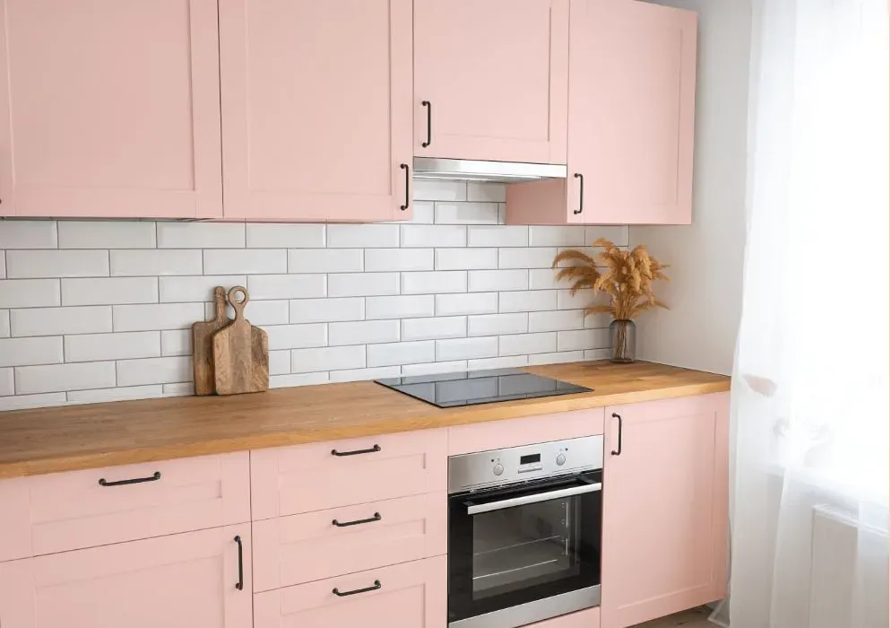
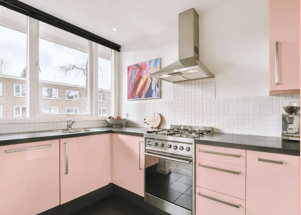
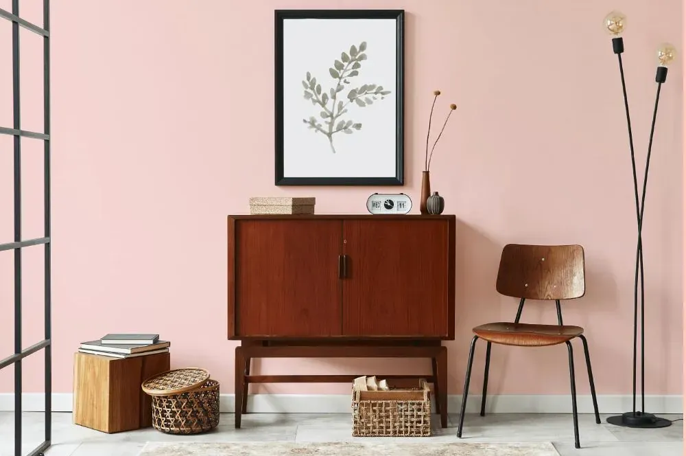
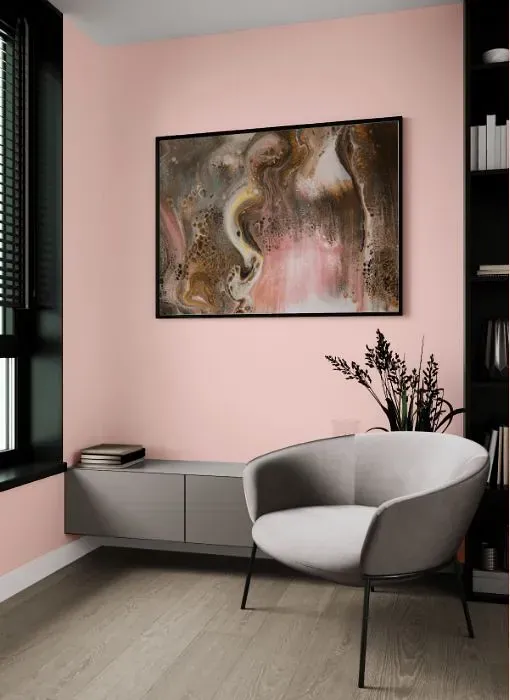
Introducing the warm and inviting Benjamin Moore Creamy Peach (2012-60) – a hue that effortlessly infuses any space with a sense of serenity and sophistication. This soft and delicate shade is perfect for creating a cozy atmosphere in living rooms, bedrooms, and nurseries. Creamy Peach (2012-60) pairs beautifully with neutral tones and natural materials, adding a touch of elegance to any interior. Whether you're aiming for a modern or traditional look, this versatile color brings a timeless charm to your home. Embrace the subtle allure of Creamy Peach (2012-60) and transform your space into a sanctuary of tranquility and style.
Loading...
LRV of Creamy Peach
Creamy Peach has an LRV of 74.91% and refers to Off‑White colors that reflect a lot of light. Why LRV is important?

Light Reflectance Value measures the amount of visible and usable light that reflects from a painted surface.
Simply put, the higher the LRV of a paint color, the brighter the room you will get.
The scale goes from 0% (absolute black, absorbing all light) to 100% (pure white, reflecting all light).
Act like a pro: When choosing paint with an LRV of 74.91%, pay attention to your bulbs' brightness. Light brightness is measured in lumens. The lower the paint's LRV, the higher lumen level you need. Every square foot of room needs at least 40 lumens. That means for a 200 ft2 living room you'll need about 8000 lumens of light – e.g., eight 1000 lm bulbs.
Color codes
We have collected almost every possible color code you could ever need.
Not sure what the difference between HEX and RGB is? We break down color models in plain language. Understanding color models
| Format | Code |
|---|---|
| HEX | #FFDBD4 |
| RGB Decimal | 255, 219, 212 |
| RGB Percent | 100.00%, 85.88%, 83.14% |
| HSV | Hue: 10° Saturation: 16.86% Value: 100.0% |
| HSL | hsl(10, 100, 92) |
| CMYK | Cyan: 0.0 Magenta: 14.12 Yellow: 16.86 Key: 0.0 |
| YIQ | Y: 228.966 I: 23.702 Q: 5.437 |
| XYZ | X: 78.454 Y: 76.679 Z: 72.937 |
| CIE Lab | L:90.174 a:11.38 b:8.062 |
| CIE Luv | L:90.174 u:22.234 v:9.894 |
| Decimal | 16767956 |
| Hunter Lab | 87.566, 6.684, 11.912 |