Benjamin Moore Creamy White / Spring in Aspen / 954 / OC-7
| Official page: | Creamy White OC-7 |
| Code: | OC-7 |
| Name: | Creamy White |
| Brand: | Benjamin Moore |
What color is Benjamin Moore Creamy White?
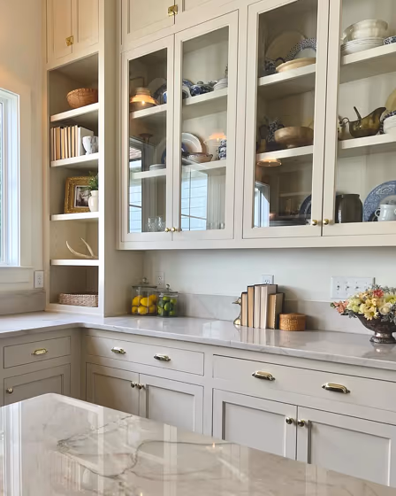
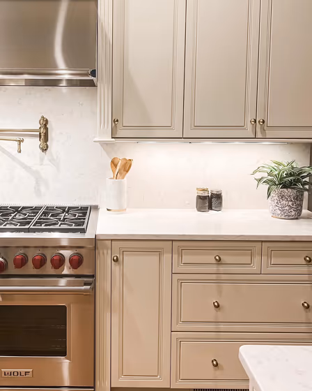
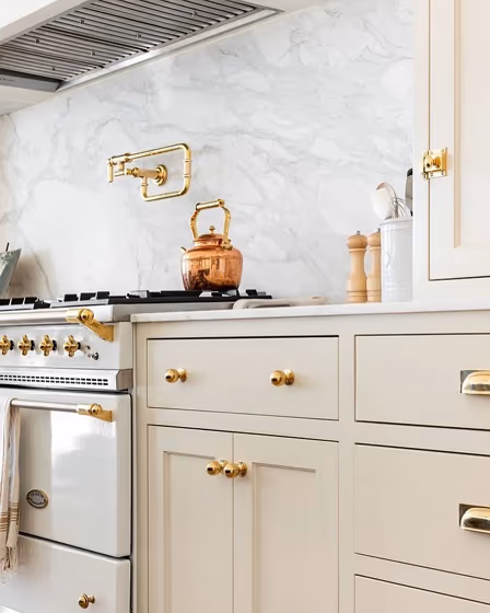
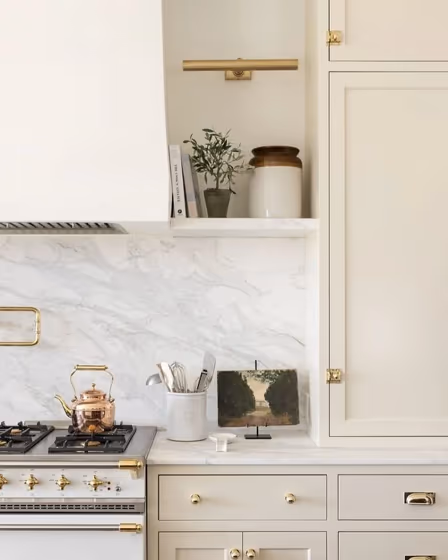
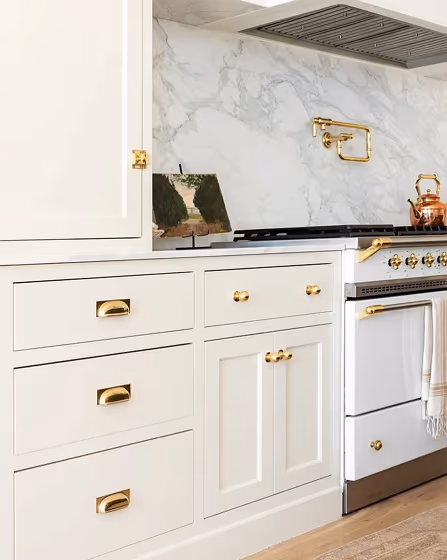
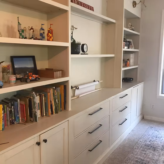
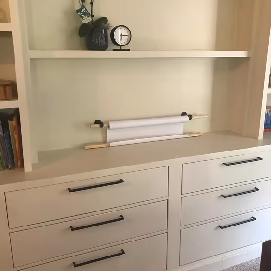
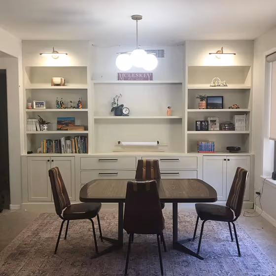
Create a timeless and inviting space with Benjamin Moore's OC-7 Creamy White. This warm and elegant shade provides a versatile backdrop that pairs beautifully with a variety of colors, such as charcoal gray, soft sage, and navy blue. Incorporating Creamy White into your interior design scheme can create a sophisticated and harmonious atmosphere. Whether used as the main wall color or as an accent, OC-7 adds a sense of warmth and brightness to any room. Elevate your home decor with this classic yet modern hue that complements both traditional and contemporary aesthetics.
Benjamin Moore OC-7 on kitchen cabinets
Want a stylish kitchen? View real-life photo examples of this fascinating warm hue is paired with backsplashes, countertops, and hardware.
Benjamin Moore Creamy White reviews
View the photos of real spaces painted with this that were not included in specific categories.Close-ups, painted furniture, storages and dressers, hallways, stairs and ceilings.
Try before you buy

100% accurate
reusable paint samples
Peel, stick,
and repeat
Twice painted
with real paint
Next day
delivery
What are Benjamin Moore Creamy White undertones?
The undertones of Creamy White can be accurately described as a Yellow and Red hue, as is apparent from the color space provided. By isolating the pure hue and eliminating any tints, tones, and shades, we were able to precisely determine its undertone. This approach has proven to be more accurate than traditional methods of defining undertones on a white background, which are now considered outdated.
HEX value
HEX value:
#E3DCC8
RGB code:
227, 220, 200
Is Benjamin Moore Creamy White OC-7 cool or warm?
With a hue of 44° thisGreyrefers warm paint shade according to HSL (Hue, Saturation, Lightness) on the color wheel.
OC-7 Creamy White HSL code: 44, 33%, 84%
Hue - degree on a color wheel from 0 to 360. 0 is red, 120 is green, and 240 is blue.
Saturation is expressed as a percentage. At 0%, it appears as a shade of grey, and at 100%, it is in full color..
Lightness is also a percentage value. 0% is black, and 100% is white.
- Warm colors are ideal for kitchens, living rooms or bathrooms
- Warmer hues make larger spaces feel more inviting
- Warm grey shades are versatile and provide a neutral canvas for your interior design. They seamlessly complement any style, whether it's Victorian, Scandinavian, or Modern.
- Warm greige shades combine the warmth of beige with the modernity of grey, offering a versatile and inviting backdrop for living rooms, dining areas, and bedrooms.
- To prevent a space from feeling too monotonous, consider pairing warm light shades with richer tones like deep greens or browns, or adding textures through fabrics and furnishings. Avoid using them in rooms with limited natural light, as they may appear too dull or yellowish
Act like a pro: Mixing warm and cool shades is a must have to get harmonius interior. Add accents that contrast with the primary color to create visual balance. If your walls are a warm color, don’t forget to add accent in cold colors (furniture, art, décor). A good practice is too use a complementary color scheme.
How light temperature affects Creamy White
Natural Lighting. During the day, natural light shifts from about 2000 K at sunrise/sunset to 5500–6500 K at noon.
In addition, natural‑light temperature depends on its direction:
| Direction of sunlight | Visible temp. | Hue | Duration |
|---|---|---|---|
| North | Cool | Bluish | All day |
| East | Warm | Yellow | Before noon |
| West | Warm | Orange‑red | After noon |
| South | Warm | Orange‑yellow | All day |
Artificial Lighting. When choosing bulbs, pay attention to their color‑temperature (Kelvins).
Use the slider to see how this Grey shade looks under different lighting:


4000K
Coordinating colors.
Colors that go with Benjamin Moore Creamy White:
Monochromatic color scheme
This scheme consists of various shades, tints, and tones of a single color. While it offers a perfect combination of hues, without accent décor it may become monotonous.
Lighter shades
OC-7
Creamy White
Darker shades
Complementary color scheme
This color scheme is a combination of two shades that are opposite each other on the color wheel. The high contrast between these colors creates a vibrant and dynamic visual effect. For the color Creamy White with a orange hue, complementary colors are those with a blue hue close to 224, such as Benjamin Moore Bachelor Blue and Coastline.
LRV of Creamy White
Creamy White has an LRV of 70.95% and refers to Light colors that reflect most of the incident light. Why LRV is important?
Light Reflectance Value measures the amount of visible and usable light that reflects from a painted surface.
Simply put, the higher the LRV of a paint color, the brighter the room you will get.
The scale goes from 0% (absolute black, absorbing all light) to 100% (pure white, reflecting all light).
Act like a pro: When choosing paint with an LRV of 70.95%, pay attention to your bulbs' brightness. Light brightness is measured in lumens. The lower the paint's LRV, the higher lumen level you need. Every square foot of room needs at least 40 lumens. That means for a 200 ft2 living room you’ll need about 8000 lumens of light – e.g., eight 1000 lm bulbs.
Color codes
We have collected almost every possible color code you could ever need. To copy the code, just click the icon to the right of it.
| Format | Code | |
|---|---|---|
| HEX | #E3DCC8 | |
| RGB Decimal | 227, 220, 200 | |
| RGB Percent | 89.02%, 86.27%, 78.43% | |
| HSV | Hue: 44° Saturation: 11.89% Value: 89.02% | |
| HSL | hsl(44, 33, 84) | |
| CMYK | Cyan: 0.0 Magenta: 3.08 Yellow: 11.89 Key: 10.98 | |
| YIQ | Y: 219.813 I: 10.598 Q: -4.743 | |
| XYZ | X: 67.695 Y: 71.688 Z: 64.899 | |
| CIE Lab | L:87.818 a:-0.97 b:10.682 | |
| CIE Luv | L:87.818 u:5.23 v:15.953 | |
| Decimal | 14933192 | |
| Hunter Lab | 84.669, -5.455, 13.822 |
Color equivalents
MQ3-12
Ivory Paper
Behr
MQ3-17
Chartreuse Frost
Behr
PPU7-16
Vintage Linen
Behr
SW 9506
Warm Winter
Sherwin Williams
YL-W13
Sentimental Beige
Behr
OC-1
Natural Wicker
Benjamin Moore

CW-100
Prentis Cream
Benjamin Moore
SW 7564
Polar Bear
Sherwin Williams
OC-10
White Sand
Benjamin Moore

PPU8-15
Stonewashed
Behr
OC-8
Elephant Tusk
Benjamin Moore

GR-W12
Confident White
Behr
CSP-215
Cake Batter
Benjamin Moore
OC-6
Feather Down
Benjamin Moore

OC-144
Lancaster White
Benjamin Moore
SW 6413
Restoration Ivory
Sherwin Williams
PPU8-14
Silky Bamboo
Behr

OC-142
Sail Cloth
Benjamin Moore

N330-2
Prairie Dust
Behr
HDC-NT-15
Rococo Beige
Behr


