Benjamin Moore French Press AF-170
Contentsshow +hide -
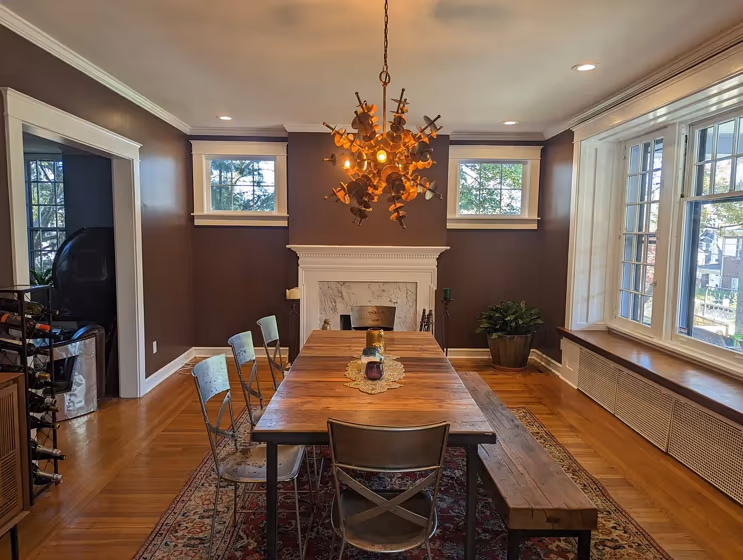
- French Press for living room (1 photo)
- What are Benjamin Moore French Press undertones?
- Is French Press AF-170 cool or warm?
- How light temperature affects on French Press
- Monochromatic color scheme
- Complementary color scheme
- Color comparison and matching
- LRV of French Press AF-170
- Color codes
- Color equivalents
| Official page: | French Press AF-170 |
| Code: | AF-170 |
| Name: | French Press |
| Brand: | Benjamin Moore |
What color is Benjamin Moore French Press?
Benjamin Moore AF-170 French Press exudes a rich and luxurious charm, reminiscent of a warm cup of coffee on a crisp autumn morning. This deep and sophisticated hue pairs beautifully with soft neutrals like Benjamin Moore OC-17 White Dove, creating a cozy and inviting ambiance. For a more dramatic contrast, consider pairing French Press with a bold accent color like Benjamin Moore HC-154 Hale Navy to add depth and character to any space. The versatility of French Press makes it an excellent choice for both traditional and modern interiors, adding a touch of elegance and warmth to any room.
Loading...
LRV of French Press
French Press has an LRV of 9.89% and refers to Dark colors which means that this color almost does not reflect light. Why LRV is important?

Light Reflectance Value measures the amount of visible and usable light that reflects from a painted surface.
Simply put, the higher the LRV of a paint color, the brighter the room you will get.
The scale goes from 0% (absolute black, absorbing all light) to 100% (pure white, reflecting all light).
Act like a pro: When choosing paint with an LRV of 9.89%, pay attention to your bulbs' brightness. Light brightness is measured in lumens. The lower the paint's LRV, the higher lumen level you need. Every square foot of room needs at least 40 lumens. That means for a 200 ft2 living room you'll need about 8000 lumens of light – e.g., eight 1000 lm bulbs.
Color codes
We have collected almost every possible color code you could ever need.
Not sure what the difference between HEX and RGB is? We break down color models in plain language. Understanding color models
| Format | Code |
|---|---|
| HEX | #5F4D43 |
| RGB Decimal | 95, 77, 67 |
| RGB Percent | 37.25%, 30.20%, 26.27% |
| HSV | Hue: 21° Saturation: 29.47% Value: 37.25% |
| HSL | hsl(21, 17, 32) |
| CMYK | Cyan: 0.0 Magenta: 18.95 Yellow: 29.47 Key: 62.75 |
| YIQ | Y: 81.242 I: 13.94 Q: 0.696 |
| XYZ | X: 8.386 Y: 8.146 Z: 6.439 |
| CIE Lab | L:34.286 a:5.846 b:8.778 |
| CIE Luv | L:34.286 u:11.565 v:9.258 |
| Decimal | 6245699 |
| Hunter Lab | 28.542, 2.501, 6.603 |