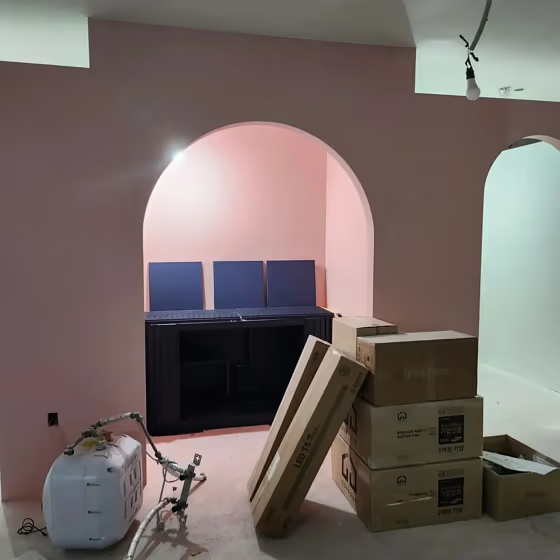
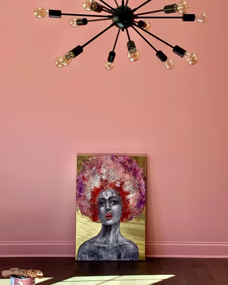
Benjamin Moore Fruit Shake 2088-60
Contentsshow +hide -
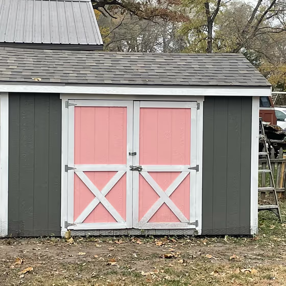
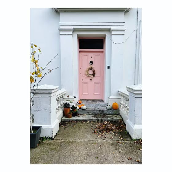
- Fruit Shake for exterior (2 photos)
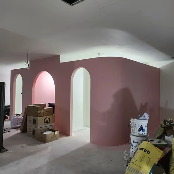
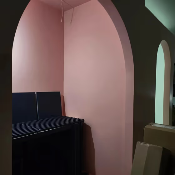
- Benjamin Moore Fruit Shake reviews (4 photos)
- What are Benjamin Moore Fruit Shake undertones?
- Is Fruit Shake 2088-60 cool or warm?
- How light temperature affects on Fruit Shake
- Monochromatic color scheme
- Complementary color scheme
- Color comparison and matching
- LRV of Fruit Shake 2088-60
- Color codes
- Color equivalents
| Official page: | Fruit Shake 2088-60 |
| Code: | 2088-60 |
| Name: | Fruit Shake |
| Brand: | Benjamin Moore |
What color is Benjamin Moore Fruit Shake?
Benjamin Moore Fruit Shake 2088-60 is a soft and soothing pastel yellow that adds a touch of warmth and cheerfulness to any space. This versatile color pairs beautifully with crisp whites, soft greys, and earthy tones like sage green or sandy beige. Whether used as an accent color or as the main hue in a room, Fruit Shake complements both modern and traditional decor styles. Its subtle undertones make it a great choice for creating a relaxed and inviting atmosphere in bedrooms, nurseries, or living rooms. Add touches of navy blue or coral accents to enhance the playful and charming feel of Fruit Shake in your interior design scheme.
LRV of Fruit Shake
Fruit Shake has an LRV of 56.58% and refers to Light colors that reflect most of the incident light. Why LRV is important?

Light Reflectance Value measures the amount of visible and usable light that reflects from a painted surface.
Simply put, the higher the LRV of a paint color, the brighter the room you will get.
The scale goes from 0% (absolute black, absorbing all light) to 100% (pure white, reflecting all light).
Act like a pro: When choosing paint with an LRV of 56.58%, pay attention to your bulbs' brightness. Light brightness is measured in lumens. The lower the paint's LRV, the higher lumen level you need. Every square foot of room needs at least 40 lumens. That means for a 200 ft2 living room you'll need about 8000 lumens of light – e.g., eight 1000 lm bulbs.
Color codes
We have collected almost every possible color code you could ever need.
| Format | Code |
|---|---|
| HEX | #ECBDB7 |
| RGB Decimal | 236, 189, 183 |
| RGB Percent | 92.55%, 74.12%, 71.76% |
| HSV | Hue: 7° Saturation: 22.46% Value: 92.55% |
| HSL | hsl(7, 58, 82) |
| CMYK | Cyan: 0.0 Magenta: 19.92 Yellow: 22.46 Key: 7.45 |
| YIQ | Y: 202.369 I: 29.935 Q: 8.075 |
| XYZ | X: 61.337 Y: 57.649 Z: 52.683 |
| CIE Lab | L:80.543 a:15.944 b:9.442 |
| CIE Luv | L:80.543 u:29.808 v:10.728 |
| Decimal | 15515063 |
| Hunter Lab | 75.927, 11.326, 12.01 |


