Benjamin Moore Old World 2011-40
Contentsshow +hide -
| Official page: | Old World 2011-40 |
| Code: | 2011-40 |
| Name: | Old World |
| Brand: | Benjamin Moore |
What color is Benjamin Moore Old World?
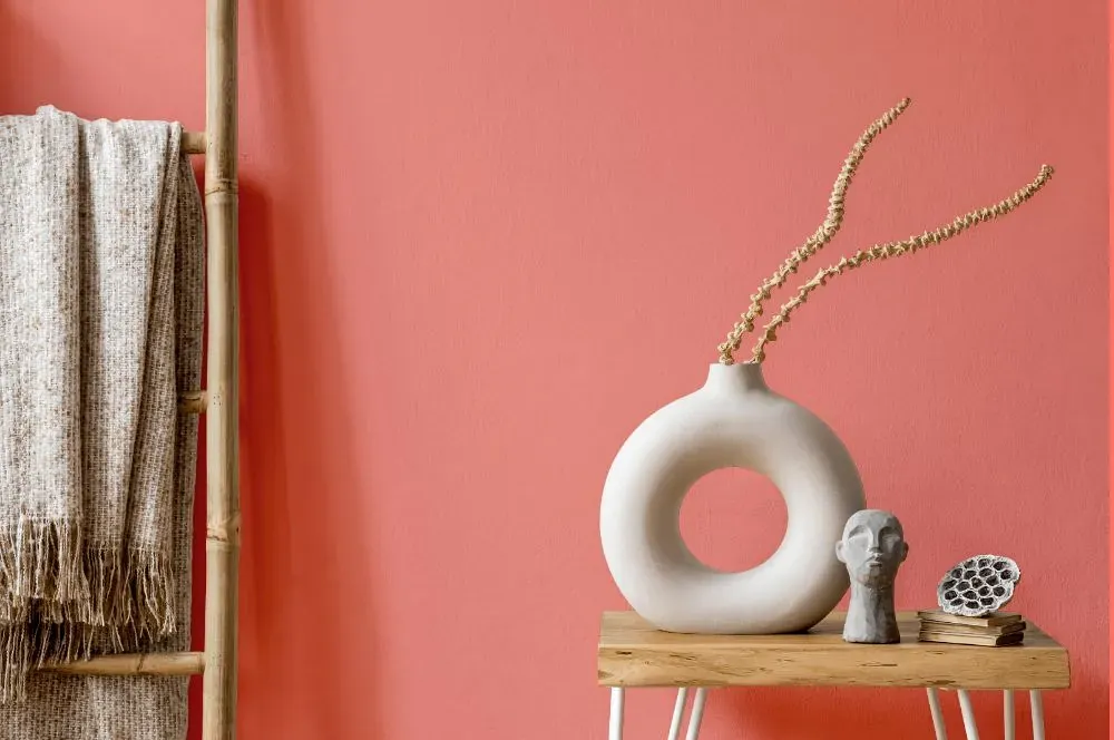
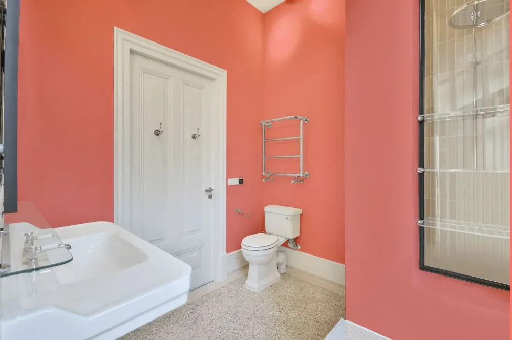
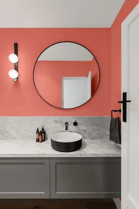
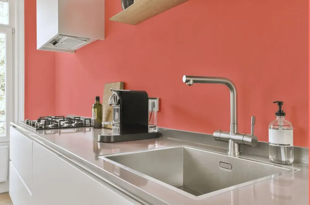
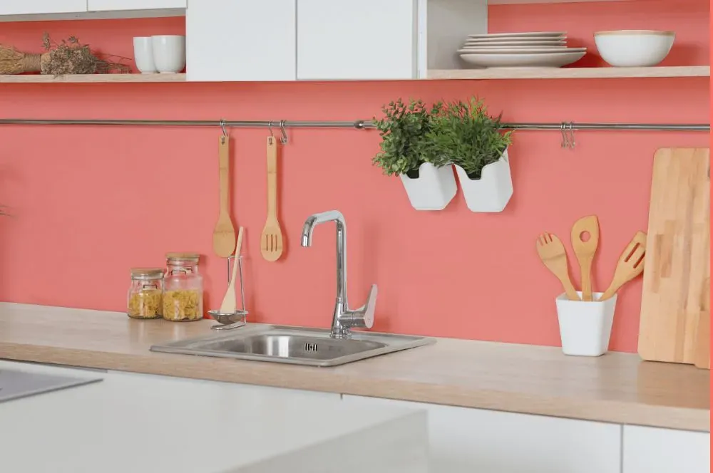
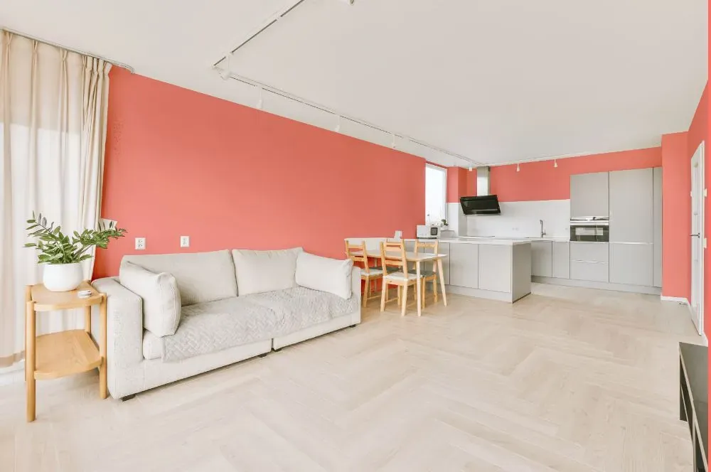
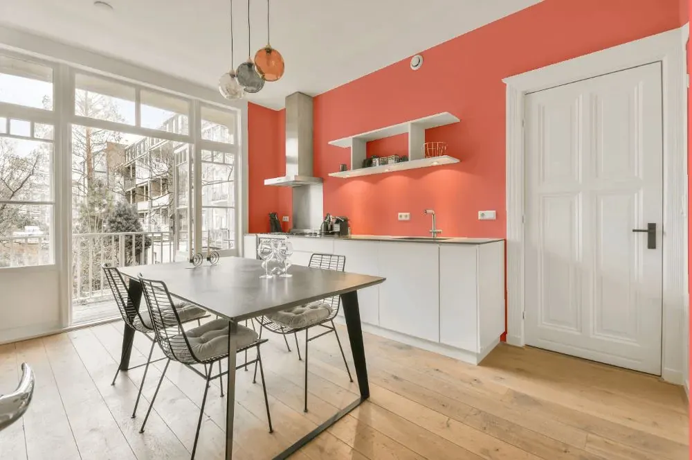
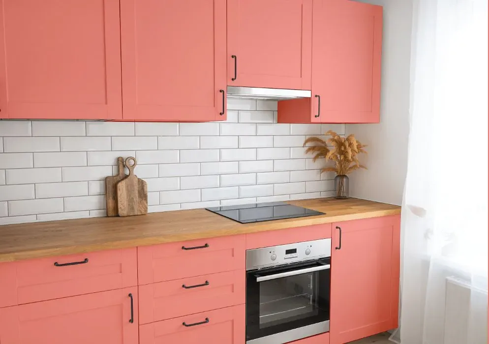
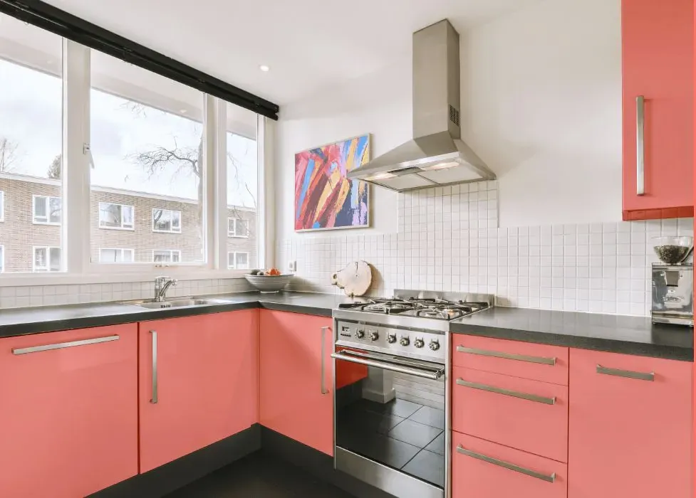
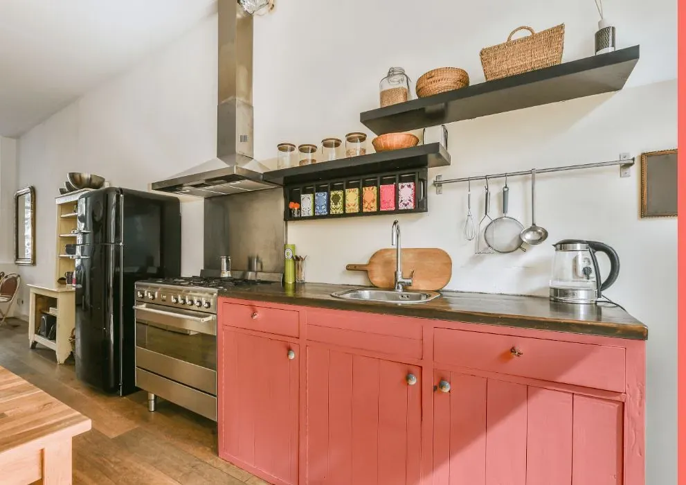
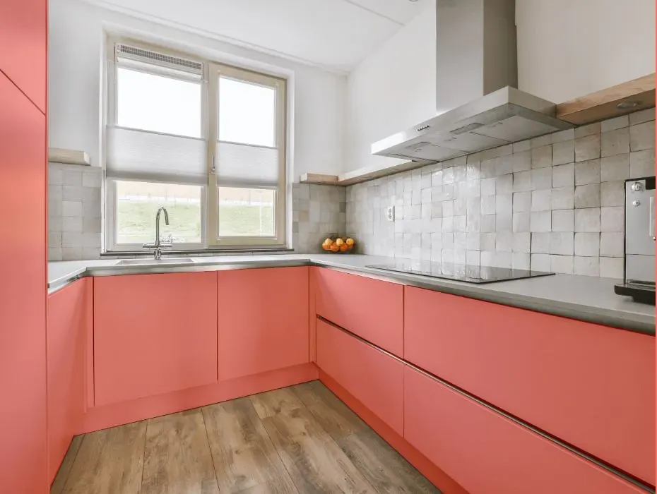
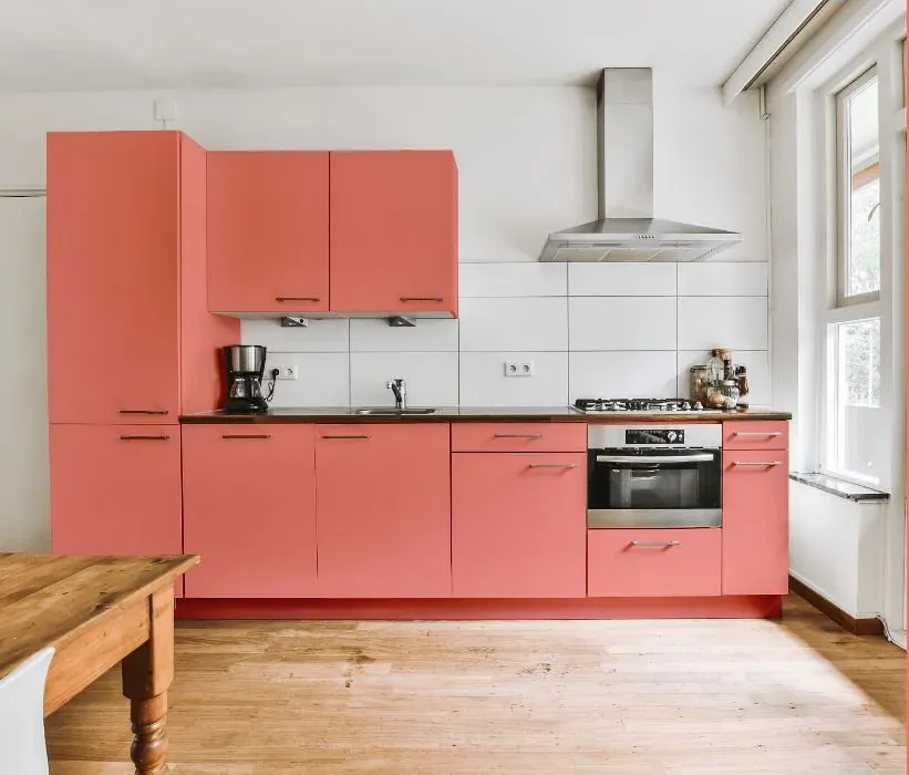
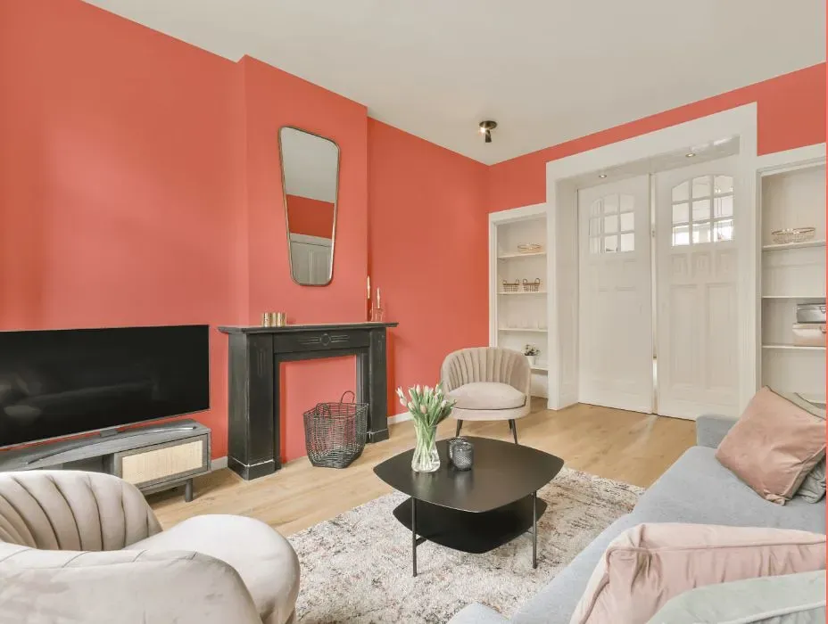
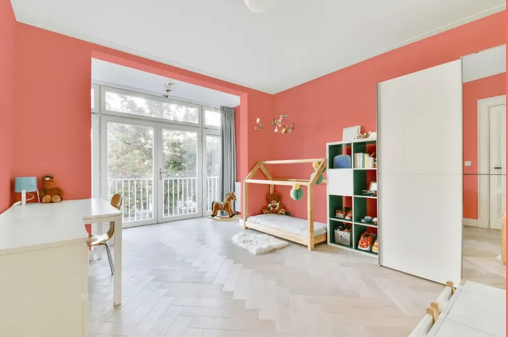
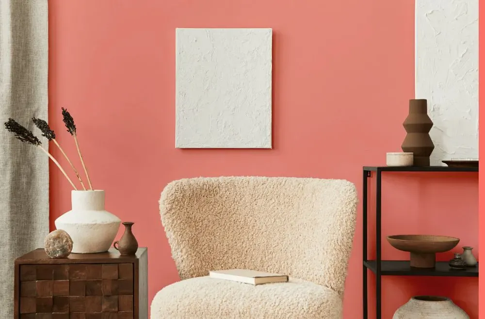
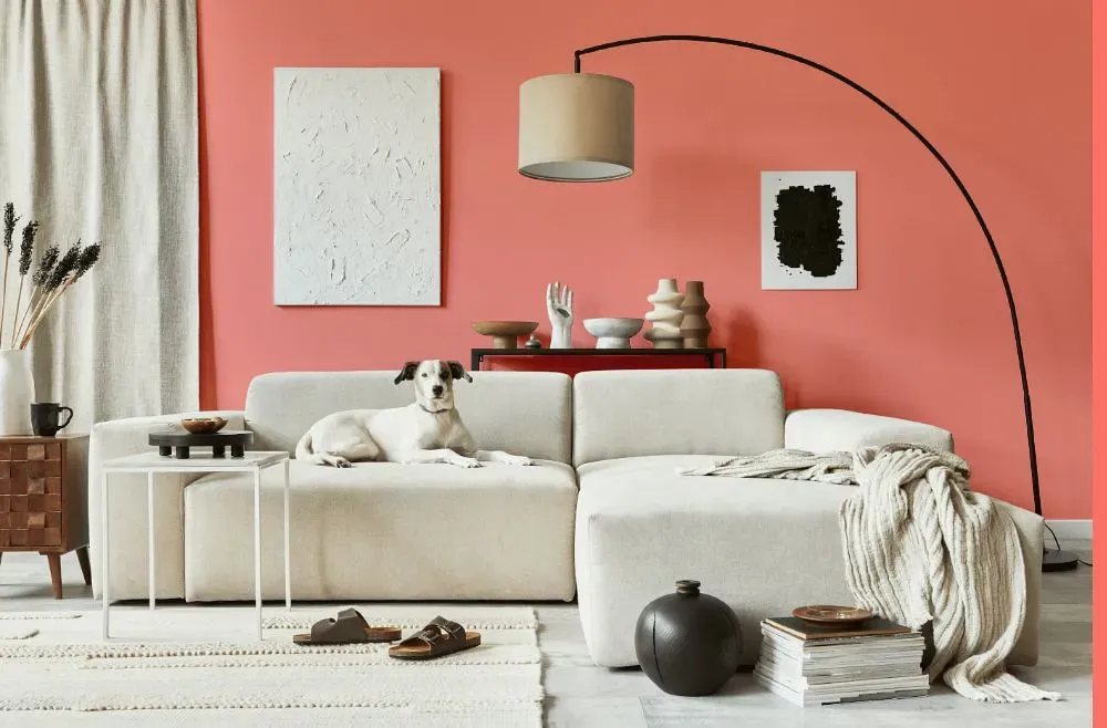
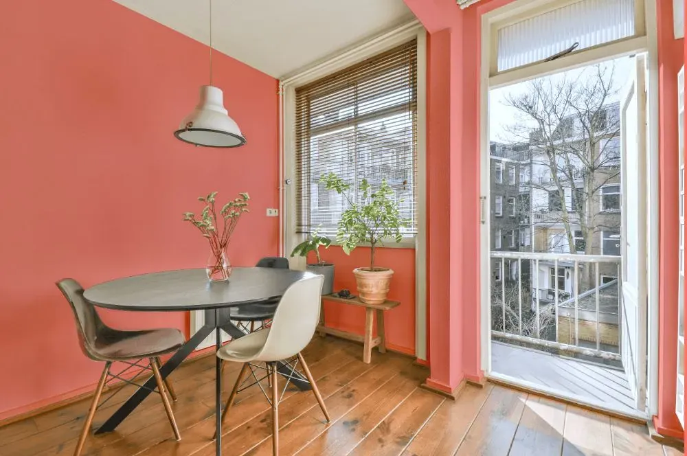
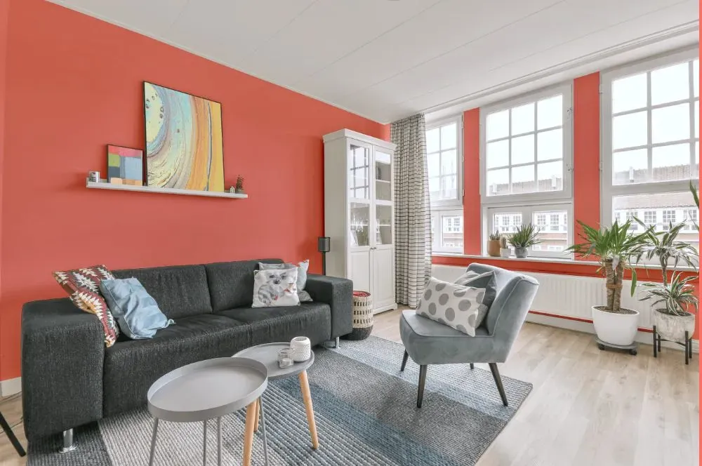
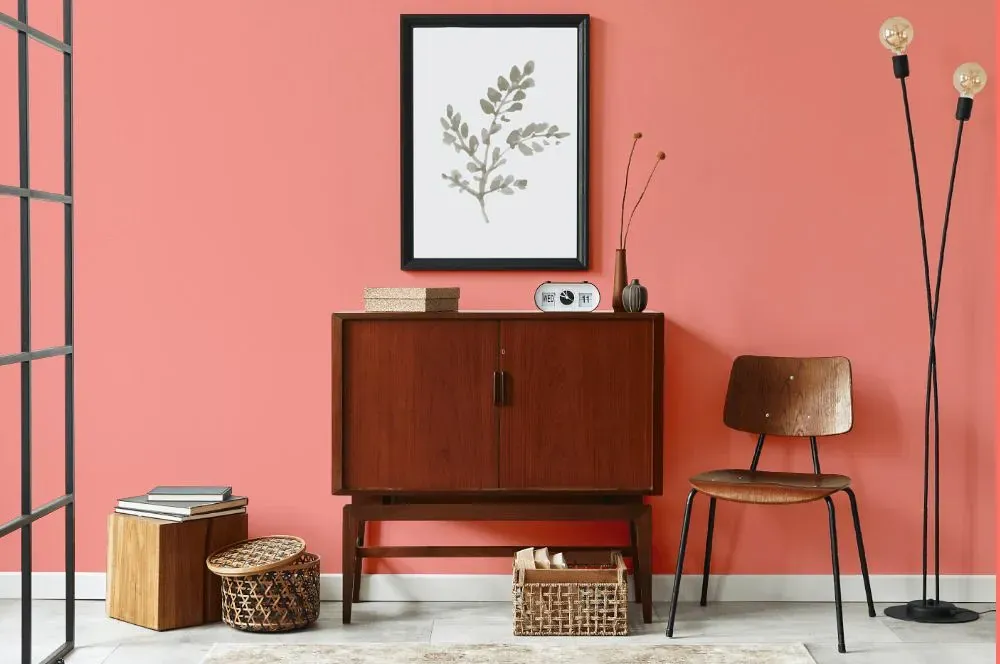
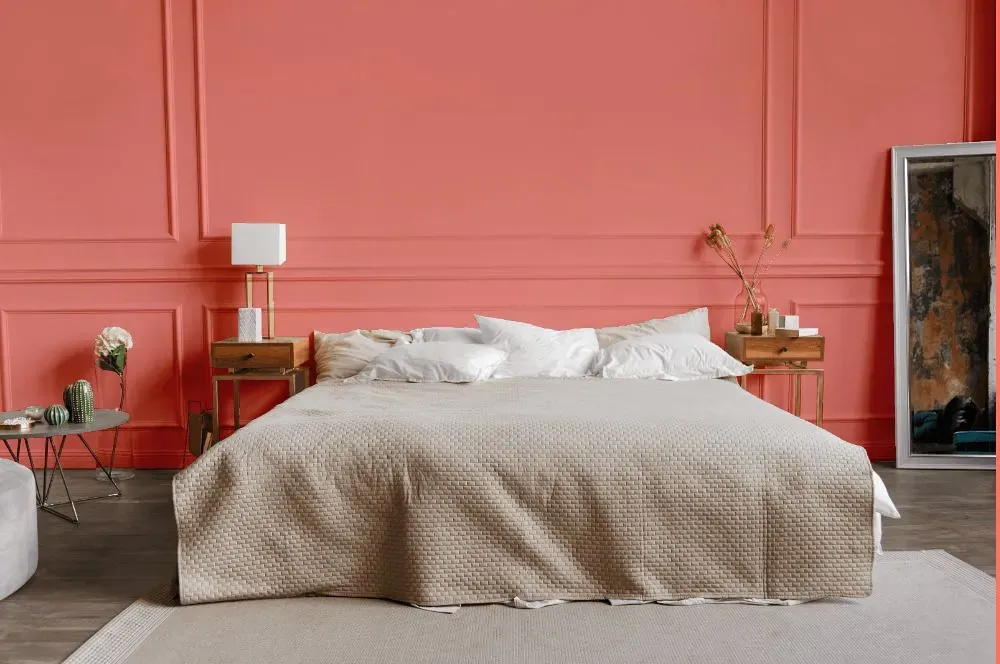
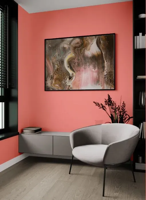
Introducing Benjamin Moore color 2011-40 Old World, a rich and timeless hue that exudes sophistication. This warm and inviting shade complements a wide range of colors, making it a versatile choice for any space. Pair Old World with soft neutrals like creams and beiges for a classic look, or with deep jewel tones like emerald green and sapphire blue for a luxurious feel. Experiment with contrasting textures and finishes to enhance the depth and beauty of this elegant color. Benjamin Moore's Old World is sure to add a touch of charm and elegance to your interior design scheme.
Loading...
LRV of Old World
Old World has an LRV of 44.43% and refers to Light Medium colors that reflect half of the incident light. Why LRV is important?

Light Reflectance Value measures the amount of visible and usable light that reflects from a painted surface.
Simply put, the higher the LRV of a paint color, the brighter the room you will get.
The scale goes from 0% (absolute black, absorbing all light) to 100% (pure white, reflecting all light).
Act like a pro: When choosing paint with an LRV of 44.43%, pay attention to your bulbs' brightness. Light brightness is measured in lumens. The lower the paint's LRV, the higher lumen level you need. Every square foot of room needs at least 40 lumens. That means for a 200 ft2 living room you'll need about 8000 lumens of light – e.g., eight 1000 lm bulbs.
Color codes
We have collected almost every possible color code you could ever need.
Not sure what the difference between HEX and RGB is? We break down color models in plain language. Understanding color models
| Format | Code |
|---|---|
| HEX | #FD988E |
| RGB Decimal | 253, 152, 142 |
| RGB Percent | 99.22%, 59.61%, 55.69% |
| HSV | Hue: 5° Saturation: 43.87% Value: 99.22% |
| HSL | hsl(5, 97, 77) |
| CMYK | Cyan: 0.0 Magenta: 39.92 Yellow: 43.87 Key: 0.78 |
| YIQ | Y: 181.059 I: 63.399 Q: 18.253 |
| XYZ | X: 56.621 Y: 45.297 Z: 31.345 |
| CIE Lab | L:73.087 a:36.715 b:21.54 |
| CIE Luv | L:73.087 u:71.257 v:21.635 |
| Decimal | 16619662 |
| Hunter Lab | 67.303, 32.39, 19.499 |