Benjamin Moore Outrageous Orange 2013-10
Contentsshow +hide -
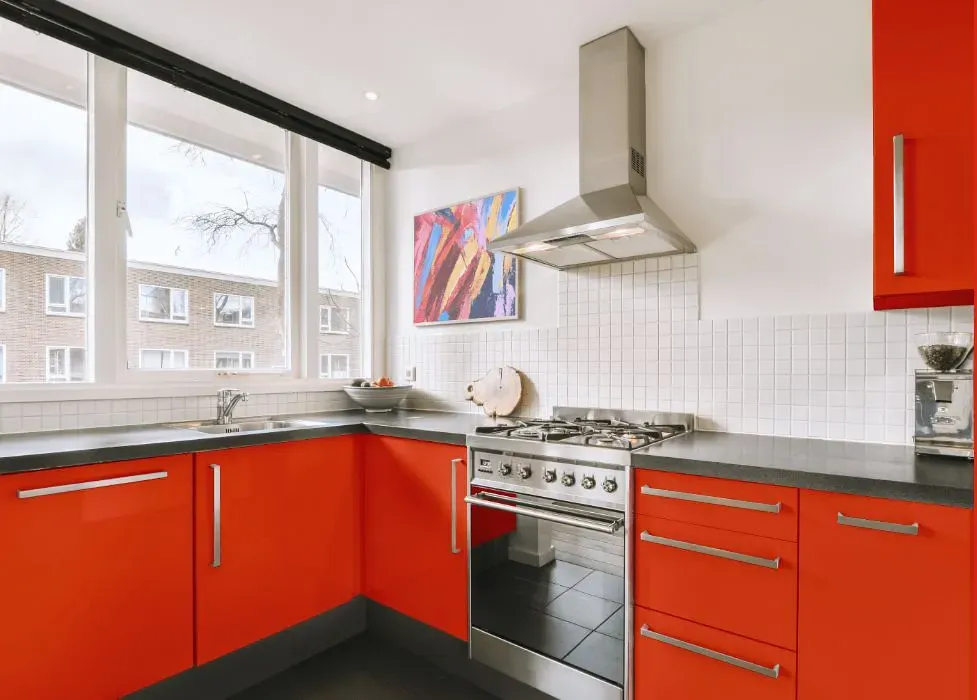
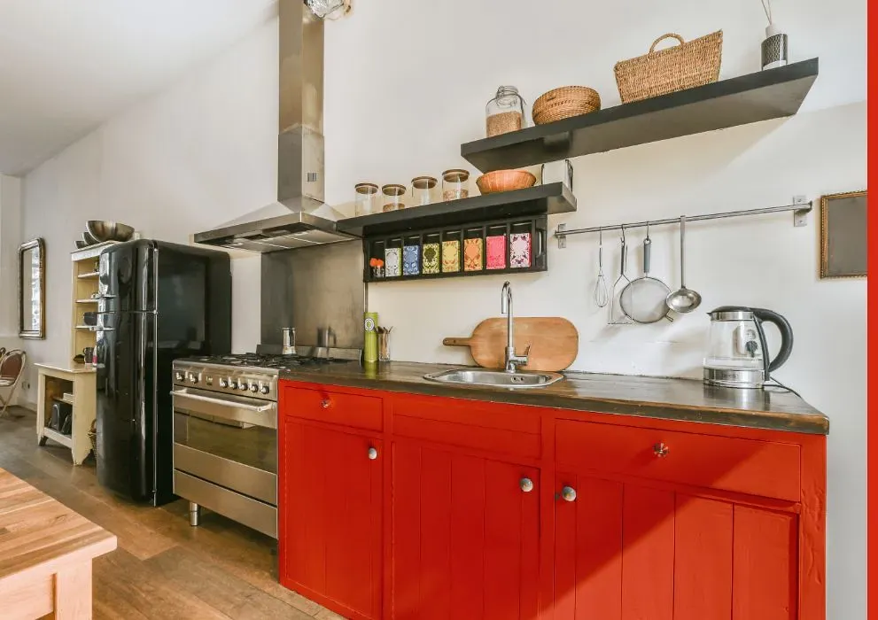
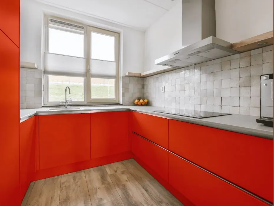
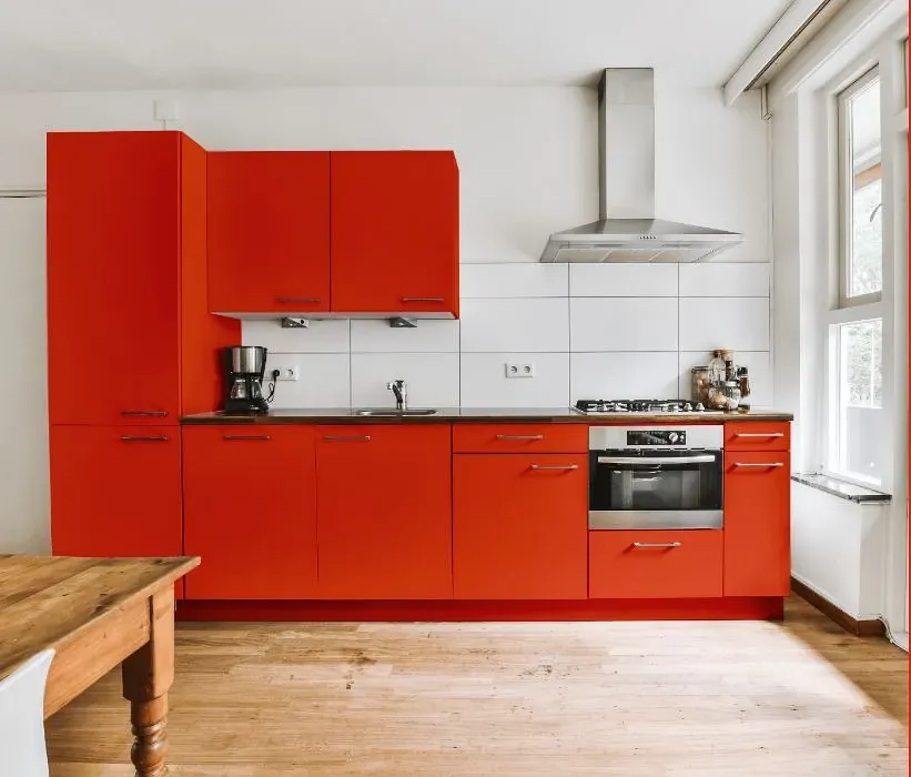
- Benjamin Moore Outrageous Orange reviews (23 photos)
- What are Benjamin Moore Outrageous Orange undertones?
- Is Outrageous Orange 2013-10 cool or warm?
- How light temperature affects on Outrageous Orange
- Monochromatic color scheme
- Complementary color scheme
- Color comparison and matching
- LRV of Outrageous Orange 2013-10
- Color codes
- Color equivalents
| Official page: | Outrageous Orange 2013-10 |
| Code: | 2013-10 |
| Name: | Outrageous Orange |
| Brand: | Benjamin Moore |
What color is Benjamin Moore Outrageous Orange?
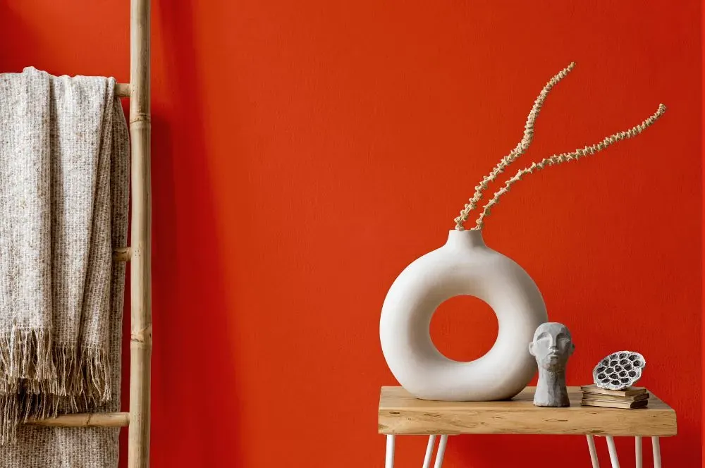
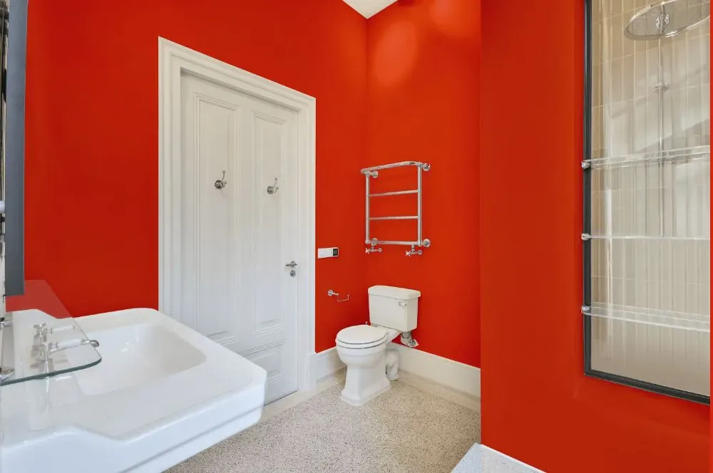
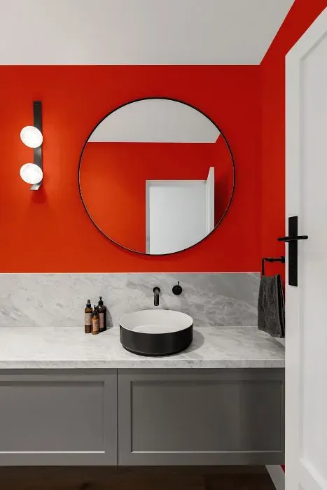
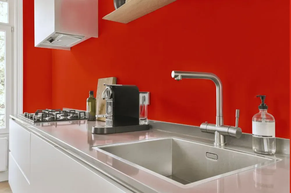
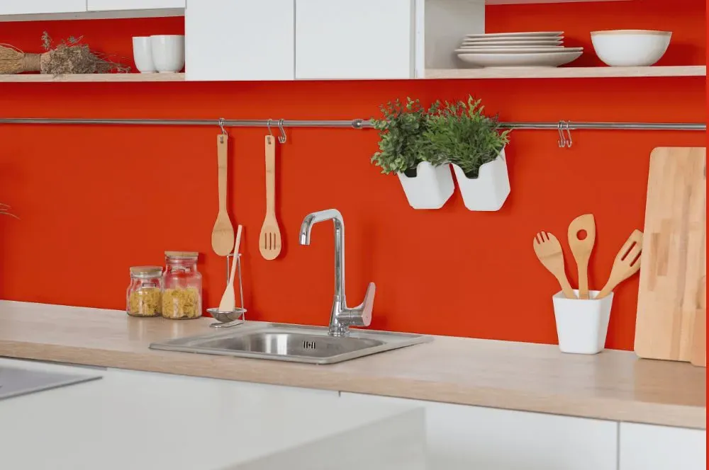
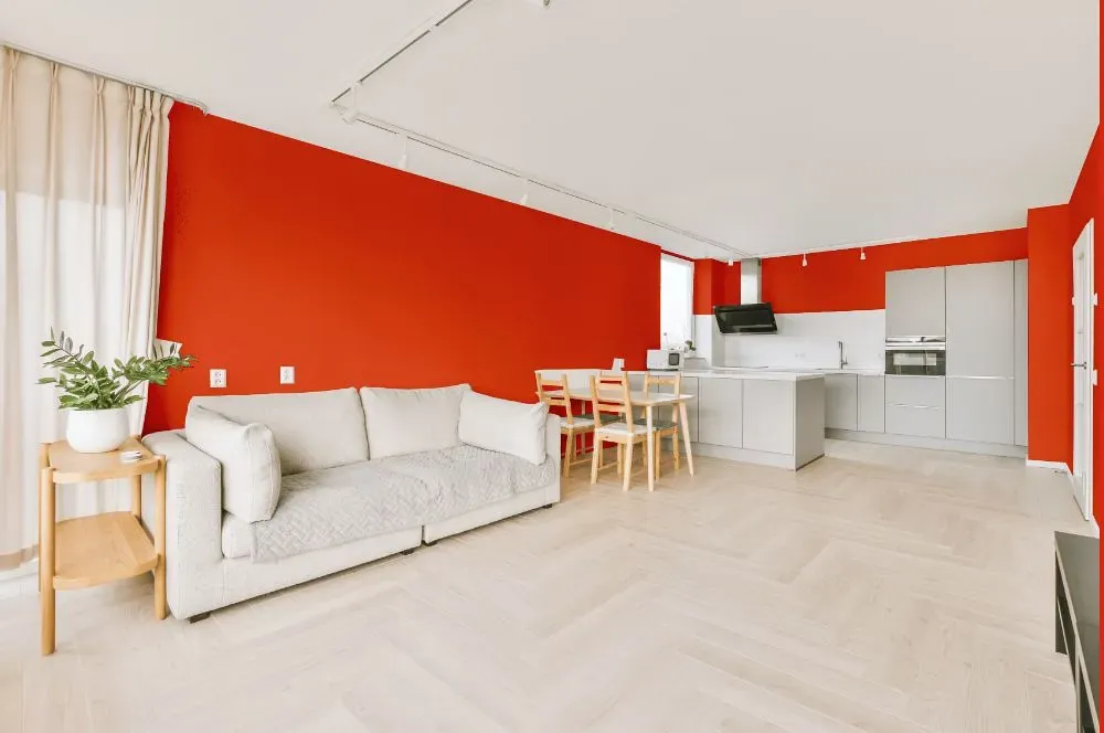
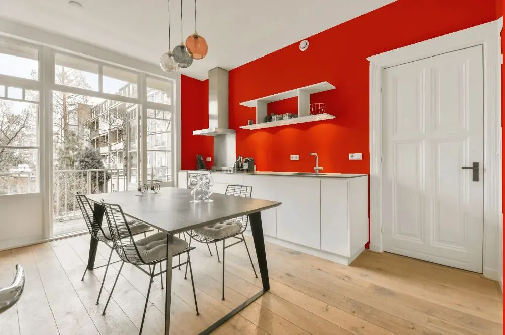
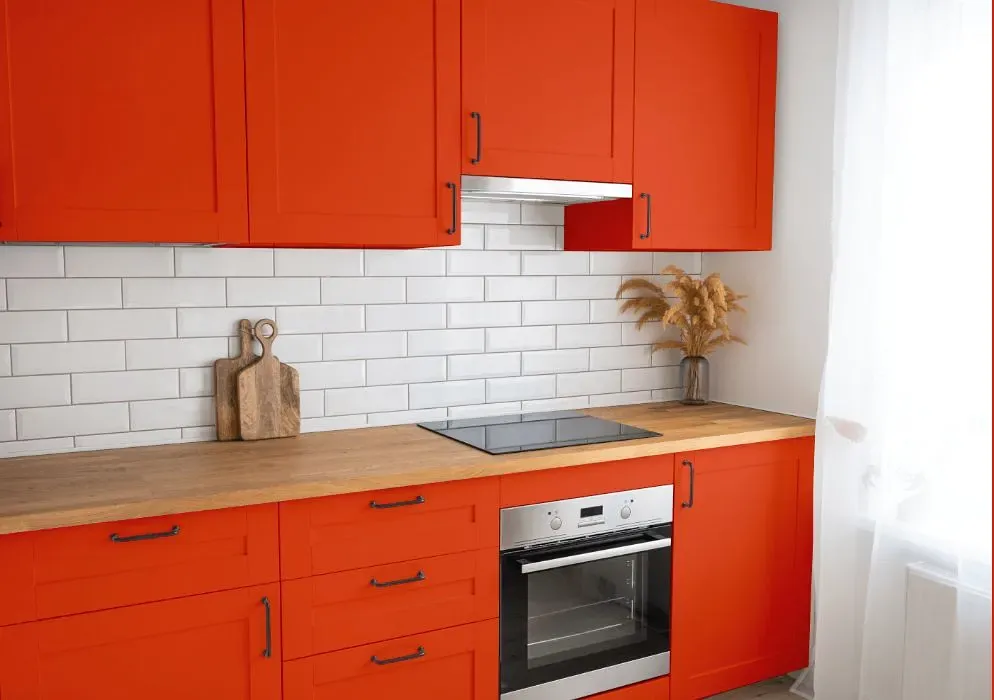
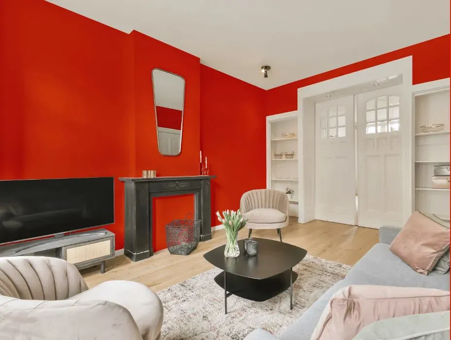
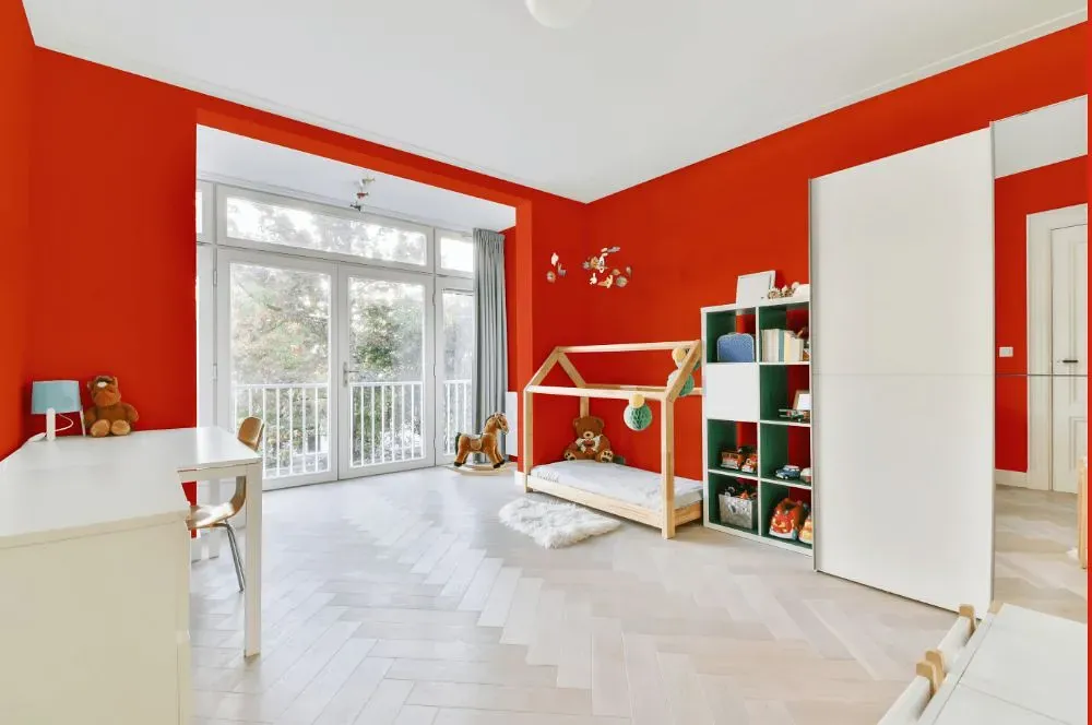
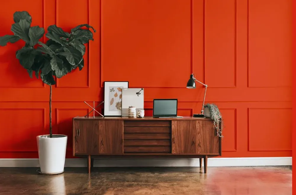
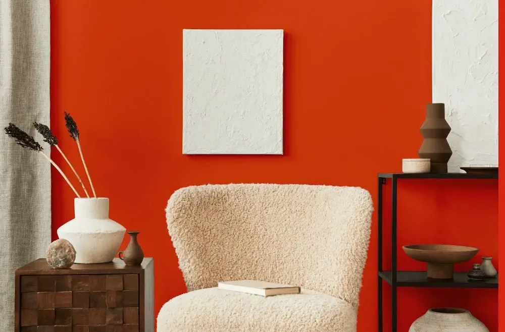
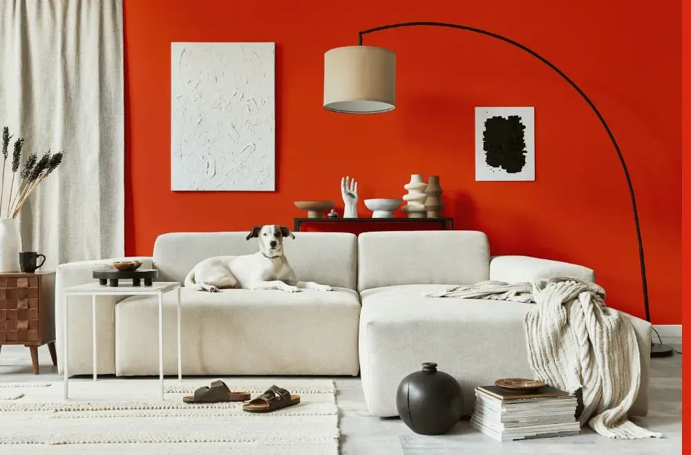
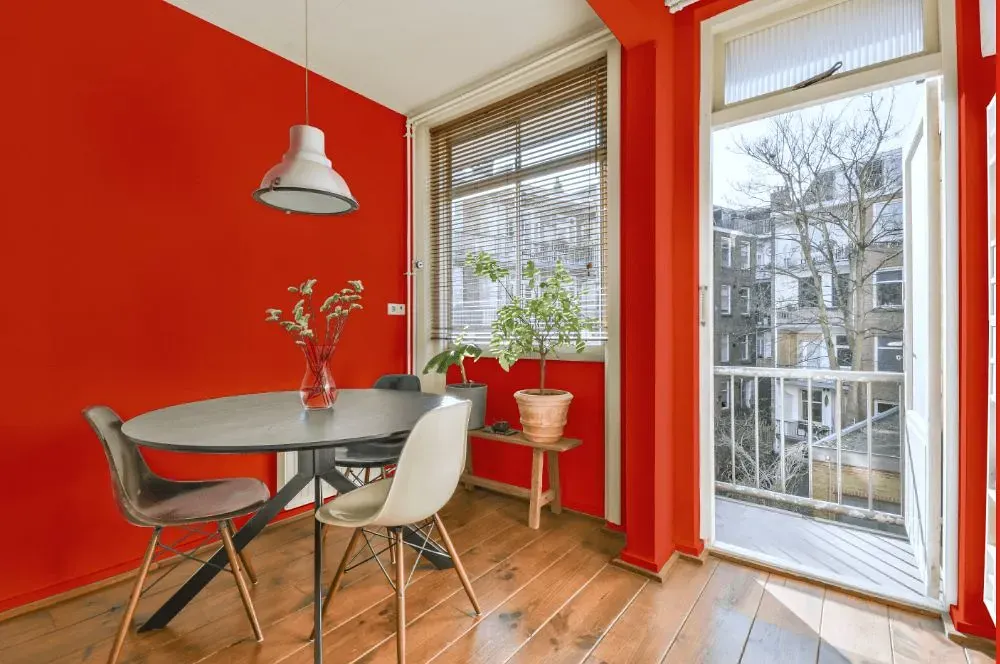
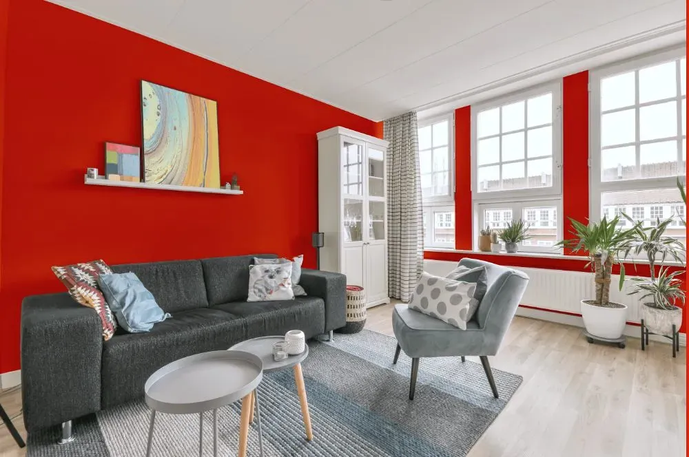
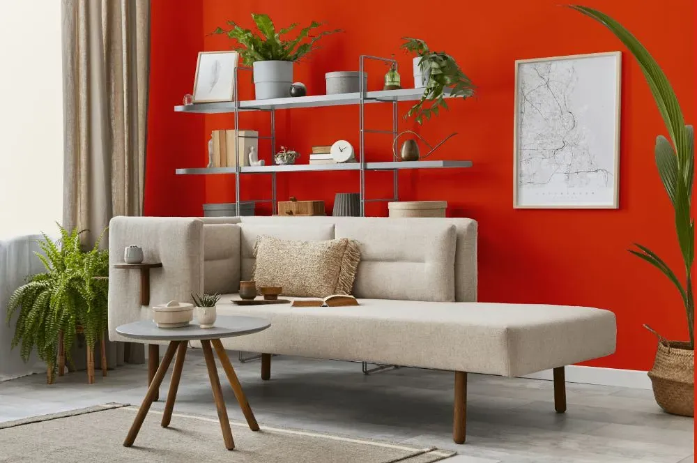
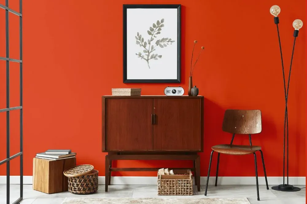
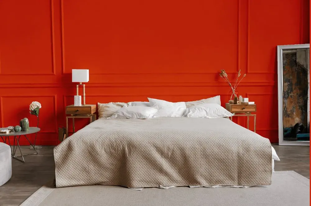
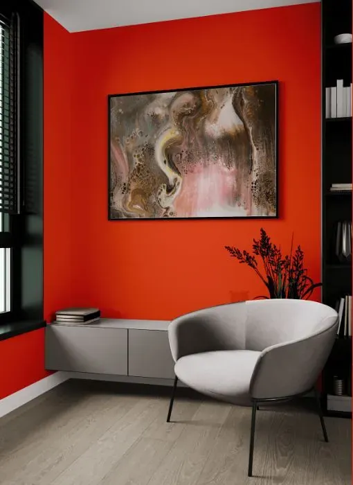
Benjamin Moore's 2013-10 Outrageous Orange is a vibrant and energetic hue that adds a bold pop of color to any space. This dynamic shade pairs well with neutrals such as crisp white or soft gray to create a striking contrast and make the orange truly stand out. For a more daring look, combine Outrageous Orange with complementary colors like deep teal or sunny yellow to create a lively and harmonious color scheme. Whether used as an accent wall or for furniture pieces, this captivating color choice is sure to bring warmth and excitement to your interior design.
Loading...
LRV of Outrageous Orange
Outrageous Orange has an LRV of 20.06% and refers to Medium colors that reflect a lot of light. Why LRV is important?

Light Reflectance Value measures the amount of visible and usable light that reflects from a painted surface.
Simply put, the higher the LRV of a paint color, the brighter the room you will get.
The scale goes from 0% (absolute black, absorbing all light) to 100% (pure white, reflecting all light).
Act like a pro: When choosing paint with an LRV of 20.06%, pay attention to your bulbs' brightness. Light brightness is measured in lumens. The lower the paint's LRV, the higher lumen level you need. Every square foot of room needs at least 40 lumens. That means for a 200 ft2 living room you'll need about 8000 lumens of light – e.g., eight 1000 lm bulbs.
Color codes
We have collected almost every possible color code you could ever need.
Not sure what the difference between HEX and RGB is? We break down color models in plain language. Understanding color models
| Format | Code |
|---|---|
| HEX | #E34C28 |
| RGB Decimal | 227, 76, 40 |
| RGB Percent | 89.02%, 29.80%, 15.69% |
| HSV | Hue: 12° Saturation: 82.38% Value: 89.02% |
| HSL | hsl(12, 77, 52) |
| CMYK | Cyan: 0.0 Magenta: 66.52 Yellow: 82.38 Key: 10.98 |
| YIQ | Y: 117.045 I: 101.549 Q: 20.739 |
| XYZ | X: 34.65 Y: 21.658 Z: 4.363 |
| CIE Lab | L:53.662 a:56.914 b:51.669 |
| CIE Luv | L:53.662 u:121.474 v:38.224 |
| Decimal | 14896168 |
| Hunter Lab | 46.538, 51.459, 27.018 |