Benjamin Moore Pacific Grove Pink 889
Contentsshow +hide -
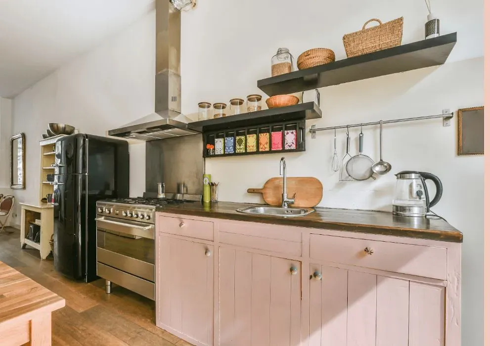
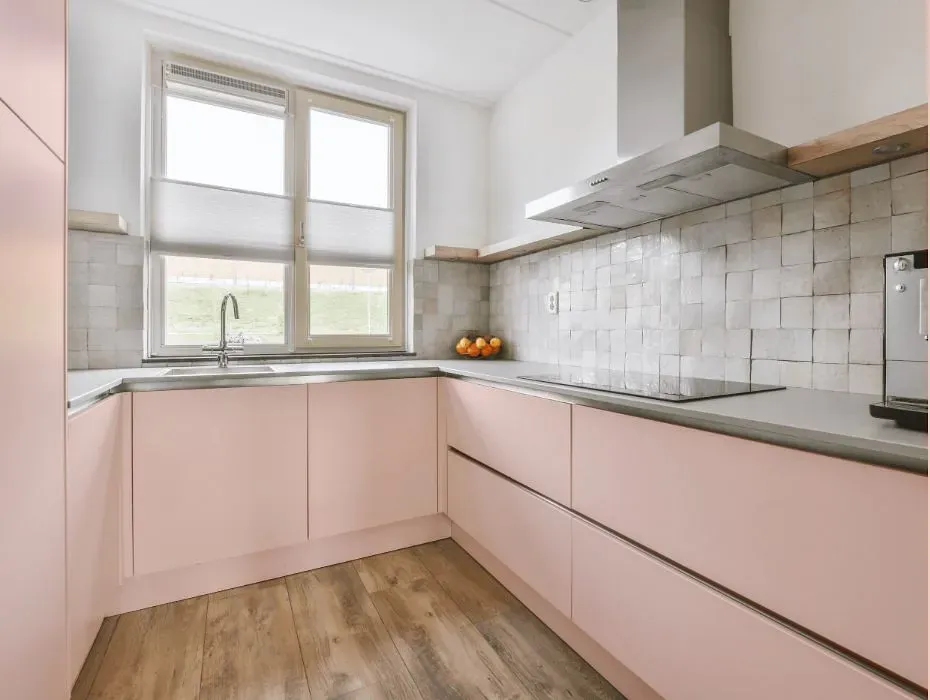
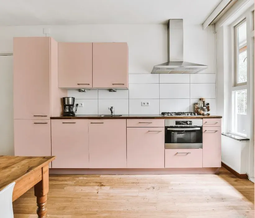
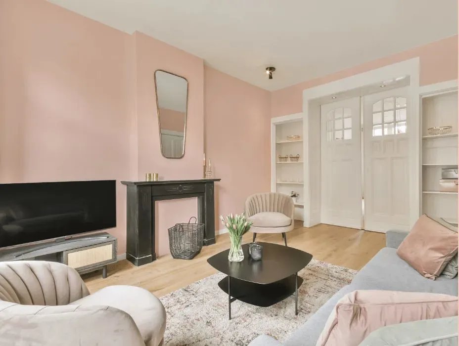
- Benjamin Moore Pacific Grove Pink reviews (23 photos)
- What are Benjamin Moore Pacific Grove Pink undertones?
- Is Pacific Grove Pink 889 cool or warm?
- How light temperature affects on Pacific Grove Pink
- Monochromatic color scheme
- Complementary color scheme
- Color comparison and matching
- LRV of Pacific Grove Pink 889
- Color codes
- Color equivalents
| Official page: | Pacific Grove Pink 889 |
| Code: | 889 |
| Name: | Pacific Grove Pink |
| Brand: | Benjamin Moore |
What color is Benjamin Moore Pacific Grove Pink?
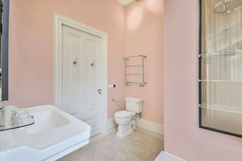
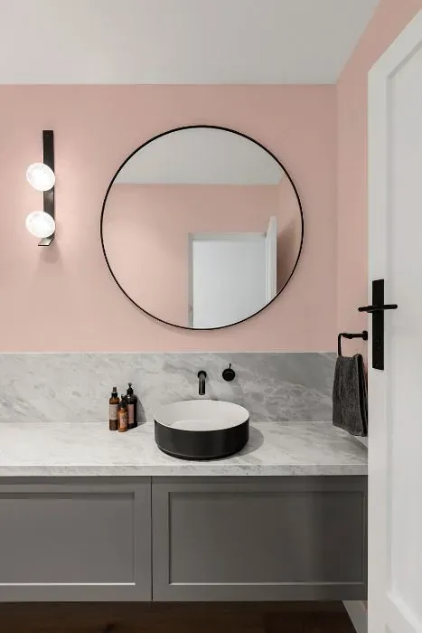
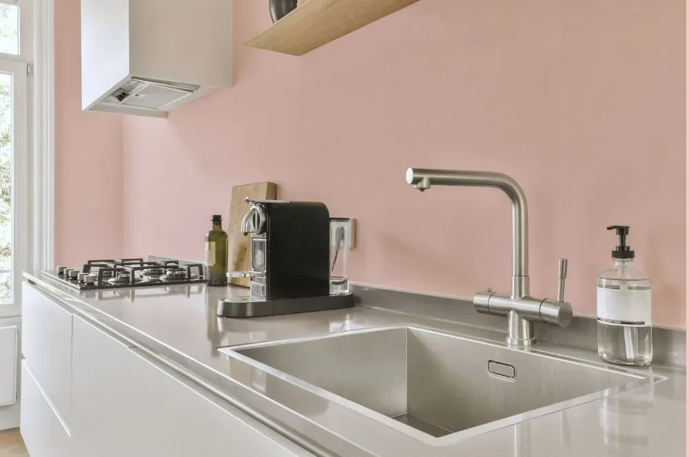
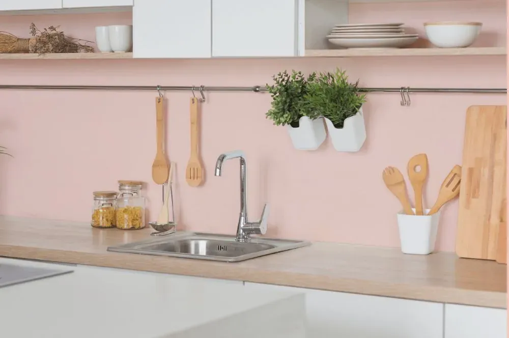
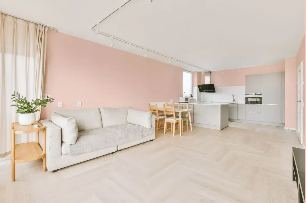
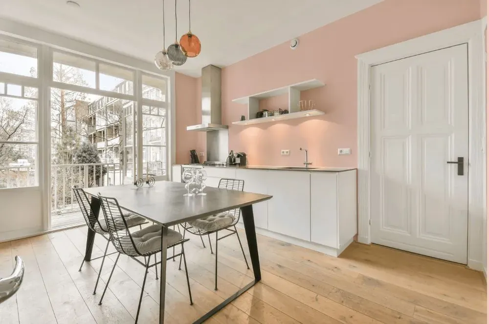
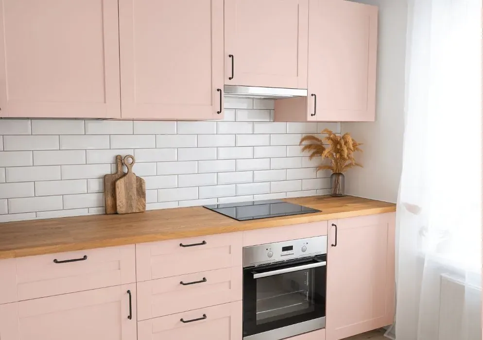
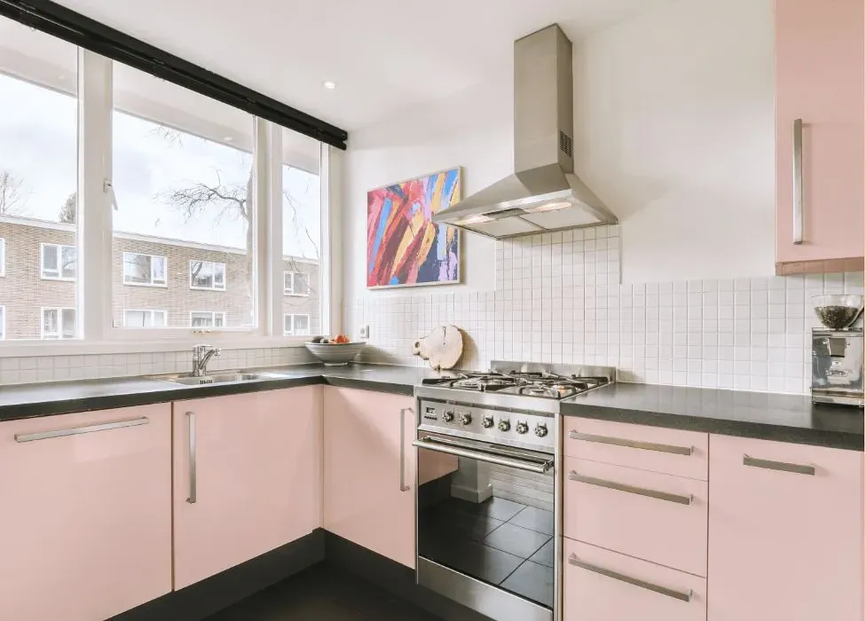
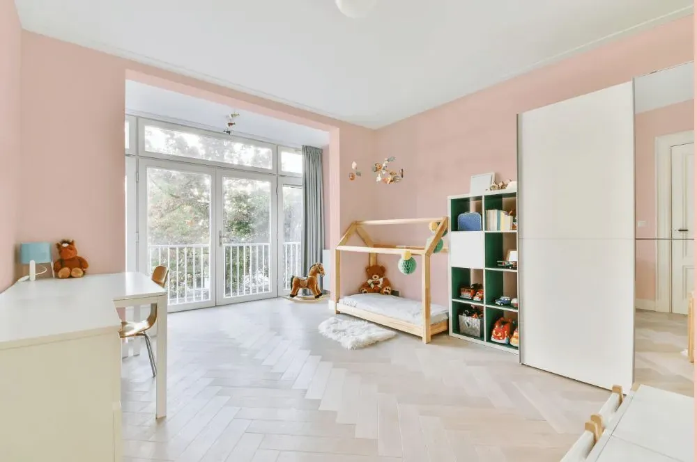
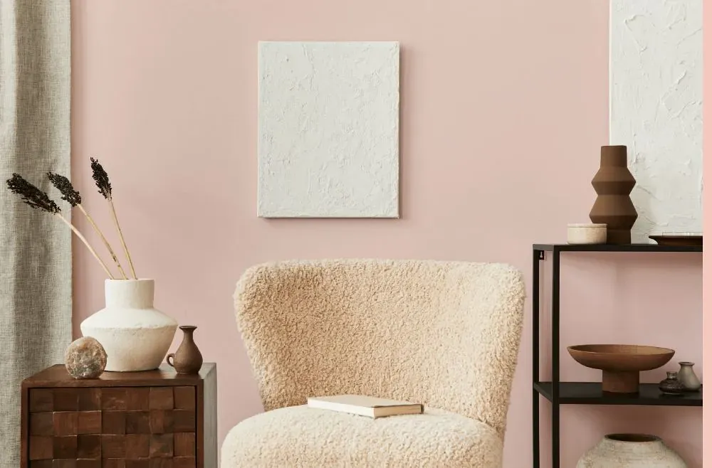
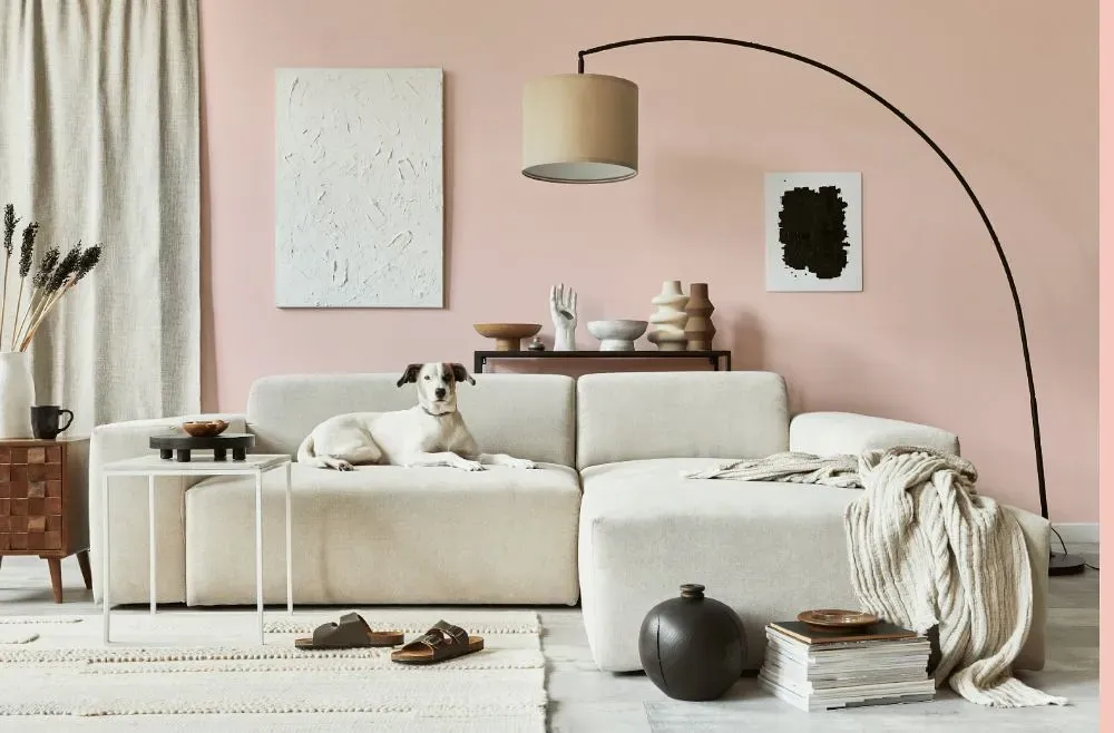
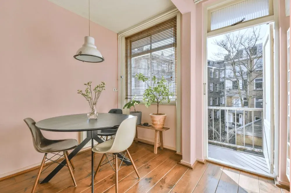
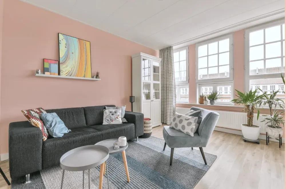
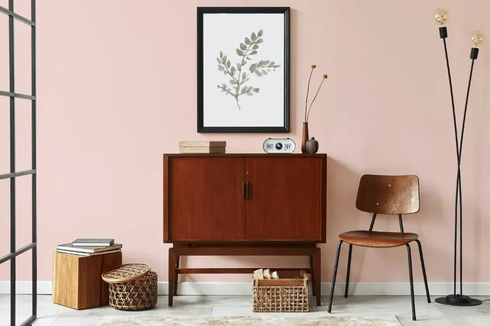
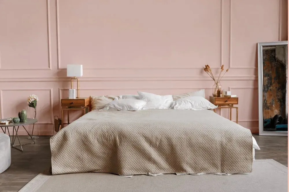
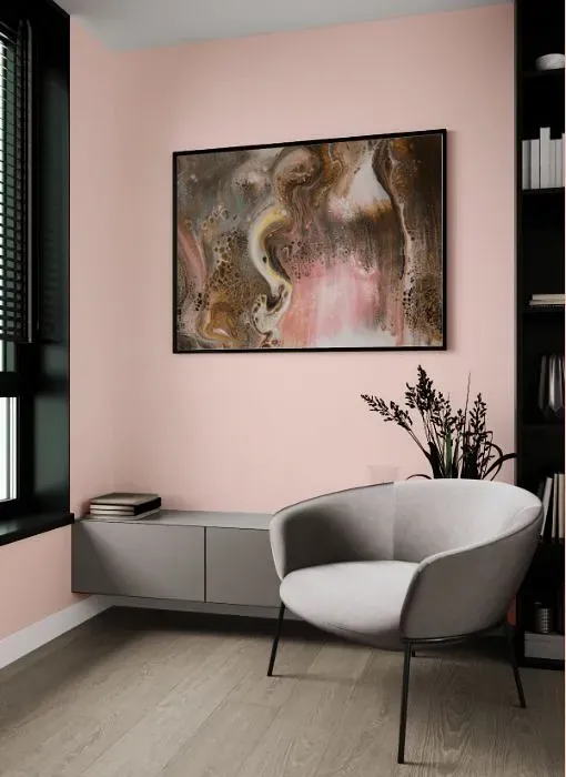
Step into a world of warmth and sophistication with Benjamin Moore's Pacific Grove Pink (Color code 889). This soft and romantic hue brings a touch of elegance to any room it graces, from cozy living rooms to serene master bedrooms. The gentle blush tones of Pacific Grove Pink create a soothing atmosphere, perfect for unwinding after a long day. Whether used as an accent wall or to envelop an entire space in its rosy glow, this versatile color effortlessly complements both contemporary and traditional decor styles. Embrace the timeless beauty of Pacific Grove Pink and elevate your home with its understated charm.
Loading...
LRV of Pacific Grove Pink
Pacific Grove Pink has an LRV of 73.13% and refers to Off‑White colors that reflect a lot of light. Why LRV is important?

Light Reflectance Value measures the amount of visible and usable light that reflects from a painted surface.
Simply put, the higher the LRV of a paint color, the brighter the room you will get.
The scale goes from 0% (absolute black, absorbing all light) to 100% (pure white, reflecting all light).
Act like a pro: When choosing paint with an LRV of 73.13%, pay attention to your bulbs' brightness. Light brightness is measured in lumens. The lower the paint's LRV, the higher lumen level you need. Every square foot of room needs at least 40 lumens. That means for a 200 ft2 living room you'll need about 8000 lumens of light – e.g., eight 1000 lm bulbs.
Color codes
We have collected almost every possible color code you could ever need.
Not sure what the difference between HEX and RGB is? We break down color models in plain language. Understanding color models
| Format | Code |
|---|---|
| HEX | #F9DAD3 |
| RGB Decimal | 249, 218, 211 |
| RGB Percent | 97.65%, 85.49%, 82.75% |
| HSV | Hue: 11° Saturation: 15.26% Value: 97.65% |
| HSL | hsl(11, 76, 90) |
| CMYK | Cyan: 0.0 Magenta: 12.45 Yellow: 15.26 Key: 2.35 |
| YIQ | Y: 226.471 I: 20.722 Q: 4.379 |
| XYZ | X: 75.895 Y: 74.988 Z: 72.086 |
| CIE Lab | L:89.387 a:9.613 b:7.39 |
| CIE Luv | L:89.387 u:19.064 v:9.243 |
| Decimal | 16374483 |
| Hunter Lab | 86.595, 4.901, 11.261 |