Benjamin Moore Paradise Valley 559
Contentsshow +hide -
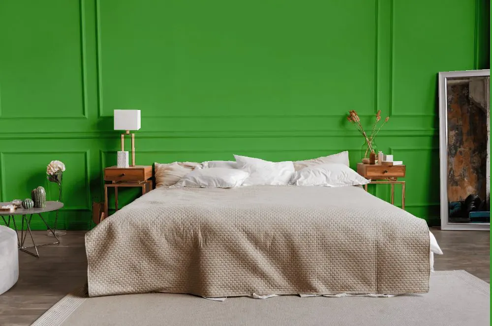
- Paradise Valley for bedroom (1 photo)
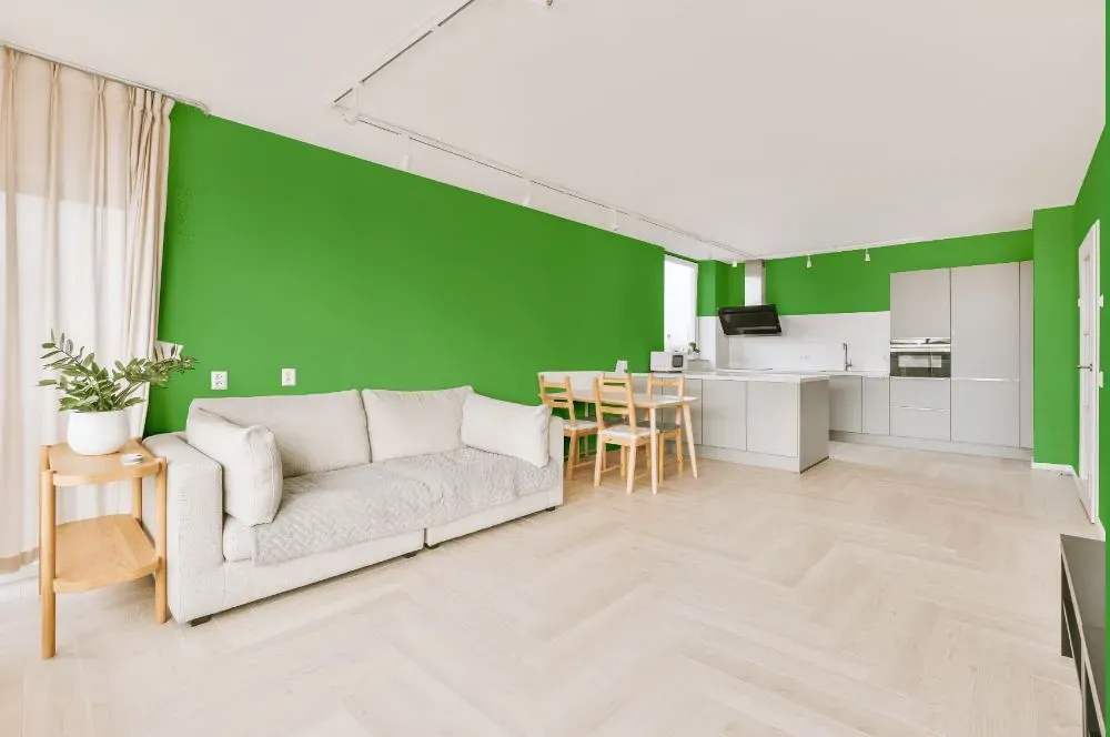
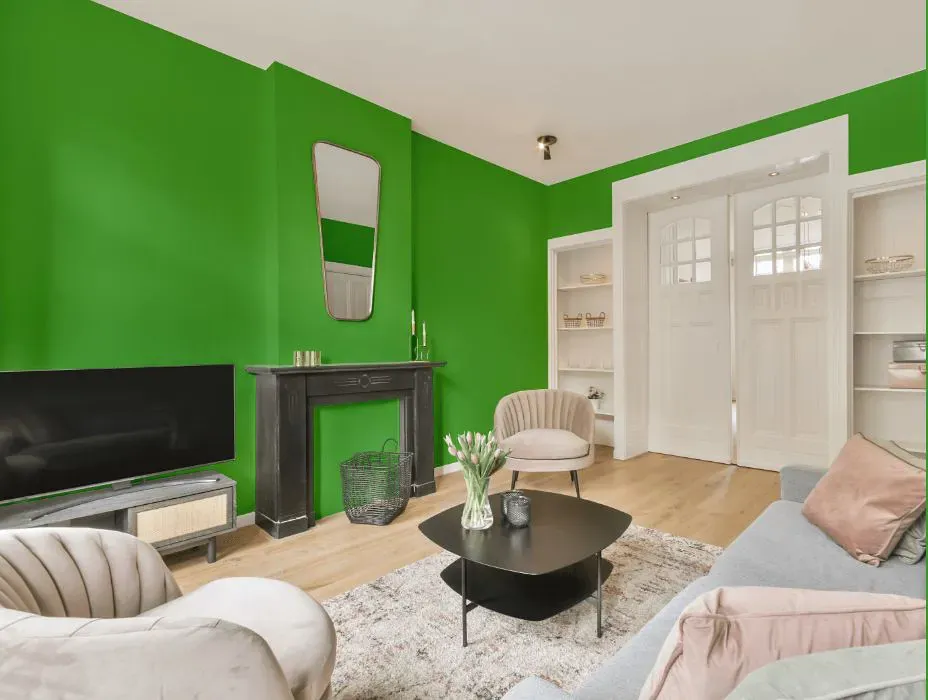
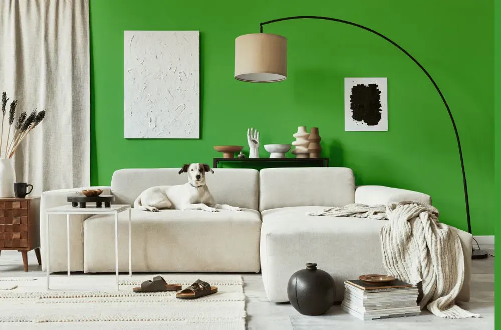
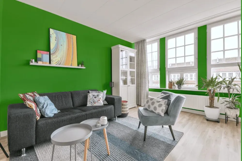
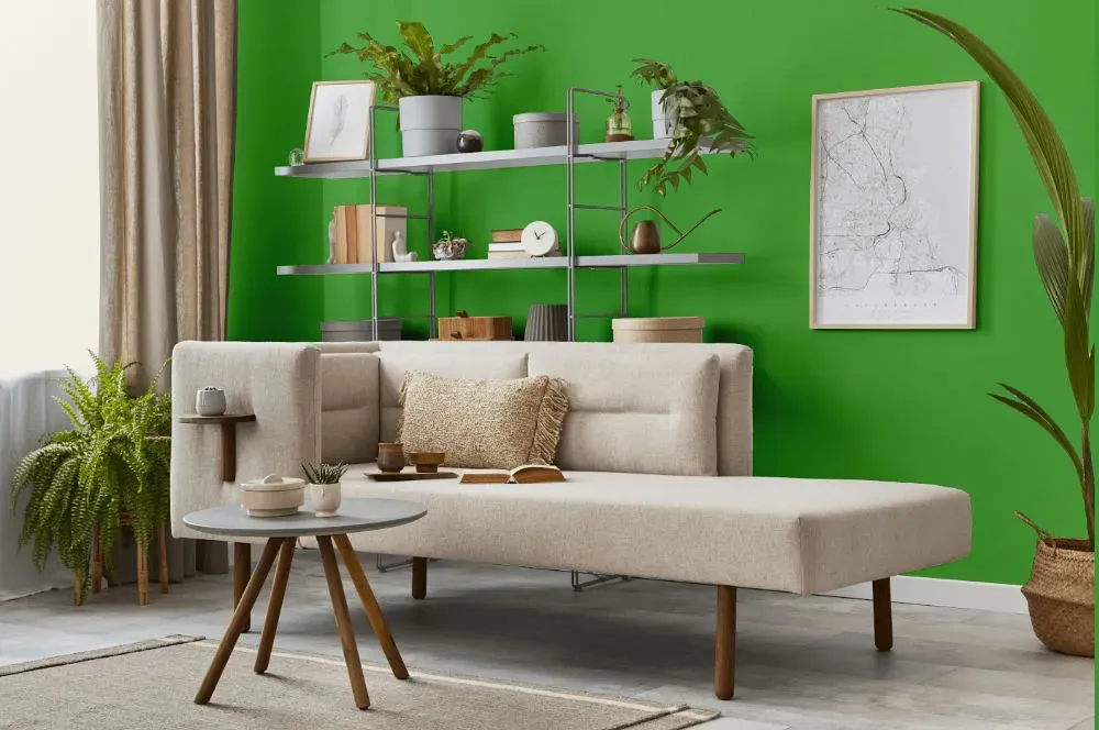
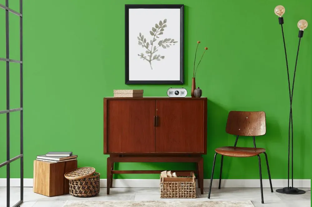
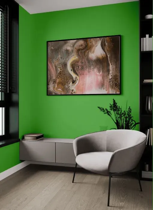
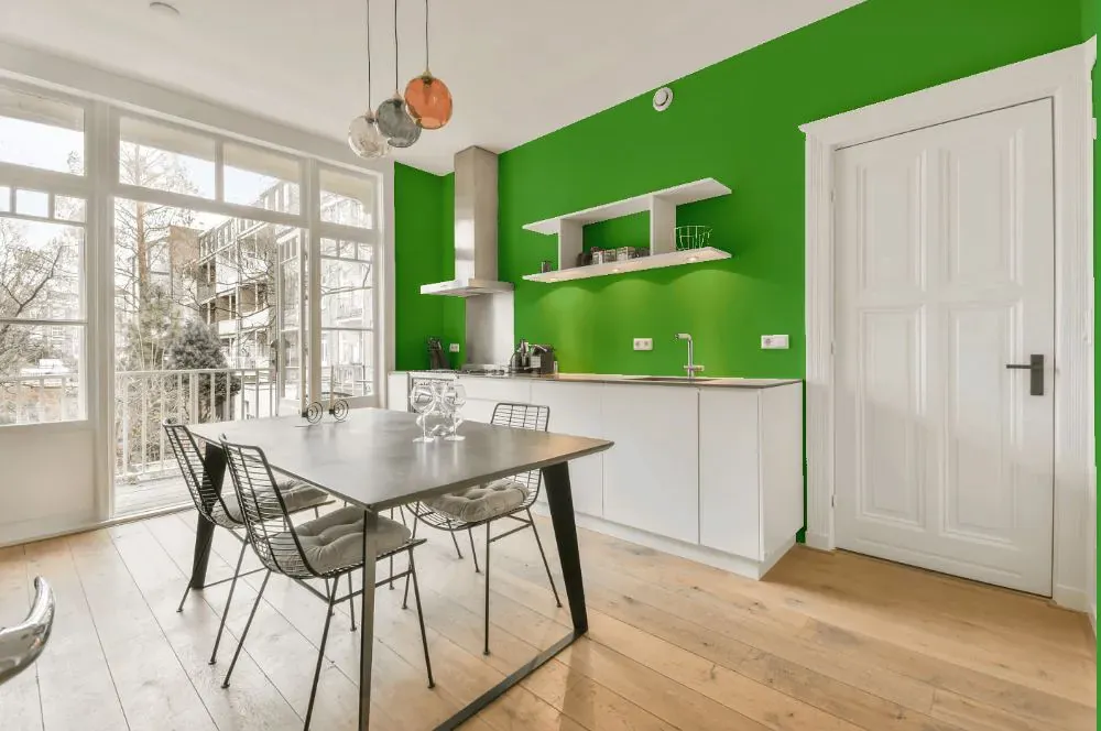
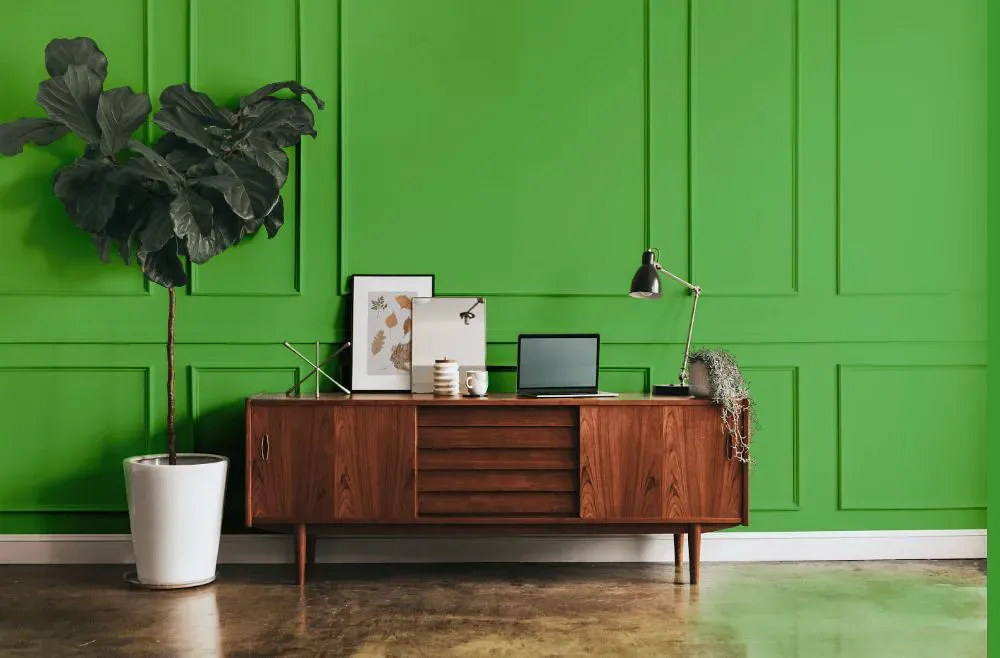
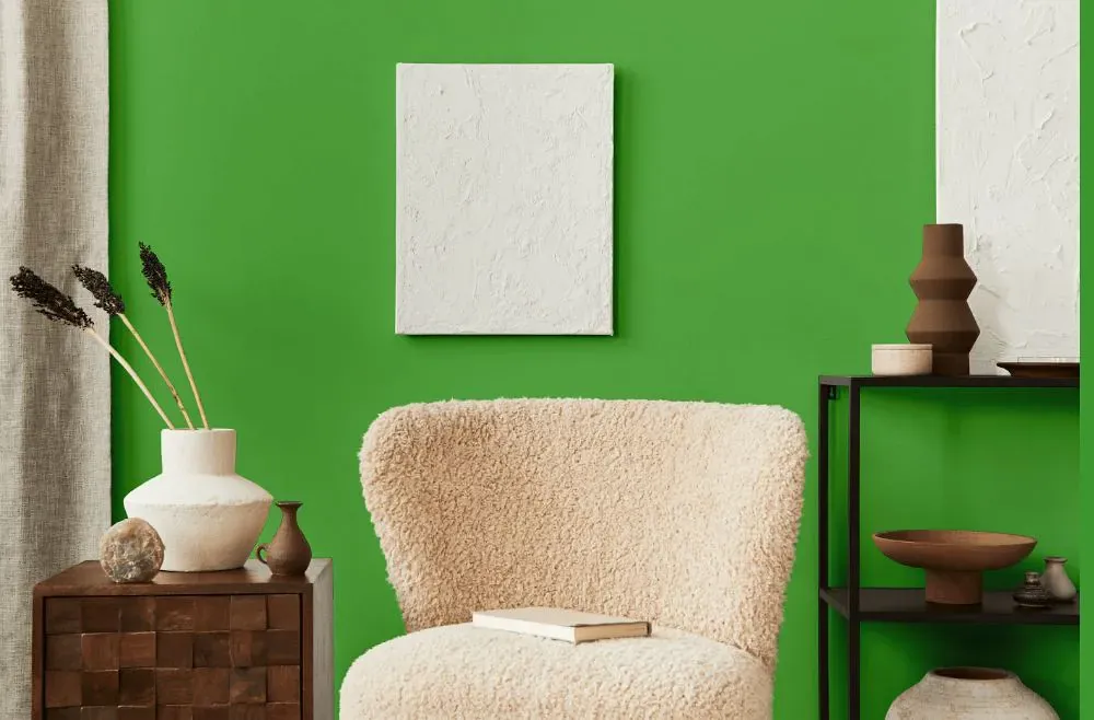
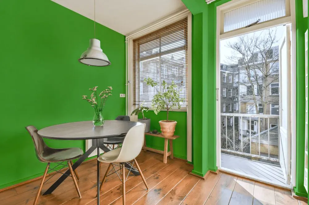
- Paradise Valley for living room (7 photos)
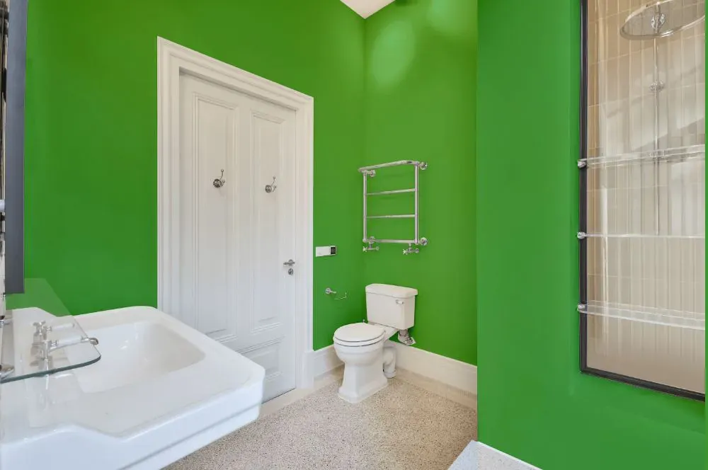
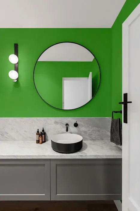
- Benjamin Moore Paradise Valley for bathroom (2 photos)
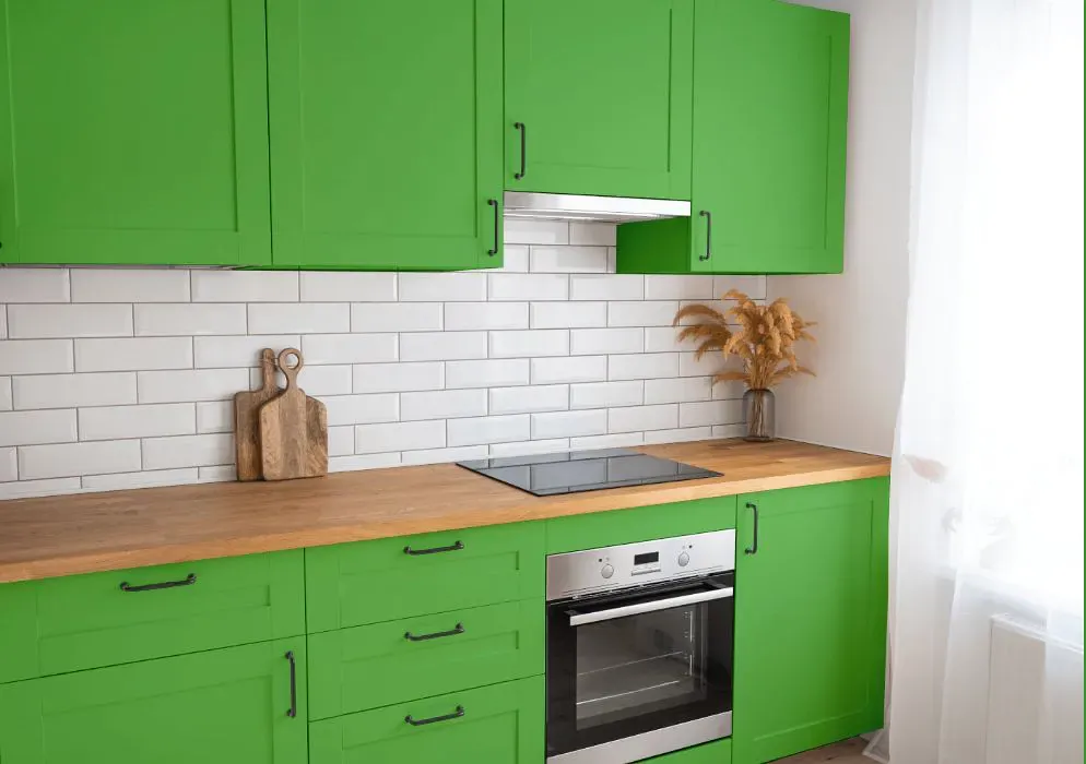
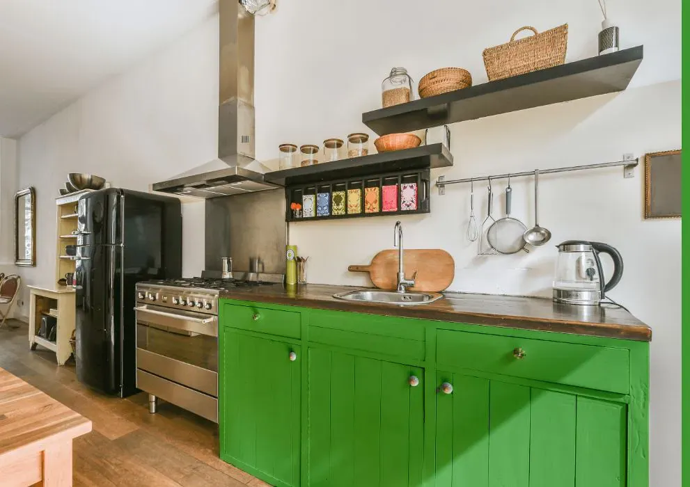
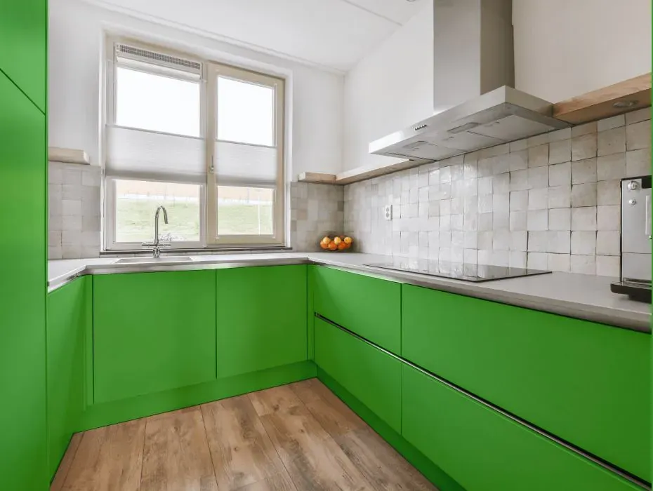
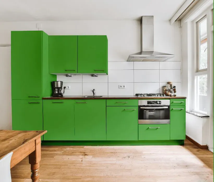
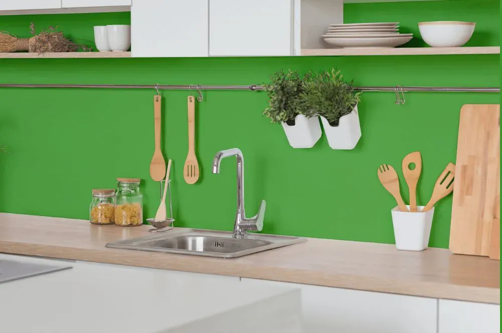
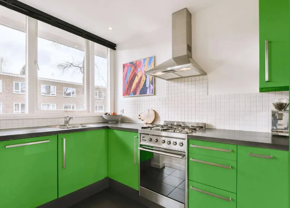
- Benjamin Moore 559 on kitchen cabinets (4 photos)
- Benjamin Moore Paradise Valley reviews (9 photos)
- What are Benjamin Moore Paradise Valley undertones?
- Is Paradise Valley 559 cool or warm?
- How light temperature affects on Paradise Valley
- Monochromatic color scheme
- Complementary color scheme
- Color comparison and matching
- LRV of Paradise Valley 559
- Color codes
- Color equivalents
| Official page: | Paradise Valley 559 |
| Code: | 559 |
| Name: | Paradise Valley |
| Brand: | Benjamin Moore |
What color is Benjamin Moore Paradise Valley?
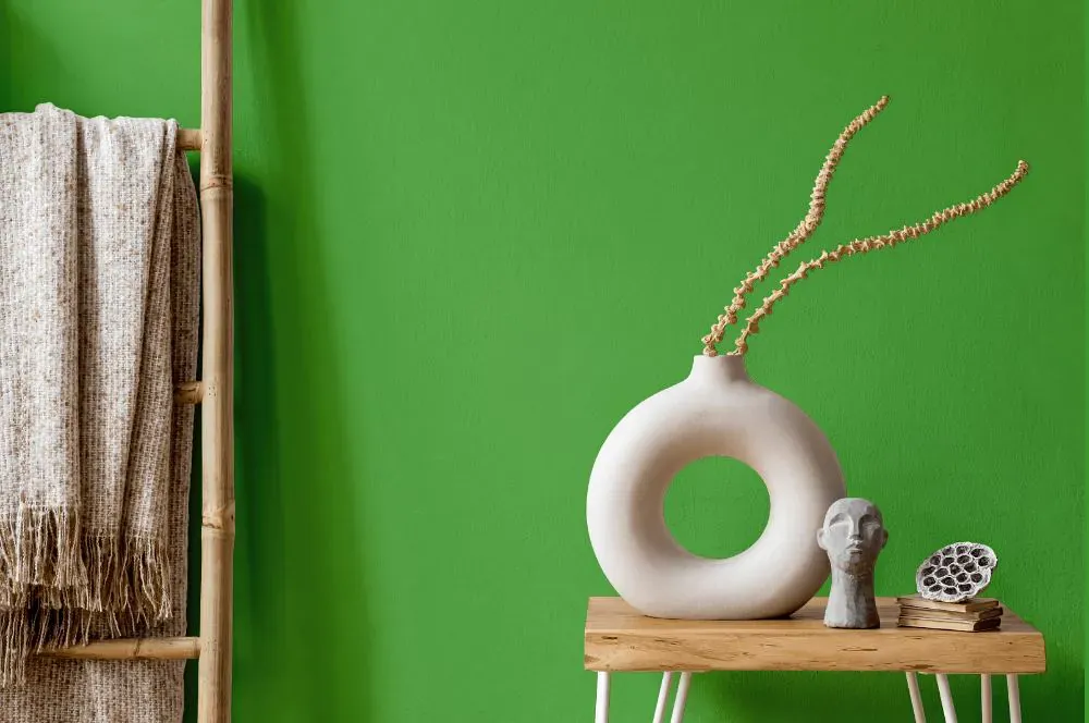
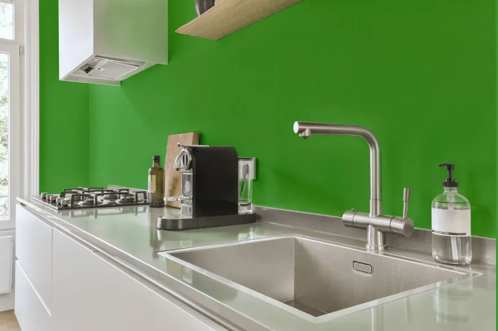
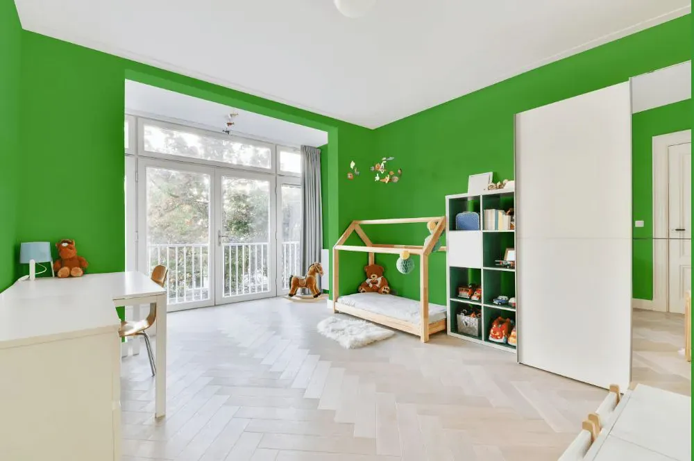
The serene hue of Benjamin Moore 559, Paradise Valley, evokes a sense of calm and tranquility. This soft shade of green pairs beautifully with neutral tones such as gray and beige, creating a harmonious and soothing palette. When combined with accents in earthy tones like terracotta or sandy beige, the space feels warm and inviting. The versatility of Paradise Valley makes it a perfect choice for both modern and traditional interiors, adding a touch of nature-inspired elegance to any room.
Loading...
LRV of Paradise Valley
Paradise Valley has an LRV of 35.8% and refers to Medium colors that reflect a lot of light. Why LRV is important?

Light Reflectance Value measures the amount of visible and usable light that reflects from a painted surface.
Simply put, the higher the LRV of a paint color, the brighter the room you will get.
The scale goes from 0% (absolute black, absorbing all light) to 100% (pure white, reflecting all light).
Act like a pro: When choosing paint with an LRV of 35.8%, pay attention to your bulbs' brightness. Light brightness is measured in lumens. The lower the paint's LRV, the higher lumen level you need. Every square foot of room needs at least 40 lumens. That means for a 200 ft2 living room you'll need about 8000 lumens of light – e.g., eight 1000 lm bulbs.
Color codes
We have collected almost every possible color code you could ever need.
Not sure what the difference between HEX and RGB is? We break down color models in plain language. Understanding color models
| Format | Code |
|---|---|
| HEX | #67B458 |
| RGB Decimal | 103, 180, 88 |
| RGB Percent | 40.39%, 70.59%, 34.51% |
| HSV | Hue: 110° Saturation: 51.11% Value: 70.59% |
| HSL | hsl(110, 38, 53) |
| CMYK | Cyan: 42.78 Magenta: 0.0 Yellow: 51.11 Key: 29.41 |
| YIQ | Y: 146.489 I: -16.321 Q: -44.919 |
| XYZ | X: 23.675 Y: 36.229 Z: 14.975 |
| CIE Lab | L:66.695 a:-41.846 b:39.34 |
| CIE Luv | L:66.695 u:-37.378 v:55.848 |
| Decimal | 6796376 |
| Hunter Lab | 60.191, -35.124, 27.382 |