Benjamin Moore Patriot Red 2080-20
Contentsshow +hide -
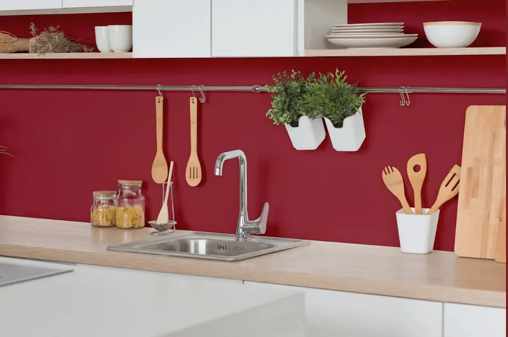
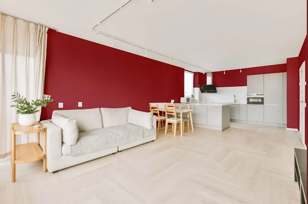
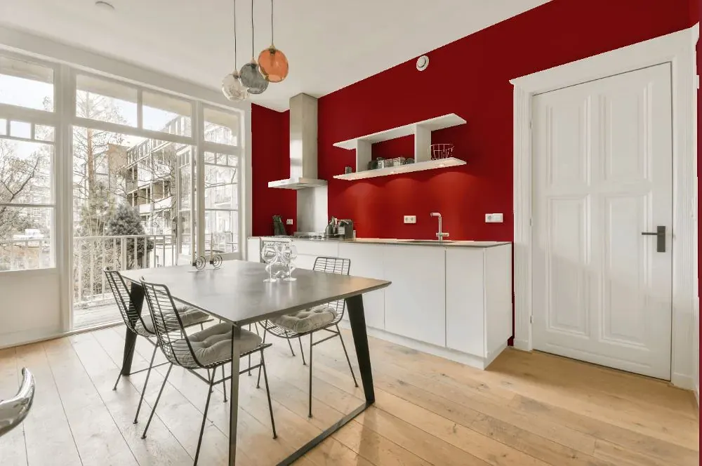
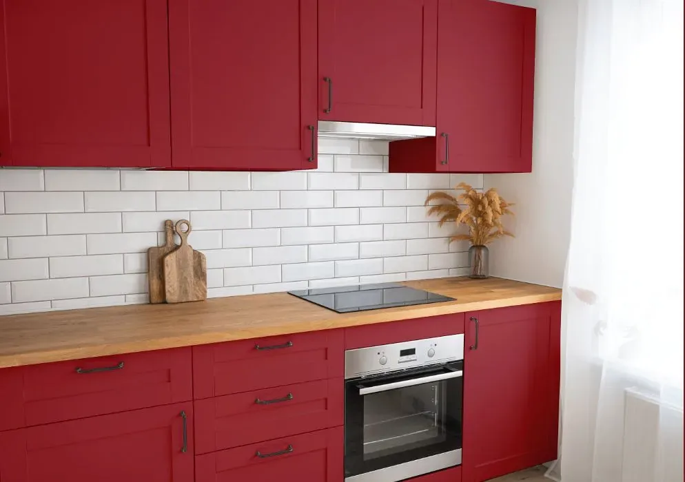
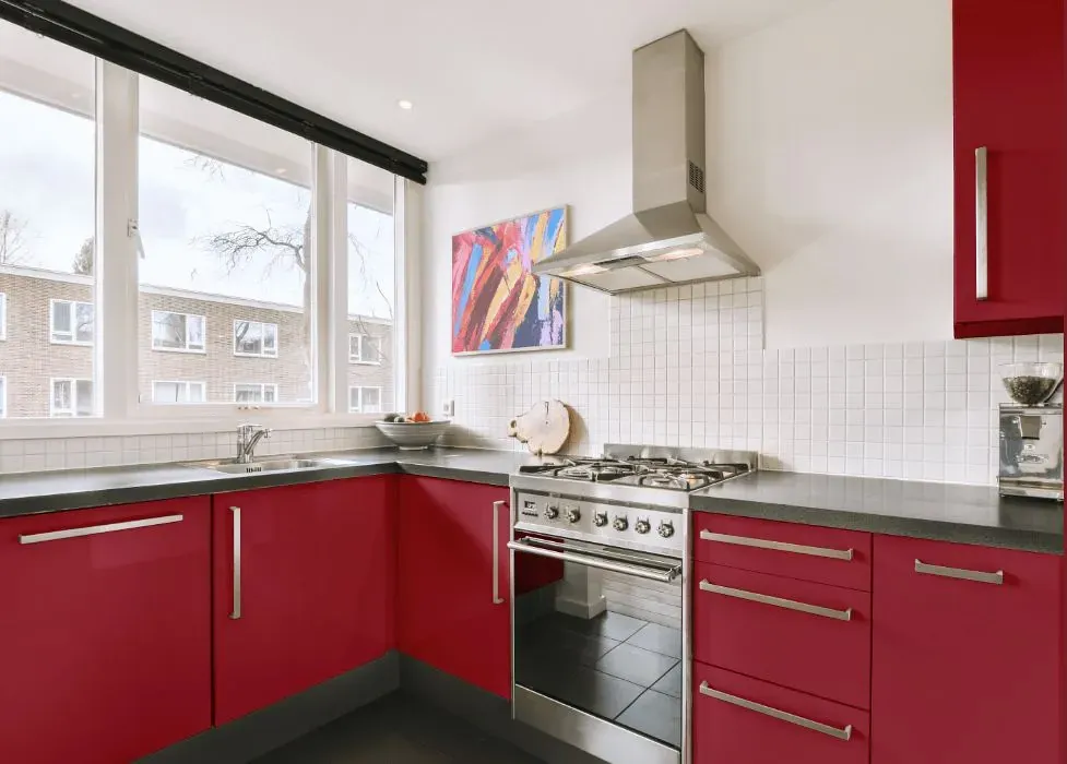
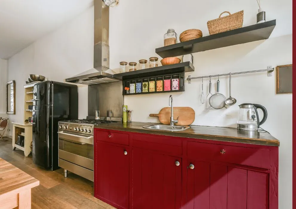
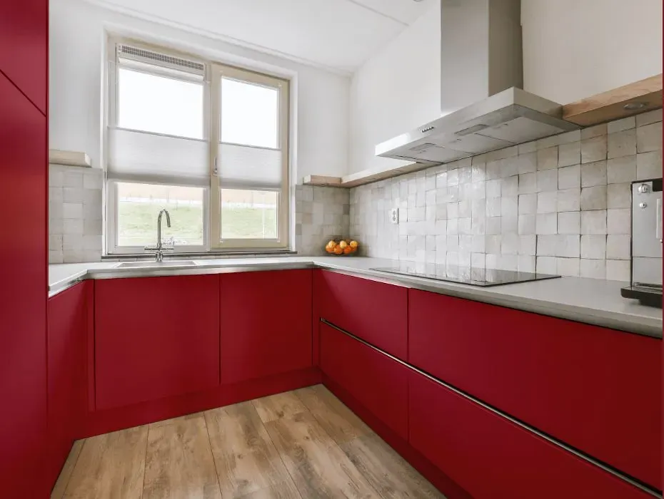
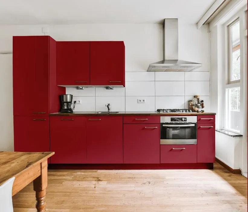
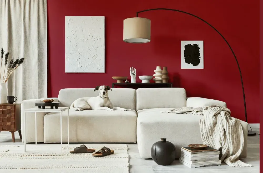
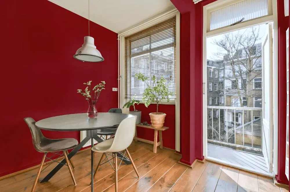
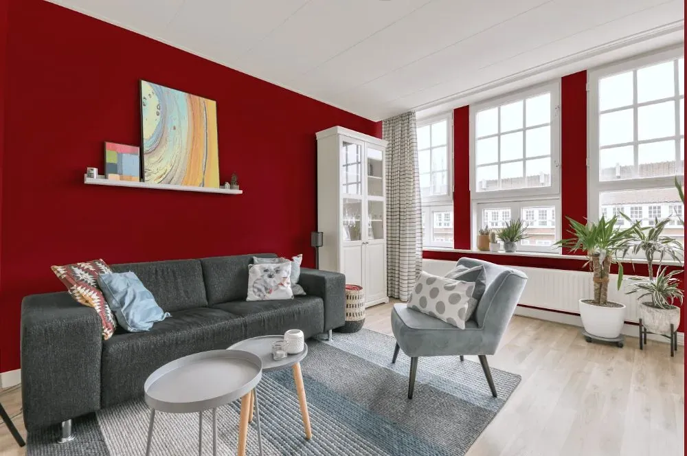
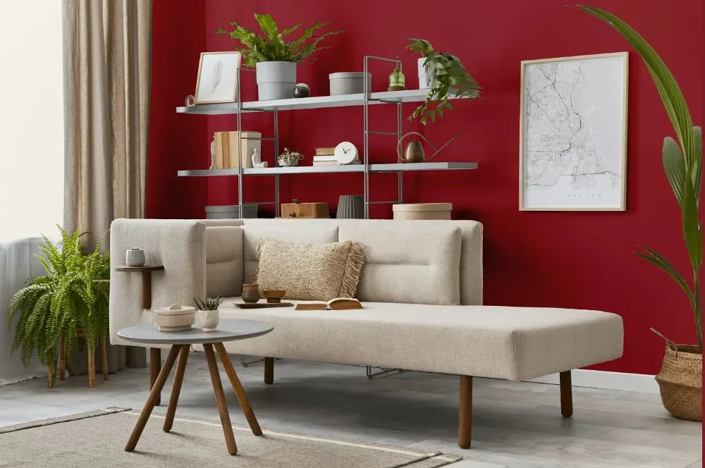
- Benjamin Moore Patriot Red reviews (23 photos)
- What are Benjamin Moore Patriot Red undertones?
- Is Patriot Red 2080-20 cool or warm?
- How light temperature affects on Patriot Red
- Monochromatic color scheme
- Complementary color scheme
- Color comparison and matching
- LRV of Patriot Red 2080-20
- Color codes
- Color equivalents
| Official page: | Patriot Red 2080-20 |
| Code: | 2080-20 |
| Name: | Patriot Red |
| Brand: | Benjamin Moore |
What color is Benjamin Moore Patriot Red?
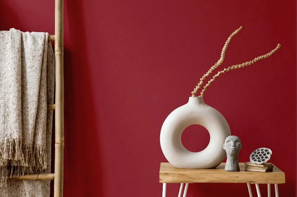
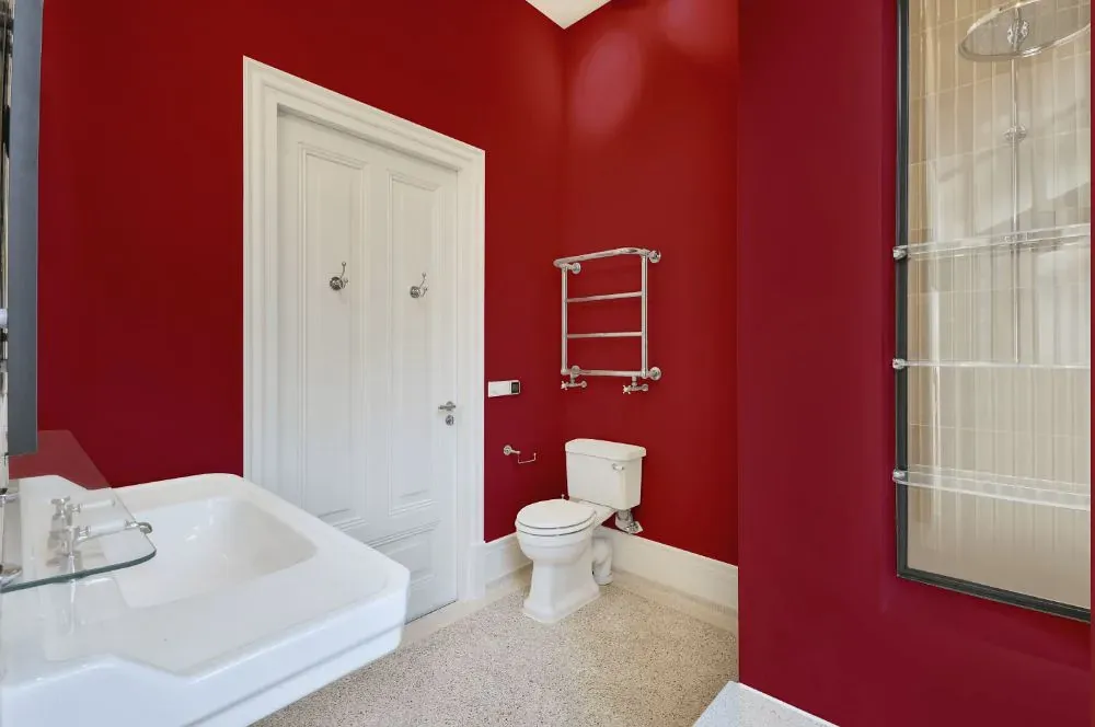
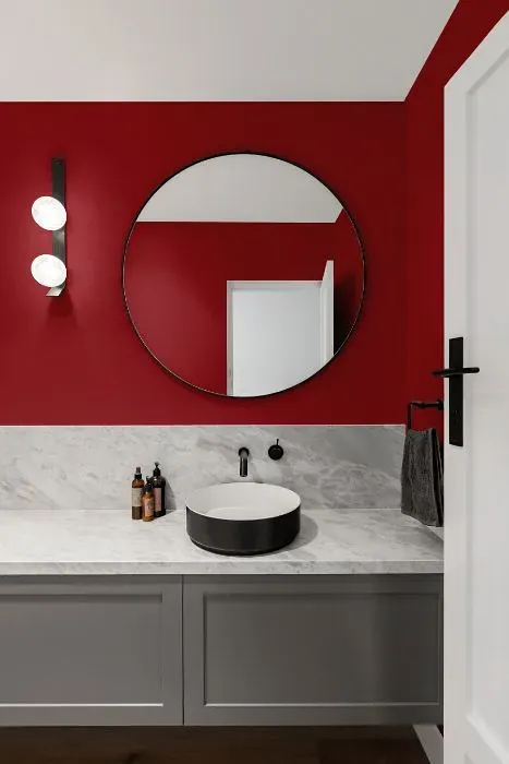
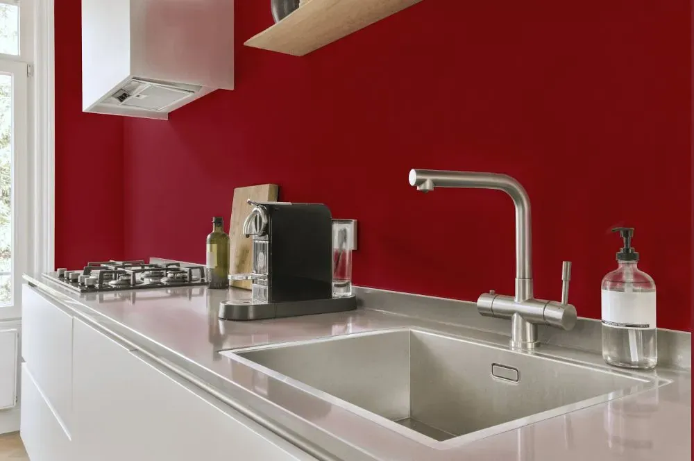
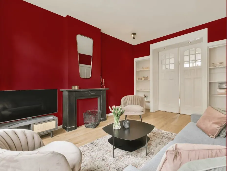
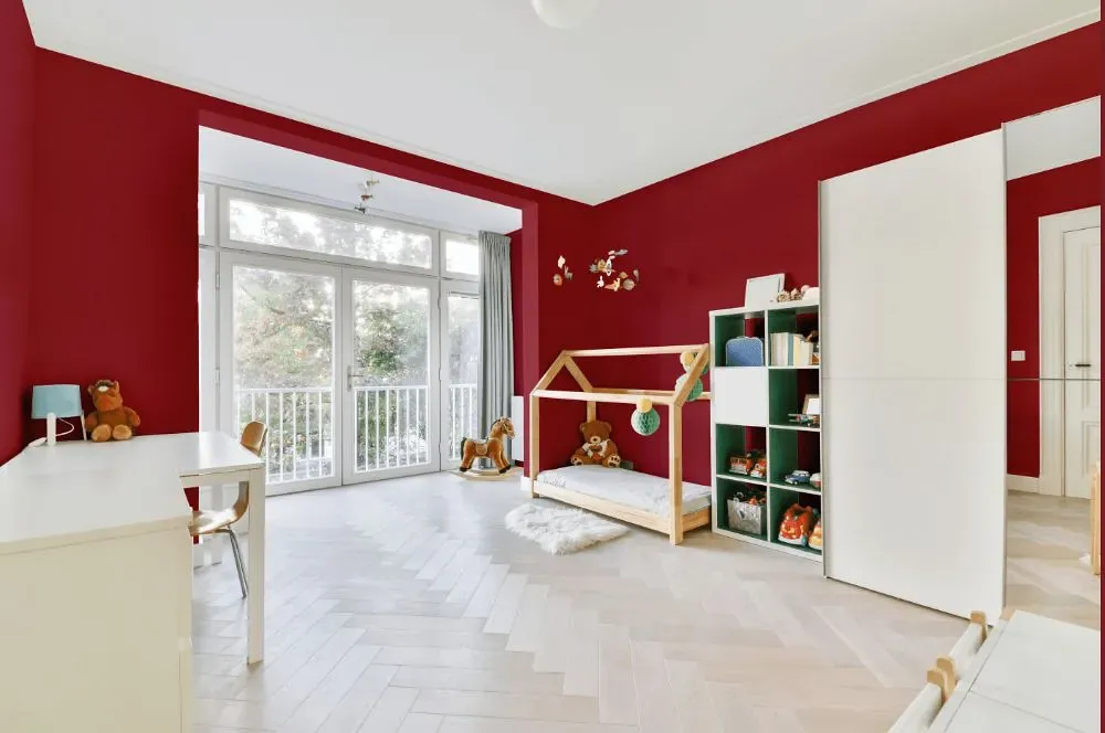
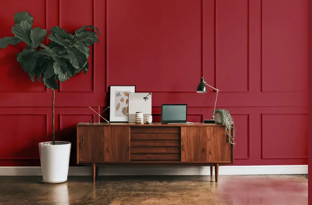
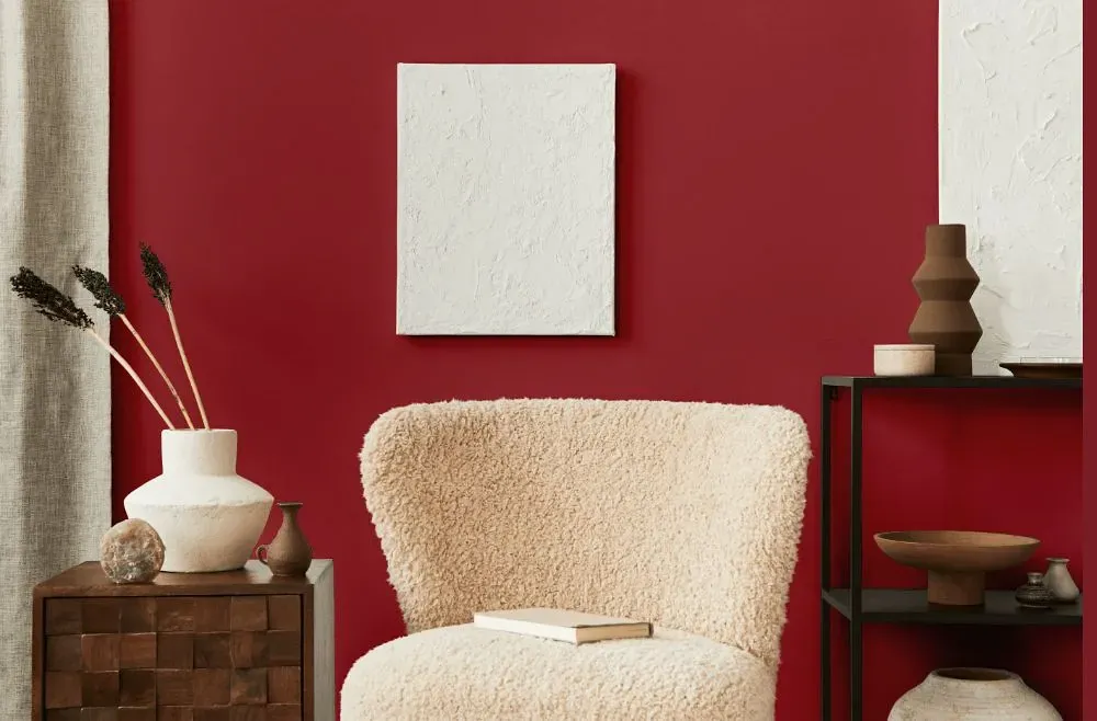
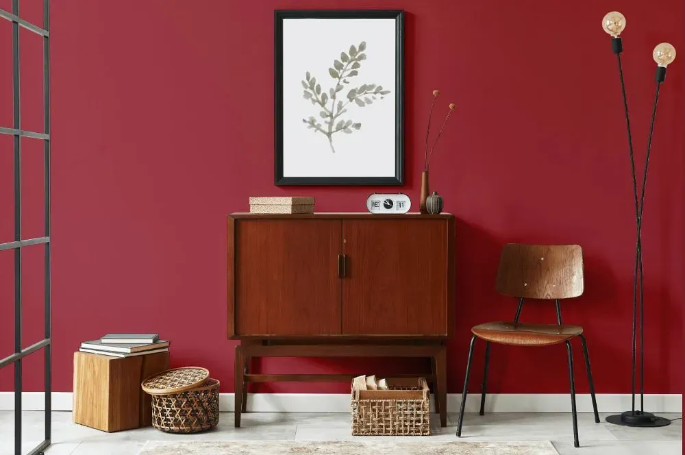
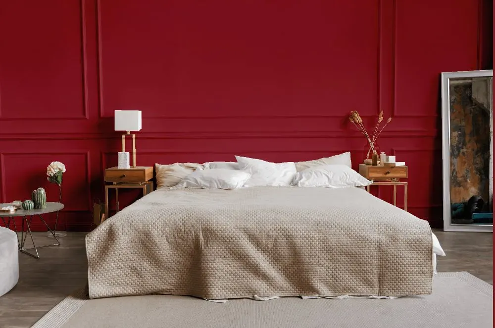
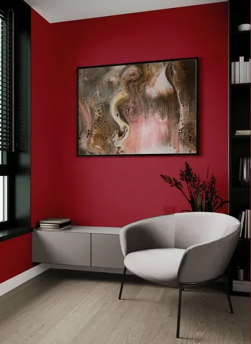
Elevate your home with the bold and invigorating Patriot Red from Benjamin Moore, code 2080-20. This rich and empowering hue is perfect for spaces that crave drama and sophistication. Picture your dining room adorned in Patriot Red, creating a captivating ambiance for memorable gatherings. From a cozy study to a chic living room, this color has the power to transform any room into a statement of elegance and modernity. Benjamin Moore's 2080-20 Patriot Red is the ideal choice for those seeking to infuse their interiors with passion and style.
Loading...
LRV of Patriot Red
Patriot Red has an LRV of 11.58% and refers to Medium Dark which means that this color reflects very little light. Why LRV is important?

Light Reflectance Value measures the amount of visible and usable light that reflects from a painted surface.
Simply put, the higher the LRV of a paint color, the brighter the room you will get.
The scale goes from 0% (absolute black, absorbing all light) to 100% (pure white, reflecting all light).
Act like a pro: When choosing paint with an LRV of 11.58%, pay attention to your bulbs' brightness. Light brightness is measured in lumens. The lower the paint's LRV, the higher lumen level you need. Every square foot of room needs at least 40 lumens. That means for a 200 ft2 living room you'll need about 8000 lumens of light – e.g., eight 1000 lm bulbs.
Color codes
We have collected almost every possible color code you could ever need.
Not sure what the difference between HEX and RGB is? We break down color models in plain language. Understanding color models
| Format | Code |
|---|---|
| HEX | #9E3B45 |
| RGB Decimal | 158, 59, 69 |
| RGB Percent | 61.96%, 23.14%, 27.06% |
| HSV | Hue: 354° Saturation: 62.66% Value: 61.96% |
| HSL | hsl(354, 46, 43) |
| CMYK | Cyan: 0.0 Magenta: 62.66 Yellow: 56.33 Key: 38.04 |
| YIQ | Y: 89.741 I: 55.781 Q: 24.054 |
| XYZ | X: 16.74 Y: 10.829 Z: 6.837 |
| CIE Lab | L:39.291 a:41.948 b:15.834 |
| CIE Luv | L:39.291 u:70.227 v:10.078 |
| Decimal | 10369861 |
| Hunter Lab | 32.907, 33.216, 10.716 |