Benjamin Moore Precocious 051
Contentsshow +hide -
| Official page: | Precocious 051 |
| Code: | 051 |
| Name: | Precocious |
| Brand: | Benjamin Moore |
What color is Benjamin Moore Precocious?
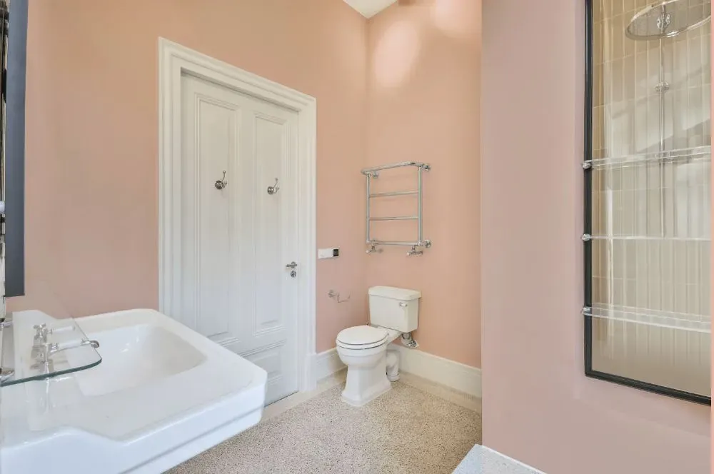
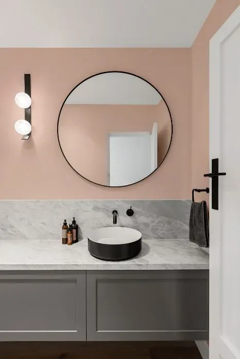
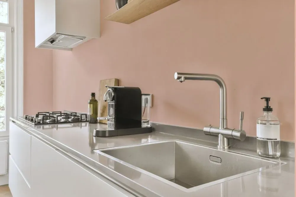
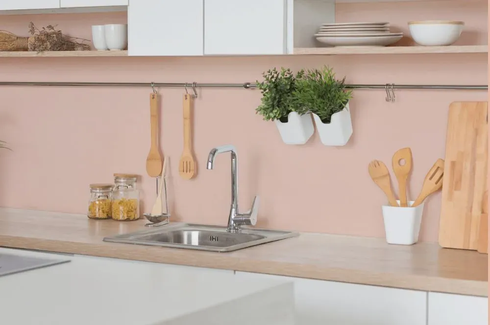
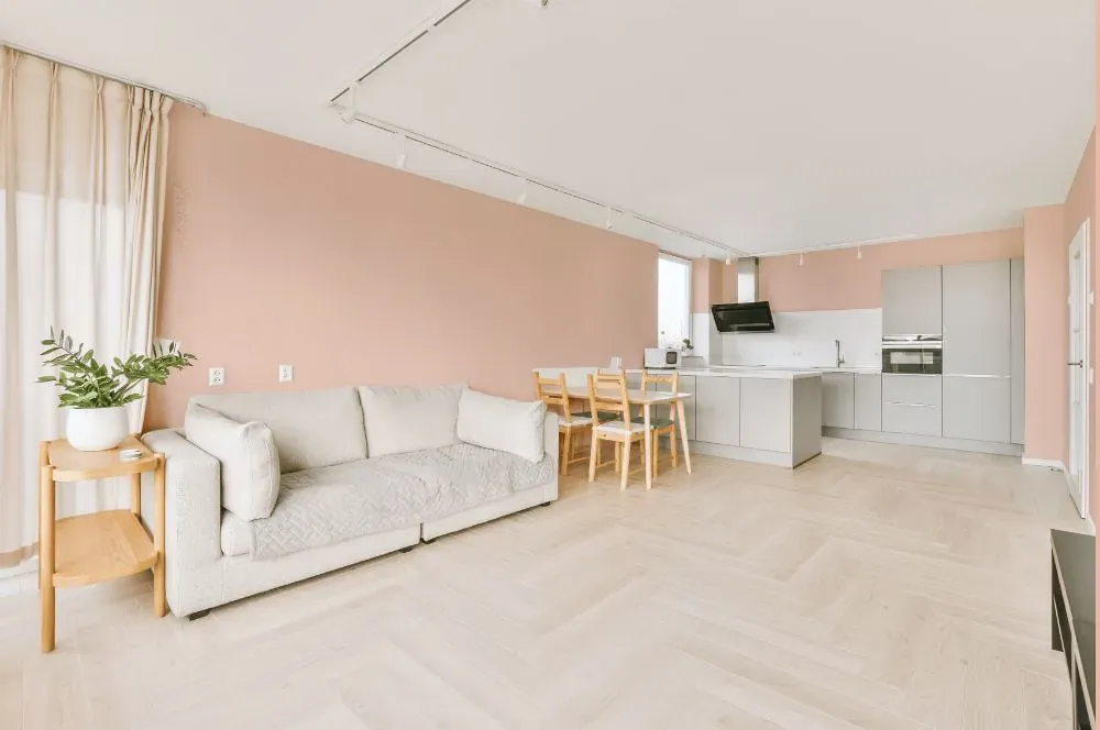
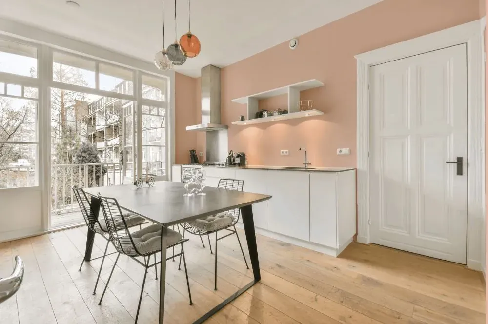
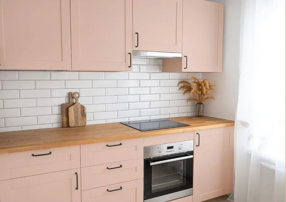
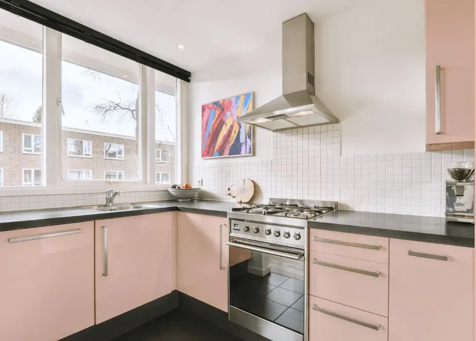
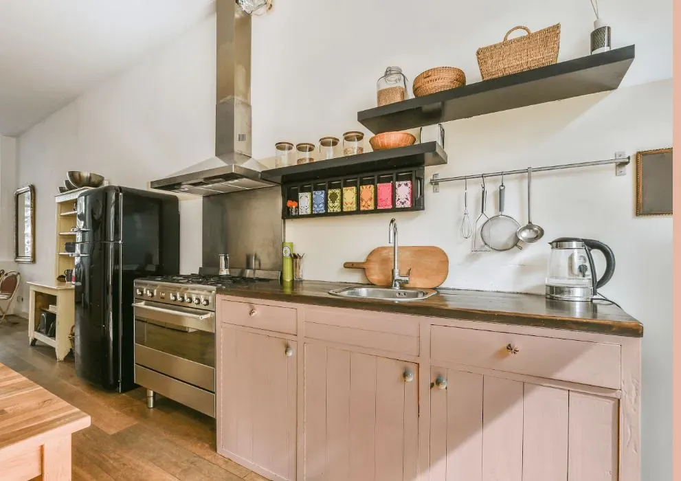
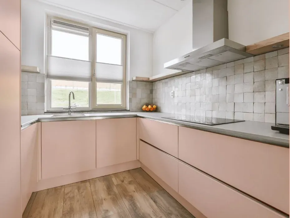
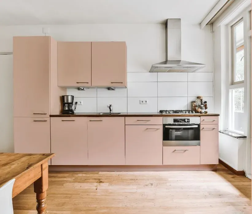
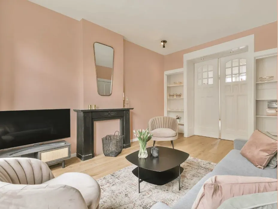
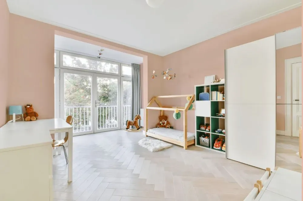
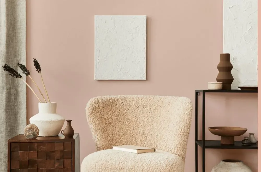
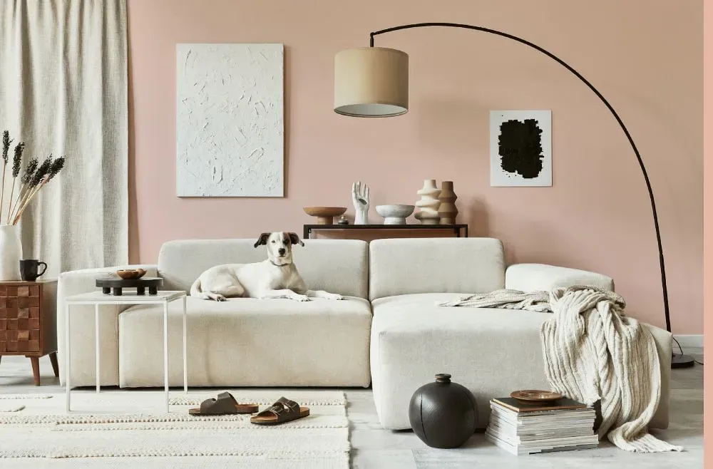
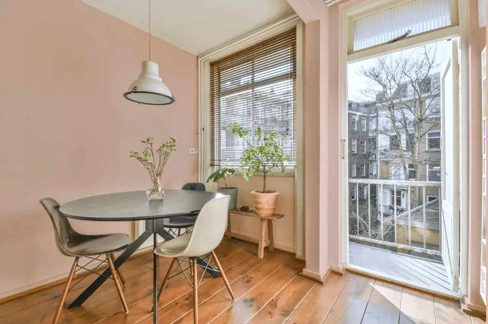
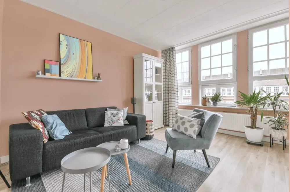
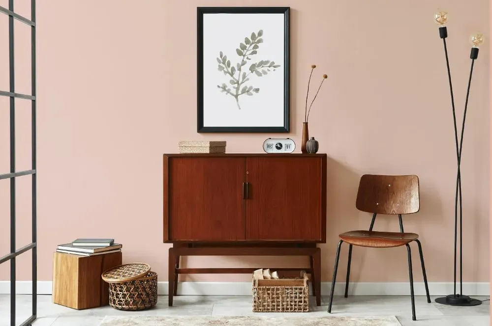
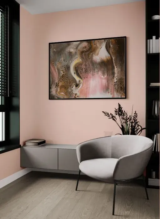
Benjamin Moore 051 Precocious exudes a vibrant and inviting energy that instantly lifts any space. This bold color pairs beautifully with soft neutrals like warm whites and subtle grays, creating a harmonious balance in the room. For a more dramatic contrast, consider adding accents in deep navy or emerald green to complement the playful nature of Precocious. Whether used as a statement wall or throughout the room, this versatile color brings a modern twist to traditional interiors. Experience the dynamic impact of Benjamin Moore 051 Precocious in your home today.
Loading...
LRV of Precocious
Precocious has an LRV of 64.17% and refers to Light colors that reflect most of the incident light. Why LRV is important?

Light Reflectance Value measures the amount of visible and usable light that reflects from a painted surface.
Simply put, the higher the LRV of a paint color, the brighter the room you will get.
The scale goes from 0% (absolute black, absorbing all light) to 100% (pure white, reflecting all light).
Act like a pro: When choosing paint with an LRV of 64.17%, pay attention to your bulbs' brightness. Light brightness is measured in lumens. The lower the paint's LRV, the higher lumen level you need. Every square foot of room needs at least 40 lumens. That means for a 200 ft2 living room you'll need about 8000 lumens of light – e.g., eight 1000 lm bulbs.
Color codes
We have collected almost every possible color code you could ever need.
Not sure what the difference between HEX and RGB is? We break down color models in plain language. Understanding color models
| Format | Code |
|---|---|
| HEX | #EECEC1 |
| RGB Decimal | 238, 206, 193 |
| RGB Percent | 93.33%, 80.78%, 75.69% |
| HSV | Hue: 17° Saturation: 18.91% Value: 93.33% |
| HSL | hsl(17, 57, 85) |
| CMYK | Cyan: 0.0 Magenta: 13.45 Yellow: 18.91 Key: 6.67 |
| YIQ | Y: 214.086 I: 23.246 Q: 2.724 |
| XYZ | X: 66.956 Y: 66.172 Z: 59.683 |
| CIE Lab | L:85.084 a:9.184 b:10.604 |
| CIE Luv | L:85.084 u:20.346 v:13.818 |
| Decimal | 15650497 |
| Hunter Lab | 81.346, 4.568, 13.442 |