Benjamin Moore Raspberry Parfait 2172-40
Contentsshow +hide -
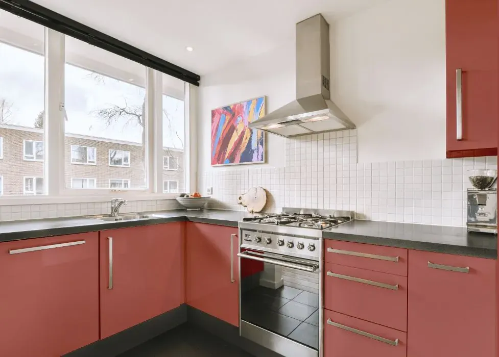
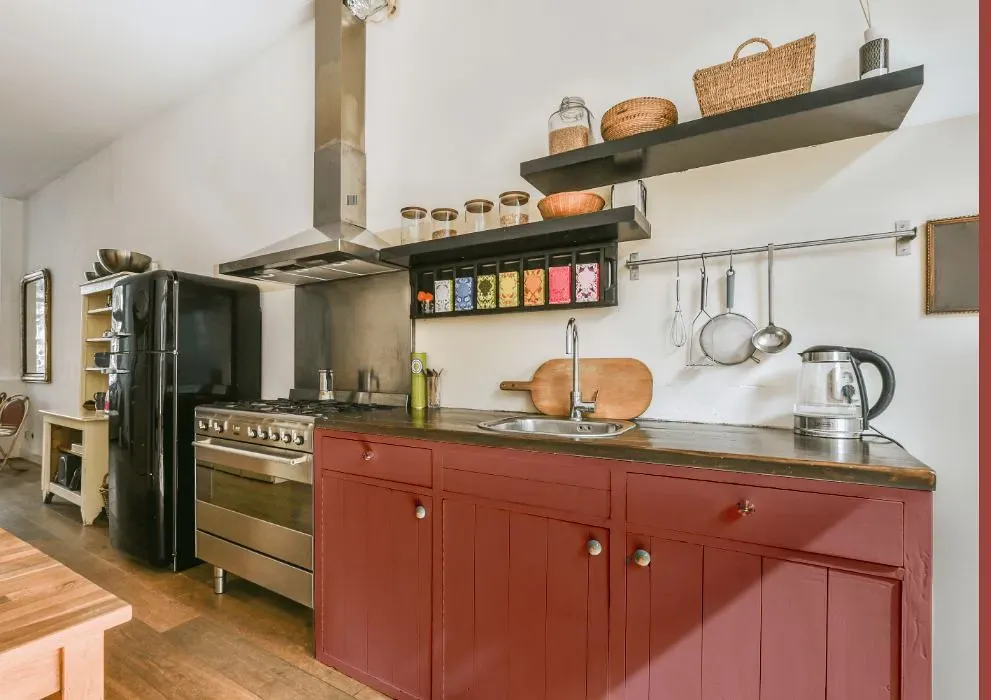
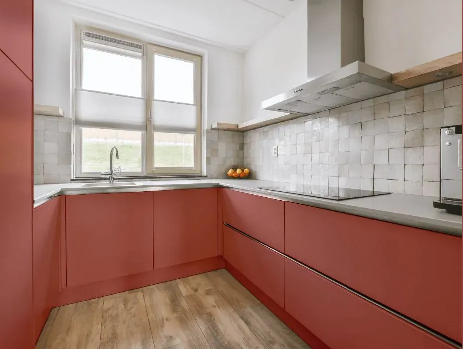
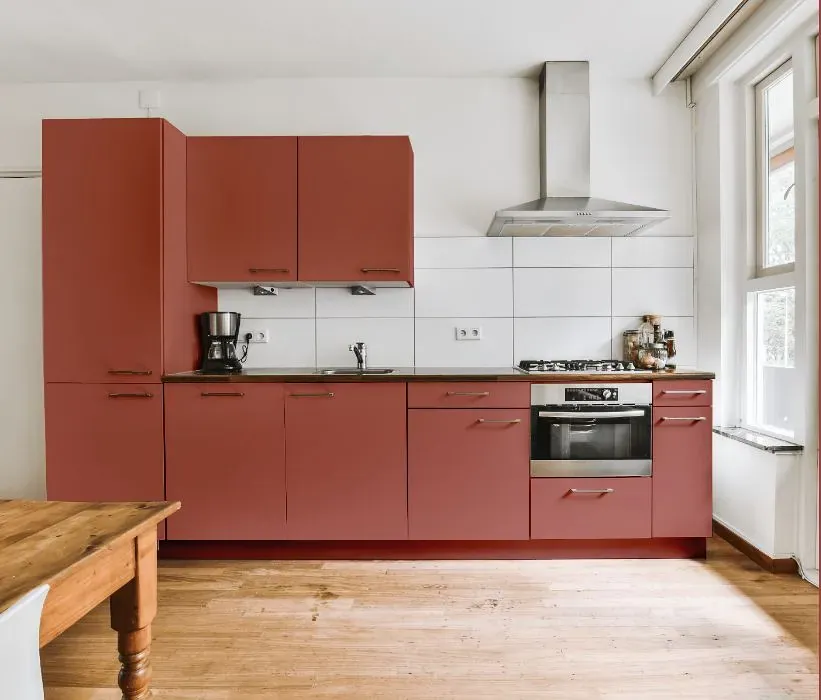
- Benjamin Moore Raspberry Parfait reviews (23 photos)
- What are Benjamin Moore Raspberry Parfait undertones?
- Is Raspberry Parfait 2172-40 cool or warm?
- How light temperature affects on Raspberry Parfait
- Monochromatic color scheme
- Complementary color scheme
- Color comparison and matching
- LRV of Raspberry Parfait 2172-40
- Color codes
- Color equivalents
| Official page: | Raspberry Parfait 2172-40 |
| Code: | 2172-40 |
| Name: | Raspberry Parfait |
| Brand: | Benjamin Moore |
What color is Benjamin Moore Raspberry Parfait?
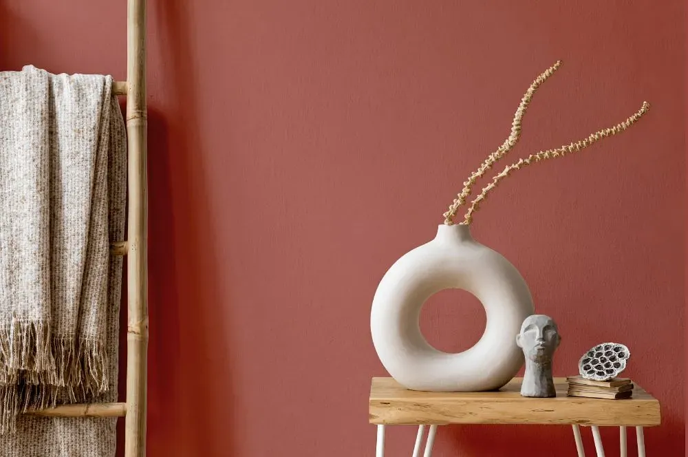
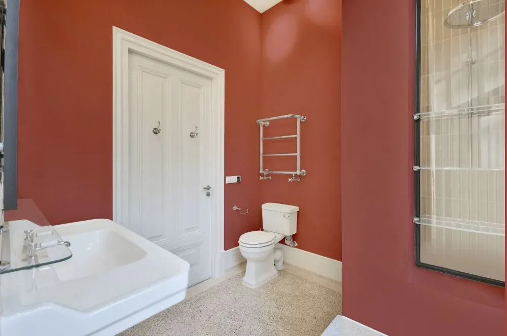
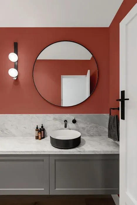
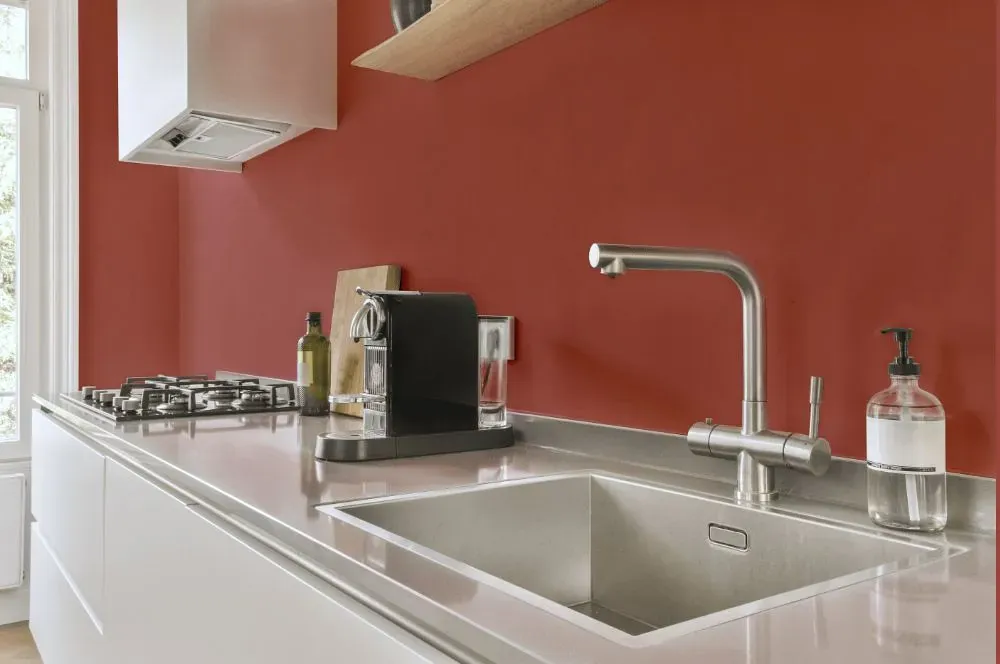
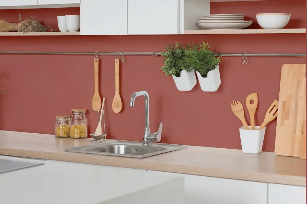
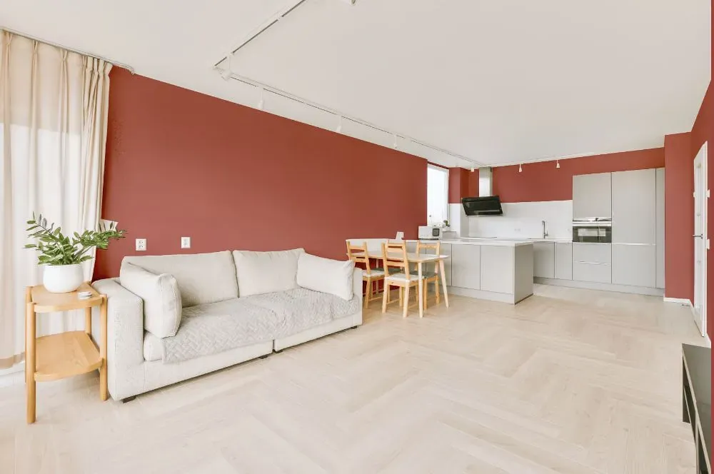
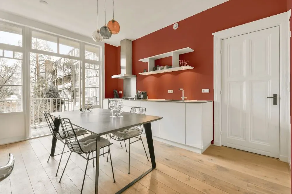
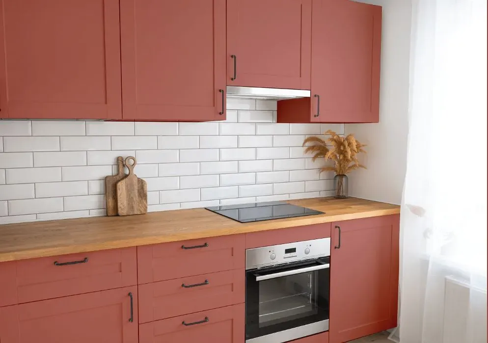
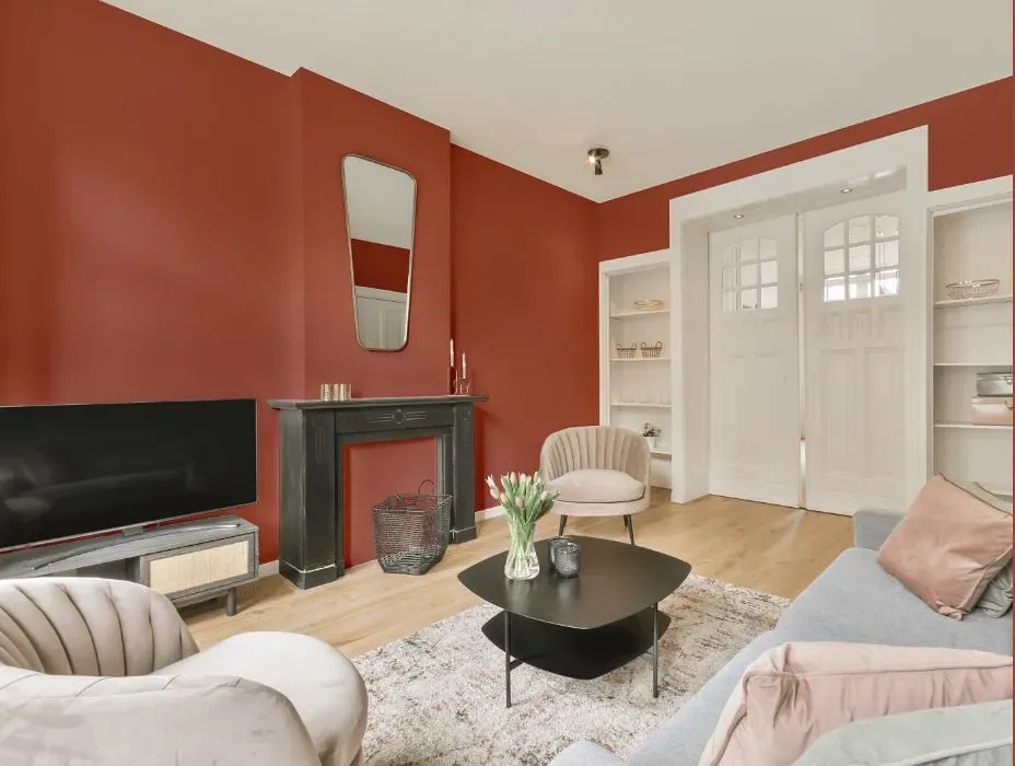
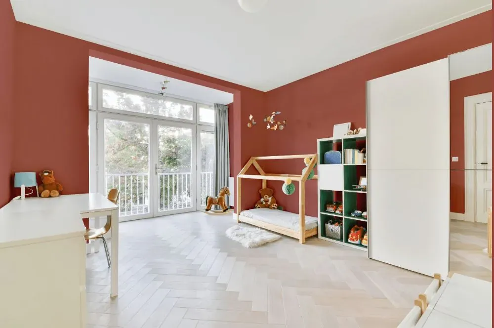
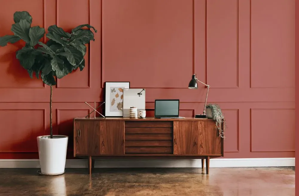
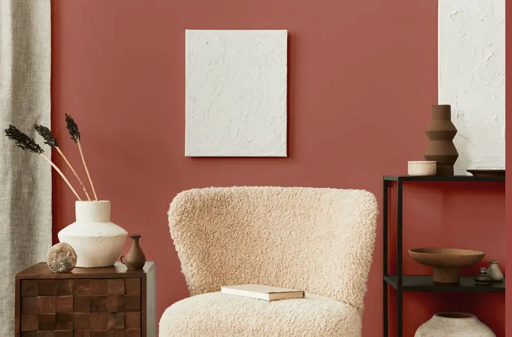
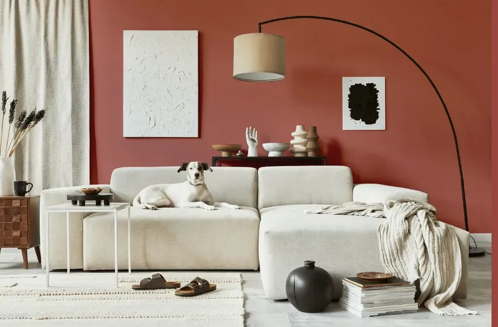
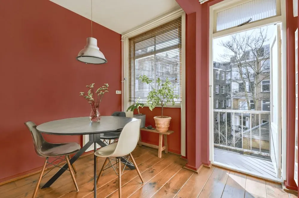
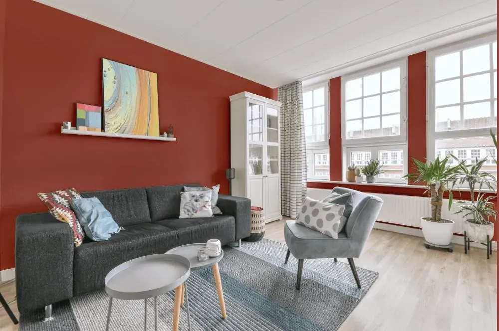
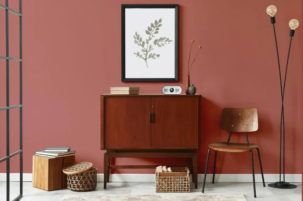
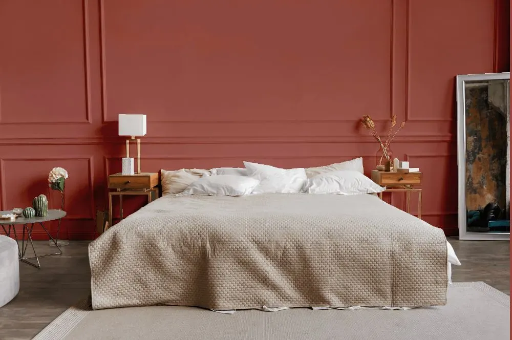
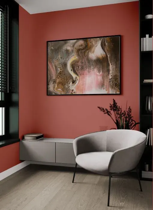
Step into a world of vibrant elegance with Benjamin Moore's Raspberry Parfait (2172-40). This luscious hue infuses any space with a playful warmth, perfect for creating a cozy yet sophisticated ambiance. Adorn your living room or bedroom with Raspberry Parfait to evoke a sense of luxury and creativity. This color is a fantastic choice for a stylish accent wall in a contemporary kitchen or a chic nursery that bursts with energy. Let Raspberry Parfait (2172-40) bring a sweet pop of color to your home, elevating your decor with its rich and inviting charm.
Loading...
LRV of Raspberry Parfait
Raspberry Parfait has an LRV of 23.6% and refers to Medium colors that reflect a lot of light. Why LRV is important?

Light Reflectance Value measures the amount of visible and usable light that reflects from a painted surface.
Simply put, the higher the LRV of a paint color, the brighter the room you will get.
The scale goes from 0% (absolute black, absorbing all light) to 100% (pure white, reflecting all light).
Act like a pro: When choosing paint with an LRV of 23.6%, pay attention to your bulbs' brightness. Light brightness is measured in lumens. The lower the paint's LRV, the higher lumen level you need. Every square foot of room needs at least 40 lumens. That means for a 200 ft2 living room you'll need about 8000 lumens of light – e.g., eight 1000 lm bulbs.
Color codes
We have collected almost every possible color code you could ever need.
Not sure what the difference between HEX and RGB is? We break down color models in plain language. Understanding color models
| Format | Code |
|---|---|
| HEX | #B77067 |
| RGB Decimal | 183, 112, 103 |
| RGB Percent | 71.76%, 43.92%, 40.39% |
| HSV | Hue: 7° Saturation: 43.72% Value: 71.76% |
| HSL | hsl(7, 36, 56) |
| CMYK | Cyan: 0.0 Magenta: 38.8 Yellow: 43.72 Key: 28.24 |
| YIQ | Y: 132.203 I: 45.201 Q: 12.218 |
| XYZ | X: 27.772 Y: 22.637 Z: 15.735 |
| CIE Lab | L:54.697 a:27.06 b:16.937 |
| CIE Luv | L:54.697 u:49.875 v:16.455 |
| Decimal | 12021863 |
| Hunter Lab | 47.579, 20.929, 13.697 |