Benjamin Moore Soft Pink 2012-70
Contentsshow +hide -
| Official page: | Soft Pink 2012-70 |
| Code: | 2012-70 |
| Name: | Soft Pink |
| Brand: | Benjamin Moore |
What color is Benjamin Moore Soft Pink?
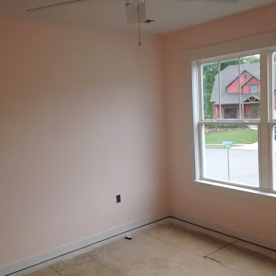
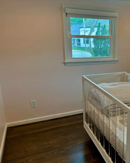
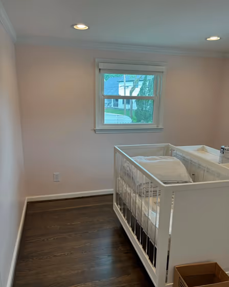
Welcome to a sanctuary of elegance and tranquility, painted with Benjamin Moore Soft Pink (2012-70). This gentle hue infuses any space with a sense of warmth and serenity, making it perfect for bedrooms, nurseries, or even a cozy reading nook. Soft Pink brings a subtle touch of romance and sophistication, creating a soothing atmosphere that promotes relaxation and well-being. Whether adorning the walls of a chic living room or a charming bathroom, Soft Pink adds a touch of timeless beauty to any room it graces. Let this delicate color envelop you in a whisper of softness and grace, transforming your home into a haven of subtle luxury.
Loading...
LRV of Soft Pink
Soft Pink has an LRV of 84.1% and refers to White colors that reflect almost all light. Why LRV is important?

Light Reflectance Value measures the amount of visible and usable light that reflects from a painted surface.
Simply put, the higher the LRV of a paint color, the brighter the room you will get.
The scale goes from 0% (absolute black, absorbing all light) to 100% (pure white, reflecting all light).
Act like a pro: When choosing paint with an LRV of 84.1%, pay attention to your bulbs' brightness. Light brightness is measured in lumens. The lower the paint's LRV, the higher lumen level you need. Every square foot of room needs at least 40 lumens. That means for a 200 ft2 living room you'll need about 8000 lumens of light – e.g., eight 1000 lm bulbs.
Color codes
We have collected almost every possible color code you could ever need.
Not sure what the difference between HEX and RGB is? We break down color models in plain language. Understanding color models
| Format | Code |
|---|---|
| HEX | #FDEBE5 |
| RGB Decimal | 253, 235, 229 |
| RGB Percent | 99.22%, 92.16%, 89.80% |
| HSV | Hue: 15° Saturation: 9.49% Value: 99.22% |
| HSL | hsl(15, 86, 95) |
| CMYK | Cyan: 0.0 Magenta: 7.11 Yellow: 9.49 Key: 0.78 |
| YIQ | Y: 239.698 I: 12.654 Q: 1.94 |
| XYZ | X: 84.357 Y: 85.958 Z: 86.255 |
| CIE Lab | L:94.294 a:5.098 b:5.106 |
| CIE Luv | L:94.294 u:10.855 v:6.808 |
| Decimal | 16640997 |
| Hunter Lab | 92.713, 0.163, 9.739 |