Benjamin Moore Startling Orange 2016-10
Contentsshow +hide -
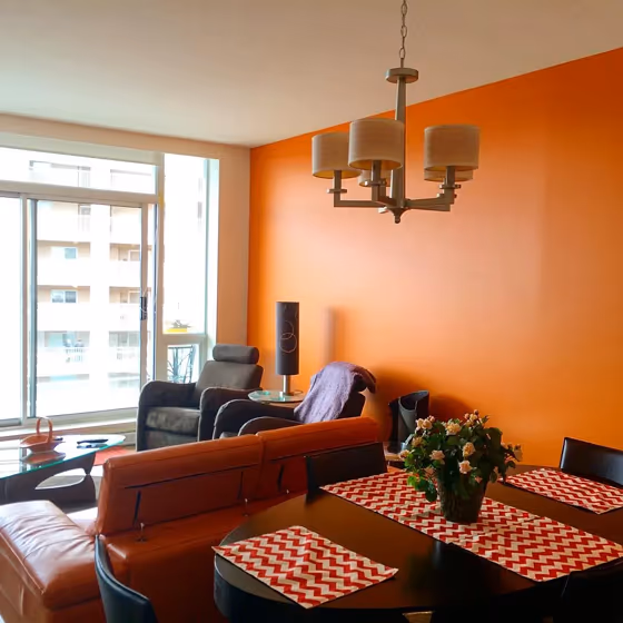
- Benjamin Moore Startling Orange reviews (5 photos)
- What are Benjamin Moore Startling Orange undertones?
- Is Startling Orange 2016-10 cool or warm?
- How light temperature affects on Startling Orange
- Monochromatic color scheme
- Complementary color scheme
- Color comparison and matching
- LRV of Startling Orange 2016-10
- Color codes
- Color equivalents
| Official page: | Startling Orange 2016-10 |
| Code: | 2016-10 |
| Name: | Startling Orange |
| Brand: | Benjamin Moore |
What color is Benjamin Moore Startling Orange?
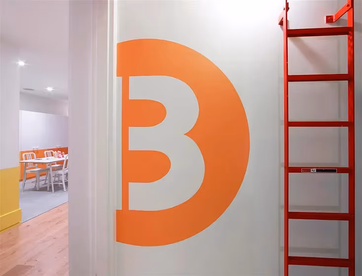
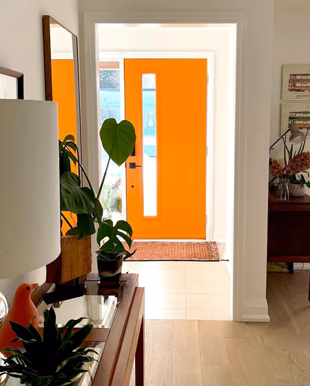
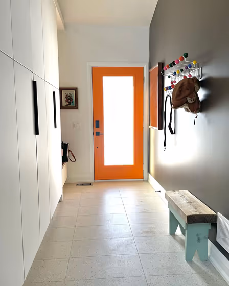
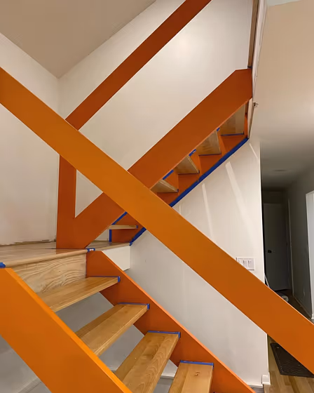
Step into a room painted in Benjamin Moore 2016-10 Startling Orange and feel the vibrancy come to life. This bold and invigorating color injects energy into any space, from a lively kitchen to an eclectic living room. Embrace the warmth of 2016-10 with its glowing sunset hues, perfect for a creative home office or a cozy reading nook. Let 2016-10 infuse your bedroom or dining area with a touch of modern elegance and sophistication. Wherever you choose to use it, Benjamin Moore's Startling Orange is sure to make a bold statement and elevate your home's aesthetic.
Loading...
LRV of Startling Orange
Startling Orange has an LRV of 32.31% and refers to Medium colors that reflect a lot of light. Why LRV is important?

Light Reflectance Value measures the amount of visible and usable light that reflects from a painted surface.
Simply put, the higher the LRV of a paint color, the brighter the room you will get.
The scale goes from 0% (absolute black, absorbing all light) to 100% (pure white, reflecting all light).
Act like a pro: When choosing paint with an LRV of 32.31%, pay attention to your bulbs' brightness. Light brightness is measured in lumens. The lower the paint's LRV, the higher lumen level you need. Every square foot of room needs at least 40 lumens. That means for a 200 ft2 living room you'll need about 8000 lumens of light – e.g., eight 1000 lm bulbs.
Color codes
We have collected almost every possible color code you could ever need.
Not sure what the difference between HEX and RGB is? We break down color models in plain language. Understanding color models
| Format | Code |
|---|---|
| HEX | #F47C1B |
| RGB Decimal | 244, 124, 27 |
| RGB Percent | 95.69%, 48.63%, 10.59% |
| HSV | Hue: 27° Saturation: 88.93% Value: 95.69% |
| HSL | hsl(27, 91, 53) |
| CMYK | Cyan: 0.0 Magenta: 49.18 Yellow: 88.93 Key: 4.31 |
| YIQ | Y: 148.822 I: 102.678 Q: -4.802 |
| XYZ | X: 44.718 Y: 33.733 Z: 5.193 |
| CIE Lab | L:64.75 a:40.821 b:66.695 |
| CIE Luv | L:64.75 u:99.348 v:57.052 |
| Decimal | 16022555 |
| Hunter Lab | 58.08, 35.793, 35.355 |