Benjamin Moore Supple Pink 2007-50
Contentsshow +hide -
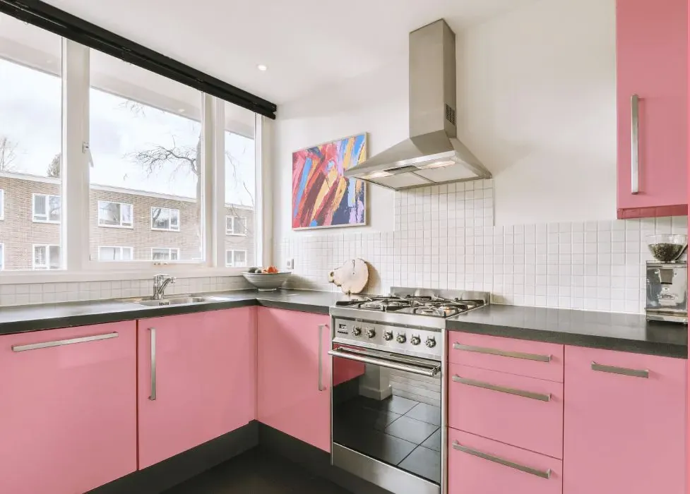
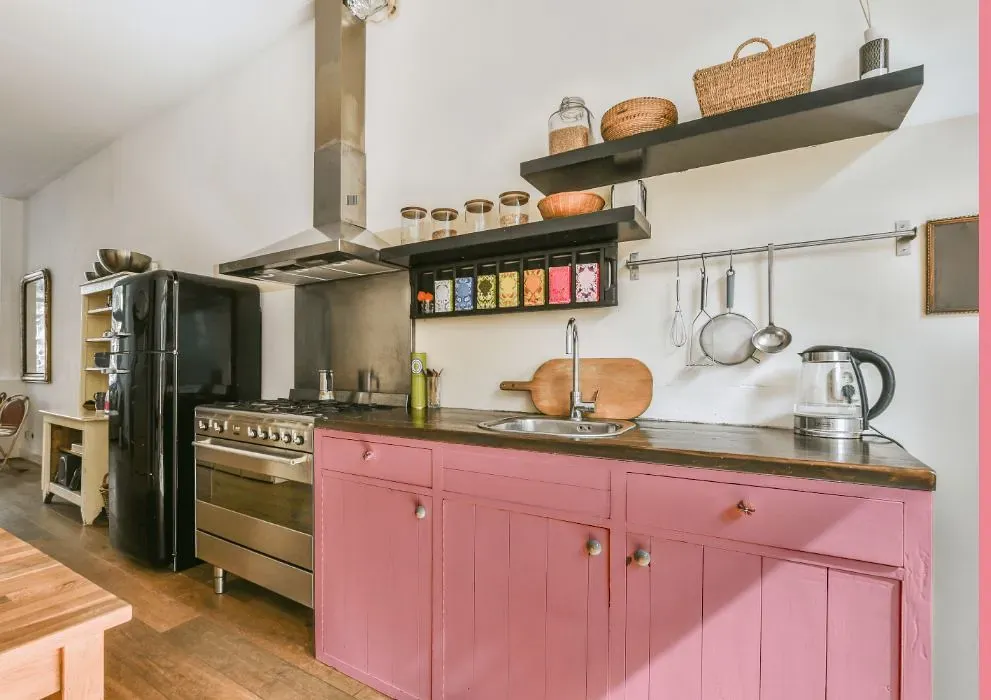
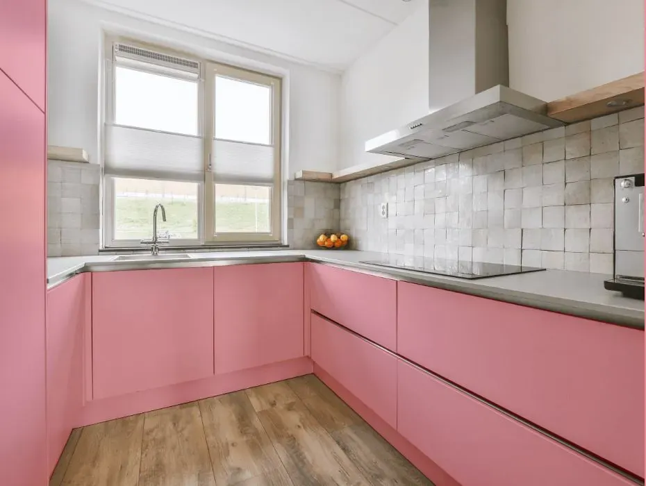
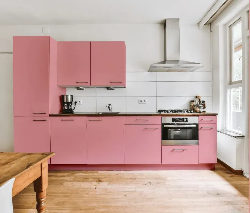
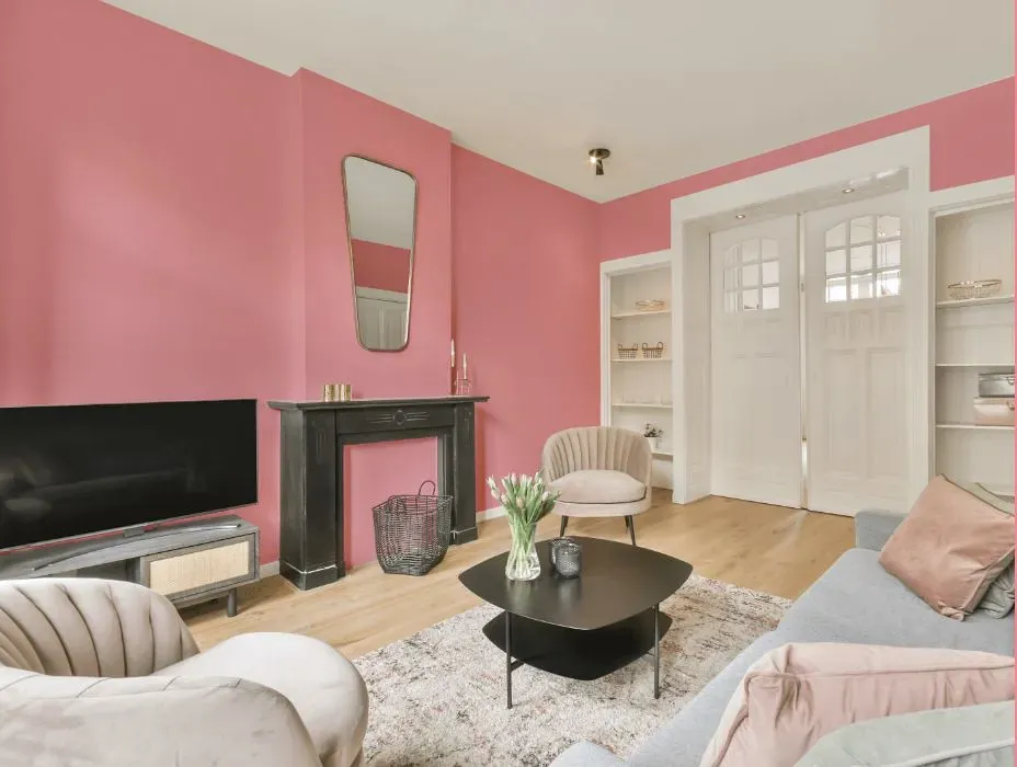
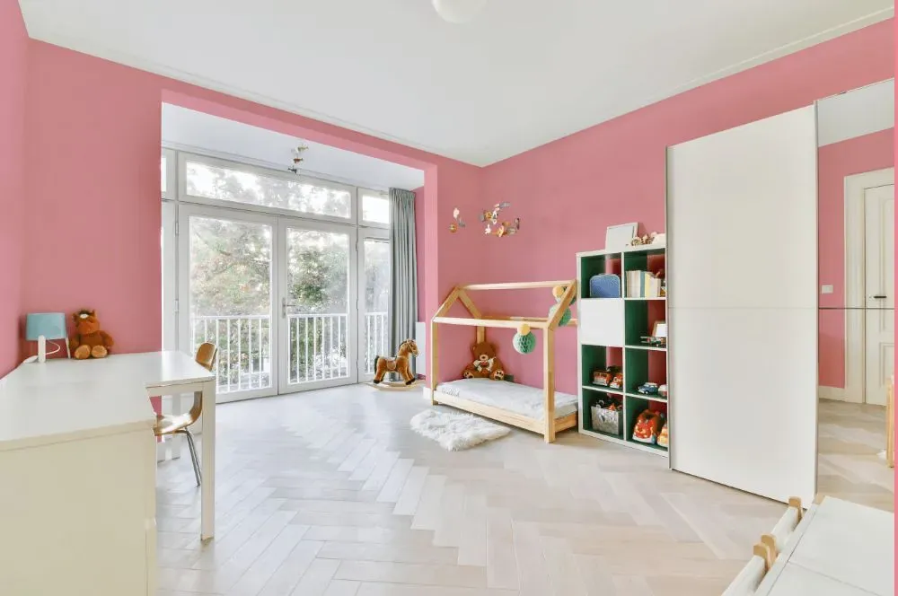
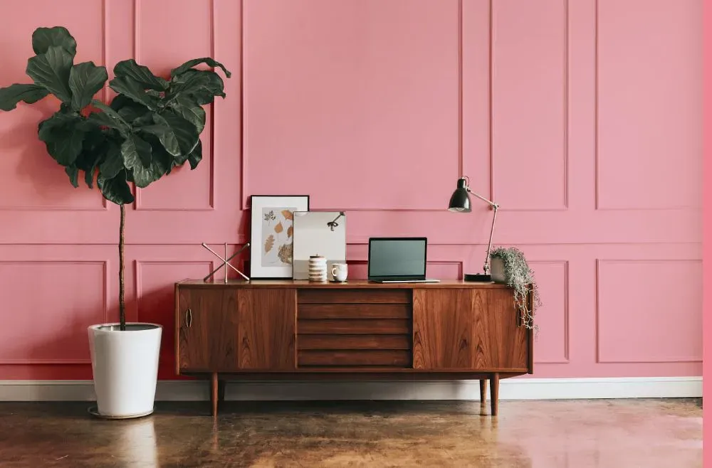
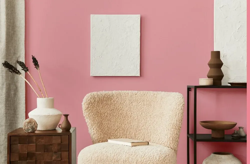
- Benjamin Moore Supple Pink reviews (23 photos)
- What are Benjamin Moore Supple Pink undertones?
- Is Supple Pink 2007-50 cool or warm?
- How light temperature affects on Supple Pink
- Monochromatic color scheme
- Complementary color scheme
- Color comparison and matching
- LRV of Supple Pink 2007-50
- Color codes
- Color equivalents
| Official page: | Supple Pink 2007-50 |
| Code: | 2007-50 |
| Name: | Supple Pink |
| Brand: | Benjamin Moore |
What color is Benjamin Moore Supple Pink?
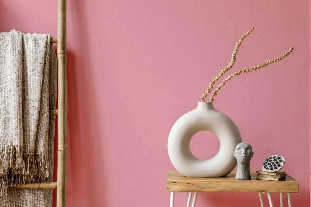
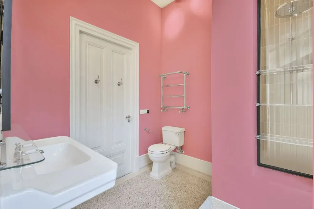
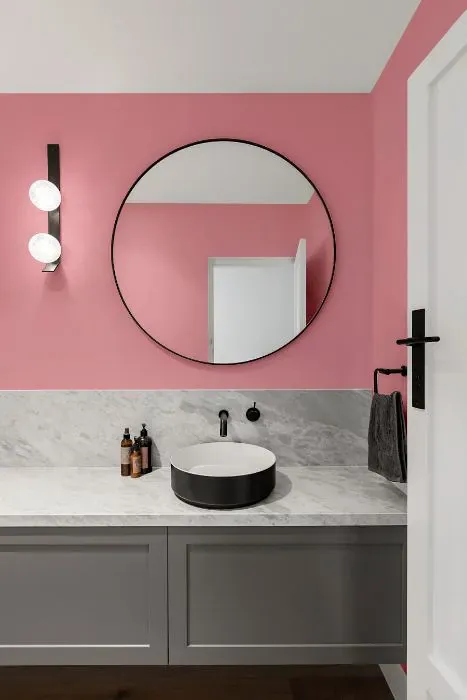
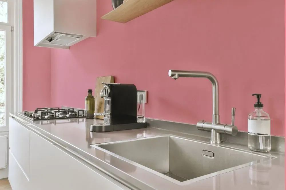
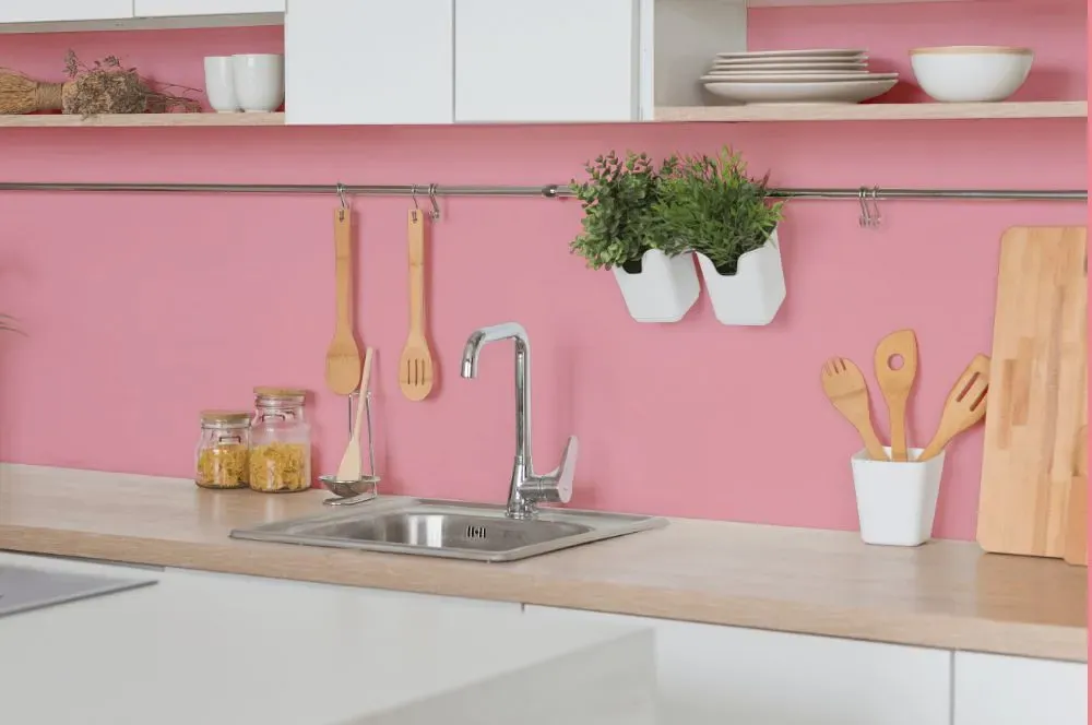
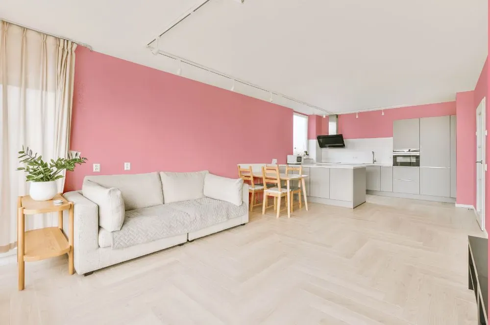
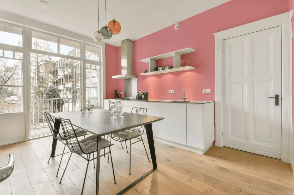
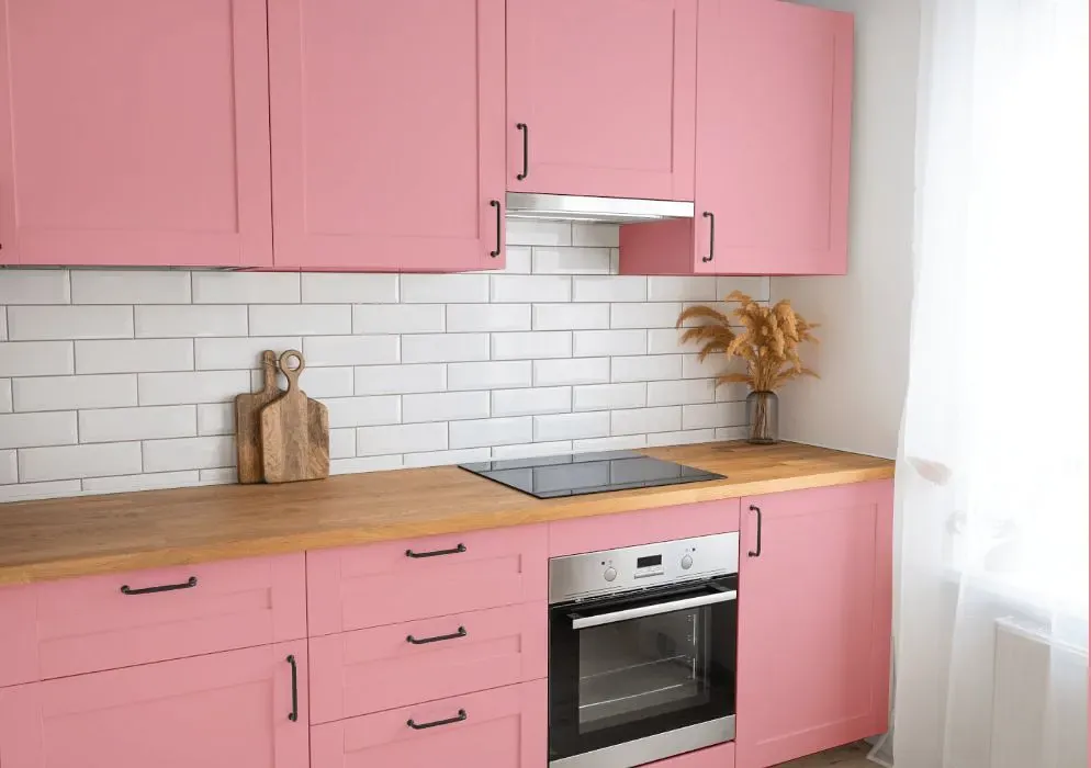
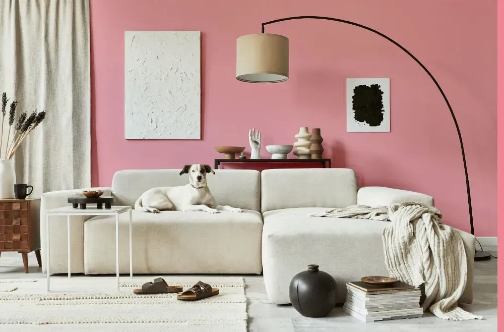
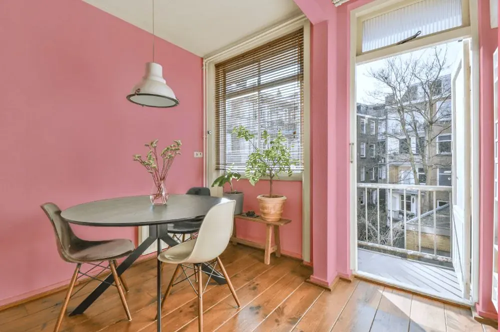
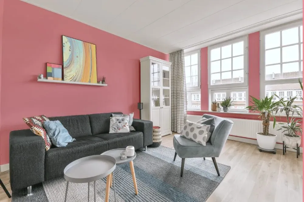
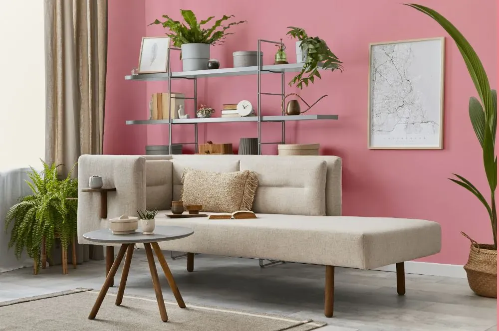
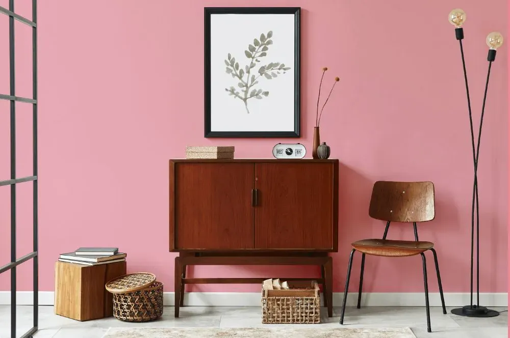
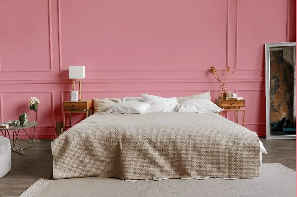
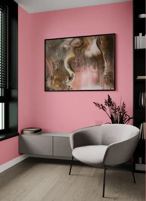
A warm and inviting shade, Benjamin Moore 2007-50 Supple Pink adds a soft touch to any space. This versatile hue pairs seamlessly with muted greys, soft whites, and warm beiges for a harmonious and calming palette. Incorporate touches of sage green or dusty blue to bring a hint of contrast and depth to the overall look. Benjamin Moore 2007-50 is perfect for creating a cozy and serene atmosphere, whether in a nursery, bedroom, or living room. Its understated elegance will surely enhance the ambiance of your home.
Loading...
LRV of Supple Pink
Supple Pink has an LRV of 50.19% and refers to Light Medium colors that reflect half of the incident light. Why LRV is important?

Light Reflectance Value measures the amount of visible and usable light that reflects from a painted surface.
Simply put, the higher the LRV of a paint color, the brighter the room you will get.
The scale goes from 0% (absolute black, absorbing all light) to 100% (pure white, reflecting all light).
Act like a pro: When choosing paint with an LRV of 50.19%, pay attention to your bulbs' brightness. Light brightness is measured in lumens. The lower the paint's LRV, the higher lumen level you need. Every square foot of room needs at least 40 lumens. That means for a 200 ft2 living room you'll need about 8000 lumens of light – e.g., eight 1000 lm bulbs.
Color codes
We have collected almost every possible color code you could ever need.
Not sure what the difference between HEX and RGB is? We break down color models in plain language. Understanding color models
| Format | Code |
|---|---|
| HEX | #F2AAB3 |
| RGB Decimal | 242, 170, 179 |
| RGB Percent | 94.90%, 66.67%, 70.20% |
| HSV | Hue: 352° Saturation: 29.75% Value: 94.9% |
| HSL | hsl(352, 73, 81) |
| CMYK | Cyan: 0.0 Magenta: 29.75 Yellow: 26.03 Key: 5.1 |
| YIQ | Y: 192.554 I: 40.013 Q: 18.031 |
| XYZ | X: 59.13 Y: 50.885 Z: 49.343 |
| CIE Lab | L:76.609 a:27.657 b:6.05 |
| CIE Luv | L:76.609 u:45.699 v:3.566 |
| Decimal | 15903411 |
| Hunter Lab | 71.333, 23.129, 8.921 |