Benjamin Moore Tara 1270
Contentsshow +hide -
| Official page: | Tara 1270 |
| Code: | 1270 |
| Name: | Tara |
| Brand: | Benjamin Moore |
What color is Benjamin Moore Tara?
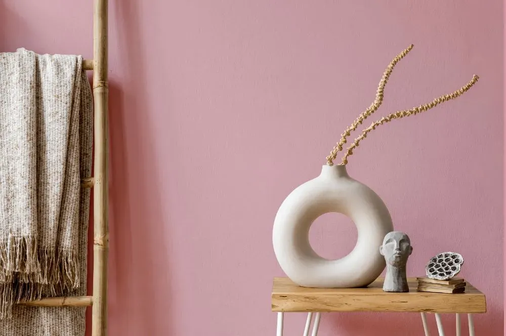
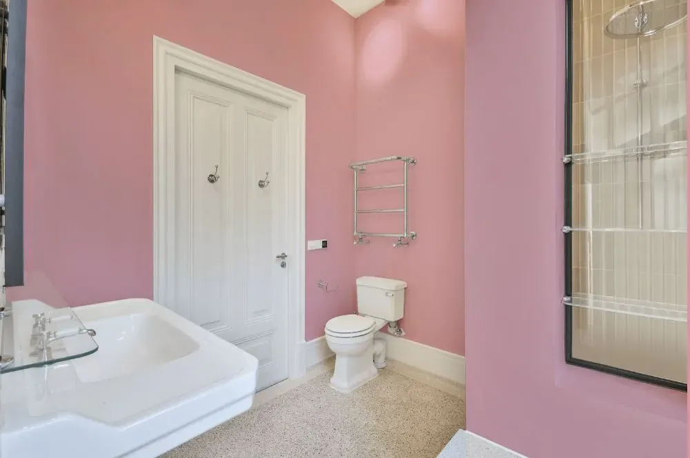
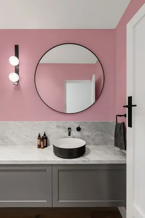
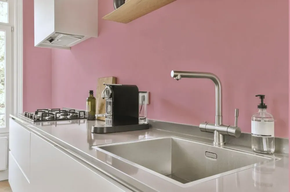
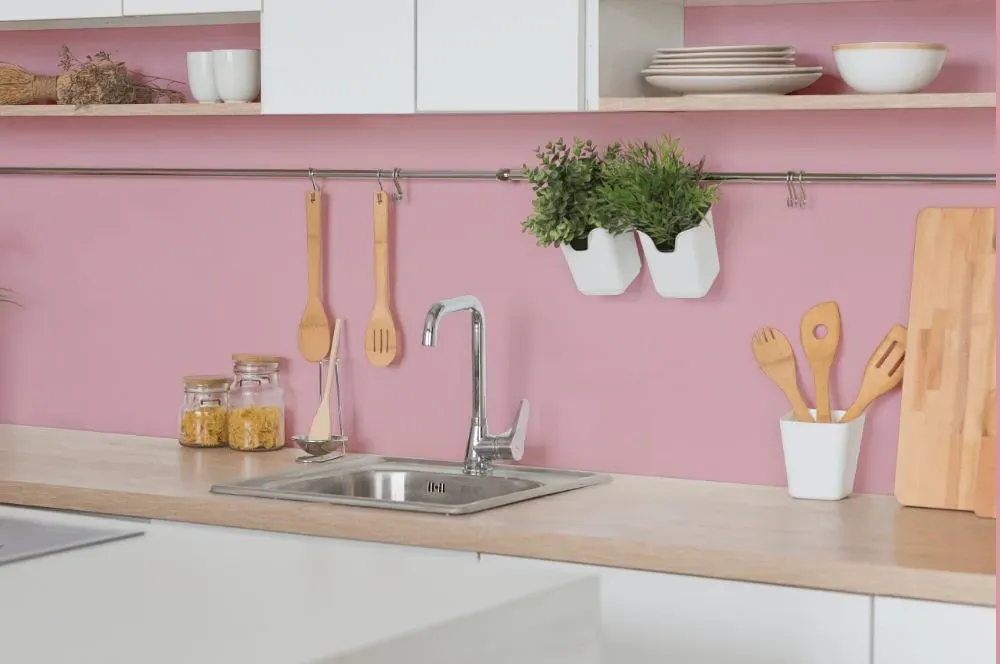
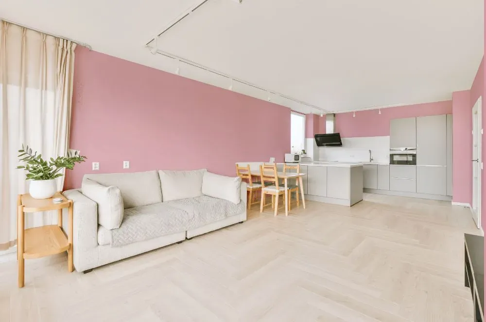
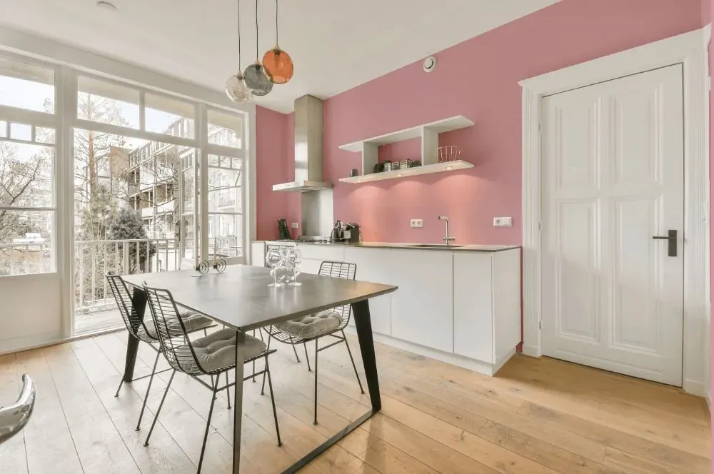
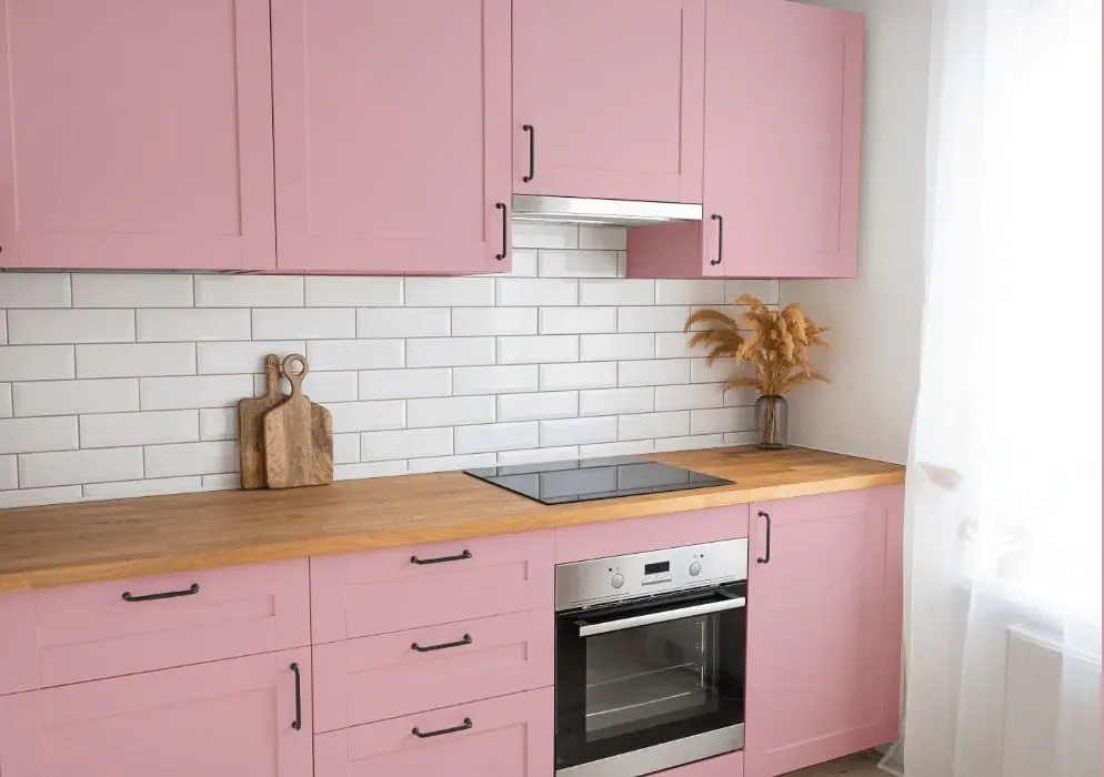
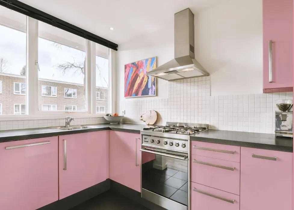
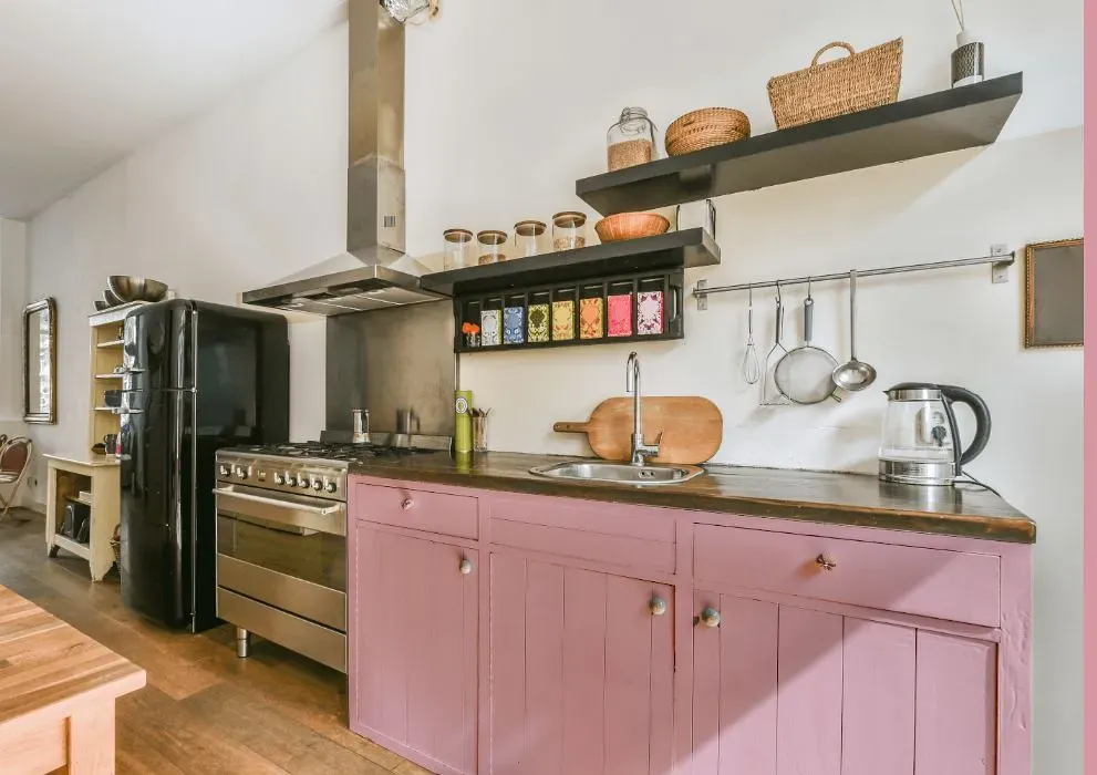
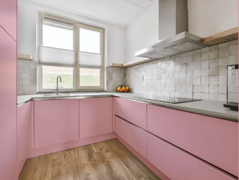
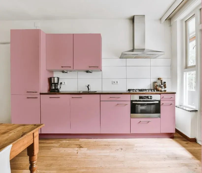
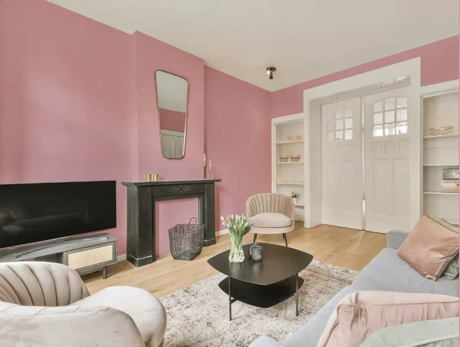
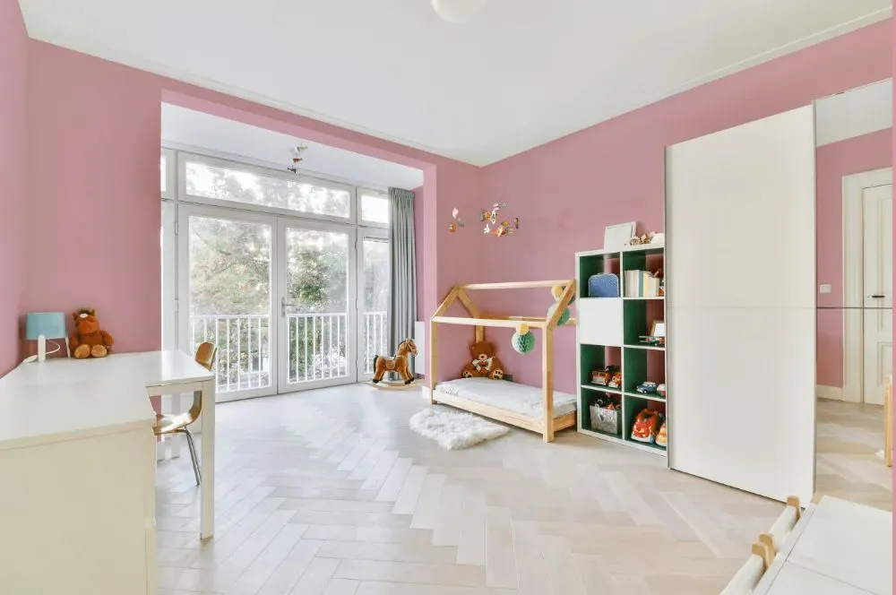
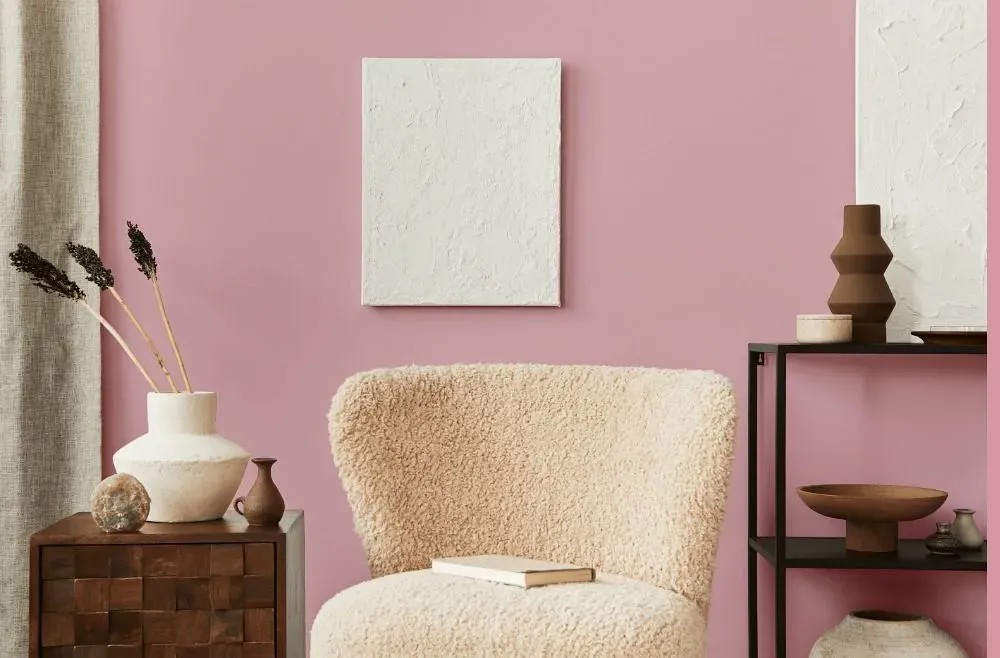
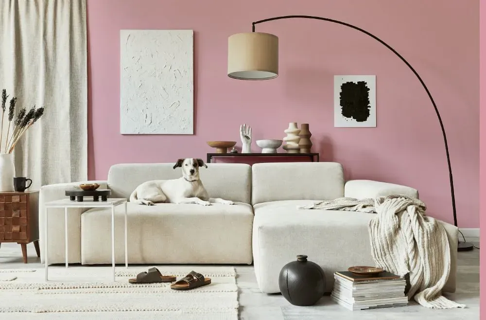
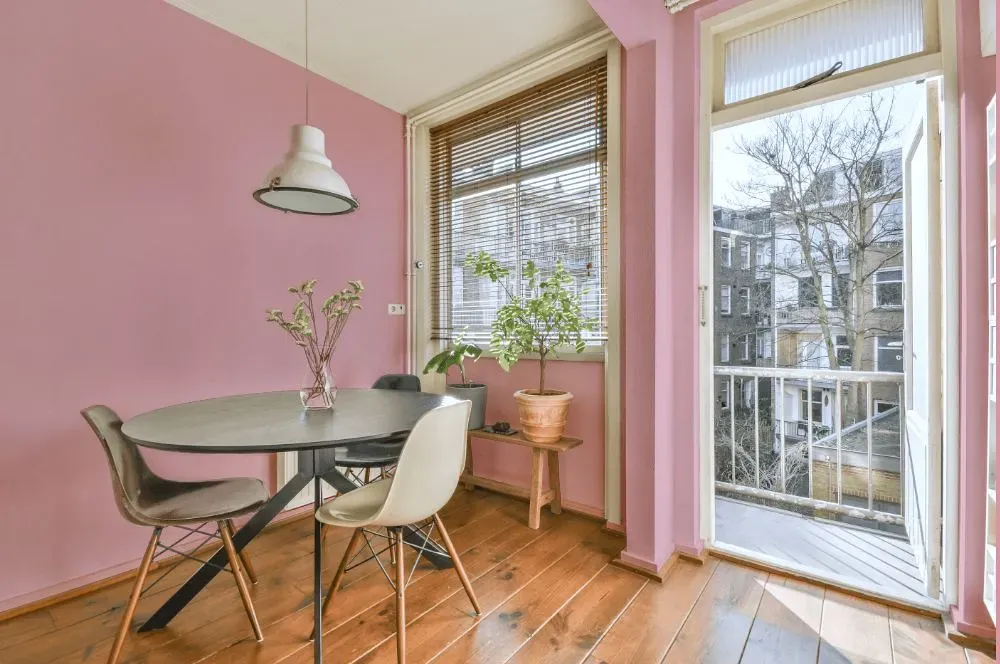
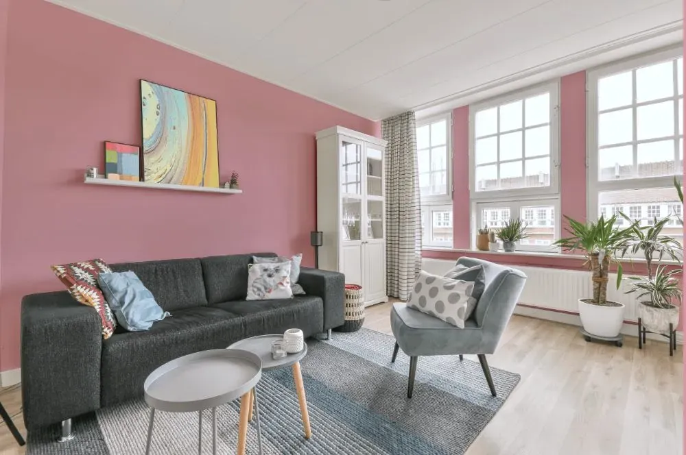
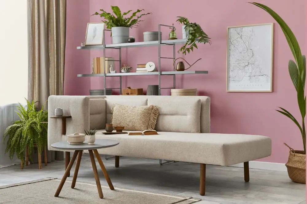
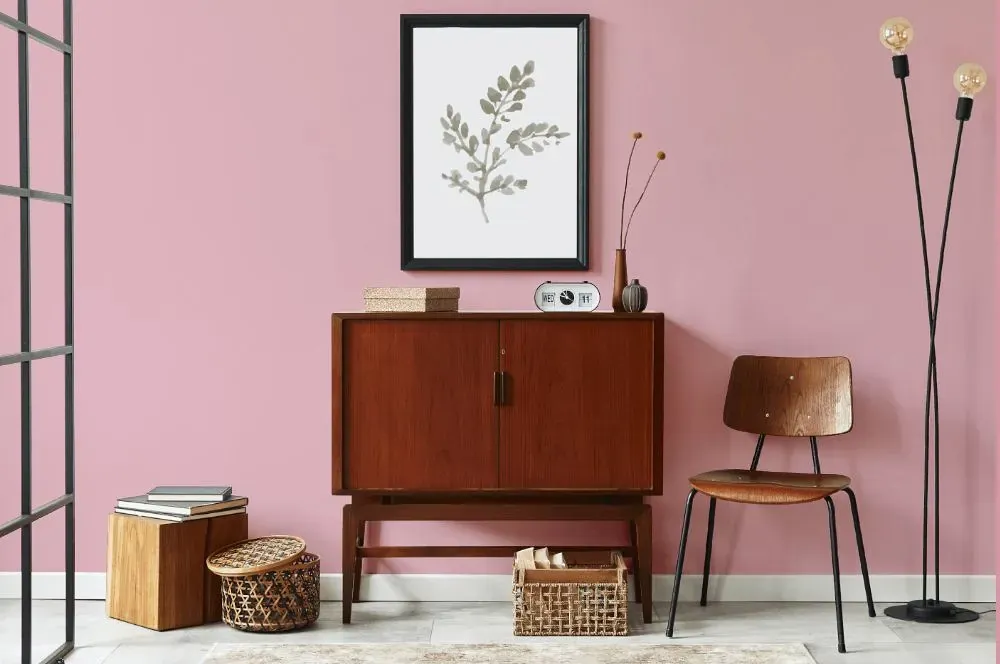
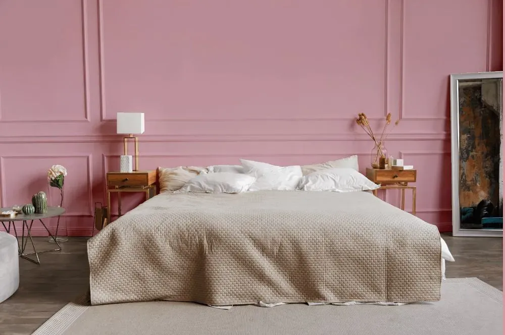
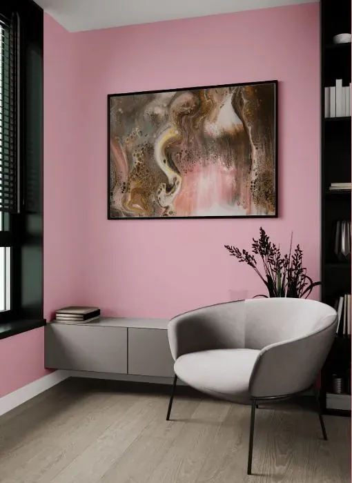
Benjamin Moore 1270 Tara is a stunning shade that exudes warmth and depth. This rich color, with its balance of green and gray undertones, adds sophistication to any space. Pair Tara with crisp whites and soft creams for a classic look, or combine it with touches of gold and navy for a more modern feel. This versatile color works well in both traditional and contemporary design schemes. Elevate your space with Benjamin Moore 1270 Tara for a timeless and elegant atmosphere.
Loading...
LRV of Tara
Tara has an LRV of 53.43% and refers to Light Medium colors that reflect half of the incident light. Why LRV is important?

Light Reflectance Value measures the amount of visible and usable light that reflects from a painted surface.
Simply put, the higher the LRV of a paint color, the brighter the room you will get.
The scale goes from 0% (absolute black, absorbing all light) to 100% (pure white, reflecting all light).
Act like a pro: When choosing paint with an LRV of 53.43%, pay attention to your bulbs' brightness. Light brightness is measured in lumens. The lower the paint's LRV, the higher lumen level you need. Every square foot of room needs at least 40 lumens. That means for a 200 ft2 living room you'll need about 8000 lumens of light – e.g., eight 1000 lm bulbs.
Color codes
We have collected almost every possible color code you could ever need.
Not sure what the difference between HEX and RGB is? We break down color models in plain language. Understanding color models
| Format | Code |
|---|---|
| HEX | #E5B6BF |
| RGB Decimal | 229, 182, 191 |
| RGB Percent | 89.80%, 71.37%, 74.90% |
| HSV | Hue: 349° Saturation: 20.52% Value: 89.8% |
| HSL | hsl(349, 47, 81) |
| CMYK | Cyan: 0.0 Magenta: 20.52 Yellow: 16.59 Key: 10.2 |
| YIQ | Y: 197.079 I: 25.115 Q: 12.743 |
| XYZ | X: 58.444 Y: 53.878 Z: 56.597 |
| CIE Lab | L:78.39 a:18.324 b:1.934 |
| CIE Luv | L:78.39 u:28.256 v:-0.477 |
| Decimal | 15054527 |
| Hunter Lab | 73.401, 13.674, 5.665 |