Benjamin Moore Turquoise Powder 2057-50
Contentsshow +hide -
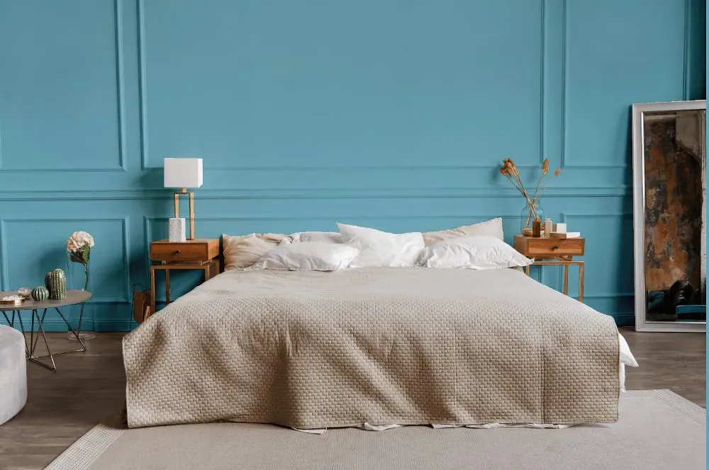
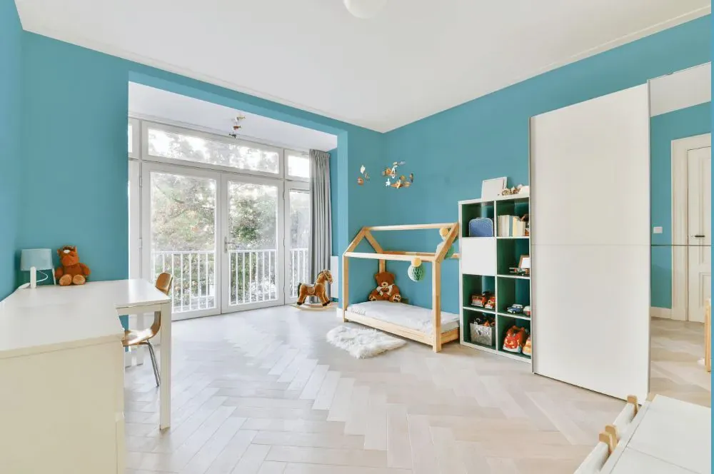
- Turquoise Powder for bedroom (1 photo)
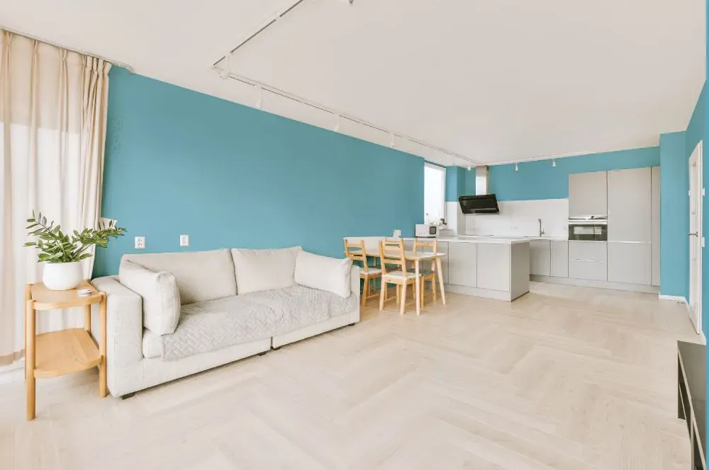
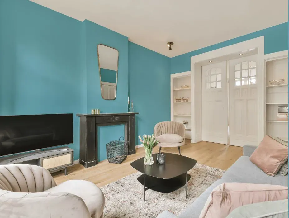
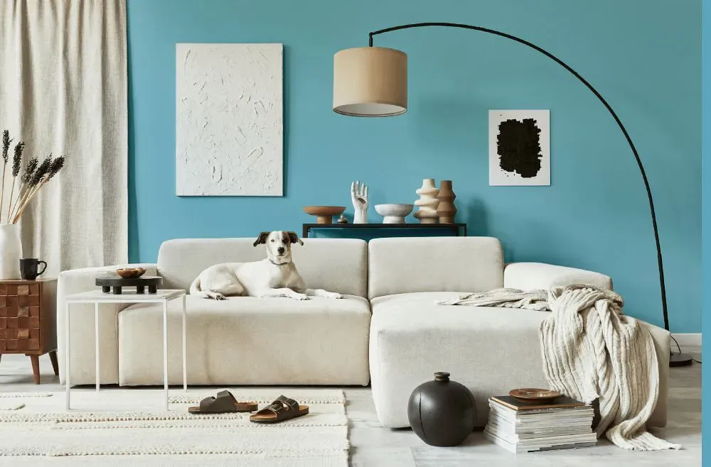
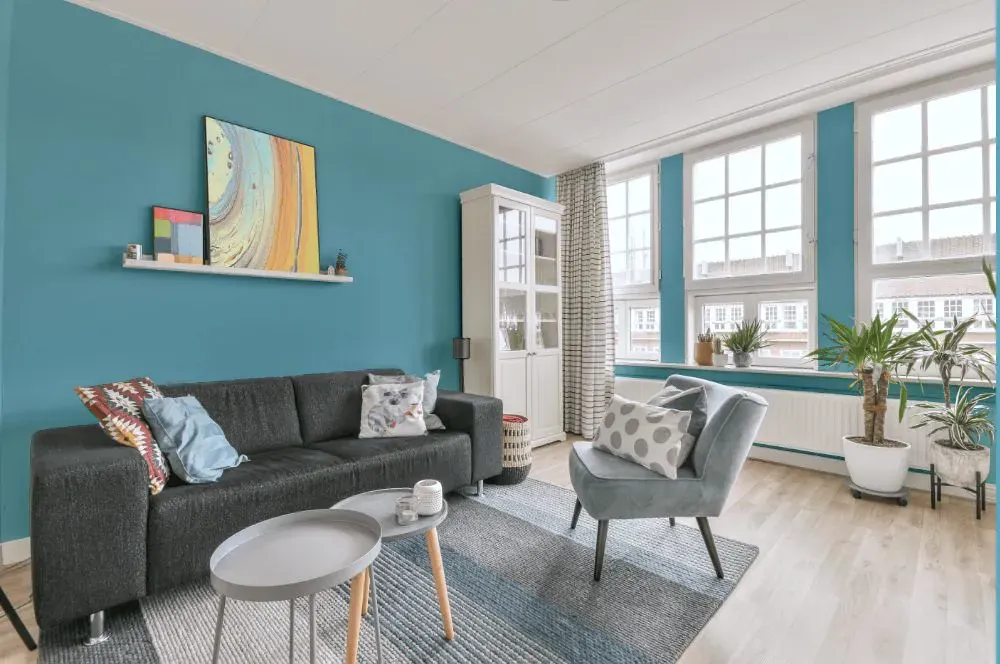
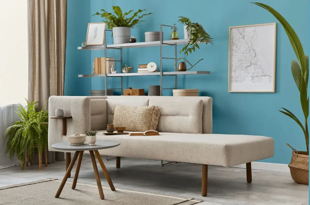
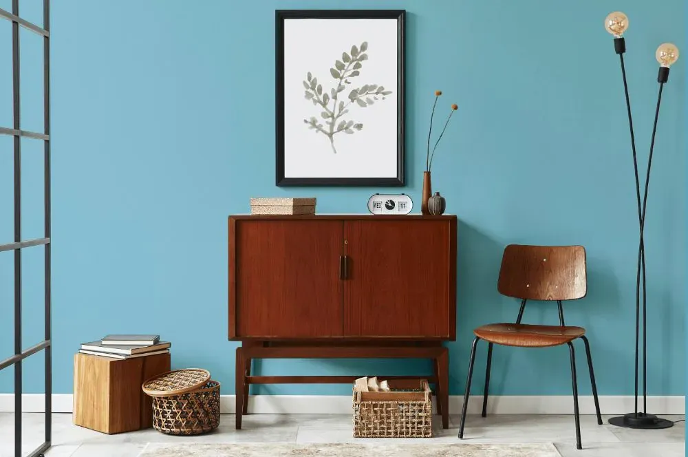
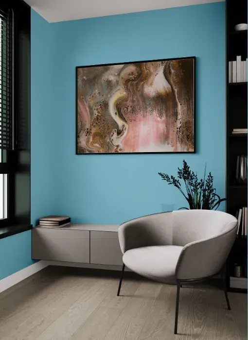
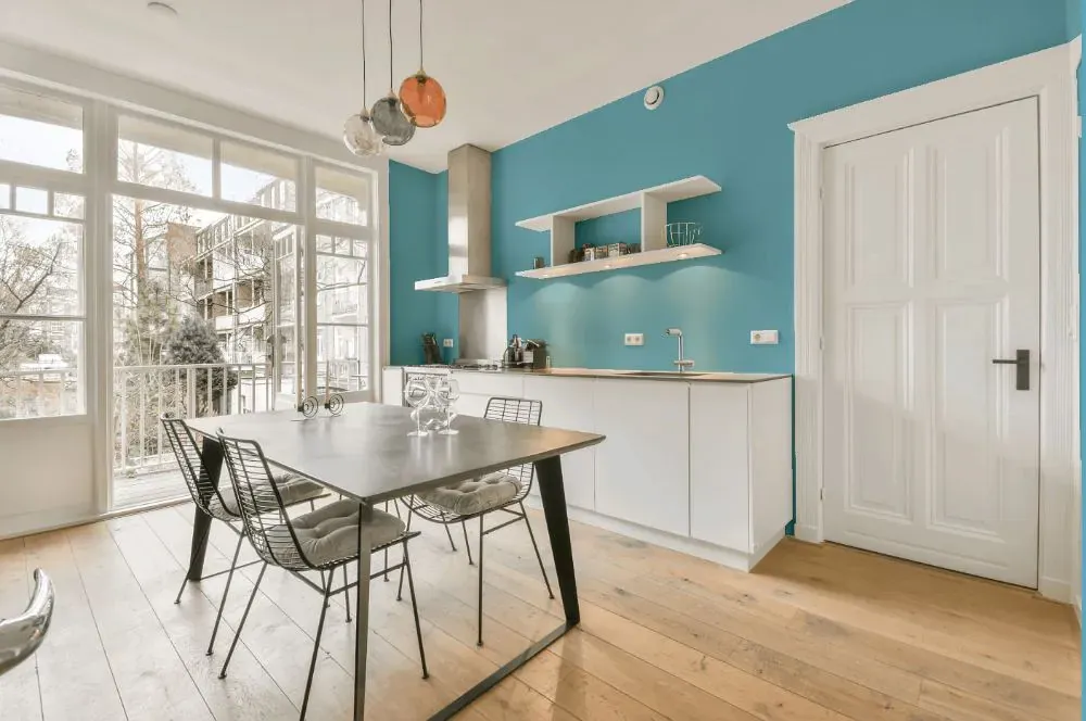
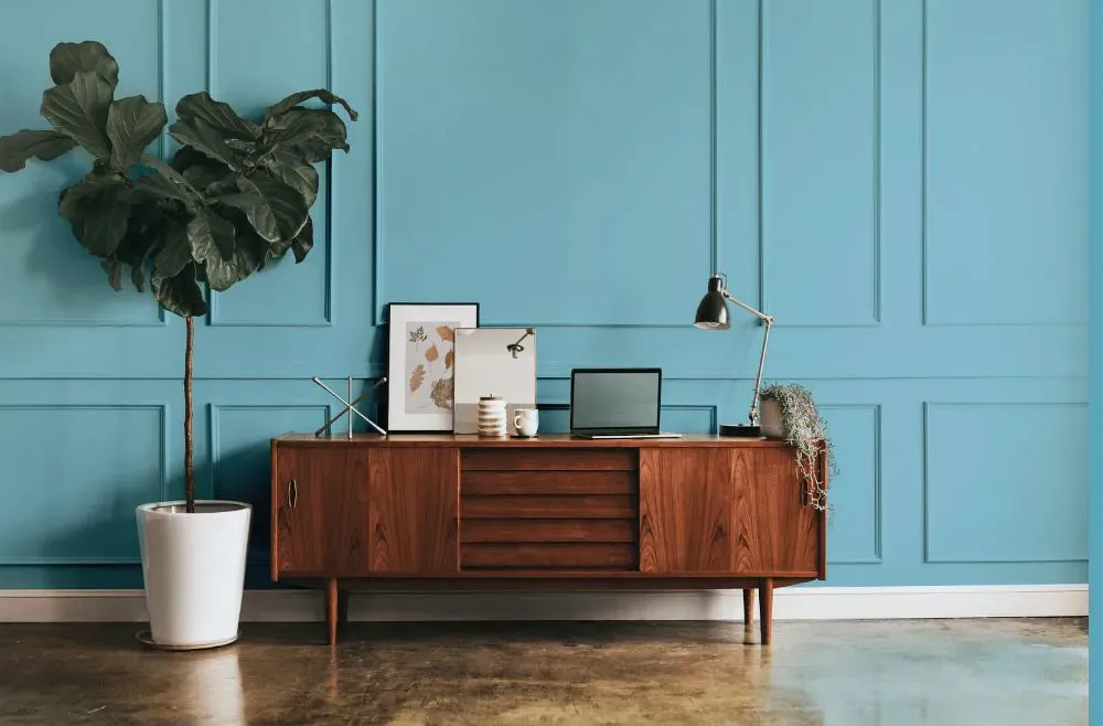
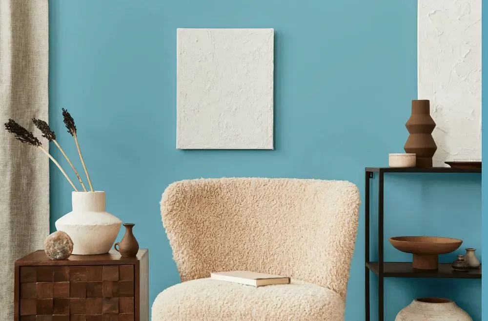
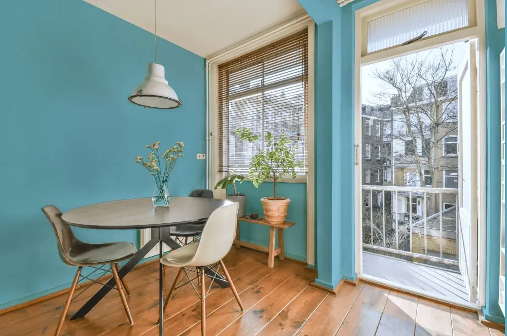
- Turquoise Powder for living room (7 photos)
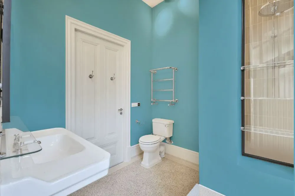
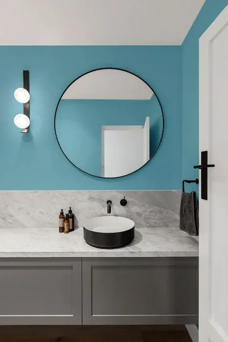
- Benjamin Moore Turquoise Powder for bathroom (2 photos)
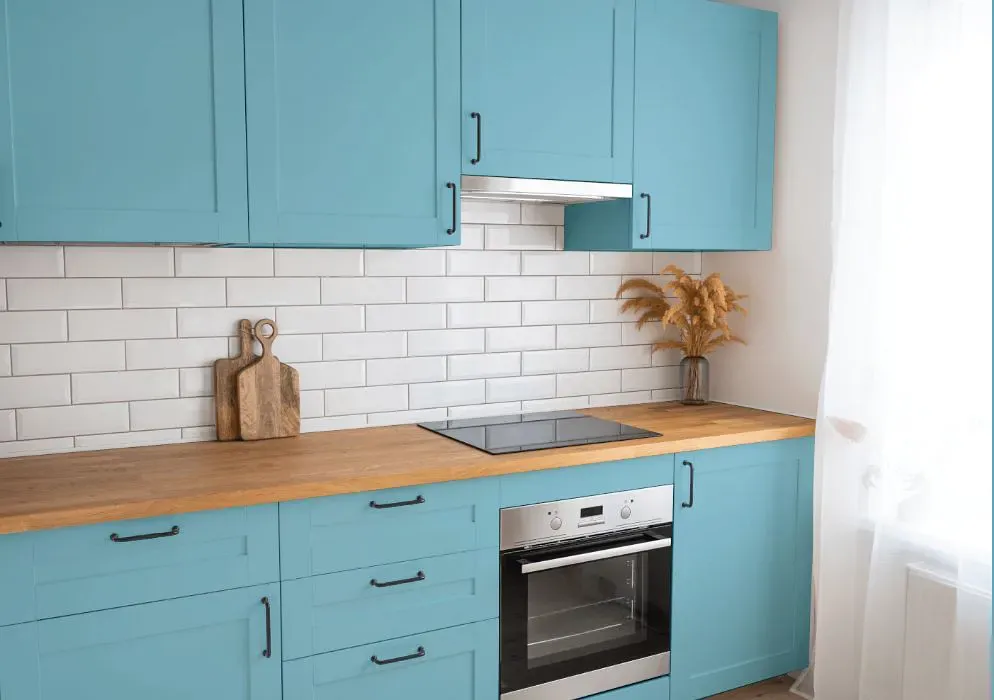
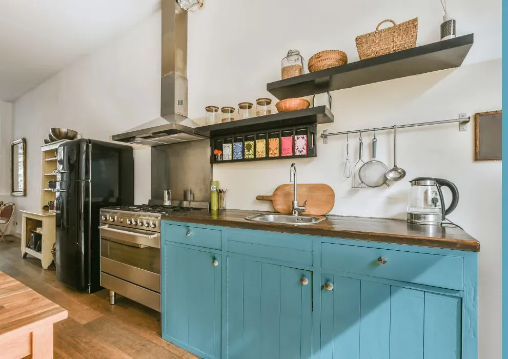
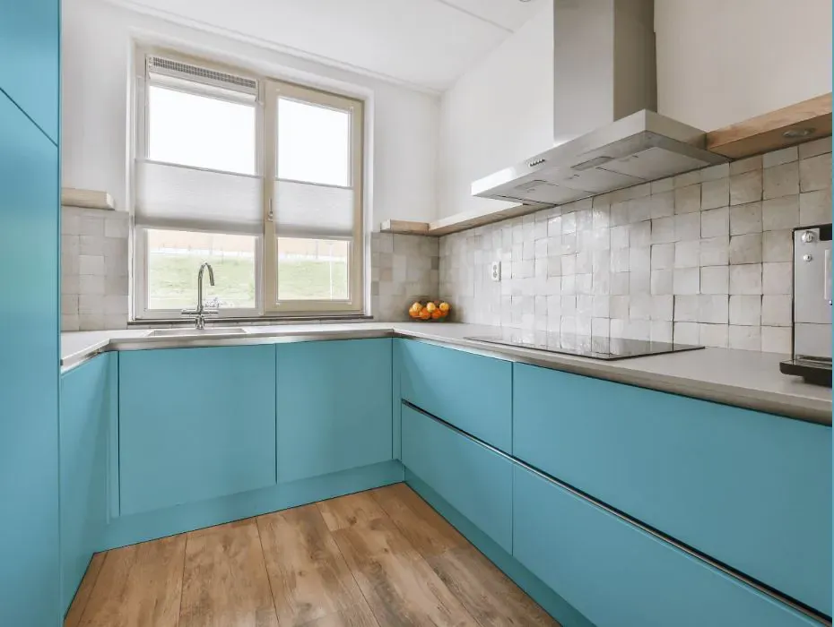
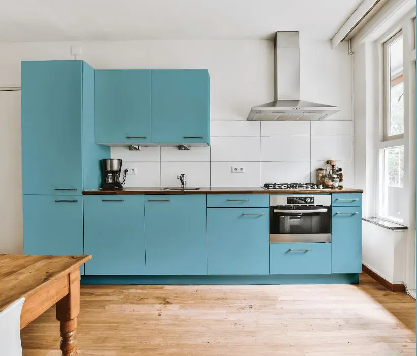
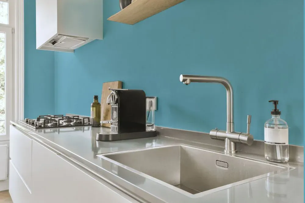
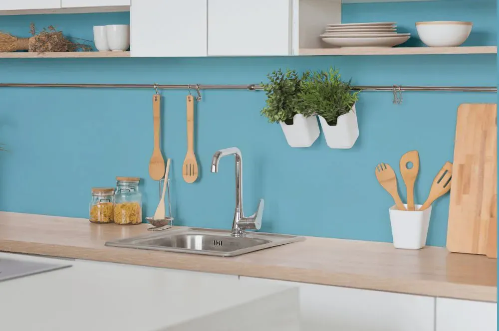
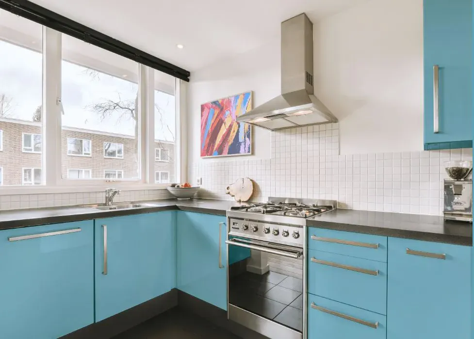
- Benjamin Moore 2057-50 on kitchen cabinets (4 photos)
- Benjamin Moore Turquoise Powder reviews (9 photos)
- What are Benjamin Moore Turquoise Powder undertones?
- Is Turquoise Powder 2057-50 cool or warm?
- How light temperature affects on Turquoise Powder
- Monochromatic color scheme
- Complementary color scheme
- Color comparison and matching
- LRV of Turquoise Powder 2057-50
- Color codes
- Color equivalents
| Official page: | Turquoise Powder 2057-50 |
| Code: | 2057-50 |
| Name: | Turquoise Powder |
| Brand: | Benjamin Moore |
What color is Benjamin Moore Turquoise Powder?
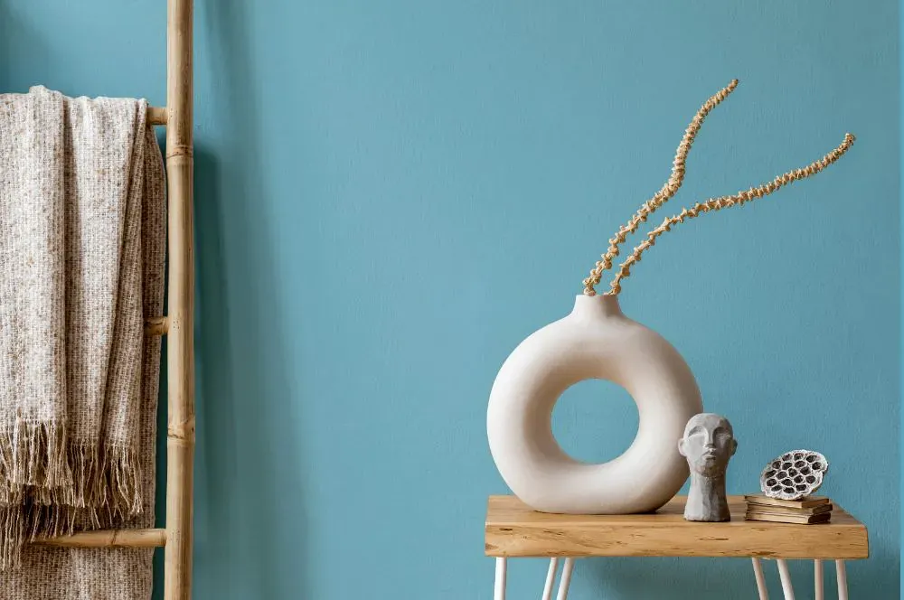
Benjamin Moore 2057-50 Turquoise Powder is a refreshing and vibrant hue that brings a sense of tranquility to any space. This color pairs beautifully with warm neutrals such as beige and ivory to create a calming and sophisticated atmosphere. For a more energetic and playful look, consider pairing Turquoise Powder with shades of coral and yellow to create a dynamic and spirited space. The versatility of Benjamin Moore's 2057-50 allows for endless possibilities in creating a space that is both stylish and inviting.
Loading...
LRV of Turquoise Powder
Turquoise Powder has an LRV of 47.89% and refers to Light Medium colors that reflect half of the incident light. Why LRV is important?

Light Reflectance Value measures the amount of visible and usable light that reflects from a painted surface.
Simply put, the higher the LRV of a paint color, the brighter the room you will get.
The scale goes from 0% (absolute black, absorbing all light) to 100% (pure white, reflecting all light).
Act like a pro: When choosing paint with an LRV of 47.89%, pay attention to your bulbs' brightness. Light brightness is measured in lumens. The lower the paint's LRV, the higher lumen level you need. Every square foot of room needs at least 40 lumens. That means for a 200 ft2 living room you'll need about 8000 lumens of light – e.g., eight 1000 lm bulbs.
Color codes
We have collected almost every possible color code you could ever need.
Not sure what the difference between HEX and RGB is? We break down color models in plain language. Understanding color models
| Format | Code |
|---|---|
| HEX | #87C0D1 |
| RGB Decimal | 135, 192, 209 |
| RGB Percent | 52.94%, 75.29%, 81.96% |
| HSV | Hue: 194° Saturation: 35.41% Value: 81.96% |
| HSL | hsl(194, 45, 67) |
| CMYK | Cyan: 35.41 Magenta: 8.13 Yellow: 0.0 Key: 18.04 |
| YIQ | Y: 176.895 I: -39.429 Q: -6.767 |
| XYZ | X: 40.345 Y: 47.451 Z: 67.337 |
| CIE Lab | L:74.477 a:-14.22 b:-14.401 |
| CIE Luv | L:74.477 u:-27.787 v:-20.083 |
| Decimal | 8896721 |
| Hunter Lab | 68.885, -16.003, -9.739 |