Benjamin Moore Violet Pearl 1451
Contentsshow +hide -
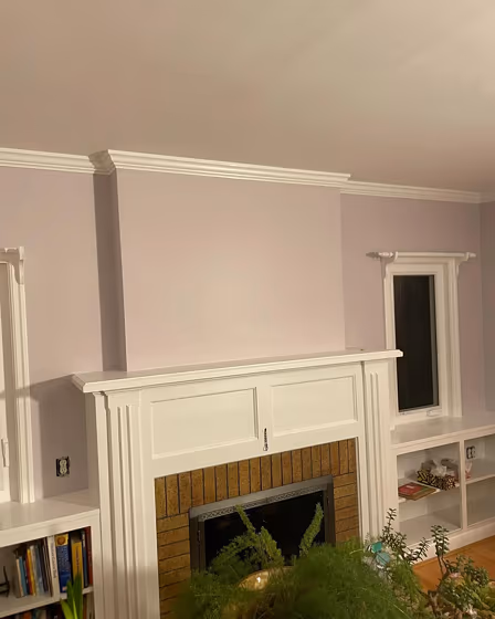
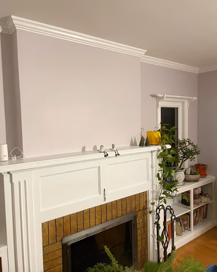
- Violet Pearl for living room (2 photos)
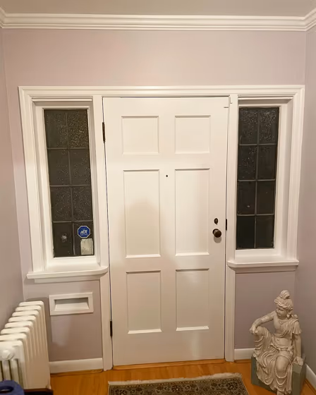
- Benjamin Moore Violet Pearl reviews (1 photo)
- What are Benjamin Moore Violet Pearl undertones?
- Is Violet Pearl 1451 cool or warm?
- How light temperature affects on Violet Pearl
- Monochromatic color scheme
- Complementary color scheme
- Color comparison and matching
- LRV of Violet Pearl 1451
- Color codes
- Color equivalents
| Official page: | Violet Pearl 1451 |
| Code: | 1451 |
| Name: | Violet Pearl |
| Brand: | Benjamin Moore |
What color is Benjamin Moore Violet Pearl?
Elevate your space with the captivating hues of Benjamin Moore 1451 Violet Pearl. This soothing shade, with its subtle undertones of gray and hints of purple, exudes elegance and tranquility. Pair Violet Pearl with complementary colors such as Benjamin Moore 2143-50 Stormy Monday for a sophisticated and modern look. To add warmth, consider combining it with accents in Benjamin Moore 2108-30 Soft Fern or Benjamin Moore 1470 Shadow Gray. Let Violet Pearl (1451) be the focal point of your room while creating a harmonious color scheme that brings a sense of serenity to your home.
Loading...
LRV of Violet Pearl
Violet Pearl has an LRV of 62.54% and refers to Light colors that reflect most of the incident light. Why LRV is important?

Light Reflectance Value measures the amount of visible and usable light that reflects from a painted surface.
Simply put, the higher the LRV of a paint color, the brighter the room you will get.
The scale goes from 0% (absolute black, absorbing all light) to 100% (pure white, reflecting all light).
Act like a pro: When choosing paint with an LRV of 62.54%, pay attention to your bulbs' brightness. Light brightness is measured in lumens. The lower the paint's LRV, the higher lumen level you need. Every square foot of room needs at least 40 lumens. That means for a 200 ft2 living room you'll need about 8000 lumens of light – e.g., eight 1000 lm bulbs.
Color codes
We have collected almost every possible color code you could ever need.
Not sure what the difference between HEX and RGB is? We break down color models in plain language. Understanding color models
| Format | Code |
|---|---|
| HEX | #D3CFD0 |
| RGB Decimal | 211, 207, 208 |
| RGB Percent | 82.75%, 81.18%, 81.57% |
| HSV | Hue: 345° Saturation: 1.9% Value: 82.75% |
| HSL | hsl(345, 4, 82) |
| CMYK | Cyan: 0.0 Magenta: 1.9 Yellow: 1.42 Key: 17.25 |
| YIQ | Y: 208.31 I: 2.062 Q: 1.157 |
| XYZ | X: 60.559 Y: 63.029 Z: 68.633 |
| CIE Lab | L:83.458 a:1.55 b:-0.004 |
| CIE Luv | L:83.458 u:2.218 v:-0.28 |
| Decimal | 13881296 |
| Hunter Lab | 79.391, -2.774, 4.318 |