Sherwin Williams Blushing SW 6617
Contentsshow +hide -
| Official page: | Blushing SW 6617 |
| Code: | SW 6617 |
| Name: | Blushing |
| Brand: | Sherwin Williams |
| Collections: | Living Well |
What color is Sherwin Williams Blushing?
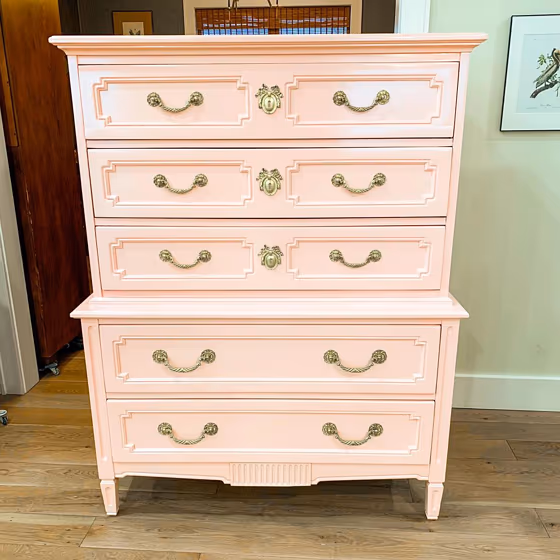
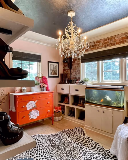
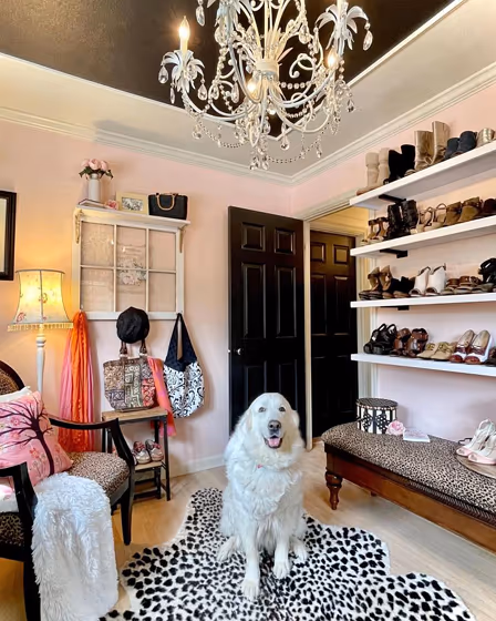
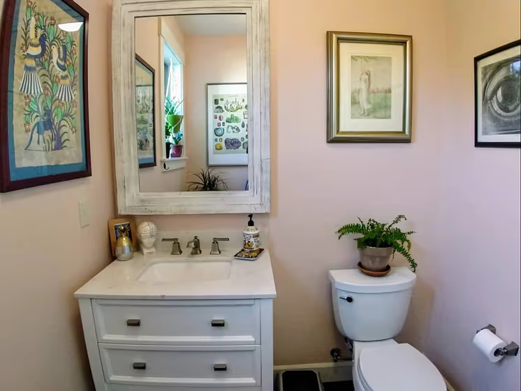
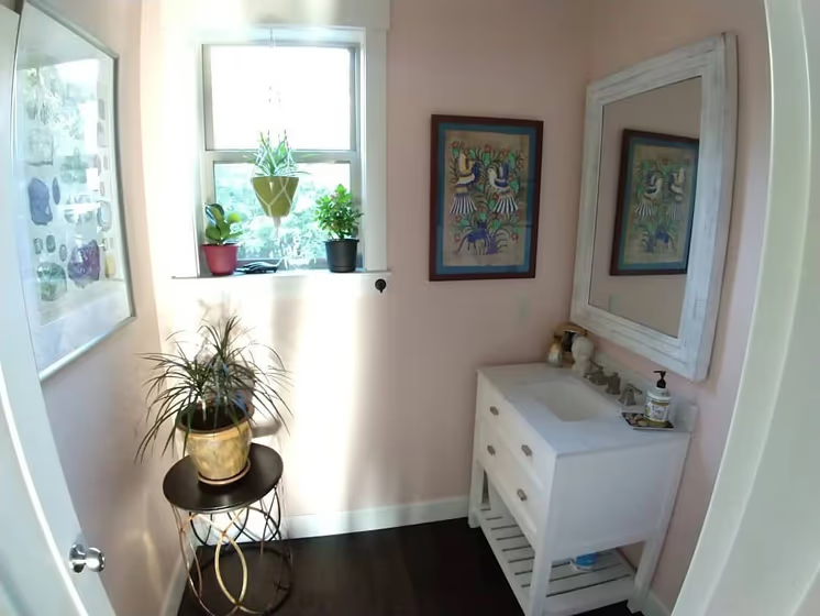
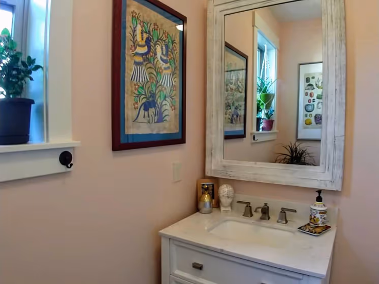
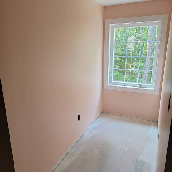
Sherwin Williams SW 6617 Blushing is a soft and elegant hue that adds a touch of warmth to any space. This gentle shade pairs beautifully with crisp whites, muted grays, and deep charcoal tones. SW 6617 Blushing complements natural wood finishes, adding a subtle contrast that enhances the overall ambience. When paired with accents in sage green or dusty rose, this color creates a soothing and harmonious atmosphere in a room. Experimenting with different textures and materials alongside Sherwin Williams SW 6617 Blushing can help create a space that feels inviting and chic.
Loading...
LRV of Blushing
Blushing has an LRV of 67.81% and refers to Light colors that reflect most of the incident light. Why LRV is important?

Light Reflectance Value measures the amount of visible and usable light that reflects from a painted surface.
Simply put, the higher the LRV of a paint color, the brighter the room you will get.
The scale goes from 0% (absolute black, absorbing all light) to 100% (pure white, reflecting all light).
Act like a pro: When choosing paint with an LRV of 67.81%, pay attention to your bulbs' brightness. Light brightness is measured in lumens. The lower the paint's LRV, the higher lumen level you need. Every square foot of room needs at least 40 lumens. That means for a 200 ft2 living room you'll need about 8000 lumens of light – e.g., eight 1000 lm bulbs.
Color codes
We have collected almost every possible color code you could ever need.
Not sure what the difference between HEX and RGB is? We break down color models in plain language. Understanding color models
| Format | Code |
|---|---|
| HEX | #f0d1c3 |
| RGB Decimal | 240, 209, 195 |
| RGB Percent | 94.12%, 81.96%, 76.47% |
| HSV | Hue: 19° Saturation: 18.75% Value: 94.12% |
| HSL | hsl(19, 60, 85) |
| CMYK | Cyan: 0.0 Magenta: 12.92 Yellow: 18.75 Key: 5.88 |
| YIQ | Y: 216.673 I: 22.972 Q: 2.201 |
| XYZ | X: 68.585 Y: 68.068 Z: 61.141 |
| CIE Lab | L:86.041 a:8.64 b:10.931 |
| CIE Luv | L:86.041 u:19.755 v:14.416 |
| Decimal | 15782339 |
| Hunter Lab | 82.503, 4.006, 13.815 |