Sherwin Williams Persimmon SW 6339
Contentsshow +hide -
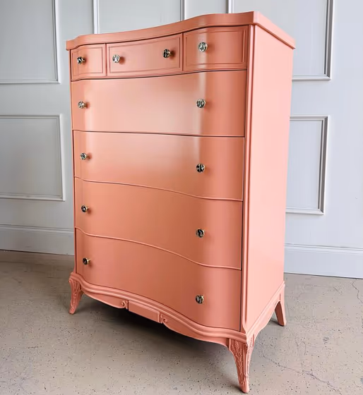
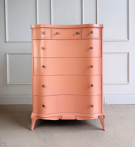
- Sherwin Williams Persimmon reviews (2 photos)
- What are Sherwin Williams Persimmon undertones?
- Is Persimmon SW 6339 cool or warm?
- How light temperature affects on Persimmon
- Monochromatic color scheme
- Complementary color scheme
- Color comparison and matching
- LRV of Persimmon SW 6339
- Color codes
- Color equivalents
| Official page: | Persimmon SW 6339 |
| Code: | SW 6339 |
| Name: | Persimmon |
| Brand: | Sherwin Williams |
| Collections: | Assistance |
What color is Sherwin Williams Persimmon?
Sherwin Williams Persimmon SW 6339 is a softened orange-pink with a noticeable earthy clay cast. Its warm, mid-tone character reads like muted coral in bright daylight, while lower light can bring out its dusty terracotta side. Persimmon is especially effective on dining room walls, a powder room, or a painted accent such as an interior door or built-in. Pair it with creamy off-whites, warm beige textiles, natural oak, rattan, and aged brass for a cohesive look. For more contrast, use deep olive green or a charcoal-brown accent rather than a stark cool gray.
Loading...
LRV of Persimmon
Persimmon has an LRV of 38.72% and refers to Medium colors that reflect a lot of light. Why LRV is important?

Light Reflectance Value measures the amount of visible and usable light that reflects from a painted surface.
Simply put, the higher the LRV of a paint color, the brighter the room you will get.
The scale goes from 0% (absolute black, absorbing all light) to 100% (pure white, reflecting all light).
Act like a pro: When choosing paint with an LRV of 38.72%, pay attention to your bulbs' brightness. Light brightness is measured in lumens. The lower the paint's LRV, the higher lumen level you need. Every square foot of room needs at least 40 lumens. That means for a 200 ft2 living room you'll need about 8000 lumens of light – e.g., eight 1000 lm bulbs.
Color codes
We have collected almost every possible color code you could ever need.
Not sure what the difference between HEX and RGB is? We break down color models in plain language. Understanding color models
| Format | Code |
|---|---|
| HEX | #d9987c |
| RGB Decimal | 217, 152, 124 |
| RGB Percent | 85.10%, 59.61%, 48.63% |
| HSV | Hue: 18° Saturation: 42.86% Value: 85.1% |
| HSL | hsl(18, 55, 67) |
| CMYK | Cyan: 0.0 Magenta: 29.95 Yellow: 42.86 Key: 14.9 |
| YIQ | Y: 168.243 I: 47.731 Q: 5.036 |
| XYZ | X: 43.483 Y: 38.666 Z: 24.236 |
| CIE Lab | L:68.509 a:21.006 b:24.497 |
| CIE Luv | L:68.509 u:46.308 v:28.077 |
| Decimal | 14260348 |
| Hunter Lab | 62.182, 16.003, 20.419 |