Sherwin Williams Breathless SW 6022

Official page:Breathless SW 6022
Code:SW 6022
Name:Breathless
Brand:Sherwin Williams
Collections:Living Well, 2020 Mantra

What color is Sherwin Williams Breathless?

Sherwin Williams SW 6022 Breathless is a soft, serene shade that evokes a sense of tranquility in any space. This gentle hue pairs beautifully with crisp whites and sandy neutrals for a calming, sophisticated look. Consider adding accents in muted greens or subtle blues to complement Breathless and create a harmonious color palette that brings a touch of elegance to your interior. With its understated charm, SW 6022 effortlessly adds a timeless appeal to any room, making it the perfect choice for those seeking a refreshing and relaxing atmosphere.

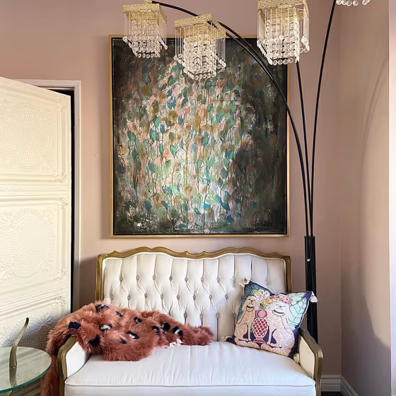
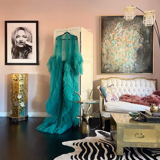
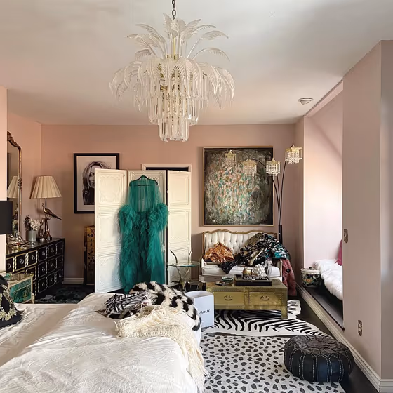
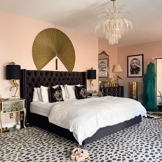
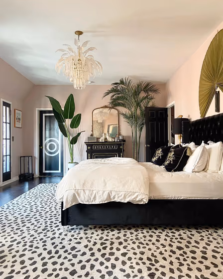
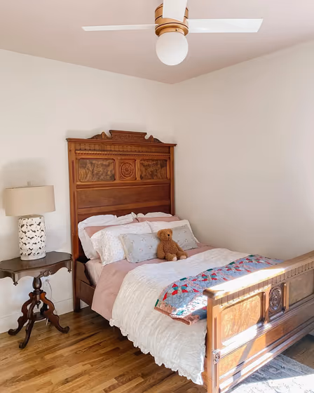
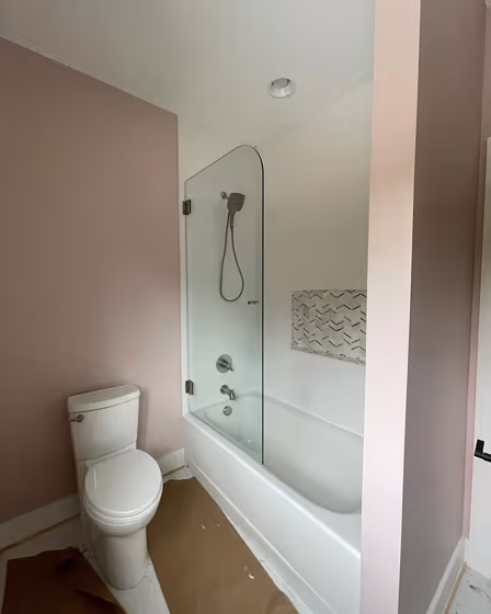
Breathless for bedroom (5 photos)

We’ve hand-picked a beautiful collection of photos of this amazing pink shade used in real bedrooms. Take a look and imagine how this wonderful warm mid-tone paint color could transform your own bedroom space.

Sw 6022 Wall Paint
@lagirl310
Sw Breathless Bedroom Paint
@lagirl310
Breathless Pink Bedroom
@lagirl310
Bedroom
@lagirl310
Breathless Bedroom
@lagirl310

Sherwin Williams Breathless reviews (5 photos)

View the photos of real spaces painted with this pink that were not included in specific categories.Close-ups, painted furniture, storages and dressers, hallways, stairs and ceilings.

Sw 6022 Front Door
@lorifoester
Breathless Ceiling
@secret.hollow.farm
Sherwin Williams Breathless Bathroom
@littlemodernlottafarm
Sw Breathless Nursery
@anorris740
Sw Breathless Nursery
@anorris740

Try before you buy

Samplize samples on the wall

100% accurate
reusable paint samples

Peel, stick and repeat

Peel, stick,
and repeat

Twice painted samples

Twice painted
with real paint

Fast delivery

Next day
delivery

Shop now

What are Sherwin Williams Breathless undertones?

Breathless has a clear red undertone based on its position in the color space. We identify undertones by isolating the pure hue (separating it from lightness and saturation), which avoids distortions caused by tints, tones, and shades.
This method is generally more reliable than judging undertones on a white background.

HEX value:

#D6C2BE

RGB code:

214, 194, 190

Is Sherwin Williams Breathless SW 6022 cool or warm?

warm
cool
Color wheel

With a hue of 10°, this Pink reads warm on the HSL color wheel.

SW 6022 Breathless HSL code: 10, 23%, 79%

Hue - degree on a color wheel from 0 to 360. 0 is red, 120 is green, and 240 is blue.
Saturation is expressed as a percentage. At 0%, it appears as a shade of grey, and at 100%, it is in full color.
Lightness is also a percentage value. 0% is black, and 100% is white.

How light temperature affects Breathless

Natural Lighting. During the day, natural light shifts from about 2000 K at sunrise/sunset to 5500–6500 K at noon.

In addition, natural‑light temperature depends on its direction:

Direction of sunlightVisible temp.HueDuration
NorthCoolBluishAll day
EastWarmYellowBefore noon
WestWarmOrange‑redAfter noon
SouthWarmOrange‑yellowAll day

Artificial Lighting. When choosing bulbs, pay attention to their color‑temperature (Kelvins).
Use the slider to see how this Pink shade looks under different lighting:

Living‑room mockup
Living‑room overlay

4000K

2000K
3000K
4000K
5000K
6000K
7000K

Coordinating colors.
Colors that go with Sherwin Williams Breathless:

Monochromatic color scheme

Monochromatic color scheme

This scheme consists of various shades, tints, and tones of a single color. While it offers a perfect combination of hues, without accent décor it may become monotonous.

Lighter shades

Darker shades

Complementary color scheme

Complementary color scheme

This color scheme is a combination of two shades that are opposite each other on the color wheel. The high contrast between these colors creates a vibrant and dynamic visual effect. For the color Breathless with a red hue, complementary colors are those with a green hue close to 190, such as Sherwin Williams Mountain Air and Niebla Azul.

LRV of Breathless

Breathless has an LRV of 56.69% and refers to Light colors that reflect most of the incident lightWhy LRV is important?

Light Reflectance Value scale illustration

Light Reflectance Value measures the amount of visible and usable light that reflects from a painted surface.
Simply put, the higher the LRV of a paint color, the brighter the room you will get.
The scale goes from 0% (absolute black, absorbing all light) to 100% (pure white, reflecting all light).

Act like a pro: When choosing paint with an LRV of 56.69%, pay attention to your bulbs' brightness. Light brightness is measured in lumens. The lower the paint's LRV, the higher lumen level you need. Every square foot of room needs at least 40 lumens. That means for a 200 ft2 living room you’ll need about 8000 lumens of light – e.g., eight 1000 lm bulbs.

Color codes

We have collected almost every possible color code you could ever need. To copy the code, just click the icon to the right of it.

FormatCode
HEX#d6c2beCopy color code
RGB Decimal214, 194, 190Copy color code
RGB Percent83.92%, 76.08%, 74.51%Copy color code
HSVHue: 10° Saturation: 11.21% Value: 83.92%Copy color code
HSLhsl(10, 23, 79)Copy color code
CMYKCyan: 0.0 Magenta: 9.35 Yellow: 11.21 Key: 16.08Copy color code
YIQY: 199.524 I: 13.203 Q: 2.986Copy color code
XYZX: 56.316 Y: 56.598 Z: 56.659Copy color code
CIE LabL:79.953 a:6.362 b:4.57Copy color code
CIE LuvL:79.953 u:12.115 v:5.604Copy color code
Decimal14074558Copy color code
Hunter Lab75.232, 1.963, 8.009Copy color code
Copy color code
Copy paint color code

Color equivalents