Sherwin Williams Butternut SW 6389
Contentsshow +hide -
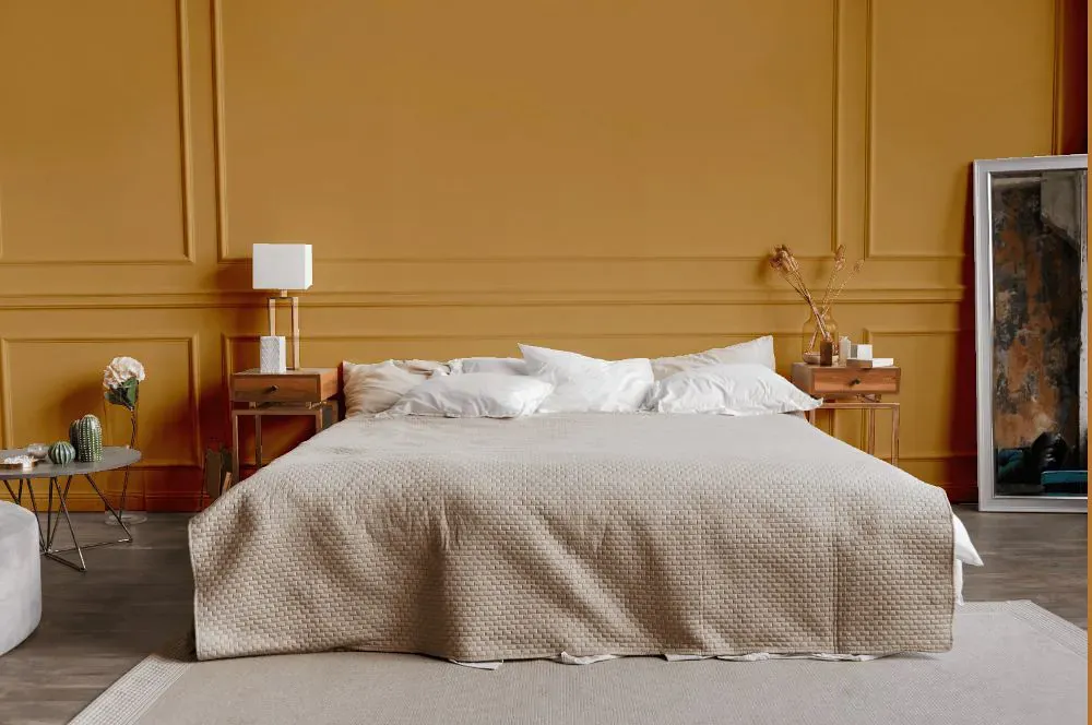
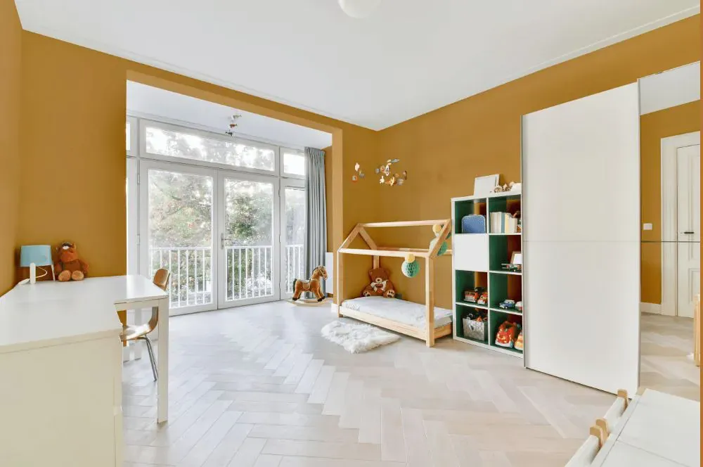
- Butternut for bedroom (1 photo)
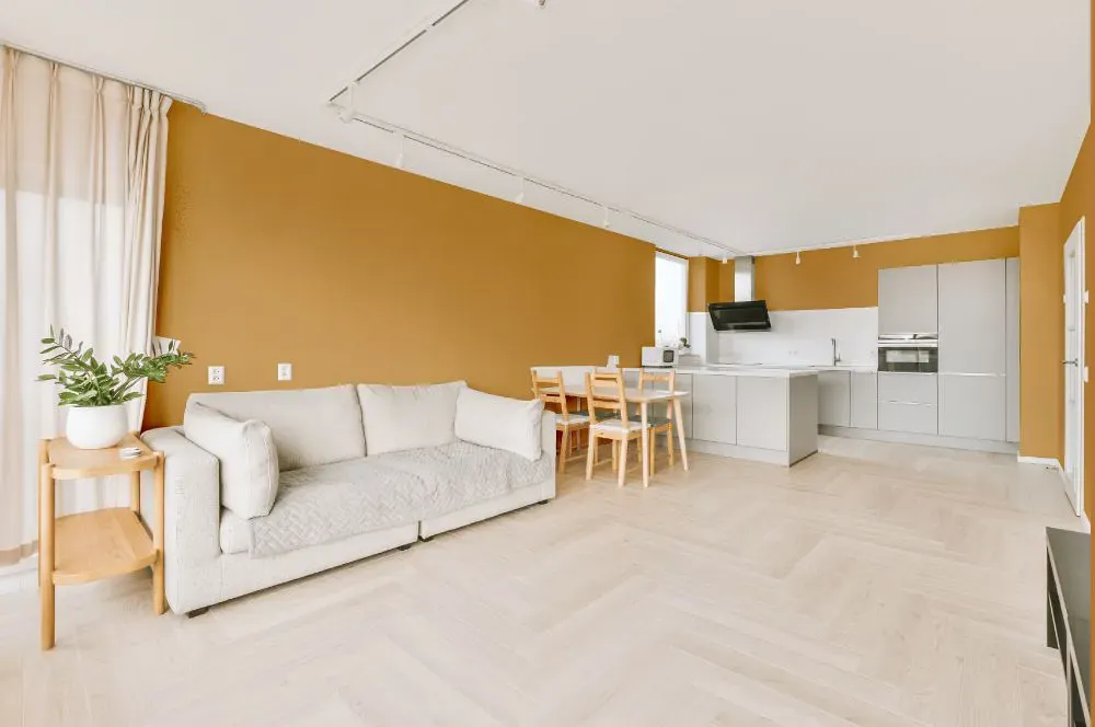
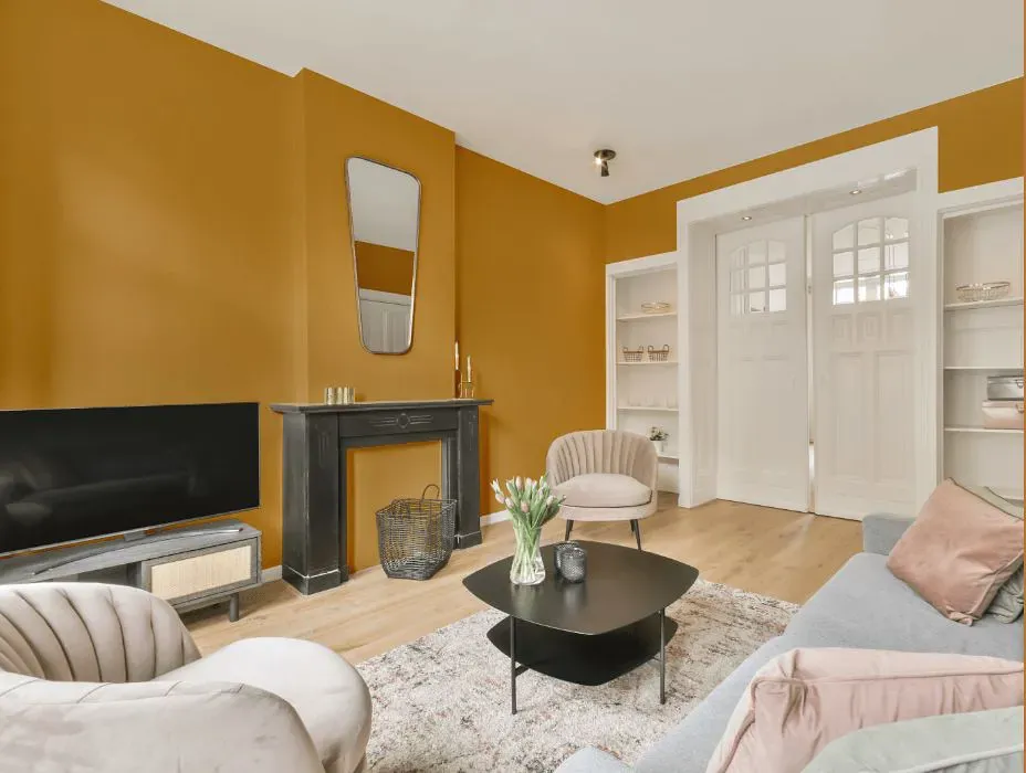
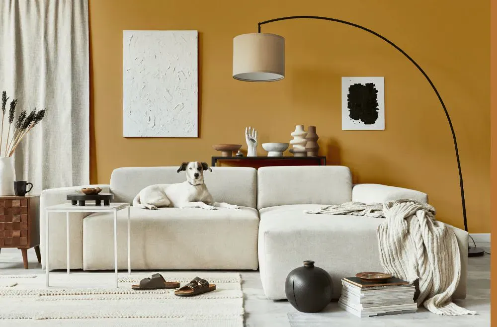
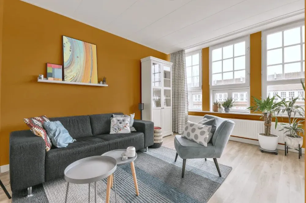
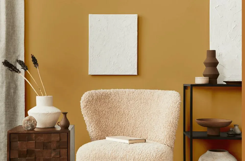
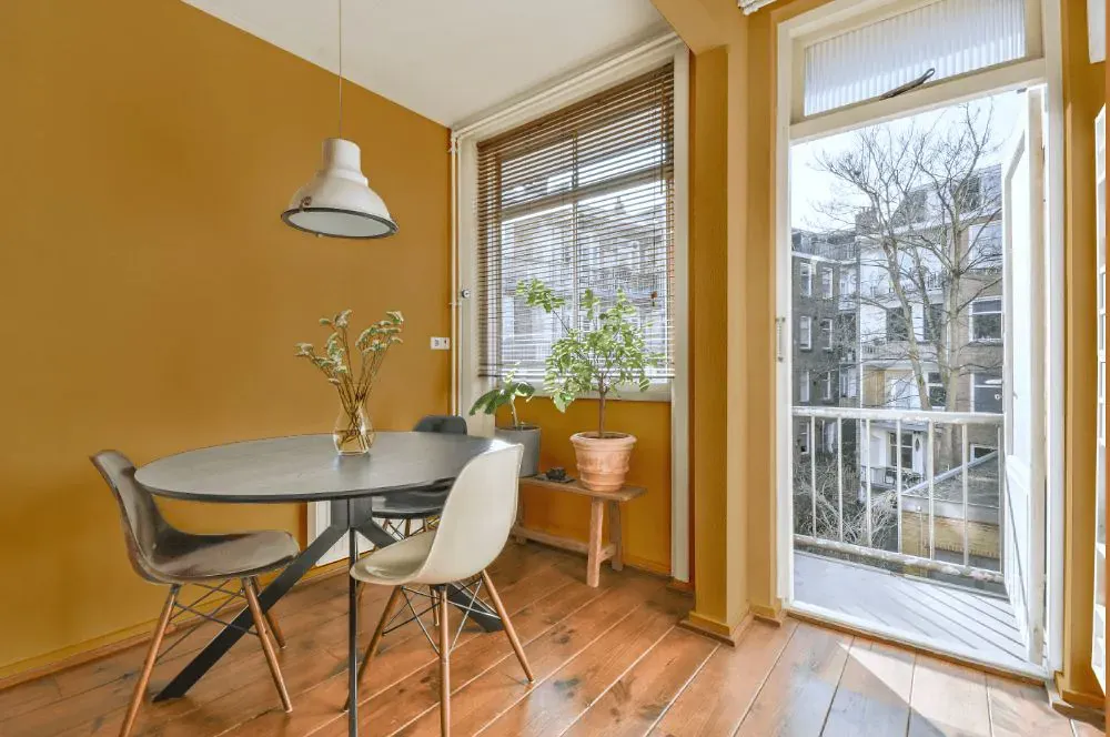
- Butternut for living room (7 photos)
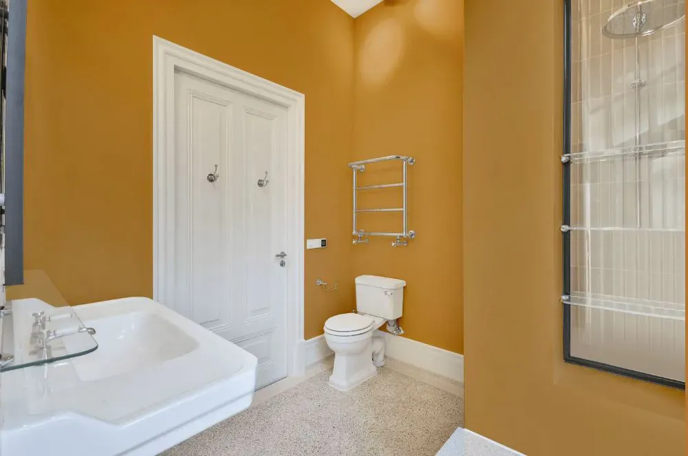
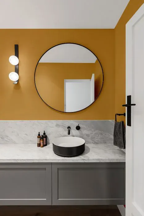
- Sherwin Williams Butternut for bathroom (2 photos)
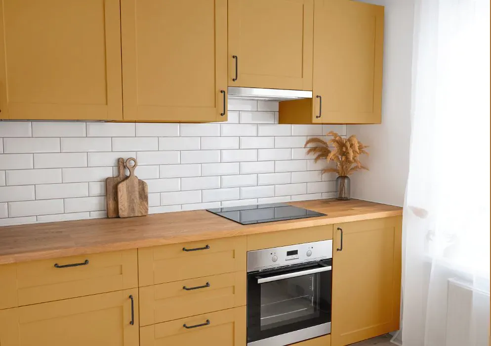
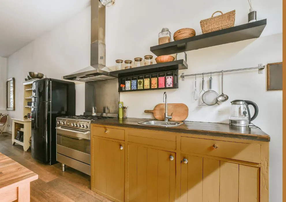
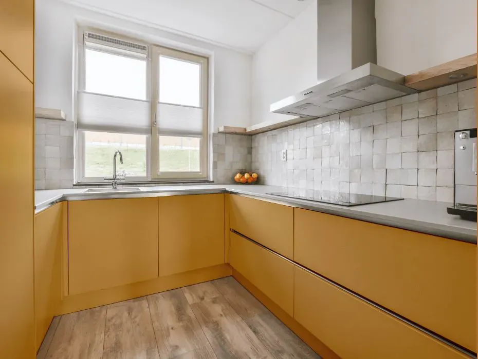
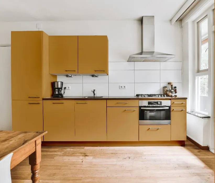
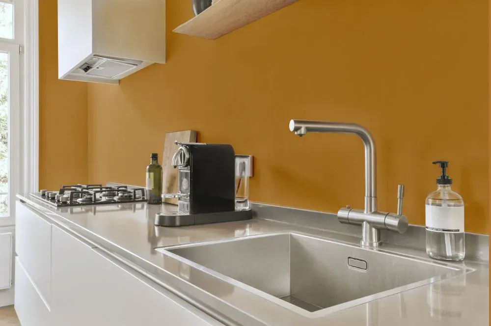
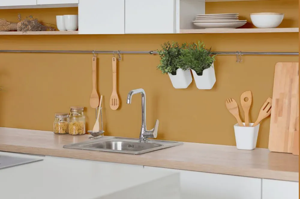
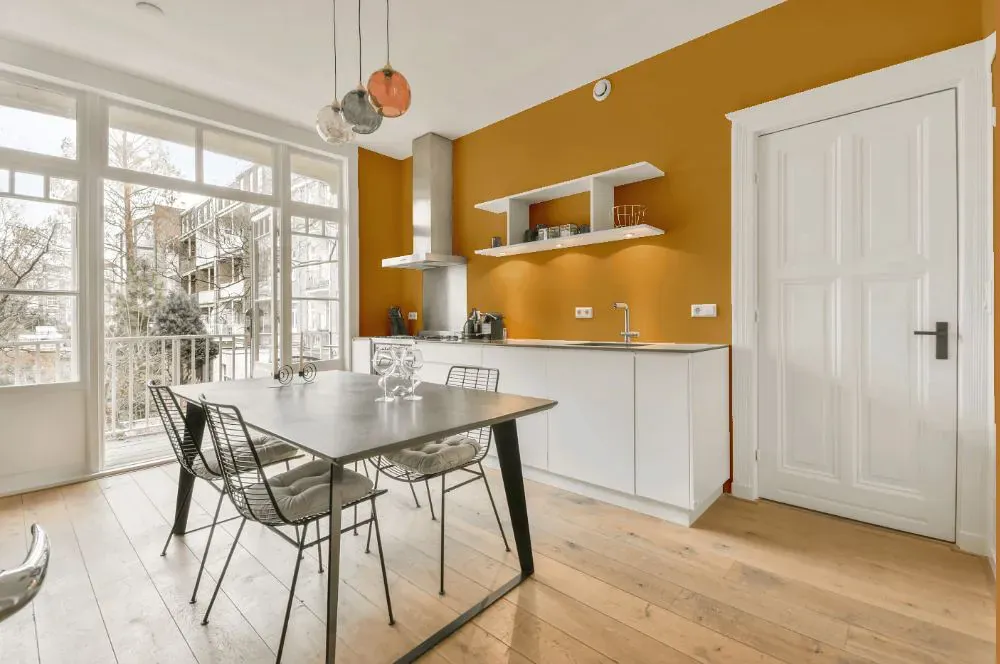
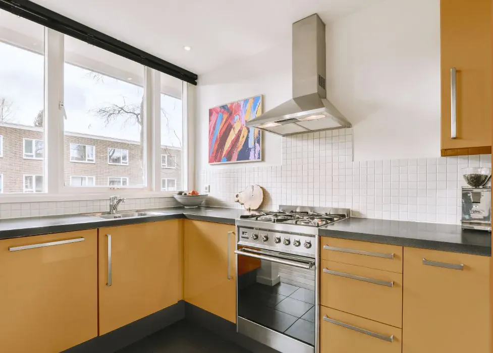
- Sherwin Williams SW 6389 on kitchen cabinets (4 photos)
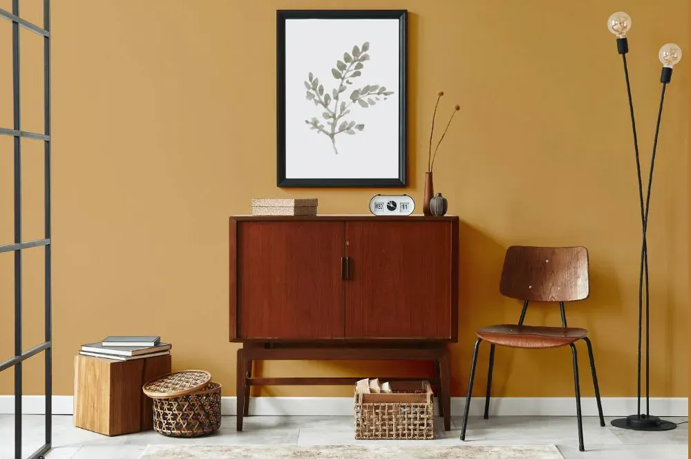
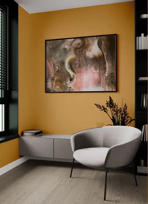
- Sherwin Williams Butternut reviews (9 photos)
- What are Sherwin Williams Butternut undertones?
- Is Butternut SW 6389 cool or warm?
- How light temperature affects on Butternut
- Monochromatic color scheme
- Complementary color scheme
- Color comparison and matching
- LRV of Butternut SW 6389
- Color codes
- Color equivalents
| Official page: | Butternut SW 6389 |
| Code: | SW 6389 |
| Name: | Butternut |
| Brand: | Sherwin Williams |
What color is Sherwin Williams Butternut?
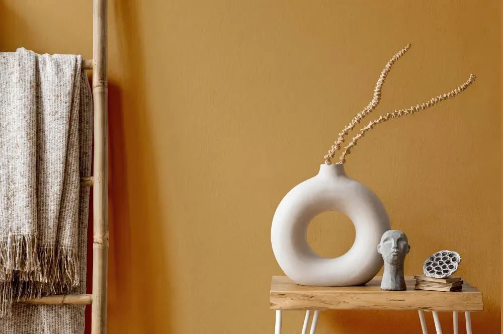
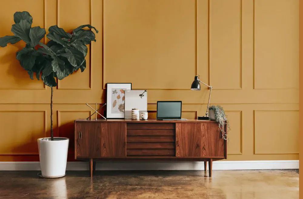
Feel the warm embrace of SW 6389 Butternut by Sherwin Williams. This inviting shade exudes a cozy and welcoming atmosphere, perfect for living rooms, kitchens, or bedrooms. SW 6389 complements natural wood finishes and brings a touch of autumnal splendor to any space. Infuse your home with the rich and comforting tones of Butternut to create a sense of tranquility and harmony. Embrace the beauty and versatility of SW 6389 in your interior design for a space that radiates with warmth and charm.
Loading...
LRV of Butternut
Butternut has an LRV of 37.07% and refers to Medium colors that reflect a lot of light. Why LRV is important?

Light Reflectance Value measures the amount of visible and usable light that reflects from a painted surface.
Simply put, the higher the LRV of a paint color, the brighter the room you will get.
The scale goes from 0% (absolute black, absorbing all light) to 100% (pure white, reflecting all light).
Act like a pro: When choosing paint with an LRV of 37.07%, pay attention to your bulbs' brightness. Light brightness is measured in lumens. The lower the paint's LRV, the higher lumen level you need. Every square foot of room needs at least 40 lumens. That means for a 200 ft2 living room you'll need about 8000 lumens of light – e.g., eight 1000 lm bulbs.
Color codes
We have collected almost every possible color code you could ever need.
Not sure what the difference between HEX and RGB is? We break down color models in plain language. Understanding color models
| Format | Code |
|---|---|
| HEX | #cc9b5c |
| RGB Decimal | 204, 155, 92 |
| RGB Percent | 80.00%, 60.78%, 36.08% |
| HSV | Hue: 34° Saturation: 54.9% Value: 80.0% |
| HSL | hsl(34, 52, 58) |
| CMYK | Cyan: 0.0 Magenta: 24.02 Yellow: 54.9 Key: 20.0 |
| YIQ | Y: 162.469 I: 49.444 Q: -9.24 |
| XYZ | X: 38.557 Y: 37.055 Z: 15.244 |
| CIE Lab | L:67.319 a:11.001 b:39.802 |
| CIE Luv | L:67.319 u:37.714 v:46.083 |
| Decimal | 13409116 |
| Hunter Lab | 60.873, 6.533, 27.764 |