Sherwin Williams Composed SW 6472
Contentsshow +hide -
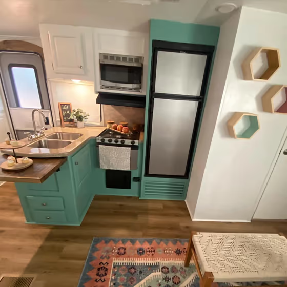
- Sherwin Williams SW 6472 on kitchen cabinets (1 photo)
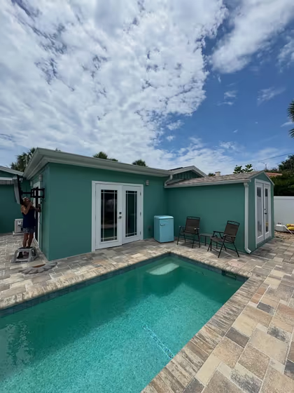
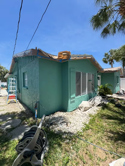
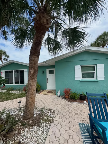
- Composed for exterior (8 photos)
- Sherwin Williams Composed reviews (9 photos)
- What are Sherwin Williams Composed undertones?
- Is Composed SW 6472 cool or warm?
- How light temperature affects on Composed
- Monochromatic color scheme
- Complementary color scheme
- Color comparison and matching
- LRV of Composed SW 6472
- Color codes
- Color equivalents
| Official page: | Composed SW 6472 |
| Code: | SW 6472 |
| Name: | Composed |
| Brand: | Sherwin Williams |
What color is Sherwin Williams Composed?
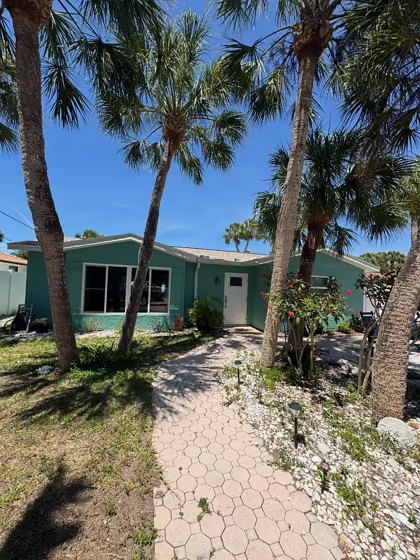
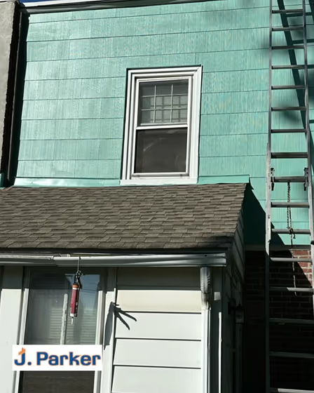
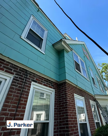
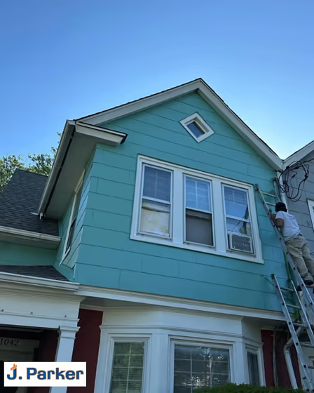
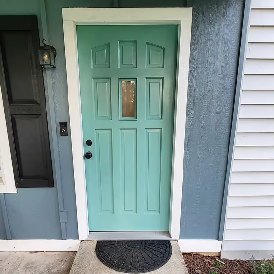
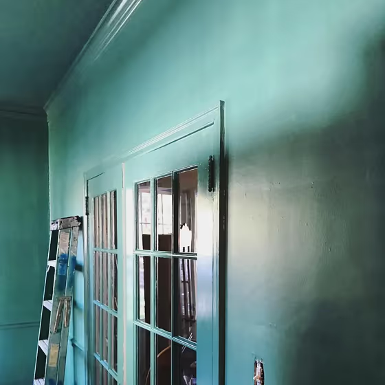
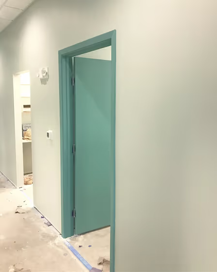
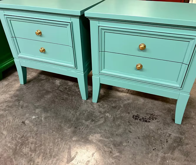
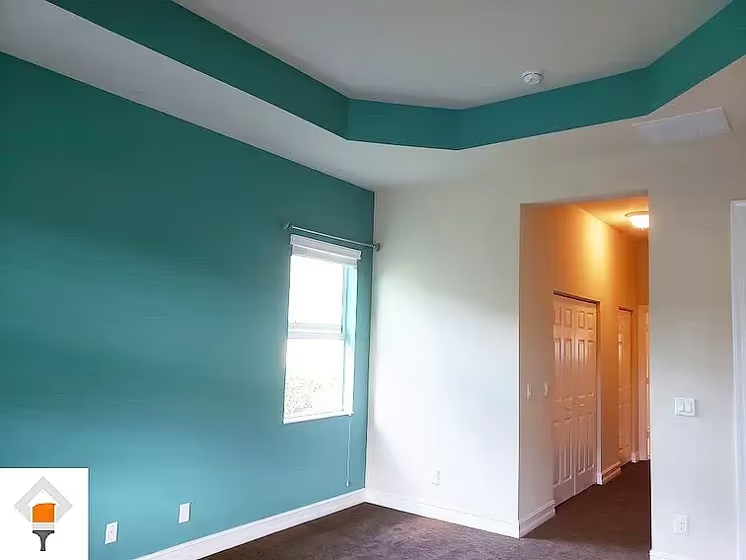
Sherwin Williams Composed SW 6472 is a muted mid-tone green with a noticeable blue-gray cast that keeps it from reading too leafy or bright. Its softened saturation gives walls a calm, weathered look, especially in bedrooms, bathrooms, and home offices. In cool daylight, Composed can appear more blue-leaning and slightly grayer, while warm evening lighting brings forward its gentler green side. Pair it with warm white trim, pale oak, aged brass, or natural linen for contrast without making the room feel overly crisp. It also has enough depth for painted cabinetry or an exterior front door where a restrained green-blue is wanted.
Loading...
LRV of Composed
Composed has an LRV of 32.55% and refers to Medium colors that reflect a lot of light. Why LRV is important?

Light Reflectance Value measures the amount of visible and usable light that reflects from a painted surface.
Simply put, the higher the LRV of a paint color, the brighter the room you will get.
The scale goes from 0% (absolute black, absorbing all light) to 100% (pure white, reflecting all light).
Act like a pro: When choosing paint with an LRV of 32.55%, pay attention to your bulbs' brightness. Light brightness is measured in lumens. The lower the paint's LRV, the higher lumen level you need. Every square foot of room needs at least 40 lumens. That means for a 200 ft2 living room you'll need about 8000 lumens of light – e.g., eight 1000 lm bulbs.
Color codes
We have collected almost every possible color code you could ever need.
Not sure what the difference between HEX and RGB is? We break down color models in plain language. Understanding color models
| Format | Code |
|---|---|
| HEX | #7ea298 |
| RGB Decimal | 126, 162, 152 |
| RGB Percent | 49.41%, 63.53%, 59.61% |
| HSV | Hue: 163° Saturation: 22.22% Value: 63.53% |
| HSL | hsl(163, 16, 56) |
| CMYK | Cyan: 22.22 Magenta: 0.0 Yellow: 6.17 Key: 36.47 |
| YIQ | Y: 150.096 I: -18.239 Q: -10.727 |
| XYZ | X: 27.19 Y: 32.542 Z: 34.546 |
| CIE Lab | L:63.789 a:-14.463 b:1.158 |
| CIE Luv | L:63.789 u:-18.349 v:4.017 |
| Decimal | 8299160 |
| Hunter Lab | 57.046, -14.751, 4.027 |