Sherwin Williams Daphne SW 9151
Contentsshow +hide -
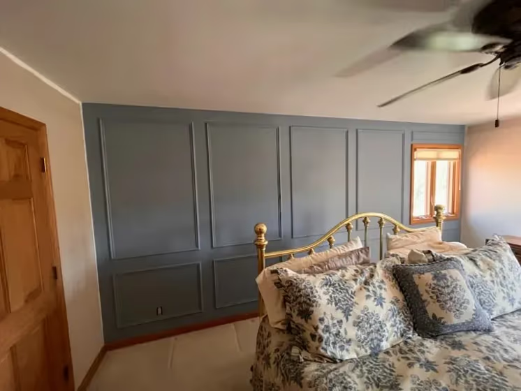
- Daphne for bedroom (2 photos)
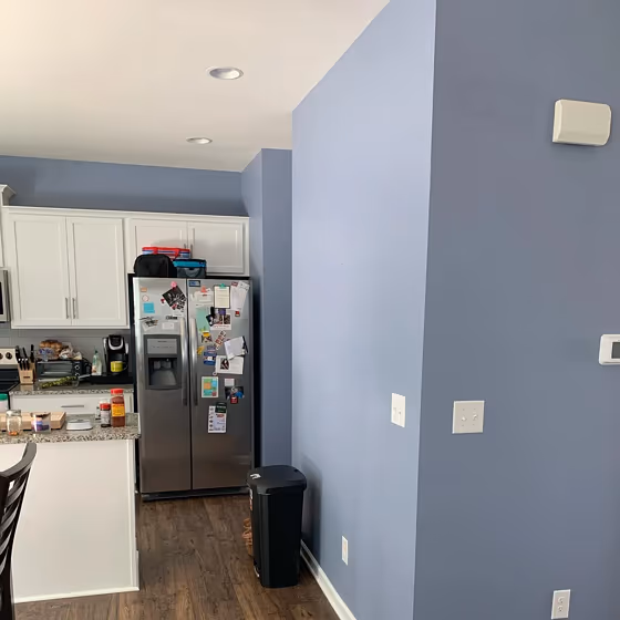
- Daphne for living room (1 photo)
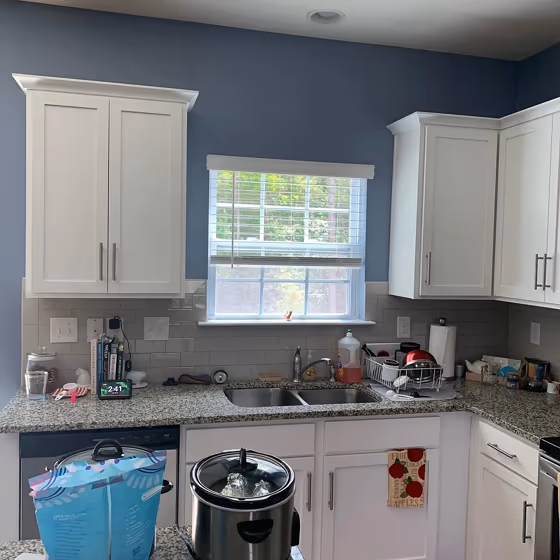
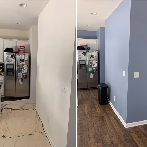
- Sherwin Williams Daphne reviews (12 photos)
- What are Sherwin Williams Daphne undertones?
- Is Daphne SW 9151 cool or warm?
- How light temperature affects on Daphne
- Monochromatic color scheme
- Complementary color scheme
- Color comparison and matching
- LRV of Daphne SW 9151
- Color codes
- Color equivalents
| Official page: | Daphne SW 9151 |
| Code: | SW 9151 |
| Name: | Daphne |
| Brand: | Sherwin Williams |
| Collections: | Trendsetter |
What color is Sherwin Williams Daphne?
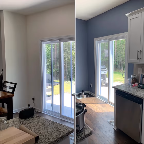
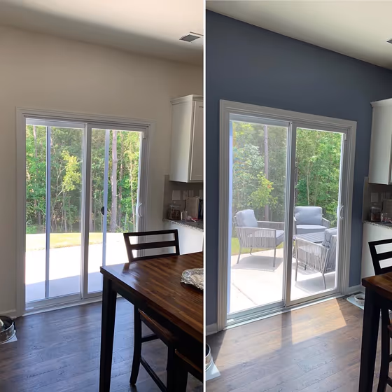
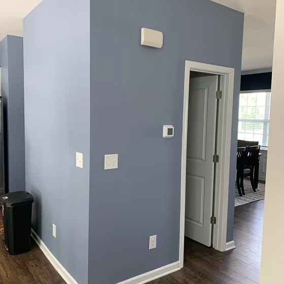
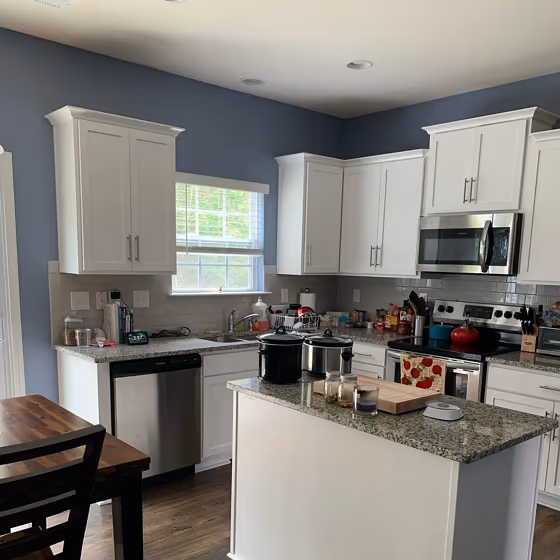
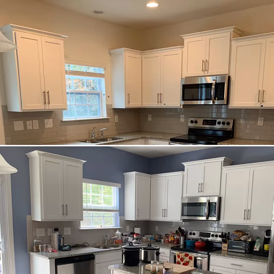
Sherwin Williams SW 9151 Daphne, a serene and sophisticated blue-green hue, brings a calming and elegant touch to any space. This versatile color pairs beautifully with crisp whites, such as SW 7008 Alabaster, to create a fresh and timeless look. For a more dramatic contrast, combine Daphne with deep charcoal tones like SW 7066 Gray Matters or rich jewel tones like SW 6244 Naval. Whether used as an accent wall or throughout a room, Daphne adds a subtle pop of color while still maintaining a sense of tranquility. Embrace the beauty of Sherwin Williams SW 9151 Daphne in your home for a chic and inviting atmosphere.
Loading...
LRV of Daphne
Daphne has an LRV of 31.97% and refers to Medium colors that reflect a lot of light. Why LRV is important?

Light Reflectance Value measures the amount of visible and usable light that reflects from a painted surface.
Simply put, the higher the LRV of a paint color, the brighter the room you will get.
The scale goes from 0% (absolute black, absorbing all light) to 100% (pure white, reflecting all light).
Act like a pro: When choosing paint with an LRV of 31.97%, pay attention to your bulbs' brightness. Light brightness is measured in lumens. The lower the paint's LRV, the higher lumen level you need. Every square foot of room needs at least 40 lumens. That means for a 200 ft2 living room you'll need about 8000 lumens of light – e.g., eight 1000 lm bulbs.
Color codes
We have collected almost every possible color code you could ever need.
Not sure what the difference between HEX and RGB is? We break down color models in plain language. Understanding color models
| Format | Code |
|---|---|
| HEX | #899caa |
| RGB Decimal | 137, 156, 170 |
| RGB Percent | 53.73%, 61.18%, 66.67% |
| HSV | Hue: 205° Saturation: 19.41% Value: 66.67% |
| HSL | hsl(205, 16, 60) |
| CMYK | Cyan: 19.41 Magenta: 8.24 Yellow: 0.0 Key: 33.33 |
| YIQ | Y: 151.915 I: -15.821 Q: 0.338 |
| XYZ | X: 29.458 Y: 31.997 Z: 42.643 |
| CIE Lab | L:63.34 a:-3.613 b:-9.534 |
| CIE Luv | L:63.34 u:-10.669 v:-13.589 |
| Decimal | 9018538 |
| Hunter Lab | 56.566, -6.031, -5.101 |